









The best pixel fonts do more than imitate old video games. At their strongest, they translate the logic of early digital screens into a visual language that still works in contemporary design.
A pixel typeface can make a game interface feel intentionally nostalgic, give a technology brand a low-resolution identity, turn an ordinary poster into something that references early computer graphics, or add enough digital character to a social campaign without relying on neon gradients, scan lines, or obvious arcade imagery.
The challenge is choosing the right kind of pixel typography.
A chunky 8-bit arcade font, a compact bitmap UI face, a dotted experimental display, and a futuristic modular typeface may all feel “digital,” but they behave very differently. Some work surprisingly well at small interface sizes. Others should only be used as large display typography. Some feel unmistakably retro. Others use pixel logic in a much more contemporary way.
This DesignRise collection brings together 20 pixel fonts and pixel-inspired display typefaces for game design, UI concepts, posters, digital branding, pixel art, social graphics, tech campaigns, merchandise, and experimental typography.
The guide also goes beyond a simple font list. You will learn how to distinguish true pixel fonts from merely digital-looking display faces, how to choose a font for game UI versus branding, how to test readability at small sizes, how to pair pixel typography with modern fonts, and how to avoid turning every retro project into the same predictable 8-bit composition.
Licensing note: these fonts come from different creators and download websites. A free download does not automatically mean unrestricted commercial use. Always check the current license on the original source page before using a font in client branding, logos, apps, games, websites, merchandise, templates, or other commercial projects.
Explore More DesignRise Resources:
- Best Psychedelic Fonts 2026: Groovy, Retro & Trippy Typefaces for Designers
- Best Figma Fonts for UI Projects (And How to Add Them)
- Best Free Fonts for 2026: Modern Typography Trends Designers Love
- Explore More Font Collections on DesignRise
What Makes a Pixel Font Different From a Regular Digital Font?
Not every geometric or futuristic typeface is a pixel font.
Traditional bitmap typography was designed around a fixed pixel grid. Instead of drawing smooth vector curves and scaling them freely, the designer worked with a limited number of square units. Every diagonal, curve, stem, and counter had to make sense inside that restriction.
That limitation created the visual language we now associate with early computers, arcade games, handheld consoles, terminal screens, and low-resolution interfaces.
True Pixel Fonts
A true or strongly bitmap-inspired font usually shows:
- Visible grid-based construction.
- Stepped curves.
- Square or modular counters.
- Limited diagonal smoothing.
- Clear low-resolution logic.
Pixel-Inspired Fonts
Other typefaces borrow only parts of that language. They may use sharp modular cuts, monospaced proportions, geometric fragmentation, dotted construction, or digital terminal references while remaining fully vector-based and visually smoother.
These fonts can be easier to use in branding because they suggest digital nostalgia without making the complete project look like a game interface.
How to Choose a Pixel Font for the Right Project
20 Best Pixel Fonts and Pixel-Inspired Typefaces
1. Edit Undo Font Family
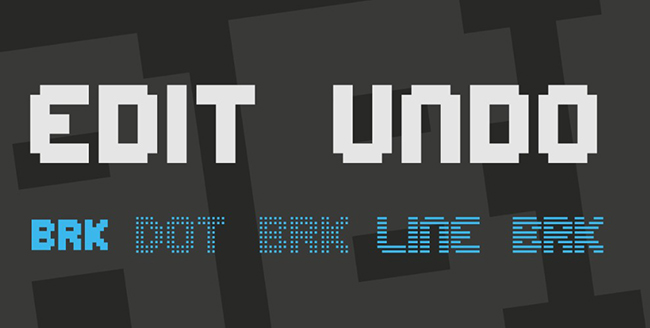
Edit Undo sits in a particularly useful space between nostalgic bitmap typography and contemporary digital design. The letterforms reference early interfaces and low-resolution screens without becoming so exaggerated that they can only be used in gaming projects.
Best for: UI concepts, tech branding, retro software graphics, posters, digital campaigns, editorial titles, and game-related projects.
Why It Works
The clean structure gives designers more flexibility than a heavily stylized arcade font. It can be paired with modern photography, minimal layouts, and contemporary color systems while still bringing an unmistakable digital character.
2. Pixel Game Font Family

Pixel Game is closer to the classic 8-bit language most people immediately associate with pixel typography.
Best for: arcade projects, indie games, pixel art, game menus, retro titles, merchandise, gaming events, and nostalgic digital graphics.
Use It Where the Gaming Reference Is Intentional
This kind of font communicates genre very quickly. That is an advantage for a retro game, but potentially a limitation for a corporate technology project.
Use it when you want the viewer to immediately think “game,” “arcade,” or “8-bit.”
3. Coral Pixels Font

Coral Pixels feels lighter and more playful than the stereotypical heavy arcade font. That makes it useful when the digital reference should feel friendly rather than aggressive.
Best for: casual games, kids graphics, stickers, playful branding, social media, digital illustrations, and colorful retro layouts.
Pair It With Simple Shapes
The font already contains visual character, so it works well with flat illustrations, simple icons, and restrained compositions rather than several competing pixel effects.
4. Pharmakon Font

Pharmakon is better described as an experimental digital display font than a strict pixel face. Its sharp, fragmented geometry still makes it relevant to designers working with cyber, tech, and post-digital aesthetics.
Best for: experimental posters, electronic music, cyber-themed branding, fashion graphics, technology campaigns, and bold display typography.
Use it for short titles rather than body copy. The strength of Pharmakon is its silhouette and visual tension.
5. Avalancheno Font

Avalancheno is another pixel-adjacent option rather than a classic bitmap font. Its geometric construction works when you want digital precision without directly referencing arcade games.
Best for: modern posters, tech branding, futuristic campaigns, editorial covers, motion graphics, and experimental identities.
Use It as Contrast
Pair a geometric display font like Avalancheno with a highly functional sans serif for longer information. That lets the headline carry the visual concept while the supporting typography remains easy to read.
6. Pixeloid Font

Pixeloid is one of the more practical choices in the collection because its pixel character is clear without sacrificing too much readability.
Best for: game interfaces, retro dashboards, digital labels, pixel-art projects, status screens, and compact headlines.
Test It at the Actual Interface Size
A UI font should never be judged only in a large specimen. Test labels, numbers, navigation, and button text at the real sizes your project will use.
7. Pixelary Font

Pixelary has a relatively balanced structure that makes it less visually noisy than many novelty pixel faces.
Best for: indie game branding, small titles, pixel art, interface concepts, merchandise, and digital identity systems.
It can be especially useful when the design needs to feel nostalgic without looking deliberately childish.
8. ByteBounce Font
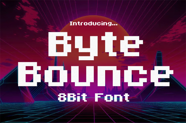
ByteBounce is more expressive. The name and letterforms both lean into playful digital culture, making it a good fit for projects where typography should feel energetic rather than purely functional.
Best for: gaming events, streamer graphics, social campaigns, stickers, youth branding, casual games, and merchandise.
Keep the Message Short
Highly characterful display fonts become harder to process across long phrases. Use ByteBounce for names, short statements, and titles rather than dense information.
9. Karmatic Arcade Font

Karmatic Arcade is one of the most recognizable old-school gaming directions in the collection.
Best for: arcade posters, gaming logos, game titles, pixel-art scenes, tournament graphics, retro merchandise, and nostalgic social content.
Do Not Overbuild the Arcade Theme
The font already does most of the historical referencing. You may not need pixel icons, neon grids, CRT noise, joystick illustrations, and scan lines at the same time.
One strong reference is often enough.
10. Star Crush Font

Star Crush feels closer to expressive retro display typography than strict bitmap lettering. Its playful proportions make it useful in entertainment-led work.
Best for: posters, music, youth campaigns, game titles, event graphics, social media, and playful branding.
Let the typography become the hero instead of surrounding it with equally expressive decorative elements.
11. Many Dots Font

Many Dots is not a conventional pixel font, but its modular construction makes it relevant to experimental digital typography.
Best for: editorial covers, posters, motion design, music artwork, fashion graphics, and unconventional branding.
Use Negative Space Carefully
Dotted letterforms can lose clarity quickly when reduced. Test the word at the smallest intended size before building the rest of the layout around it.
12. Retro Pixel Font
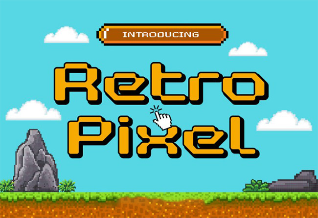
Retro Pixel is a direct, classic option for designers who want unmistakable low-resolution character.
Best for: retro games, arcade graphics, pixel art, game covers, digital stickers, nostalgic web graphics, and themed events.
This is the kind of font to choose when subtlety is not the objective.
13. Pigxel Modern Pixel Font

Pigxel is particularly useful for contemporary work because it brings pixel construction into a cleaner, more modern visual system.
Best for: modern game branding, UI experiments, technology identities, digital posters, social media, and merchandise.
Good Choice for “Modern Retro”
If a project should reference pixel culture without looking like a direct recreation of a 1980s game, Pigxel is worth testing.
14. Pixel Millennium Font

Pixel Millennium combines bitmap logic with a more futuristic attitude, which makes it feel less arcade-specific.
Best for: sci-fi graphics, cyber interfaces, technology campaigns, game titles, futuristic posters, and digital branding.
Build the Future Without the Usual Clichés
Instead of automatically adding neon blue, chrome, grids, and holographic effects, try the font in black and white first. Strong typography can often carry the futuristic direction by itself.
15. Space Rabbit Font

Space Rabbit is better understood as a futuristic display font than a traditional pixel face. It still fits this collection because its geometry works naturally beside pixel art and digital visual systems.
Best for: sci-fi posters, game branding, event graphics, digital campaigns, entertainment, and space-themed projects.
Use it when you want the technological feel without an overtly 8-bit result.
16. Buse Font

Buse is the least traditionally pixel-like option here. Its value is as a clean geometric partner for more aggressive bitmap typography.
Best for: contemporary branding, headlines, interface concepts, editorial design, and supporting typography in digital-themed projects.
Use It as a Supporting Voice
A pixel font does not need to handle every level of the hierarchy. Buse can provide a calmer counterpoint to a more expressive primary face.
17. Bitrimus Font
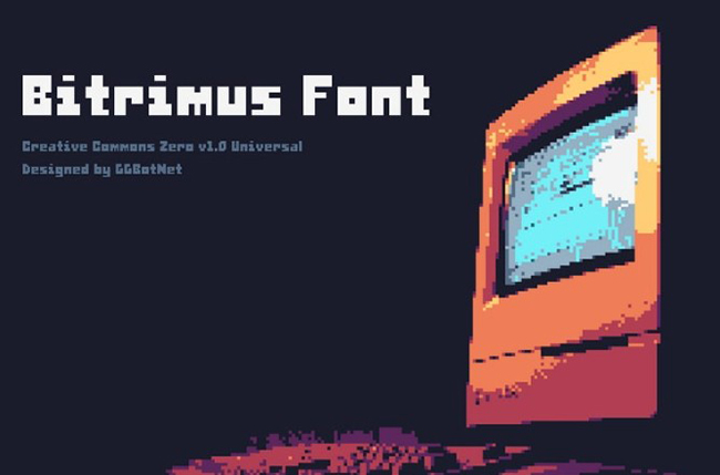
Bitrimus has a heavier, more forceful digital personality. It works well when the typography needs to survive busy backgrounds and high-energy compositions.
Best for: game titles, esports-style graphics, technology campaigns, posters, event branding, and digital merchandise.
Check the Counterforms
Heavy modular fonts can visually close up at small sizes. Test letters with enclosed spaces such as A, B, D, O, P, and R before choosing the final scale.
18. Pixelzone Font

Pixelzone is a clean modern pixel option that can work in both retro and more contemporary game-related projects.
Best for: game interfaces, digital branding, indie games, pixel art, labels, merchandise, and compact display typography.
Its relatively controlled structure makes it easier to integrate into systems that also use modern sans-serif typography.
19. LT Railway Font

LT Railway is not a pixel font in the strict sense. Its industrial vintage construction earns it a place here as an alternative when the project needs retro character without gaming references.
Best for: posters, industrial branding, music graphics, heritage identities, signage-inspired layouts, and retro editorial work.
A Useful Break From Gaming
Collections of pixel typography can become visually repetitive. LT Railway provides a different historical reference while still fitting a broader retro-digital art direction.
20. DarkByte Font

DarkByte closes the collection with a darker cyber-oriented interpretation of pixel typography.
Best for: cyberpunk graphics, dark game interfaces, esports, technology branding, sci-fi posters, music, and digital campaigns.
Let the Font Carry the Mood
You do not need to make every surrounding element equally aggressive. A dark pixel font can look especially strong against a restrained neutral layout or a single high-contrast accent color.
How to Use Pixel Fonts in Game UI Without Hurting Readability
Reserve the Most Decorative Font for Important Moments
Use expressive pixel typography for:
- Game title.
- Level headings.
- Score screens.
- Short buttons.
- Achievement labels.
Long dialogue and instructions may need a simpler companion face.
Test Numbers Separately
Games often display:
- Scores.
- Health.
- Currency.
- Timers.
- Percentages.
A font with attractive letters but weak numerals may create problems later.
Test Similar Characters
Compare:
- 0 and O.
- 1, I, and l.
- 5 and S.
- 8 and B.
Low-resolution construction can make these characters more ambiguous than in regular text fonts.
How to Pair Pixel Fonts With Modern Typography
Pixel Display + Neutral Sans
This is the safest combination for interfaces and modern branding.
Use the pixel font for personality and the neutral sans for usability.
Pixel Font + Monospace
This works particularly well for:
- Developer tools.
- Terminal-inspired graphics.
- Retro software branding.
- Tech events.
Pixel Font + Clean Serif
An unexpected editorial serif can make pixel typography feel less predictable and more fashion- or culture-oriented.
Avoid Two Competing Pixel Fonts
Two display fonts with equally strong modular construction usually create noise rather than hierarchy.
How to Make Pixel Typography Look Modern
Pixel fonts do not have to live inside a fake arcade cabinet.
Use Large Amounts of Negative Space
A tiny grid-based typeface can feel surprisingly premium when surrounded by generous whitespace.
Use Contemporary Photography
Combine pixel headlines with:
- Fashion photography.
- Architecture.
- Minimal product photography.
- Abstract 3D renders.
The contrast between low-resolution typography and high-resolution imagery can become the concept.
Limit the Color Palette
Black, white, and one accent color can feel much fresher than the expected rainbow gaming palette.
Mix Resolutions Deliberately
Low-resolution type beside smooth gradients, polished photography, or clean 3D work creates a strong visual tension.
Five Practical Pixel Font Workflows
1. Indie Game Identity
- Choose one readable pixel display font.
- Create the game title.
- Test numbers and UI labels.
- Pair it with a simpler secondary font.
- Apply the system to menus, social assets, and store graphics.
2. Retro Tech Brand
- Use a modern pixel-inspired face rather than a literal arcade font.
- Keep the logo simple.
- Add one digital reference such as a grid, cursor, or terminal label.
- Use contemporary photography.
- Keep the interface typography functional.
3. Music Poster
- Select a distinctive pixel display font.
- Set one oversized headline.
- Add a simple sans serif for details.
- Use texture only where it supports the concept.
- Test the poster as a small social thumbnail.
4. Social Media Campaign
- Choose a short recurring typographic format.
- Keep headlines under control.
- Create 1:1 and 9:16 versions separately.
- Use the pixel font consistently across the campaign.
- Test everything on a phone.
5. Experimental Editorial Layout
- Use pixel typography as a contrast element.
- Pair it with a refined body typeface.
- Allow typography to cross image boundaries.
- Use large scale changes.
- Keep the body copy highly readable.
How to Test a Pixel Font Before Using It
Type the Real Project Name
Do not choose from the specimen alone.
Test Uppercase and Lowercase
Some pixel fonts work much better in one case than the other.
Test Numbers
Especially important for games, dashboards, events, and technology.
Test Punctuation
Look at:
- Colon.
- Slash.
- Brackets.
- Plus and minus signs.
- Percent sign.
Test at Actual Size
A font can look excellent at 80 px and fail completely at 14 px.
Check Language Support
Do not assume that a visually complete English specimen includes every accented or multilingual character your project may require.
Common Pixel Typography Mistakes
1. Making Every Element Pixelated
Pixel typography becomes more interesting when it contrasts with smoother elements.
2. Using Pixel Fonts for Long Paragraphs
Most display pixel faces are not designed for extended reading.
3. Automatically Using Neon Colors
Digital does not have to mean neon.
4. Mixing Several Gaming Eras
8-bit arcade, 1990s PC, Y2K, cyberpunk, and modern indie-game aesthetics are not the same visual language.
5. Ignoring Numerals
A beautiful alphabet does not guarantee usable score or timer displays.
6. Adding Blur to a Font That Depends on Crisp Pixels
Bitmap-style typography often relies on hard edges.
7. Scaling Without Testing
Some pixel fonts become awkward at intermediate sizes.
8. Pairing Two Loud Digital Fonts
Let one typeface provide the personality.
9. Assuming Every “Digital” Font Is a Pixel Font
Modular, futuristic, dotted, industrial, and geometric typefaces may share digital character without being bitmap-based.
10. Assuming Free Means Commercial Use
Always verify the license on the original source page.
Pixel Font Licensing Checklist
- Is commercial use permitted?
- Can the font be used in a logo?
- Can it be embedded in a website?
- Can it be embedded in a game or app?
- Is merchandise use allowed?
- Can the font file be distributed with a project?
- Is attribution required?
- Is the version a demo?
- Are modifications permitted?
- Does the license cover client work?
Game and app projects deserve particular attention because embedding a font inside software may be treated differently from using it in a static image.
Frequently Asked Questions About Pixel Fonts
What are pixel fonts?
Pixel fonts are typefaces based on the visual logic of low-resolution bitmap grids. They often use stepped curves, square forms, and modular construction inspired by early digital screens and video games.
What are the best pixel fonts for designers?
The best choice depends on the project. Pixeloid, Pixelary, Pigxel, Pixelzone, Retro Pixel, Karmatic Arcade, and Pixel Game are strong options for clearly pixel-based design, while Edit Undo and Pixel Millennium offer more contemporary interpretations.
Can pixel fonts be used for UI design?
Yes, especially in games and intentionally retro interfaces. Test small sizes carefully and consider using a more readable secondary font for longer instructions or text-heavy sections.
Are pixel fonts only for gaming?
No. They can also work in branding, posters, editorial design, music graphics, technology campaigns, merchandise, social media, and experimental typography.
What font should I pair with a pixel font?
A clean sans serif is usually the easiest choice. Monospace fonts can reinforce a technical direction, while a refined serif can create a more unexpected editorial contrast.
Can pixel fonts look professional?
Yes. Professional results depend on hierarchy, spacing, scale, color, and context rather than the historical origin of the typeface.
What is the difference between a bitmap font and a pixel-inspired font?
A bitmap-style font follows an obvious grid-based construction, while a pixel-inspired font may simply borrow modular or digital characteristics without reproducing true low-resolution forms.
Can I use pixel fonts for logos?
Yes, when the license permits it and the visual language suits the brand. Test the logo at several sizes before committing to the typeface.
Are all fonts in this collection strict pixel fonts?
No. The collection intentionally includes several pixel-adjacent digital and retro display fonts such as Pharmakon, Avalancheno, Space Rabbit, Buse, and LT Railway. They are useful alternatives when a project needs digital character without literal bitmap styling.
Are these fonts free for commercial use?
No universal licensing claim should be made. Check each original download page before using a font commercially.
Final Thoughts
The best pixel fonts are not simply the ones that look most like an old arcade game.
Pixel Game, Karmatic Arcade, Retro Pixel, and similar faces provide direct 8-bit nostalgia. Pixeloid, Pixelary, Pigxel, and Pixelzone are more flexible for contemporary game and digital work. Edit Undo and Pixel Millennium bridge retro and modern visual systems, while Pharmakon, Avalancheno, Many Dots, Space Rabbit, Buse, and LT Railway offer useful alternatives when a project only needs part of the digital language rather than a literal bitmap aesthetic.
The most important decision is context.
Test the real word. Test the numerals. Check small sizes. Pair expressive typography with something quieter. Decide which digital era you are referencing. Remove effects that do not strengthen the idea.
And most importantly, do not use pixel typography simply because the project involves technology.
A good pixel font creates nostalgia. A great typographic system makes that nostalgia feel intentional.
For more curated fonts, typography guides, UI resources, and practical design inspiration, continue exploring DesignRise.
Discover more from DesignRise
Subscribe to get the latest posts sent to your email.