









Free clean fonts for professional design projects are valuable for a reason that has little to do with trends: they make complicated visual systems easier to understand. A well-designed clean typeface can support a brand identity, website, app, presentation, editorial layout, or packaging system without constantly competing for attention.
That restraint is often harder to achieve than it looks. Minimal typography can appear simple on the surface, but small differences in proportions, spacing, x-height, terminals, curves, weight distribution, and character width determine whether a design feels refined or generic.
A neutral-looking sans serif may perform beautifully in a dashboard and poorly as a fashion wordmark. A condensed font may create excellent poster headlines but become uncomfortable in navigation. A geometric family can feel precise and contemporary, while a humanist sans may feel warmer and easier to read across longer passages.
This collection brings together 18 modern and minimal fonts for designers working across branding, UI/UX, corporate identity, websites, presentations, social media, editorial design, and digital products. The selection includes Satoshi, General Sans, Plus Jakarta Sans, Dense, Sifonn, Sabado, Neris, Alegreya Sans HT, Kugile, Poppins, Coolvetica, Cocogoose, IT Monelix, Gondens, Retro Floral, ROTHEFIGHT, Antipasto Pro, and ZT Nature.
Not every typeface in the list is strictly minimalist in the same way. That is intentional. A professional font library needs neutral workhorses, compact headline tools, softer humanist options, and a few more expressive faces that can provide contrast without forcing the entire project into a decorative style.
This DesignRise guide therefore goes beyond a simple download list. You will learn how to evaluate a clean typeface, how to choose fonts for interface design versus branding, how to pair minimal fonts, how to test readability, and how to avoid the “default startup template” look that can happen when every project uses the same familiar sans serif.
Licensing note: availability as a free download does not automatically guarantee unrestricted commercial use. Some fonts may be demos or may have separate personal and commercial terms. Always review the current license on the original source page before using a font in client branding, logos, websites, apps, packaging, merchandise, templates, or other commercial work.
Explore More DesignRise Resources:
- Best Psychedelic Fonts 2026: Groovy, Retro & Trippy Typefaces for Designers
- Pixel Perfect: The Best Pixel Fonts Every Designer Should Try
- Best Free Fonts 2026: Handpicked Typefaces for Creative Projects
- Explore More Font Collections on DesignRise
What Makes a Font Feel Clean and Professional?
“Clean” is often used as a vague synonym for sans serif, but a font can be minimal without being sterile and professional without being completely neutral.
The strongest clean typefaces tend to share several qualities.
Clear Letterforms
Characters should remain distinguishable at realistic sizes. Letters such as uppercase I, lowercase l, and the numeral 1 should not become unnecessarily ambiguous in interfaces or data-heavy layouts.
Controlled Proportions
Balanced character widths create a calm reading rhythm. Extremely wide or narrow letters can be useful stylistically, but they change how much information fits in a line and how the type behaves in responsive layouts.
Consistent Spacing
A professional typeface should not require constant manual kerning just to make ordinary words look acceptable. Display headlines may still need optical adjustment, but regular text should have a stable natural rhythm.
Enough Weight Options
A family with several useful weights makes it easier to establish hierarchy without introducing a second typeface purely for emphasis.
For example:
- Regular for body copy.
- Medium for UI controls.
- Semibold for subheadings.
- Bold for primary titles.
Useful Character Coverage
Professional projects often require more than A–Z. Check punctuation, currency symbols, numerals, accented characters, mathematical symbols, and the languages the brand may eventually support.
How to Choose a Clean Font for the Right Design Job
The phrase free clean fonts for professional design projects covers very different needs. A font that excels in a SaaS dashboard may not be the best choice for a beauty brand or editorial cover.
18 Free Clean Fonts for Professional Design Projects in 2026
The fonts below range from highly neutral workhorse families to more distinctive display choices. Use the cleaner families as a system and the more expressive options as controlled accents.
1. Satoshi Font Family

Satoshi is a geometric grotesk with enough personality to avoid feeling completely anonymous. Its clean structure makes it easy to integrate into modern interfaces and identity systems, while subtle details prevent it from reading like a default template font.
It is especially useful when the design needs contemporary clarity without moving into an overly rounded or obviously geometric direction.
Best for: UI/UX design, landing pages, portfolios, startup identities, editorial layouts, presentations, and modern branding.
Designer Approach
Try using Satoshi at a comfortable regular weight for body text and a stronger weight for headlines. For premium branding, generous whitespace will often create more sophistication than excessive letter spacing.
2. General Sans Font Family

General Sans offers a useful balance between neutrality and character. It can sit quietly inside a large product interface but still hold enough personality for branding and editorial applications.
That versatility makes it particularly valuable for teams that do not want a different typeface for every touchpoint.
Best for: SaaS products, dashboards, websites, branding systems, editorial design, presentations, and corporate communication.
Pairing Direction
If General Sans carries most of the functional typography, introduce contrast through a serif or expressive display face only in major campaign or editorial moments.
3. Plus Jakarta Sans

Plus Jakarta Sans combines geometric clarity with softer humanist influence. The result is clean enough for interface work without feeling excessively rigid.
Its proportions and relatively open forms make it useful in digital environments where readability must survive smaller sizes, longer labels, and varying screen widths.
Best for: UI/UX, websites, SaaS products, dashboards, digital reports, branding, and mobile applications.
Body Copy Tip
Do not compress clean sans-serif body text simply because the interface needs to feel compact. A comfortable line-height usually improves both perceived quality and readability.
4. Dense Typeface

Dense is a condensed display typeface rather than a general-purpose text family. Its narrow proportions allow designers to create large headlines in limited horizontal space.
That makes it useful when the project needs clean typography with stronger visual tension than a neutral UI font can provide.
Best for: posters, magazine covers, campaign headlines, presentation titles, editorial layouts, and compact visual identities.
Where Dense Works Best
Use it as contrast. A condensed headline paired with a wider, calmer body typeface can create more hierarchy than using several font weights from one family.
5. Sifonn Font

Sifonn leans toward geometric display typography. Smooth curves and simple construction give it a clean presence while keeping enough shape personality for logos and headlines.
Best for: branding concepts, logo exploration, posters, social campaigns, fashion graphics, editorial headlines, and presentations.
Because Sifonn is more display-oriented than the first three families, avoid using it automatically for long body copy. Its strongest role is usually to establish the visual voice rather than handle every level of information.
6. Sabado Font Family

Sabado adds a serif option to an otherwise sans-heavy collection. A clean design does not require removing serifs; it requires controlling hierarchy, ornament, spacing, and visual noise.
Sabado can bring more sophistication to editorial and identity work while still participating in a restrained modern system.
Best for: editorial design, branding, hospitality, fashion, cultural projects, invitations, and refined visual identities.
Pair It With a Neutral Sans
A clean serif can become more contemporary when paired with restrained sans-serif body copy. Use the serif for large titles and the sans for supporting information.
7. Neris Font Family
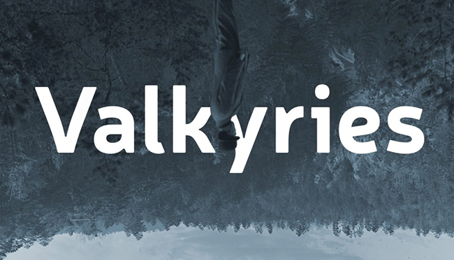
Neris is one of the more versatile workhorse-style options in the list. A family like this is useful when the typography needs to support several hierarchy levels without constantly announcing itself.
Best for: corporate identity, web design, editorial layouts, reports, presentations, dashboards, and long-form digital content.
Build Hierarchy With Weight First
Before adding another font family, see whether Neris already provides enough contrast through size, weight, spacing, and color. Many professional systems become more coherent when they use fewer fonts more deliberately.
8. Alegreya Sans HT

Alegreya Sans HT brings more human warmth than a purely geometric sans. Subtle calligraphic influence can make typography feel less mechanical while maintaining professional clarity.
This is useful for organizations that want a clean identity without looking cold or technology-driven.
Best for: editorial design, publishing, cultural organizations, education, web typography, professional communication, and approachable branding.
Use Humanist Fonts When Tone Matters
Not every minimal brand needs geometric precision. Healthcare, education, cultural institutions, and service businesses may benefit from typography that feels more conversational.
9. Kugile Font

Kugile moves toward a more assertive display direction. Its clean forms still fit a contemporary system, but the overall personality is stronger than that of a neutral UI family.
Best for: campaign headlines, logos, modern branding, posters, packaging, social media, and editorial design.
Kugile is most useful when a project needs a clean visual base but cannot afford to feel anonymous.
10. Poppins Font Family

Poppins is a geometric sans-serif family with recognizable circular construction and a broad range of potential uses.
Its familiarity can be an advantage when clarity and predictable behavior matter more than typographic novelty. It can also be a disadvantage when a brand needs to feel highly distinctive.
Best for: web design, interfaces, corporate presentations, social graphics, simple brand systems, dashboards, and marketing pages.
How to Avoid the Template Look
Do not expect Poppins alone to create brand personality. Distinction can come from custom spacing, photography, color, iconography, motion, layout, or a contrasting display font.
11. Coolvetica Font

Coolvetica is cleaner than many retro display fonts but more characterful than a neutral grotesk. Its smooth, rounded personality can introduce nostalgia without requiring distressed textures or decorative illustration.
Best for: logos, poster headlines, retro-inspired branding, apparel, entertainment, social campaigns, and packaging concepts.
Keep the Surrounding System Modern
Pairing a retro-inspired font with a highly contemporary grid and simple color palette can produce a fresher result than surrounding it with obvious vintage effects.
12. Cocogoose Font

Cocogoose offers stronger geometric structure and is particularly useful when the typography needs to hold its own against photography, packaging graphics, or large campaign imagery.
Best for: branding, packaging, logos, posters, product launches, sports graphics, and digital campaigns.
Use it where a neutral system would feel too quiet but a highly decorative font would be too specific.
13. IT Monelix Demo Font Family

IT Monelix Demo is positioned toward elegant modern typography. Its balanced forms can support branding and editorial work where the design needs to feel polished without becoming overly decorative.
Best for: branding concepts, editorial layouts, logos, fashion, presentations, hospitality, and sophisticated digital graphics.
Because this is a demo version, review the source page carefully before commercial use. Demo fonts may have licensing or character limitations.
14. Gondens DEMO Font

Gondens DEMO uses condensed proportions to create a strong vertical rhythm. It can fit large headlines into narrow spaces while retaining a relatively clean modern character.
Best for: posters, editorial covers, campaign headlines, events, sports graphics, presentations, and compact brand typography.
Condensed Does Not Mean Body Text
Narrow letterforms can become tiring across long passages. Use Gondens where space and impact matter, then pair it with a more open font for functional information.
15. Retro Floral Font

Retro Floral is deliberately more decorative than the core clean-font families in this collection. It is included as a contrast option for designers who need a minimal system with one expressive typographic accent.
Best for: packaging, posters, invitations, boutique branding, event graphics, retro projects, and decorative headlines.
Use It as the Exception
A clean identity can become more memorable when one controlled element breaks the system. Use Retro Floral for a campaign title or special product line while keeping the remaining typography restrained.
16. ROTHEFIGHT Font

ROTHEFIGHT brings a stronger, edgier display personality. It is less appropriate as a neutral workhorse but useful when a clean layout requires one high-impact headline.
Best for: posters, entertainment, sports, music, fashion graphics, campaign identities, and social content.
Use it with restraint. A strong display font often becomes more effective when every secondary element is intentionally quieter.
17. Antipasto Pro Font Family

Antipasto Pro is a clean geometric sans serif with balanced forms that can work across branding, interface, and editorial contexts.
Best for: corporate identity, websites, digital interfaces, presentations, editorial design, landing pages, and contemporary branding.
Use a Family Like a System
Instead of immediately pairing Antipasto with another sans serif, explore whether its available weights can provide sufficient hierarchy on their own.
18. ZT Nature Font Family

ZT Nature combines a contemporary sans-serif foundation with a slightly more organic character. That makes it useful for brands that want modern cleanliness without appearing overly technical or corporate.
Best for: natural products, wellness, lifestyle branding, packaging, editorial work, hospitality, and modern visual identities.
Organic Does Not Require Rustic Design
Pair the font with clean photography, restrained color, and generous spacing rather than automatically adding leaves, kraft textures, or handmade effects. A natural tone can still feel sophisticated.
How to Pair Clean Fonts Without Making a Design Feel Generic
Clean typography often fails not because the fonts are poor, but because every typographic role looks too similar.
Neutral Sans + Editorial Serif
Use a family such as Satoshi, General Sans, Neris, or Plus Jakarta Sans for functional typography and introduce Sabado for major editorial or campaign headlines.
Workhorse Sans + Condensed Display
Combine a wide, readable body family with Dense or Gondens for headlines. The contrast in width creates hierarchy even when both fonts remain visually clean.
Geometric Sans + Humanist Sans
A more geometric family can handle branding and navigation, while Alegreya Sans HT provides a warmer voice for longer content or editorial contexts.
Minimal System + One Expressive Accent
Use a neutral family throughout the system and introduce Coolvetica, Retro Floral, ROTHEFIGHT, or Kugile only for campaigns or selected display moments.
Do Not Pair Fonts Just Because They Are Different
Each typeface should have a job. If two fonts are performing the same role, one of them may be unnecessary.
How to Avoid the “Generic Startup Font” Look
Minimal branding can become repetitive when every project uses the same wide geometric sans serif, pastel gradient, rounded card, and oversized heading.
Change the Proportions
A condensed or narrower typeface can completely change the rhythm without sacrificing cleanliness.
Use Different Case Strategies
Sentence case, lowercase, title case, and uppercase all create different personalities even before the font changes.
Use Typography as Layout
Instead of centering every headline above a paragraph, experiment with:
- Oversized left-aligned type.
- Asymmetric grids.
- Vertical labels.
- Large numerals.
- Type that overlaps photography.
- Headlines spanning several columns.
Introduce Character Through Content
A neutral typeface becomes less generic when the copy has a distinctive voice. Typography cannot compensate for bland messaging.
Customize Important Wordmarks
For a major brand identity, adjust kerning, selected letterforms, proportions, ligatures, or spacing instead of using the font untouched.
How to Evaluate Clean Fonts for UI/UX Design
Interface typography has different requirements from poster or logo typography.
Test Small Sizes First
A UI font should remain clear at realistic sizes, not only in a large specimen.
Test:
- 12–14 px captions.
- 14–16 px labels.
- 16–18 px body text.
- Buttons.
- Form fields.
- Navigation.
- Tables.
Inspect Similar Characters
Compare:
- I / l / 1
- O / 0
- rn / m
- c / e
Ambiguous forms matter in passwords, financial data, codes, tables, and user-generated content.
Test Numerals
Dashboards, eCommerce, fintech, analytics, and SaaS products often contain more numbers than designers expect.
Check:
- Currency.
- Percentages.
- Large totals.
- Decimals.
- Dates.
- Tabular data.
Test Long Labels
Replace “Save” with “Save and Continue to Checkout.” If the UI immediately breaks, the typography or component system needs work.
Test Localization
Clean English layouts can become crowded when translated. Leave enough room for expansion and verify character support.
How to Use Clean Fonts in Branding
For branding, free clean fonts for professional design projects should be tested as part of a visual system rather than judged from one specimen image.
Test the Actual Brand Name
The typeface may contain beautiful characters that never appear in your wordmark. Type the real name before becoming attached to the font.
Design in Black and White First
Remove photography, gradients, and color. If the typography still feels distinctive, the foundation is stronger.
Check Competitors
Minimal sans-serif branding is common. A perfectly good font may still be the wrong choice if every competitor uses something nearly identical.
Create Supporting Rules
A professional identity should define:
- Headline family.
- Body family.
- Weight hierarchy.
- Capitalization.
- Tracking.
- Line-height.
- Alignment.
- Minimum sizes.
Do Not Expect the Font to Do Everything
Brand identity also depends on messaging, imagery, color, layout, motion, material, iconography, and behavior.
Clean Typography for Presentations
Use Fewer Sizes
Professional presentations often look stronger with three or four clearly defined levels rather than many slightly different sizes.
Prioritize Projection Readability
Thin type that looks elegant on a laptop may disappear on a projector or conference screen.
Use Weight to Separate Information
Instead of changing font families constantly, use a consistent family with controlled weight variation.
Give Numbers Enough Space
Financial and analytical slides often fail because large numbers compete with too many labels. Let important metrics breathe.
Clean Typography for Print and Packaging
Print a Physical Test
Typography that looks perfect at 200% zoom may feel too small or too light when printed.
Check Fine Weights
Very thin strokes can lose consistency depending on the printing method and material.
Test Against Real Packaging Color
Do not judge typography only on a white artboard. Contrast changes dramatically on colored paper, plastic, metallic finishes, transparent materials, and photography.
Consider Viewing Distance
A package needs different typographic hierarchy at shelf distance, hand distance, and close reading distance.
Common Mistakes With Minimal Typography
1. Assuming Minimal Means Empty
Whitespace needs structure. Random empty areas do not automatically create sophistication.
2. Using Extremely Light Weights Everywhere
Thin typography can reduce readability and often performs poorly on low-quality displays or projectors.
3. Using One Font Weight for Everything
Clean typography still needs hierarchy. Use size, weight, spacing, and color deliberately.
4. Choosing a Font Because It Looks Modern
Modern appearance does not guarantee appropriate character coverage, readability, licensing, or brand distinction.
5. Overusing Letter Spacing
Large tracking can create an elegant effect in short uppercase titles, but it can damage natural word shape and readability when applied everywhere.
6. Ignoring Line Length
Even an excellent font becomes tiring when paragraphs stretch too wide across desktop screens.
7. Pairing Two Nearly Identical Sans Serifs
If the difference is barely visible, the second family may add complexity without creating useful hierarchy.
8. Assuming Free Means Commercially Licensed
A font can be downloadable for free while still limiting commercial or redistribution rights.
A Practical Typography Checklist Before You Commit to a Font
- Type the real brand or project name.
- Test uppercase and lowercase.
- Test numerals and punctuation.
- Check accented and multilingual characters.
- Try realistic body copy.
- Test mobile sizes.
- Print a sample.
- Check the lightest usable weight.
- Check the heaviest usable weight.
- Test long navigation labels.
- Test long headlines.
- Compare against competitors.
- Confirm the current license.
- Check whether a webfont license is required.
- Save the license with the project archive.
Font Licensing Checklist
Before using any downloaded font professionally, confirm:
- Whether commercial use is permitted.
- Whether the font is a demo.
- Whether logo use is allowed.
- Whether website embedding is allowed.
- Whether an app license is required.
- Whether merchandise use is permitted.
- Whether the font file may be shared with a client.
- Whether redistribution is prohibited.
- Whether modification is allowed.
- Whether attribution is required.
Keeping licensing information with the final design files saves significant time when the project is updated later.
Frequently Asked Questions About Free Clean Fonts for Professional Design Projects
What are clean fonts?
Clean fonts are typefaces with clear forms, controlled proportions, consistent spacing, and relatively low visual clutter. They are often sans serifs, but clean serif typefaces can also work well in modern design.
Where can designers use free clean fonts for professional design projects?
Free clean fonts for professional design projects can be used for branding, websites, UI/UX, presentations, editorial layouts, social media, packaging, reports, portfolios, and digital products when the relevant license permits the intended use.
What is the best clean font for UI design?
Families such as Satoshi, General Sans, Plus Jakarta Sans, Neris, Poppins, and Antipasto Pro may suit interface-oriented work because they offer relatively clean structures. The final choice should be tested at actual UI sizes.
Which clean fonts are better for branding?
Satoshi, General Sans, Sifonn, Kugile, Cocogoose, IT Monelix, ZT Nature, and Antipasto Pro can support different branding directions. Choose based on personality and actual brand requirements rather than trend alone.
Can I use a clean font for both headlines and body copy?
Yes, when the family contains suitable weights and remains comfortable at smaller sizes. Display-oriented options such as Dense, Gondens, Retro Floral, and ROTHEFIGHT are better reserved for shorter text.
How many fonts should a professional design system use?
Many strong systems use one versatile family or two complementary families. More fonts are not automatically more expressive.
Are all fonts in this collection free for commercial use?
No universal licensing claim should be made. Check the current source page for each font, especially demo versions and resources hosted on font aggregation sites.
What makes a clean font look premium?
A premium result usually comes from the complete system: spacing, hierarchy, line length, weight selection, color, layout, photography, and content. The font alone cannot create sophistication.
Should I avoid popular fonts like Poppins?
Not necessarily. A familiar font can be useful when readability and reliability matter. The question is whether the entire visual identity becomes indistinguishable from competitors.
Can clean typography work for luxury brands?
Yes. Luxury does not require ornamental typography. Restrained typography, strong spacing, carefully controlled imagery, and high-quality materials can create a premium result.
Final Thoughts
The best free clean fonts for professional design projects are not the typefaces that disappear completely. They are the ones that support the message, hierarchy, and brand personality without creating unnecessary friction.
Satoshi, General Sans, Plus Jakarta Sans, Neris, Poppins, and Antipasto Pro can function as flexible system fonts. Dense and Gondens provide condensed headline contrast. Sifonn, Kugile, Cocogoose, and IT Monelix bring more identity to clean layouts. Alegreya Sans HT introduces a warmer humanist tone. Sabado provides a refined serif alternative. Coolvetica, Retro Floral, and ROTHEFIGHT show how a controlled expressive font can coexist with minimal design, while ZT Nature offers a softer organic direction.
The important decision is not whether a typeface looks modern in a specimen. Test it with real words, real numbers, real interface states, real packaging dimensions, and the smallest formats the project will actually use.
Compare it against competitors. Check the license. Print it. View it on a phone. Test longer translations. Remove the decorative mockup and judge the letterforms on their own.
Clean typography succeeds when the reader notices the message first — and the quality of the type system immediately after.
For more curated typography collections, font guides, branding resources, and practical design tools, continue exploring DesignRise.
Discover more from DesignRise
Subscribe to get the latest posts sent to your email.