



Halloween Design Ideas for Graphic Designers: Spooky Fonts, Colors, Mockups & Creative Assets
Halloween design ideas give graphic designers an opportunity to experiment with visual styles that may feel too dramatic, strange, playful, or theatrical during the rest of the year.
Dark color palettes, distorted typography, glowing effects, grainy textures, vintage horror references, hand-drawn ghosts, mysterious shadows, playful monsters, and cinematic lighting can all become part of the creative direction.
But good Halloween design does not need to look like a collection of pumpkins, spiderwebs, bats, and dripping letters placed into the same layout.
The most effective seasonal graphics usually have one clear concept.
A beauty campaign might use elegant black packaging with one surreal orange detail. A children’s Halloween poster can feel playful rather than frightening. A nightclub event may rely on cinematic typography and red lighting, while a seasonal food package could use vintage illustration and muted autumn colors.
This DesignRise guide explores practical Halloween graphic design ideas for posters, branding, packaging, social media, websites, events, advertisements, invitations, merchandise, and digital campaigns.
You will also find ideas for:
- Halloween color palettes.
- Fonts and typography.
- Mockups.
- Textures and overlays.
- Illustration styles.
- Photo treatments.
- Packaging.
- Social media design.
- Web banners and landing pages.
- Seasonal branding.
The goal is not to make every project “as spooky as possible.” The goal is to create a Halloween atmosphere that still feels intentional, readable, and appropriate for the brand or audience.
Explore More DesignRise Resources:
- Collection of Design Mockups: Booklets, Flyers and Brochures
- Free Text Effects for Photoshop
- Free Photoshop Brushes with Vintage & Retro Flair
Halloween Design Ideas: Start With the Mood, Not the Decorations
Before looking for Halloween assets, decide what kind of atmosphere the project needs.
Halloween can be:
- Dark and cinematic.
- Playful and child-friendly.
- Vintage and nostalgic.
- Elegant and mysterious.
- Gothic and dramatic.
- Retro horror-inspired.
- Minimal and contemporary.
- Colorful and humorous.
- Surreal and experimental.
The same pumpkin illustration will behave very differently depending on which direction you choose.
Dark & Cinematic
Use deep blacks, red highlights, atmospheric fog, dramatic lighting, large typography, and controlled photographic contrast.
This direction works well for:
- Nightclubs.
- Halloween parties.
- Horror events.
- Entertainment campaigns.
- Movie-inspired graphics.
Playful Halloween
Use simplified ghosts, candy, smiling monsters, brighter orange, violet, lime green, rounded typography, and friendly illustration.
This is better for:
- Kids events.
- Schools.
- Family campaigns.
- Candy packaging.
- Children’s products.
Elegant Halloween
Halloween can also look sophisticated.
Try:
- Black.
- Warm cream.
- Burgundy.
- Muted orange.
- Dark plum.
- Metallic accents.
Use restrained serif typography and one surreal visual element rather than filling the composition with seasonal icons.
Halloween Color Palettes for Graphic Design
Orange and black are immediately recognizable, but they are only one option.
Do Not Make Every Color Equally Strong
Choose one dominant color, one supporting color, and one or two accents.
For example:
- 80% black.
- 15% warm cream.
- 5% orange.
can feel more sophisticated than using black, orange, purple, green, and red at equal intensity.
Halloween Typography Ideas
Typography is one of the fastest ways to establish the mood of a Halloween graphic.
Gothic Serif Fonts
Best for dramatic, vintage, literary, or darker concepts.
Use them for:
- Movie-inspired posters.
- Invitations.
- Halloween events.
- Dark fashion campaigns.
Dripping Horror Fonts
These are extremely recognizable but should usually be reserved for deliberately theatrical designs.
One dripping headline can work. An entire page of dripping copy usually cannot.
Handwritten Fonts
A rough handwritten style can feel:
- Unstable.
- Mysterious.
- Childlike.
- Handmade.
- Psychological.
The same category can therefore support horror or playful Halloween depending on the execution.
Condensed Sans Serif Fonts
These are useful for more contemporary Halloween campaigns.
Instead of using an obviously “spooky” font, create the atmosphere through photography, color, texture, and composition.
Halloween Font Pairing Ideas
Gothic Serif + Neutral Sans Serif
Use the serif for the hero headline and the sans serif for:
- Dates.
- Locations.
- Prices.
- Event information.
Handwritten + Elegant Serif
This combination can create an interesting contrast between imperfection and refinement.
Playful Display Font + Rounded Sans Serif
Good for children’s Halloween design, candy packaging, and friendly events.
Condensed Sans Serif + Distressed Accent Font
Use the clean typeface for structure and the distressed typeface only for one important phrase.
Halloween Mockups Every Designer Can Use
Halloween mockups are particularly useful when seasonal artwork needs to be presented as a real campaign rather than a flat graphic.
Poster Mockups
Useful for:
- Halloween events.
- Movie nights.
- Parties.
- Festival campaigns.
- Club promotions.
Packaging Mockups
Halloween packaging can include:
- Candy bags.
- Boxes.
- Coffee cups.
- Bottles.
- Cosmetics.
- Gift packaging.
T-Shirt and Merchandise Mockups
Useful for testing:
- Halloween illustrations.
- Typography.
- Band merchandise.
- Event apparel.
- Limited-edition products.
Social Media Mockups
If you are presenting a campaign in a portfolio, show how the Halloween visual system works across several posts and stories instead of one isolated graphic.
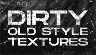
Halloween Textures and Overlays
Texture can create atmosphere faster than adding another illustration.
Grain
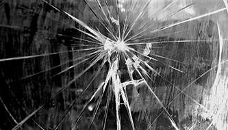
Fine grain can soften perfectly clean digital graphics and create a more cinematic or printed feel.
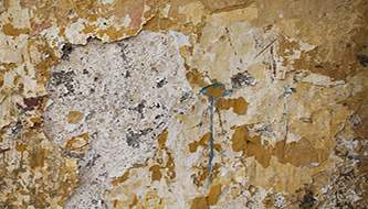
Paper Texture
Useful for vintage horror posters, tarot-inspired graphics, old book aesthetics, and retro Halloween packaging.
Dust and Scratches
Use selectively for distressed or analog-inspired artwork.
Fog and Smoke
Atmospheric overlays can create depth in photography and event graphics.
Film Texture
Good for:
- Retro horror.
- Editorial Halloween campaigns.
- Music artwork.
- Analog photography treatments.
How to Use Texture Without Ruining Readability
Mask the Headline Area
Reduce texture behind small typography.
Lower the Opacity
A 20–40% texture can often feel more convincing than a 100% overlay.
Use One Primary Texture
Grain + scratched paper + fog + noise + glow + dust can quickly become visual chaos.
Halloween Illustration Styles to Explore
Hand-Drawn Ghosts
Loose line art can feel playful, contemporary, and highly adaptable for social media or packaging.
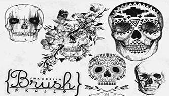
Vintage Horror Illustration
Try:
- Old comic references.
- Engraving-style drawings.
- Limited color palettes.
- Halftones.
- Aged paper.
Minimal Halloween Icons
A small visual vocabulary can be enough:
- Ghost.
- Moon.
- Bat.
- Pumpkin.
- Candle.
Use consistent stroke width and geometry to create a coherent icon system.
Surreal Halloween Imagery
Instead of literal horror, combine unexpected elements:
- Floating objects.
- Impossible shadows.
- Oversized moon.
- Distorted architecture.
- Objects appearing in unusual places.
Halloween Poster Design Ideas
Idea 1: Minimal Horror Poster
Use:
- Black background.
- One red object.
- Large white headline.
- Small event details.
Idea 2: Vintage Horror Poster
Use:
- Aged cream paper.
- Black illustration.
- Muted red.
- Condensed or serif typography.
- Halftone texture.
Idea 3: Modern Halloween Event Poster
Use oversized typography, one abstract 3D element, and a dark violet or black background.
Idea 4: Playful Halloween Poster
Use friendly monsters, oversized candy, rounded typography, and brighter colors.
Halloween Social Media Design Ideas
Create a Visual System
Instead of designing each post independently, define:
- One color palette.
- Two fonts.
- One illustration style.
- One recurring texture.
Mix Content Types
A Halloween campaign might include:
- Announcement post.
- Countdown.
- Offer.
- Behind-the-scenes post.
- Halloween quote.
- Product post.
- Event reminder.
Design Vertical First
For Stories, Reels covers, and mobile content, create the vertical version deliberately rather than cropping a square or horizontal layout later.
Halloween Packaging Design Ideas
Limited-Edition Colorway
You may not need a completely new package.
Adapt the existing brand with:
- Dark background.
- Seasonal accent color.
- Special illustration.
- Limited-edition label.
Illustrated Halloween Packaging
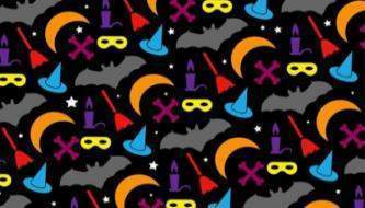
Create a repeating pattern using:
- Bats.
- Candy.
- Ghosts.
- Stars.
- Moons.
- Pumpkins.
Premium Halloween Packaging
Use black, burgundy, dark violet, cream, or metallic details and avoid cartoon imagery.
Halloween Website and Landing Page Ideas
Seasonal Hero Banner
You can create Halloween atmosphere without redesigning the complete site.
Change:
- Hero artwork.
- Accent colors.
- Promotional headline.
- Selected icons.
Temporary Promotional Section
Add a seasonal block for:
- Halloween discount.
- Event.
- Limited product.
- Seasonal collection.
Do Not Damage Usability
Decorative effects should never make navigation, buttons, forms, or product information harder to use.
Halloween Design Ideas for Different Industries
Beauty
Think black cosmetics, burgundy, metallic detail, surreal shadows, elegant serif typography, and editorial photography.
Food & Beverage
Use playful packaging, seasonal flavors, illustrated ingredients, pumpkin colors, or vintage labels.
Fashion
Halloween does not need literal pumpkins. Dark editorial photography, distorted typography, red lighting, and unusual styling can be enough.
Kids & Family
Use friendly monsters, candy, soft shapes, smiling ghosts, and bright colors rather than horror imagery.
Nightlife
Dark photography, neon accents, cinematic type, fog, grain, and strong contrast work well.
Retail
Keep the promotional message clear. Seasonal decoration should support the offer rather than hide it.
How to Make Halloween Design Look More Professional
Choose One Visual Idea
For example:
Vintage horror cinema.
Then evaluate every design choice against that direction.
Limit the Palette
Three or four well-controlled colors usually look stronger than using every traditional Halloween color at once.
Create a Typography Hierarchy
Separate:
- Headline.
- Supporting copy.
- Date.
- CTA.
- Brand.
Use Seasonal Assets Selectively
One oversized ghost may create a stronger composition than ten tiny Halloween icons.
Halloween Design Workflow
- Define the audience.
- Choose the Halloween mood.
- Create a color palette.
- Select one display font and one supporting font.
- Collect only the assets needed for that direction.
- Create the main composition first.
- Test readability.
- Adapt the design for additional formats.
- Place the artwork into realistic mockups.
- Remove any decorative element that does not improve the concept.
Common Halloween Design Mistakes
1. Using Every Halloween Symbol
Bats, ghosts, spiders, pumpkins, skulls, candy, candles, blood, and cobwebs do not all need to appear together.
2. Using Too Many Decorative Fonts
One expressive headline font is usually enough.
3. Using Pure Black Everywhere
Dark charcoal, navy, brown-black, burgundy-black, and violet-black can create richer depth.
4. Making Everything Orange
Orange works best when it has contrast around it.
5. Adding Texture at 100%
Reduce opacity and mask important elements.
6. Choosing Horror Imagery for the Wrong Audience
A family event and an adult Halloween party require completely different visual language.
7. Forgetting the Brand
The seasonal campaign should still look like it belongs to the company.
8. Sacrificing Readability
Decorative lettering is useless if the event date or offer cannot be read.
9. Designing Only One Format
Think about post, story, poster, banner, website, email, and other campaign formats from the beginning.
10. Copying Horror Clichés Without a Concept
A strong visual idea is more memorable than simply adding more spooky decoration.
Halloween Design Asset Checklist
Before starting a seasonal project, consider whether you actually need:
- One primary display font.
- One supporting text font.
- Illustration or icon set.
- One texture pack.
- Photo or hero image.
- Mockups for presentation.
- Social media templates.
- Packaging mockup if applicable.
- Print-ready poster or flyer format.
Do not download fifty unrelated resources before defining the creative direction. More assets do not automatically create a stronger design.
Frequently Asked Questions About Halloween Design Ideas
What are good Halloween design ideas?
Strong Halloween design ideas include vintage horror posters, minimal dark branding, playful ghost illustrations, gothic typography, candy-inspired packaging, cinematic photography, spooky social campaigns, surreal imagery, and limited-edition seasonal branding.
What colors work best for Halloween graphic design?
Black and orange are traditional, but dark violet, burgundy, cream, muted green, deep blue, gray, pink, and metallic accents can create more distinctive palettes.
What fonts work well for Halloween?
Gothic serif, handwritten, condensed sans serif, horror display, brush, vintage, and playful rounded fonts can all work depending on the audience and concept.
How can I make Halloween design look elegant?
Use a restrained palette, fewer decorative elements, sophisticated typography, strong photography, negative space, and one subtle seasonal motif.
How can I make Halloween graphics look less cliché?
Start with a visual concept rather than a list of Halloween symbols. You can create atmosphere through color, lighting, typography, texture, scale, and composition without using obvious seasonal illustrations.
What assets are useful for Halloween design?
Useful resources include fonts, mockups, textures, brushes, vector icons, illustrations, photo overlays, poster templates, packaging mockups, and social media templates.
Can Halloween design be minimal?
Yes. Minimal Halloween graphics can be extremely effective. One dark background, one unusual image, one accent color, and strong typography may be enough.
How do I design Halloween content for children?
Avoid graphic horror and focus on friendly ghosts, candy, pumpkins, monsters, stars, costumes, rounded forms, and brighter colors.
What is the best Halloween design style for a luxury brand?
Use dark editorial photography, serif typography, black, burgundy, cream, dark violet, or metallic accents, and subtle surreal elements rather than cartoon Halloween graphics.
Should Halloween campaign designs match the main brand identity?
Yes. Seasonal graphics can temporarily change color, illustration, imagery, and mood, but the campaign should still remain recognizable as part of the same brand.
Final Thoughts
The best Halloween design ideas do not depend on how many seasonal elements you can fit into one composition.
They depend on choosing the right atmosphere.
A luxury brand may need little more than dark photography and one mysterious serif headline. A children’s campaign can use colorful ghosts and candy. A club poster may rely on grain, red lighting, and condensed typography. Packaging can use a limited-edition pattern, while an online campaign may only need a seasonal hero graphic and a few social-media adaptations.
Start with the mood.
Then choose the color palette, typography, imagery, textures, and assets that support that direction.
Keep the hierarchy clear. Leave negative space. Test readability. Use effects selectively. And make sure the seasonal visuals still belong to the brand.
Great Halloween design does not simply look spooky. It creates a memorable visual atmosphere while still communicating clearly.
For more fonts, mockups, Photoshop resources, brushes, textures, and seasonal design inspiration, continue exploring DesignRise.
Discover more from DesignRise
Subscribe to get the latest posts sent to your email.