






The best free billboard mockups do more than place a poster inside a realistic city photograph. A strong mockup helps designers answer a much more useful question: will this advertising concept actually work at outdoor scale?
A campaign that looks excellent on a laptop can behave very differently when it is placed between buildings, above a street, inside an underground station, beside a storefront, or against a textured wall. Headlines suddenly feel smaller. Fine typography disappears. Background details compete with the message. A color combination that looked sophisticated in Photoshop may lose contrast against a real environment.
This is where a billboard mockup becomes part of the design process rather than simply a decorative portfolio asset.
A realistic outdoor mockup gives you context. It shows how typography behaves at distance, whether the brand remains recognizable, how much visual information the viewer can process quickly, and whether the campaign still has a clear focal point once it enters a busy environment.
This DesignRise collection includes 15 free billboard mockups for Photoshop, covering wall-mounted displays, urban streets, underground advertising, column formats, storefront signage, ivy-covered environments, city architecture, open-sky scenes, and other outdoor contexts.
Beyond the downloads, this guide explains how to choose the right billboard environment, how to prepare artwork before placing it into a PSD mockup, how to keep perspective and lighting believable, how to evaluate outdoor typography, and how to build a client presentation that feels like a real campaign rather than a collection of unrelated mockups.
Important: a mockup is a presentation and testing tool. Final production dimensions, bleed, safe areas, color specifications, resolution requirements, and file formats should always follow the technical specifications supplied by the billboard owner, printer, or outdoor media company.
Explore More DesignRise Resources:
- Top Glass Bottle Mockups for 2026: Realistic Packaging Templates
- Best Coffee Cup & Mug Mockup Templates for Designers
- Ultimate Free Bag Mockup Collection: Professional PSD Templates
- Free PSD Billboard Mockups for Outdoor Advertising
- Best Free Poster Mockups
- Free Realistic Banner Mockups
Why Billboard Mockups Are More Than Presentation Assets
It is tempting to treat a mockup as the final decorative stage of a branding project: finish the design, paste it into a PSD, export an attractive image, and add it to the presentation.
For outdoor advertising, that approach misses much of the value.
A billboard mockup can reveal design problems before the client, printer, or media company sees the artwork.
They Test Visual Hierarchy
Outdoor advertising has limited time to communicate. The viewer should not need to search the layout for the primary message.
A useful hierarchy usually has:
- One dominant message.
- One strong visual or product.
- A recognizable brand element.
- Only the supporting information that is genuinely necessary.
Place the design into a realistic mockup and zoom out. If every element suddenly feels equally important, the hierarchy needs more work.
They Reveal Scale Problems
A logo that appears large on an artboard can feel surprisingly small on a billboard surrounded by buildings, vehicles, signs, windows, trees, and pedestrians.
Context changes perception.
They Help Clients Understand the Idea
Many clients are not used to evaluating flat production artwork. A realistic mockup makes the same concept easier to understand because it connects abstract dimensions with a recognizable environment.
They Improve Portfolio Storytelling
A finished campaign should demonstrate more than the artwork itself. Showing how the idea behaves in several realistic environments makes a case study feel closer to an actual brand rollout.
What a Professional Billboard Mockup Should Help You Test
How to Choose the Right Billboard Mockup for Your Campaign
Use Clean Environments for Minimal Branding
If the campaign relies on typography, luxury photography, or restrained art direction, choose a mockup with simple architecture and limited visual clutter.
The environment should support the design rather than become another competitor.
Use Busy Urban Scenes to Stress-Test the Creative
A city mockup is useful when you want to know whether the design remains visible after it is surrounded by windows, signs, cars, street furniture, and architectural detail.
If the campaign still communicates clearly there, the hierarchy is probably strong.
Use Transit Mockups for Event and Entertainment Work
Underground and station-style environments naturally suit entertainment, events, fashion, cultural campaigns, and other messages aimed at urban commuters.
Use Natural Environments When They Support the Brand
Ivy walls, trees, and park settings can work beautifully for wellness, hospitality, sustainable products, outdoor brands, food, lifestyle, and environmental campaigns.
Do not choose greenery simply because the mockup is attractive. Context should reinforce the idea.
15 Best Free Billboard Mockups for Branding & Outdoor Advertising
1. Free Big Billboard on Wall Mockup

Best for: minimal advertising, typography-led campaigns, fashion, branding presentations, posters, and premium portfolio work.
This wall-mounted scene is a strong choice when you want the campaign artwork to remain the primary focus. The architectural environment provides enough realism to establish scale without overwhelming the actual billboard.
Design Strategy
Use this mockup to test large typography and simple brand statements. Because the scene is relatively controlled, weaknesses in alignment and spacing become easier to notice.
Try placing both a very minimal version and a more detailed version of the campaign into the mockup. The simpler option may have significantly more impact once the design is viewed in context.
2. Urban Park Billboard Mockup
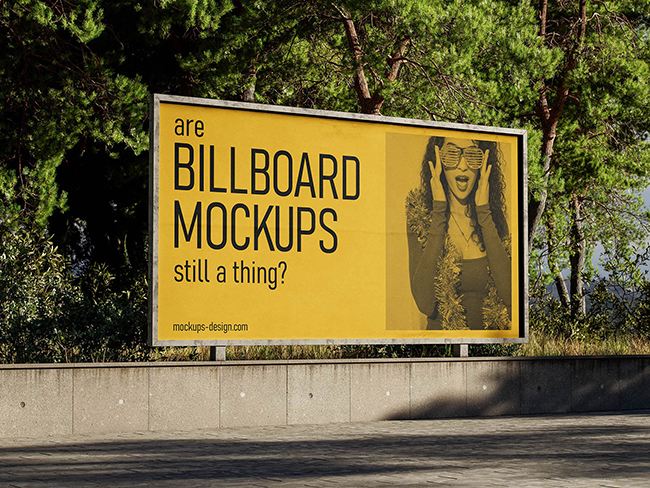
Best for: wellness, lifestyle, food, tourism, outdoor products, sustainability-focused campaigns, events, and local advertising.
The greenery around this billboard creates a softer atmosphere than a dense city street. That environmental shift can dramatically change the way a campaign feels.
Use the Environment as Part of the Art Direction
A natural setting may support greens, warm neutrals, food photography, outdoor products, or wellness messaging. It can also create interesting contrast for a very artificial or futuristic campaign.
Check whether the design remains distinct from the surrounding foliage. A campaign dominated by similar greens may need stronger tonal contrast.
3. Underground Billboard Mockup

Best for: music, film, events, fashion, entertainment, cultural campaigns, urban products, and high-energy advertising.
An underground environment introduces stronger texture and a distinctly urban context. It is a useful choice when the campaign should feel integrated into city life rather than displayed against a neutral architectural background.
Check Contrast Against Darker Surroundings
Transit environments can contain darker walls, shadows, artificial lighting, and significant visual texture.
A muted campaign that looks sophisticated on a white presentation page may disappear here.
Use this mockup to test whether your focal point remains obvious without artificially increasing the billboard brightness beyond what feels plausible.
4. Column Billboard Mockups from Various Views

Best for: campaign systems, wayfinding-style advertising, events, retail, urban branding, product launches, and portfolio presentations.
The advantage of a multi-angle column mockup is that it forces the design to work beyond one perfect frontal view.
Design for More Than the Hero Angle
Outdoor advertising is rarely viewed from one controlled perspective.
Check:
- How the headline behaves at an angle.
- Whether the logo remains recognizable.
- Whether important information sits too close to the edge.
- Whether the composition depends on perfect symmetry.
This is especially useful when preparing a campaign for a client presentation because the multiple angles make the implementation feel more tangible.
5. Outdoor Advertising Billboard Mockup

Best for: general advertising campaigns, corporate branding, product promotion, retail, posters, and agency presentations.
This is one of the more versatile environments in the collection. It does not force a strong narrative around the creative, which makes it useful as a neutral test of the campaign itself.
Use Neutral Mockups for Client Comparison
If you are presenting three campaign directions, placing all three into the same or similarly neutral environment allows the client to compare the actual designs rather than reacting to different mockup photography.
6. Square-Shaped Advertising Billboard

Best for: summer campaigns, tourism, lifestyle brands, events, fashion, hospitality, food and beverage, and colorful advertising.
The brighter environment and palm-tree context give this mockup a noticeably different personality from the more architectural scenes.
Do Not Force a Horizontal Campaign Into a Square Composition
Different billboard proportions should influence the layout rather than merely crop it.
For square or near-square placements, consider:
- A shorter headline.
- A centered product.
- A stronger vertical hierarchy.
- Reduced supporting copy.
- A single dominant image rather than a wide photographic scene.
7. Billboard on Old Wall Mockup

Best for: fashion, streetwear, music, cultural events, restaurants, editorial campaigns, and urban branding.
The textured wall gives this mockup more character than a clean commercial building.
Contrast Texture With Clean Design
A rough environment can make very clean typography feel more striking. You do not necessarily need to make the campaign itself distressed or grungy.
In fact, reproducing the wall texture inside the design can reduce separation between advertising and environment.
Use contrast deliberately.
8. Outdoor Scene Featuring Billboard Mockup
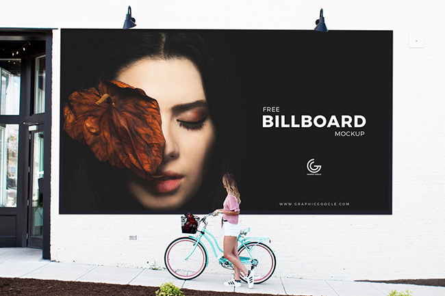
Best for: lifestyle campaigns, local business advertising, exhibitions, cultural posters, retail, and client presentations.
The presence of a person gives this mockup something many billboard scenes lack: an immediate human scale reference.
Use People to Communicate Scale
When a client sees a billboard beside a real person, the physical size of the media becomes much easier to understand.
That can be particularly valuable when presenting large typography or artwork that deliberately uses significant negative space.
9. Rectangle Billboard Mounted to a Street Wall Mockup

Best for: tourism, city campaigns, posters, exhibitions, real estate, local businesses, and corporate outdoor advertising.
The relatively uncluttered rectangular display gives designers a straightforward way to evaluate a conventional outdoor composition.
Test the Silhouette of the Design
Zoom out until individual words become harder to read and look at the advertisement as a collection of shapes.
Ask:
- Is there one dominant mass?
- Can I still recognize the product?
- Is the logo visible?
- Does the composition have a clear direction?
Strong outdoor advertising often remains visually recognizable before every word can be read.
10. Perspective Outdoor Advertising Street Billboard Mockup

Best for: pitch decks, branding systems, poster campaigns, outdoor advertising concepts, and portfolio case studies.
The perspective view is particularly useful because it prevents the mockup from behaving like a simple frame around flat artwork.
Watch Fine Typography
Perspective makes small text even harder to read. If supporting copy is already marginal in the flat artwork, this type of mockup will expose the problem quickly.
Outdoor advertising is rarely the place for paragraphs.
11. Billboard Between Buildings Mockup

Best for: major brand campaigns, property, finance, technology, retail, fashion, events, and city-based advertising.
Placing the billboard within architecture creates a convincing sense of scale and immediately makes the campaign feel more like a real media placement.
Use Architecture to Test Competition
Buildings contain windows, lines, signage, reflections, and repeated geometric forms. Your advertisement should not disappear into that structure.
A strong focal image or clear color block can help the campaign separate itself from the environment.
12. Outdoor Advertising Storefront Billboard

Best for: restaurants, cafés, bars, retail, salons, local services, hospitality, and small-business branding.
This format is especially useful for showing how a brand behaves close to the point of sale.
Think Locally
A storefront advertisement does not need to behave exactly like a highway billboard. The viewer may be closer and have more time to process supporting information.
Still, maintain a clear hierarchy. Business name, offer, and primary action should not compete equally.
13. Billboard with Ivy Wall

Best for: wellness, beauty, sustainability, food, eco-conscious branding, hospitality, lifestyle, and natural products.
The ivy-covered setting immediately adds an organic character to the presentation.
Do Not Lose the Billboard Inside the Foliage
When the advertisement itself uses plants, green packaging, or nature photography, the billboard can visually merge with the wall.
Consider a contrasting background, strong typography, or a clear border of negative space around the main subject.
14. Rectangle Billboard Mockup with Sky Background
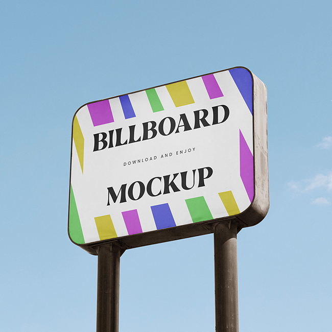
Best for: clean corporate campaigns, travel, automotive, product launches, technology, lifestyle, and minimalist advertising.
An open-sky setting offers far less environmental clutter than most urban mockups. This gives color, typography, and product photography more visual room.
Use the Sky as Negative Space
If your campaign contains a strong horizon, open background, or product silhouette, this mockup can reinforce that feeling rather than compete with it.
It is also useful for testing whether a minimal design feels intentionally restrained or simply unfinished.
15. City Billboard Mockup

Best for: fashion, retail, technology, real estate, entertainment, corporate advertising, events, and large branding campaigns.
This city environment is a useful final stress test because the advertisement appears inside a visually active urban setting.
Use It as the Final Presentation Mockup
If the campaign has already been tested in cleaner scenes, a detailed city mockup can make an effective closing image in a client deck or portfolio case study.
It shows that the concept still has enough hierarchy and presence to survive beyond a carefully controlled studio-style presentation.
How to Use a Billboard Mockup in Photoshop
Most PSD billboard mockups are designed around a Smart Object workflow, which means the advertisement can be replaced while the original perspective and scene treatment remain intact.
1. Open the PSD
Before editing anything, inspect the Layers panel. Look for a layer labelled something like:
- Place Design Here
- Your Artwork
- Smart Object
- Replace Me
2. Open the Smart Object
Double-click its thumbnail rather than rasterizing or painting directly onto the mockup.
3. Place the Final Artwork
Insert the campaign design at the correct aspect ratio.
Avoid stretching an existing poster simply to make it fit. Adapt the composition when the billboard proportions differ.
4. Save the Smart Object
Save the Smart Object document and return to the main PSD. The mockup should update while retaining the perspective and other scene settings.
5. Inspect the Result at Normal Viewing Size
Do not evaluate only at 200% zoom.
Billboard design is meant to communicate from a distance.
How to Make Billboard Mockups Look More Realistic
Match the Scene Brightness
A bright white advertisement inside a dark evening environment may look like a glowing digital display even when the original billboard is meant to be printed.
Adjust the artwork so it belongs to the available light.
Preserve Surface Texture
A printed billboard is rarely a perfectly smooth RGB rectangle.
When the mockup already contains texture, reflections, grain, or environmental shading, avoid flattening those layers unnecessarily.
Respect Perspective
Do not manually place a flat JPEG over the photograph when the PSD already contains a correctly transformed Smart Object.
Do Not Over-Saturate the Artwork
The billboard should remain visually strong, but excessively saturated colors can make it feel separated from the photograph.
Keep Natural Blur
If the photograph uses depth of field, every part of the replacement artwork should not suddenly become razor sharp.
Design the Billboard Before Designing the Mockup
A beautiful mockup cannot fix weak outdoor advertising.
Use One Main Idea
Trying to communicate a product name, five benefits, three offers, a URL, a QR code, a phone number, social media handles, and a paragraph of supporting text creates a layout that may work nowhere.
Decide what the viewer actually needs to remember.
Make Typography Work From a Distance
Choose typefaces with:
- Clear letterforms.
- Strong contrast against the background.
- Comfortable spacing.
- Enough weight to remain visible.
- Limited decorative detail.
Use Scale Aggressively
Outdoor media rewards confident hierarchy.
A product image can become much larger than it would on a website. A headline can occupy half of the surface. Negative space can become part of the message.
Remove Before You Add
When a billboard feels weak, designers often add another graphic element.
Try the opposite.
Remove:
- One line of copy.
- One badge.
- One icon.
- One decorative shape.
- One competing color.
The remaining message may immediately become stronger.
A Practical Billboard Readability Test
Thumbnail Test
Reduce the complete mockup dramatically.
You should still understand:
- What the primary visual is.
- Where the headline is.
- Which brand is advertising.
Blur Test
Slightly blur or defocus your eyes while viewing the artwork.
The major hierarchy should remain visible even when details disappear.
Grayscale Test
Temporarily remove color.
If the hierarchy collapses, the design may depend too heavily on hue without enough tonal contrast.
Different Environment Test
Place the same campaign in two or three mockups from this collection.
A strong campaign should retain its central idea even as the environment changes.
How to Present Billboard Campaigns to Clients
Do not fill the entire presentation with mockups.
A useful campaign deck might follow this sequence:
1. Show the Flat Artwork
Let the client see the actual design without perspective or environmental distraction.
2. Show One Hero Mockup
Select the environment that best communicates the campaign idea.
3. Show One Alternative Context
Demonstrate that the concept works in another real-world placement.
4. Show the Campaign System
If relevant, include:
- Additional billboard sizes.
- Posters.
- Digital advertising.
- Social media adaptations.
- Transit media.
- Brand assets.
5. End With the Strongest Image
The final slide should leave a clear visual memory of the campaign rather than a technical production page.
Using Billboard Mockups in a Portfolio Case Study
Mockups are valuable in portfolios, but too many can make the work feel artificial.
Show the Design Before the Mockup
Art directors and potential clients should be able to evaluate the actual typography, composition, and visual system.
Use Different Mockups for Different Information
One image may communicate scale. Another may communicate city context. A third may show the campaign as part of a larger brand rollout.
Each image should have a reason to exist.
Maintain Consistent Art Direction
If one mockup is bright tropical daylight, another is a dark industrial subway, and the third is a snowy highway, the case study can feel like several unrelated campaigns.
Select environments that support one coherent brand story.
AI-Assisted Workflow for Billboard Campaign Presentations
AI can support billboard presentation work without replacing the structure of a well-built PSD mockup.
Use AI During Concept Development
It can help explore:
- Campaign directions.
- Photography concepts.
- Background environments.
- Color variations.
- Alternative compositions.
Build the Final Advertisement Deliberately
Typography, logo placement, product accuracy, copy, and legal information should remain controlled by the designer.
Use a Real PSD Mockup for Repeatable Presentation
Once the campaign is approved, a structured Smart Object mockup makes it easier to replace artwork consistently across multiple presentation scenes.
Use AI for Supporting Presentation Assets
AI-generated imagery may be useful for moodboards or contextual exploration, but always review product details, logos, text, architecture, lighting, and scale before presenting generated imagery as a realistic campaign preview.
Common Billboard Mockup Mistakes
1. Choosing the Mockup Before Designing the Campaign
The campaign should determine the environment, not the other way around.
2. Using a Beautiful Scene That Hides the Design
If the first thing the viewer notices is the architecture instead of the advertisement, choose another mockup.
3. Making the Billboard Unnaturally Bright
Match the environmental lighting unless the placement is intentionally a digital illuminated display.
4. Adding Too Much Text
Outdoor advertising should communicate quickly. Detailed information belongs on a landing page, brochure, or other medium.
5. Ignoring Perspective
A headline that is readable front-on may behave differently when the billboard is viewed from a strong angle.
6. Using the Same Artwork for Every Ratio
Adapt the composition rather than simply stretching or cropping it.
7. Presenting Only Mockups
Always show enough flat artwork for the actual design work to be evaluated.
8. Using Too Many Unrelated Environments
A campaign presentation should feel coherent.
9. Confusing a Mockup With Production Artwork
The PSD preview does not replace the technical specifications required for final outdoor production.
10. Forgetting the Viewer
A billboard exists inside a real environment and is often seen while people are moving. Design for the viewing situation, not only for the Photoshop canvas.
Frequently Asked Questions About Free Billboard Mockups
What are billboard mockups?
Billboard mockups are presentation templates that place advertising artwork into realistic outdoor environments. They help designers visualize branding, posters, campaigns, and promotional graphics before real-world production.
What are free billboard mockups useful for?
Free billboard mockups can be used for branding presentations, advertising concepts, client pitches, portfolio case studies, campaign testing, poster design, and outdoor advertising visualization.
How do I edit a PSD billboard mockup?
Most editable Photoshop mockups use a Smart Object. Open the relevant Smart Object, place your artwork inside it, save the file, and return to the main PSD to see the updated billboard.
What should I look for in a billboard mockup?
Look for appropriate aspect ratio, realistic perspective, believable lighting, sufficient image resolution, an editable Smart Object, an environment that matches the campaign, and enough visual clarity to evaluate the actual design.
Should the mockup environment match the brand?
Usually yes. A luxury fashion campaign, restaurant promotion, technology launch, and sustainable product may benefit from very different outdoor contexts.
Can I use one billboard design for every mockup size?
Not always. Different aspect ratios can require changes in typography, image crop, spacing, logo position, and hierarchy.
Are billboard mockups suitable for client presentations?
Yes. They are especially useful for helping clients understand scale and context. However, include flat artwork as well so the actual design can be evaluated clearly.
Can I use billboard mockups in a design portfolio?
Yes. Use a small number of well-chosen scenes that support the project story rather than filling the case study with repetitive mockup images.
Can AI replace Photoshop billboard mockups?
AI can generate contextual advertising scenes and support concept development, but structured PSD mockups remain useful when you need repeatable placement, precise artwork, predictable perspective, and easy client revisions.
Are these billboard mockups really free?
The resources in this collection are provided through the listed DesignRise download links as free mockup resources. Always review any included license or documentation before using downloaded files in commercial client work or redistributing source assets.
Final Thoughts
The best free billboard mockups are not simply the ones with the most dramatic city photography. The right mockup makes the advertising concept easier to judge.
A clean wall scene can expose weak typography. An underground environment can test contrast. A perspective mockup reveals whether small copy survives realistic viewing angles. A storefront scene demonstrates local business branding. A city environment shows whether the campaign still has enough visual authority once it enters a busy real-world context.
Use mockups during the design process, not only at the end.
Place the campaign into several environments. Zoom out. Remove unnecessary copy. Check the brand. Compare proportions. Look at the design in grayscale. Test whether the headline still dominates. Then return to the flat artwork and improve what the mockup revealed.
For client presentations and portfolios, use mockups selectively. One excellent real-world visualization can communicate more than six repetitive PSD scenes.
A billboard mockup should not make a weak design look impressive. It should help a strong design prove that it works.
For more free PSD mockups, branding resources, packaging presentations, and practical tools for professional designers, continue exploring DesignRise.
Discover more from DesignRise
Subscribe to get the latest posts sent to your email.