








The best free heavy and ultra-bold fonts do much more than make words larger or darker. In a strong composition, heavy typography can become the visual anchor of the entire design — the element that establishes hierarchy before the viewer has fully processed the photography, illustration, color palette, or supporting copy.
That is why bold display typefaces appear so often in poster design, packaging, editorial covers, fashion campaigns, food branding, music artwork, sports graphics, social media, merchandise, and contemporary identity systems. A well-chosen heavy font can make a short message feel immediate and memorable. The wrong one can make the same layout feel loud without actually communicating anything.
The difference is usually not weight alone. A chunky rounded display font communicates something very different from a sharp geometric sans serif. A heavy slab serif can feel industrial, handcrafted, or nostalgic. A refined bold serif may suggest editorial sophistication. An exaggerated all-caps typeface can work beautifully for a three-word headline while becoming exhausting in a paragraph.
This DesignRise collection brings together 15 free heavy and ultra-bold fonts for creative designers, covering bold serif, geometric, slab-serif, chunky, retro, futuristic, and expressive display directions. The selection includes Calendas Plus, Chatlong, The Bold Font, TypoGraphica, Toma Sunn, ZT Chintzy, Motley Forces, Milkyway, Talina, Qilka, Big Zubo, Rotio, Chubsy Snack, Boldsta, and Oreon.
Rather than treating every typeface as interchangeable “bold typography,” this guide looks at what each font actually contributes to a project: authority, softness, elegance, structure, playfulness, nostalgia, futuristic energy, or editorial presence. You will also learn how to pair heavy fonts, control hierarchy, adjust spacing, evaluate a font for branding, and avoid the mistakes that make bold typography feel amateur rather than intentional.
Licensing note: a font being available as a free download does not automatically mean it is cleared for unrestricted commercial use. Some fonts may be free only for personal projects, while demo versions can have character or licensing limitations. Always review the current license on the original source page before using a font in a logo, client identity, packaging, advertising campaign, merchandise, product, website, app, or other commercial work.
Explore More DesignRise Resources:
- Free Clean Fonts for Professional Design Projects in 2026
- Pixel Perfect: The Best Pixel Fonts Every Designer Should Try
- Best Powerful Logo Fonts for Strong Brand Identity
Why Heavy Typography Works So Well in Modern Design
A heavy font creates contrast before the viewer even reads the words. Dense letterforms occupy more visual space, which naturally gives them greater priority within a composition.
Consider a festival poster seen from across a street, a product name on a crowded supermarket shelf, or a social media graphic viewed for less than two seconds. In every case, typography competes with images, color, interface elements, and surrounding visual noise.
A strong display face can create an immediate entry point.
Heavy Fonts Create Hierarchy
A layout needs a clear answer to one question: Where should I look first?
Large heavy typography can establish that first level immediately. Supporting information can then use smaller sizes, lighter weights, or quieter typefaces to create a natural reading sequence.
Typography Can Become the Graphic
One of the most effective contemporary approaches is allowing typography itself to become the primary visual element. Instead of placing a headline over an illustration, designers can crop oversized letters, overlap them with photography, mask imagery inside the text, or use the word shape to organize the page.
This can reduce the need for additional decoration and make the design feel more focused.
Bold Letterforms Survive Small Digital Formats
Thin details often disappear when a design is reduced to a social thumbnail or mobile advertisement. Heavy letterforms generally retain more presence.
That does not mean every bold font performs equally at small sizes. Highly stylized display typefaces may still lose distinctive features when reduced, which is why testing matters.
They Communicate Personality Quickly
Weight creates emphasis, but letterform structure creates personality. Depending on the design, heavy typography can feel:
- Authoritative.
- Playful.
- Premium.
- Futuristic.
- Industrial.
- Editorial.
- Retro.
- Friendly.
- Rebellious.
Free Heavy and Ultra-Bold Fonts: What to Look for Before Downloading
When comparing free heavy and ultra-bold fonts, look beyond weight alone. Letter shape, spacing, proportions, readability, character support, and brand personality determine whether a typeface will actually work in a professional design.
Test the Real Brand or Project Name
A font specimen usually showcases favorable letter combinations. Your brand name may contain completely different characters.
Test the actual words you intend to use and pay attention to:
- Repeated round letters.
- Double characters.
- Wide W and M combinations.
- Narrow I and L forms.
- Numerals.
- Ampersands.
- Punctuation.
- Accented characters.
Check the Character Set
A beautiful headline font is less useful when the project requires symbols, numbers, accented characters, or languages that the font does not support.
This is especially important for multinational brands and websites that may eventually require localization.
Test More Than One Size
A typeface that looks excellent at 120 px may become muddy at 28 px. Test the same word as:
- A large poster headline.
- A social media title.
- A mobile screen heading.
- A packaging label.
- A secondary heading.
Check the License Before Building the Identity
Do not create an entire branding presentation before confirming whether the font can legally be used for the intended purpose.
Check the license first, especially for client work, commercial logos, websites, apps, packaging, merchandise, and downloadable products.
Heavy vs Bold vs Black vs Ultra-Bold: What Do These Terms Mean?
Font-weight terminology is not perfectly standardized. One type family may call its heaviest weight Black, another Heavy, ExtraBold, Ultra, or UltraBlack.
The important question is not the label but how the typeface performs.
15 Best Free Heavy and Ultra-Bold Fonts for Creative Designers
The free heavy and ultra-bold fonts below cover very different visual directions, from refined serif typography and geometric sans serifs to chunky, playful, futuristic, and expressive display styles.
1. Calendas Plus Bold Serif Font

Calendas Plus Bold approaches heavy typography from a more refined direction. Instead of relying purely on geometric mass, it combines strong serif structure with details that can bring editorial character to a layout.
This makes Calendas particularly useful when a project needs impact without moving into an aggressive sans-serif aesthetic. A large headline can feel confident while still preserving elegance.
Best for: magazine covers, cultural branding, hospitality, beauty packaging, fashion graphics, book design, event identities, and premium editorial layouts.
How to Make Calendas Plus Feel Contemporary
A classical serif does not require a traditional composition. Try oversized type, tight cropping, unexpected line breaks, generous surrounding whitespace, or pairing it with a minimal sans-serif supporting family.
The contrast between classical letterforms and modern spacing can be more distinctive than adding decorative ornaments.
2. Chatlong All-Caps Display Font

Chatlong is an all-caps display font built for prominence. Typefaces like this work best when the message is short enough for the letterforms themselves to become part of the visual concept.
Use it when the headline should behave more like a graphic shape than ordinary text. Poster titles, apparel graphics, social campaign headlines, event names, and short branding statements are natural applications.
All Caps Has Its Own Voice
Uppercase typography is not emotionally neutral. It can communicate confidence, authority, urgency, strength, or energy.
Use Chatlong for the dominant statement and pair it with a quieter supporting typeface for descriptions, locations, dates, pricing, or longer information.
3. The Bold Font

The Bold Font is deliberately direct: thick, clean sans-serif forms with enough neutrality to work across several graphic styles.
That simplicity is useful. A highly stylized display font can become so recognizable that every campaign begins to feel identical. A cleaner heavy sans gives the designer more freedom to build personality through photography, color, layout, texture, motion, and composition.
Best for: posters, logos, sports graphics, editorial covers, social campaigns, YouTube thumbnails, and contemporary advertising.
Pair It With Contrast, Not More Weight
When the primary font is this dense, supporting typography generally benefits from a regular or lighter sans serif. Contrast lets the headline remain dominant instead of turning the complete layout into one block of equal visual weight.
4. TypoGraphica Geometric Bold Font
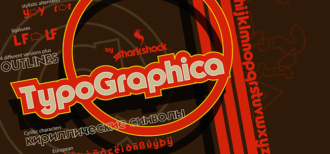
TypoGraphica takes a more geometric approach to heavy display typography. Structured forms are useful when the surrounding visual system also relies on clean grids, architecture, technology, modern illustration, or minimalist composition.
A geometric font can make an identity feel controlled and deliberate. At the same time, too much geometric perfection can become cold. Pairing the font with tactile photography, grain, natural materials, or imperfect illustration creates useful contrast.
Best for: architecture, technology, design events, contemporary posters, minimal packaging, and modern editorial graphics.
5. Toma Sunn Strong Slab Serif Font

Toma Sunn introduces the weight and stability of a slab serif. Heavy slab forms can communicate durability and confidence while retaining more historical personality than a purely geometric sans.
This makes the font useful for projects that sit between contemporary and retro visual language.
Best for: craft products, outdoor brands, hospitality, food packaging, apparel, poster design, and editorial titles.
Use the Serifs as Structural Shapes
At large sizes, slab serifs create strong horizontal forms. Instead of treating them as minor details, use their geometry to reinforce borders, image edges, columns, and other structural elements in the layout.
6. ZT Chintzy Heavy Font

ZT Chintzy Heavy is a more assertive display choice. Its dense shapes make it suitable for layouts where typography needs to operate as the dominant graphic element.
Instead of surrounding the type with numerous decorative assets, try allowing one large word to control the page. Crop letters at the canvas edge, overlap them with photography, or use the text as an image mask.
Best for: fashion graphics, music artwork, entertainment, social campaigns, event branding, and editorial covers.
Watch the Counterforms
As type becomes heavier, enclosed negative spaces become smaller. Test important words carefully, particularly at reduced sizes, to make sure letters do not visually close up.
7. Motley Forces Font

Motley Forces carries more obvious personality than a neutral heavy sans serif. That expressive quality makes it useful when the typeface should contribute energy of its own rather than merely support other visual material.
Best for: music, youth culture, streetwear, gaming-related graphics, entertainment, posters, events, and expressive campaigns.
Give Expressive Fonts Space
When the typeface already contains strong personality, simplify the surrounding system. One expressive headline, one controlled palette, and one strong image can be more effective than several competing effects.
8. Milkyway DEMO Font

Milkyway DEMO takes the collection in a more futuristic direction. Its modern shapes can support technology, gaming, electronic music, science-fiction artwork, digital products, and experimental branding.
Because the resource is explicitly presented as a demo font, check the source carefully for character-set and licensing restrictions before commercial use.
Build a Visual World Around the Typeface
A futuristic font becomes more convincing when the rest of the art direction supports it. Consider restrained gradients, dark backgrounds, metallic surfaces, interface-inspired grids, sharp photography, or controlled luminous accents.
Avoid combining every familiar “future” effect at once. The typography may already provide enough character.
9. Talina DEMO Font
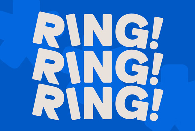
Talina DEMO combines strong visual presence with softer, more elegant curves. This gives it a different emotional range from strictly industrial or geometric heavy fonts.
Best for: fashion, beauty, lifestyle, editorial covers, hospitality, event identities, and contemporary campaigns.
Use Dramatic Scale Contrast
Try an oversized Talina headline combined with very small supporting copy. Strong scale contrast can make a composition feel editorial and premium without requiring many additional graphical elements.
As with any demo release, verify the license and included characters before committing it to a professional identity.
10. Qilka Font

Qilka is one of the cleaner geometric options in this collection. Compared with more exaggerated display faces, it can create a calmer bridge between strong headline typography and a systematic visual identity.
This makes it useful for modern branding, digital graphics, editorial layouts, website headings, presentations, and other applications where clarity matters alongside personality.
Impact Does Not Always Require Maximum Weight
A useful type collection should contain more than the heaviest possible styles. Sometimes the strongest solution is a clean geometric face surrounded by generous negative space.
Visual impact comes from scale, placement, hierarchy, spacing, and contrast — not from weight alone.
11. Big Zubo Font

Big Zubo brings a chunkier and more playful personality to the list. Rounded or exaggerated letterforms are useful for brands that should feel approachable, entertaining, nostalgic, or deliberately informal.
Best for: food and beverage brands, toys, entertainment, events, merchandise, retro packaging, and cheerful social campaigns.
Do Not Automatically Add More Retro Effects
A chunky display font already communicates significant style. It may look stronger with a flat contemporary palette than with distressed textures, multiple shadows, gradients, and outlines.
Let the letterforms provide the nostalgia while the surrounding system remains controlled.
12. Rotio Font
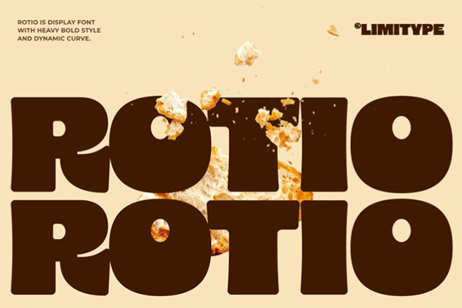
Rotio provides another modern geometric direction. Its cleaner construction can fit branding projects that require contemporary personality without moving into highly decorative typography.
Best for: technology, architecture, retail, fashion, cultural institutions, posters, web graphics, and presentations.
Use Geometry to Reinforce the Grid
When a font has strong geometric rhythm, align headlines carefully with the surrounding layout. Repeated verticals, circles, and horizontal cuts can connect naturally with image frames, columns, icons, and other structural elements.
13. Chubsy Snack Font

Chubsy Snack clearly belongs to the playful side of heavy typography. Thick rounded forms can make words feel friendly, soft, youthful, energetic, and even edible.
Best for: snack packaging, cafés, kids products, casual restaurants, stickers, merchandise, events, and fun social campaigns.
Design Packaging From Shelf Distance
When using chunky typography on packaging, zoom out. The product name should remain recognizable when the package becomes small.
Fine decorative details may disappear, but the overall silhouette of the word should remain distinctive.
14. Boldsta Font

Boldsta is designed around a confident display presence. Its dense construction makes it suitable for work that needs immediate impact.
Best for: campaign headlines, event identities, fashion graphics, music artwork, advertising, merchandise, and large poster typography.
Try Extreme Cropping
Heavy typography can survive partial cropping because the remaining strokes still contain substantial visual information.
Experiment with positioning Boldsta beyond the canvas edges or behind a photographic subject. This makes typography behave as part of the composition instead of simply sitting on top of it.
15. Oreon Font

Oreon closes the collection with another contemporary display option. Its bold construction can create clear hierarchy while remaining flexible enough for several visual directions.
Best for: branding studies, advertising, editorial design, posters, digital campaigns, merchandise, and product graphics.
Test the Font as a System
Before choosing Oreon — or any display font — create several realistic applications:
- A primary headline.
- A short logo or campaign lockup.
- A poster.
- A social media crop.
- A packaging or merchandise mockup.
A font that performs across several applications is more valuable than one that looks impressive only in its original specimen.
How to Pair Heavy Fonts Without Creating Visual Competition
A heavy display face already occupies significant visual attention. The supporting typeface should normally provide contrast rather than compete with it.
Heavy Sans + Neutral Sans
This is one of the safest systems for contemporary branding. Use the heavy font for headlines and a quieter sans serif for paragraphs, navigation, captions, metadata, and UI text.
Bold Serif + Minimal Sans
A strong serif such as Calendas can pair beautifully with a restrained geometric or neo-grotesque sans. The contrast can feel editorial, premium, and contemporary.
Chunky Display + Clean Grotesque
Playful fonts such as Big Zubo or Chubsy Snack benefit from simple supporting typography. This prevents the complete identity from becoming overly cartoonish.
Futuristic Display + Functional Sans
Use a stylized futuristic typeface for important moments and a highly readable sans serif for the information users need to process quickly.
Avoid Two Equally Loud Display Fonts
Pairing two highly expressive fonts often creates competition between them. A successful hierarchy normally needs one clear visual voice and one supporting voice.
How to Build a Strong Typographic Hierarchy
Level 1: Primary Message
The largest and heaviest typography communicates the most important idea. Keep the message concise whenever possible.
Level 2: Supporting Headline
A smaller bold or medium weight can provide additional context without competing with the primary statement.
Level 3: Body Copy
Long-form information should prioritize readability. Most display fonts in this collection are not intended for paragraphs.
Level 4: Metadata
Dates, prices, locations, categories, credits, and technical details can use smaller typography with appropriate contrast.
Create Hierarchy With More Than Size
You can also distinguish levels through:
- Weight.
- Color.
- Case.
- Spacing.
- Alignment.
- Width.
- Position.
- Negative space.
Five Practical Ways to Use Ultra-Bold Fonts
1. Poster With Oversized Typography
- Choose one short headline.
- Set it at an extremely large size.
- Allow selected letters to leave the canvas.
- Add one photograph or graphic element.
- Keep supporting information smaller and controlled.
2. Packaging With a Strong Product Name
- Test the product name in several bold typefaces.
- Check the silhouette from a distance.
- Place supporting information in a simpler font.
- Use color to distinguish variants.
- Test the final label at actual physical size.
3. Social Media Campaign
- Create one consistent typographic system.
- Use the heavy display font for short statements.
- Keep line breaks deliberate.
- Prepare square and vertical templates.
- Check every graphic at mobile size.
4. Fashion or Music Artwork
- Start with expressive photography.
- Use the headline as part of the image composition.
- Overlap typography and photography through masks.
- Experiment with tracking and close line spacing.
- Limit unnecessary effects.
5. Bold Editorial Cover
- Select one dominant article or issue title.
- Create strong scale contrast.
- Reserve the heavy font for the highest hierarchy levels.
- Keep secondary information highly legible.
- Test the cover as a small thumbnail.
How to Adjust Tracking, Kerning, and Line Height
Heavy Fonts Often Benefit From Tighter Tracking
Large bold headlines can sometimes feel disconnected when the default letter spacing is too generous. Slightly reducing tracking can create a stronger overall word shape.
Do not tighten automatically. Round and wide characters can collide much sooner than narrow letters.
Kerning Matters More at Large Sizes
Small spacing inconsistencies become obvious when a word fills half the page. Inspect important letter pairs manually.
Use Tight Leading Carefully
Heavy display typography can create powerful stacked headlines when line spacing is reduced. Make sure ascenders, descenders, accents, and decorative details do not collide.
Look at the Shape of the Headline
Stop reading individual characters for a moment and view the complete headline as a graphic block. Its silhouette should support the larger composition.
How to Use Heavy Fonts in Brand Identity
For branding projects, free heavy and ultra-bold fonts should always be tested with the real company or product name before the designer commits to the typeface.
Test the Name in Black and White
Remove color, texture, photography, and effects. If the wordmark still has personality in black on white, the typography is contributing real value.
Test Uppercase and Lowercase
Even when the final identity uses only one case, comparing both can reveal useful letter relationships.
Check the Smallest Application
Consider:
- Mobile headers.
- Labels.
- Social profile images.
- Small packaging.
- Business cards.
- Website navigation.
Look at Competitors
A fashionable display font may already be associated with many brands in the same category. Distinctiveness depends on more than finding an attractive typeface.
Customize Important Wordmarks
For a major identity, consider adjusting selected letterforms, spacing, proportions, terminals, ligatures, or connections rather than using the downloaded font unchanged.
Readability and Accessibility With Ultra-Bold Fonts
Do Not Use Display Fonts for Long Paragraphs
Heavy strokes create dense visual texture across several lines. Use a dedicated text typeface for long-form reading.
Check Small Sizes
Distinctive details can disappear when a font is reduced. Test mobile displays, labels, thumbnails, and small headlines at their final size.
Maintain Color Contrast
Large typography may remain visible at slightly lower contrast than small text, but readability still matters. Do not rely on weight alone to compensate for weak foreground and background contrast.
Do Not Communicate Meaning Through Weight Alone
If an important state depends only on a word becoming bold, some users may miss the distinction. Combine typographic emphasis with clear labels, icons, placement, or other appropriate cues.
Common Mistakes When Using Heavy Fonts
1. Making Everything Bold
If every element has equal visual weight, there is no hierarchy. Heavy type becomes powerful because quieter information exists around it.
2. Using Display Fonts for Paragraphs
Display typography is designed for attention rather than sustained reading. Use a dedicated body face for longer copy.
3. Choosing the Font Before Testing the Actual Name
The specimen may showcase the font’s best characters. Your word may contain completely different combinations.
4. Ignoring Kerning
Heavy headlines reveal awkward spacing immediately, especially at poster scale.
5. Adding Too Many Effects
Heavy fonts rarely need bevels, multiple glows, shadows, outlines, gradients, and textures simultaneously. Strong shapes often perform better with simpler treatment.
6. Using Two Competing Display Fonts
Give one typeface responsibility for personality. Let the supporting font handle clarity.
7. Forgetting Mobile and Thumbnail Sizes
A beautiful poster headline may become unreadable in a small social preview. Test the smallest important format.
8. Assuming Free Means Commercial Use
A font may be free for personal projects, distributed as a demo, or require a separate license for commercial use.
Font Licensing Checklist for Designers
Before using any downloaded typeface professionally, verify:
- Is the font free only for personal use?
- Does the license allow commercial design?
- Can it be used in client branding?
- Can it be included in a logo?
- Can it appear on merchandise?
- Can it be used on physical products?
- Does the license cover websites and apps?
- Is a separate webfont license required?
- Can the font file be shared with a client or printer?
- Is the downloaded version a demo?
- Are specific characters intentionally excluded?
Save the license or a copy of the source information with the project archive. This is especially helpful when returning to a branding project years later.
Frequently Asked Questions About Free Heavy and Ultra-Bold Fonts
What are heavy fonts?
Heavy fonts are typefaces or font weights with thick strokes and strong visual mass. They are commonly used for headlines, posters, branding, packaging, advertisements, editorial covers, and other display applications.
What is the difference between bold and ultra-bold fonts?
Ultra-bold, heavy, black, and similar names generally describe stronger weights than standard bold, although naming conventions differ between type families.
Where can designers use free heavy and ultra-bold fonts?
Free heavy and ultra-bold fonts are especially useful for posters, branding concepts, packaging, editorial covers, campaign graphics, social media, merchandise, music artwork, and other projects where typography needs strong visual presence.
Are heavy fonts good for body text?
Usually not. Dense strokes can reduce readability across long passages. Pair a heavy display font with a more comfortable text typeface.
Can an ultra-bold font be used for a logo?
Yes, provided the license allows logo use. For important identities, also test originality, kerning, small-size performance, and whether the typeface is already heavily associated with competitors.
What should I pair with a heavy display font?
A neutral regular-weight sans serif is often the easiest choice. Bold serifs can work well with minimalist sans serifs, while playful chunky fonts usually benefit from quiet supporting typography.
Are all fonts in this collection free for commercial use?
No assumption should be made based only on the availability of a free download. Some resources may be demos or have separate personal and commercial licenses. Check the original source before use.
What is the best heavy font for a poster?
The answer depends on the project. A minimalist poster may benefit from The Bold Font or TypoGraphica, an editorial design from Calendas Plus, a playful campaign from Big Zubo or Chubsy Snack, and a futuristic composition from Milkyway.
How many fonts should I use in one design?
Two type families are enough for many projects: one expressive display font and one functional supporting family. Additional fonts should have a clear role.
How do I make bold typography look more professional?
Focus on hierarchy, kerning, line breaks, spacing, negative space, scale, and contrast before adding effects. Strong typography often becomes weaker when unnecessary decoration is added.
Final Thoughts
The best free heavy and ultra-bold fonts are not simply the thickest typefaces available. The strongest choice is the font whose personality matches the message and whose structure continues to work across the formats the project actually needs.
Calendas Plus offers a more editorial serif direction. Chatlong and The Bold Font create immediate headline presence. TypoGraphica and Rotio bring geometric structure. Toma Sunn introduces slab-serif weight. ZT Chintzy, Motley Forces, Boldsta, and Oreon move toward assertive display design. Milkyway adds futuristic character, while Talina brings softer elegance. Big Zubo and Chubsy Snack show that heavy typography can also feel playful rather than aggressive.
The important part begins after the download.
Type the real brand name. Test difficult letter combinations. Adjust kerning. Compare short and long headlines. Reduce the design to black and white. View it as a small thumbnail. Print it at actual size. Pair the headline with quieter supporting typography. Remove decorative effects until only the decisions that genuinely improve the composition remain.
A powerful display font can attract attention in a second. Good typography determines what happens in the second after that.
For more carefully curated font collections, typography guides, branding resources, and practical tools for creative designers, continue exploring DesignRise.
Discover more from DesignRise
Subscribe to get the latest posts sent to your email.