




Typography can completely change how a design feels before the viewer has consciously processed a single word.
A neutral sans serif can make a brand feel controlled and contemporary. A condensed font can turn a short headline into a powerful poster element. A playful display face can give packaging personality, while a handwritten typeface can make a digital composition feel more personal and human.
That is why searching for the best free fonts for 2026 should not simply mean collecting as many typefaces as possible. A useful font library needs range.
You need typefaces that can solve different problems:
- A versatile sans serif for branding and layouts.
- An expressive display font for headlines.
- A condensed option when horizontal space is limited.
- A handwritten font for personality.
- A retro face for projects that need historical character.
- A softer decorative typeface for lifestyle and playful work.
This DesignRise collection brings together 15 modern, expressive, handwritten, retro, condensed, and experimental font downloads that can add very different voices to branding, posters, packaging, editorial graphics, social media, logos, web concepts, and other creative projects.
Instead of presenting them as a simple download list, this guide explains where each font makes the most sense, which styles work better for headlines than body copy, how to pair expressive typefaces with quieter supporting fonts, and what to check before using a downloaded font professionally.
Important licensing note: “free download” does not always mean “free for commercial use.” Some fonts in this collection are distributed under licenses that allow commercial projects, while others provide a free personal-use or demo version and require a separate license for paid work. Always review the current terms on the original download page before using a font for branding, client projects, merchandise, advertising, apps, websites, or products.
Explore More DesignRise Resources:
- Free Cool Fonts for Unique and Creative Designs
- Best Kid-Friendly Fonts Every Designer Should Bookmark
- Massive Collection of Free Brush Fonts for Designers
- Explore More Font Collections on DesignRise
What Makes a Font Useful in 2026?
A font does not become useful simply because it looks unusual in a specimen image. The real test begins when it enters a design system.
It Needs a Clear Role
Ask what the font is supposed to do.
Is it:
- A brand typeface?
- A hero headline?
- A packaging accent?
- A social-media display face?
- A body-text font?
- A logo starting point?
A highly decorative typeface can be excellent when used for a three-word headline and terrible when forced into a paragraph.
It Needs Enough Character to Be Memorable
Many contemporary layouts depend on relatively simple grids, colors, and photography. Typography often provides the distinctive personality.
It Still Needs to Communicate
Visual originality is useful only until it interferes with reading.
Good typography balances personality with function.
Typography Directions Worth Exploring
The fonts in this collection represent several useful directions for contemporary design rather than one single aesthetic.
Versatile Modern Sans Serifs
Clean sans-serif families remain valuable because they can support:
- Brand identities.
- Web layouts.
- Editorial systems.
- Presentations.
- Packaging.
- Digital products.
The strongest ones have enough personality to avoid feeling anonymous while staying neutral enough to work across many applications.
Expressive Display Typography
Display fonts are becoming an increasingly important part of identity-led layouts because one unusual headline can carry much of the visual character of a campaign.
They are particularly useful for:
- Posters.
- Music graphics.
- Social campaigns.
- Packaging.
- Editorial covers.
Handwritten and Human Typography
Handwritten fonts provide contrast against highly polished digital layouts.
They can make typography feel:
- Friendly.
- Personal.
- Informal.
- Handmade.
- Spontaneous.
Retro Type Without Full Retro Design
You do not need to build an entire vintage layout to use a historically inspired font.
A retro display face can create interesting tension when combined with contemporary photography, minimal layouts, or modern color systems.
Condensed Type for Strong Headlines
Narrow typefaces allow designers to create large, high-impact headlines without consuming excessive horizontal space.
15 Best Free Fonts for Designers in 2026
1. ZT Nature Font

Best for: branding systems, websites, editorial layouts, presentation design, interfaces, digital products, and clean contemporary typography.
ZT Nature is one of the most versatile typefaces in this collection. It combines geometric construction with softer forms, giving it enough neutrality for professional communication without feeling completely anonymous.
That makes it especially useful when you need one type family to perform several jobs rather than one decorative font for a single headline.
Why It Is a Strong Foundation Font
ZT Nature can support a hierarchy ranging from restrained supporting text to much heavier headlines. That makes it useful for identity systems where consistency matters across:
- Website layouts.
- Presentations.
- Editorial pages.
- Social media.
- Packaging.
Pair a stronger weight with generous negative space for contemporary branding, or use lighter styles in editorial and lifestyle work.
2. Bitter & Sugar Font

Best for: poster headlines, packaging, social media graphics, stickers, titles, youth-oriented branding, and short expressive messages.
Bitter & Sugar belongs on the display side of the typography spectrum. Rather than disappearing quietly into a layout, it gives the words themselves visual personality.
Use It as the Hero
Fonts with a strong visual voice work best when they do not have to compete with:
- Several other decorative fonts.
- Complex backgrounds.
- Too many effects.
Use Bitter & Sugar for the key phrase and pair it with a much quieter sans serif for supporting information.
3. Super Naive Font
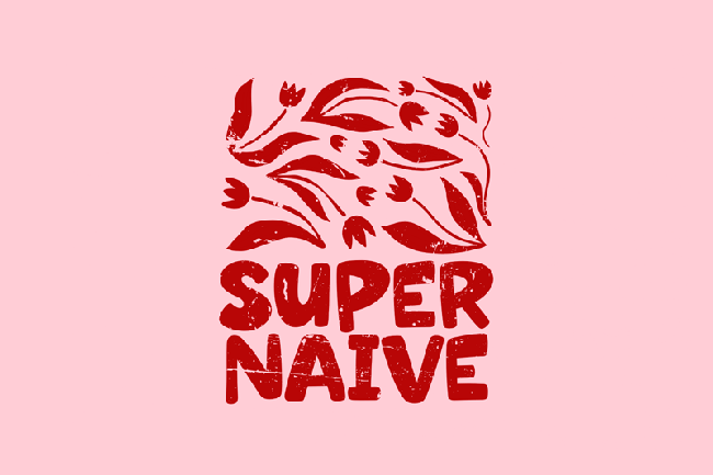
Best for: children’s graphics, stickers, food packaging, playful branding, casual posters, social media, and entertainment projects.
Super Naive is a playful display typeface rather than a general-purpose text font.
Its value comes from immediately changing the tone of the message. Even a very simple word can begin to feel more friendly, informal, and energetic.
Keep the Supporting System Simple
When the headline already carries this much personality, use restrained supporting typography and allow enough space around the lettering.
4. Pleasure Handwritten Font
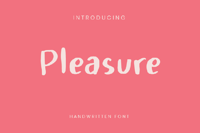
Best for: lifestyle design, social graphics, quotes, notes, personal brands, stationery concepts, and casual editorial accents.
Pleasure Handwritten introduces something deliberately human into polished digital compositions.
That makes handwritten typography especially useful beside clean layouts, product photography, or geometric sans serifs.
Do Not Set Long Paragraphs in It
Handwriting works best as an accent:
- A signature.
- A short quote.
- A label.
- A highlighted phrase.
5. Lumierepolis Font
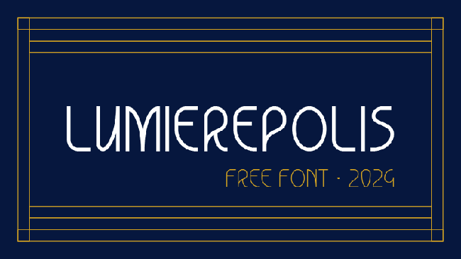
Best for: retro-modern branding, editorial titles, cultural projects, posters, hospitality, packaging, and campaign graphics.
Lumierepolis brings retro character without forcing the complete composition to become nostalgic.
The family format also makes it more practical than a one-style novelty face because a designer can build greater hierarchy while keeping the same typographic voice.
Mix Retro Type With Modern Art Direction
Try combining it with:
- Contemporary photography.
- Minimal layouts.
- Unexpected color palettes.
- Clean iconography.
This often produces a fresher result than surrounding a retro font with every possible vintage effect.
6. Wiltype Font
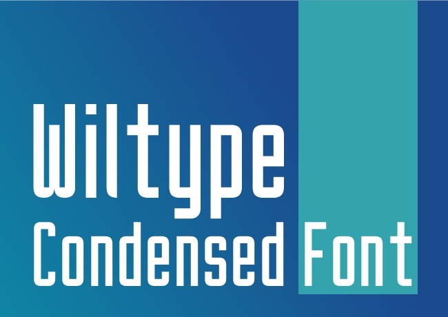
Best for: branding, headlines, posters, editorial layouts, modern presentations, packaging, and structured social graphics.
Wiltype provides a cleaner counterpoint to the more expressive fonts in this list.
Simple sans-serif forms are useful because they allow other parts of the identity — imagery, color, illustration, or layout — to carry more personality.
Use Scale Instead of Decoration
A clean sans serif does not need gradients, shadows, outlines, and effects to become interesting.
Try:
- Oversized type.
- Tight crop.
- Large contrast between headline and caption.
- Strong alignment.
7. Ryga Font

Best for: posters, events, music artwork, fashion graphics, hospitality, cultural campaigns, and retro-inspired branding.
Ryga belongs in the category of fonts that can become the visual concept of a layout by themselves.
Use It at Display Scale
Decorative structure becomes easier to appreciate when the type is large.
Use it for:
- One-word titles.
- Brand names.
- Event names.
- Short editorial headings.
and allow a simpler typeface to handle smaller information.
8. Vegan Days Script Font
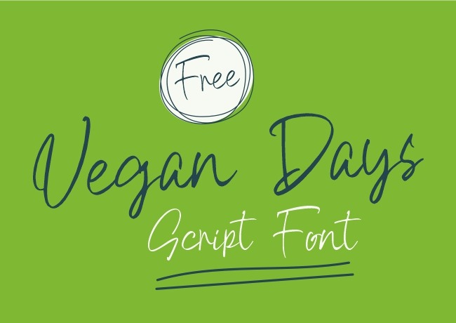
Best for: cafés, food brands, organic products, lifestyle graphics, handmade products, packaging, social media, and casual logos.
Vegan Days has a handwritten script character that naturally suits projects where friendliness and informality matter.
Pair Script With Structure
A script font becomes easier to use when paired with:
- A geometric sans serif.
- A neutral grotesk.
- A simple uppercase caption font.
The contrast creates hierarchy while preventing the entire composition from feeling handwritten.
9. Super Mellow Font

Best for: playful branding, packaging, posters, entertainment, lifestyle products, merchandise, and social media.
Super Mellow is another personality-first display option. Its role is not to disappear into the hierarchy but to make short text feel visually distinctive.
Build Around One Strong Phrase
Try using one oversized title and limiting the rest of the layout to a restrained supporting system.
10. Super Crawler Font

Best for: entertainment design, posters, gaming-adjacent graphics, music artwork, event titles, merchandise, and high-energy campaigns.
Super Crawler works when typography needs more energy than a conventional sans-serif headline can provide.
Test the Actual Project Name
Characterful display fonts can look excellent in a specimen but behave very differently depending on the exact combination of letters.
Always type the real:
- Brand name.
- Event title.
- Headline.
before deciding.
11. Hilarious HF Font

Best for: quotes, social graphics, personal branding, casual campaigns, invitations, lifestyle design, and handwritten accents.
Hilarious HF provides an informal handwritten alternative to highly polished display typography.
Check Character Support Before Multilingual Work
Handwritten free fonts sometimes contain a more limited character set than large professional font families.
Before choosing one for an international project, test:
- Accents.
- Punctuation.
- Currency.
- Special symbols.
- All required languages.
12. Scabber Font

Best for: editorial accents, art projects, posters, informal branding, handwritten notes, social graphics, and experimental layouts.
Scabber can be used to break the precision of grid-based layouts and introduce a more spontaneous typographic voice.
Contrast Is More Effective Than Repetition
One handwritten heading beside structured typography often feels more intentional than making the entire layout informal.
13. Pastel Trunk Font
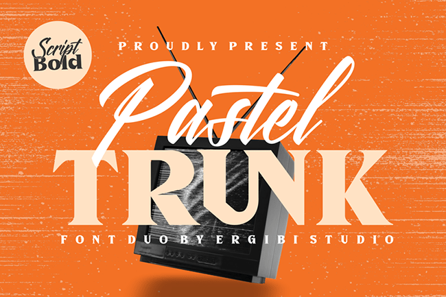
Best for: wedding stationery, beauty, fashion, lifestyle branding, invitations, packaging, photography, and elegant social graphics.
Pastel Trunk moves toward calligraphic typography, making it suitable for projects where elegance and a more decorative handwritten rhythm are important.
Give Calligraphy Enough Space
A script like this works better when it has room to breathe.
Avoid:
- Tiny sizes.
- Tight line spacing.
- Long paragraphs.
- Busy photographic backgrounds.
License reminder: check the current source terms before commercial use; the free download version may have usage restrictions.
14. Debaznue Font

Best for: contemporary branding, fashion layouts, posters, logo concepts, packaging, campaigns, and large headlines.
Debaznue brings a more modern display-oriented direction to the collection.
This kind of font can work particularly well when the layout needs clarity but a completely neutral sans serif feels too safe.
Use It for Identity-Led Headlines
Try it in:
- Large brand statements.
- Fashion campaigns.
- Packaging names.
- Poster titles.
License reminder: the free version offered through the linked source is intended for personal use, so commercial projects require checking the appropriate license.
15. Fresh Lemonade Font

Best for: food packaging, cafés, summer campaigns, posters, lifestyle branding, merchandise, and retro-inspired social content.
Fresh Lemonade closes the collection with a retro display direction that naturally fits playful, optimistic, and lifestyle-focused design.
Use Retro Typography Without Making Everything Vintage
Try pairing the font with:
- Clean photography.
- Modern grids.
- Bold contemporary color.
- Minimal iconography.
The contrast can feel fresher than applying paper grain, faded colors, retro illustrations, and multiple nostalgic effects at once.
License reminder: the version linked here is distributed as a demo/personal-use font. Check the author’s commercial license before paid use.
How to Choose a Font for Branding
Do not begin by asking which font looks the most interesting.
Start with the personality the brand needs to communicate.
Professional and Contemporary
Begin with a versatile sans serif such as ZT Nature or Wiltype.
Friendly and Handmade
Explore Vegan Days, Pleasure Handwritten, Hilarious, or Scabber.
Playful and Expressive
Test Super Naive, Super Mellow, Bitter & Sugar, or Super Crawler.
Retro but Contemporary
Lumierepolis, Ryga, or Fresh Lemonade can provide a historical reference while still being used inside a modern system.
Elegant and Decorative
Pastel Trunk works better as an accent or display element than as a complete typographic system.
How to Test a Font Before Using It in a Logo
1. Type the Real Brand Name
A specimen containing carefully chosen words does not tell you how your actual name will look.
2. Test Problematic Letter Pairs
Look at how letters interact around:
- AV.
- WA.
- TT.
- LY.
- RA.
3. Test Small Size
The logo may eventually appear as:
- A social avatar.
- Website header.
- Packaging label.
- Business card.
4. Test Black and White
A logo that only works because of color effects may have a weaker underlying typographic structure.
5. Check Licensing Specifically for Logo Use
Do not assume that permission to install a free font automatically covers every commercial application.
How to Pair Fonts Without Making a Design Look Random
Pair Personality With Neutrality
One of the safest strategies is:
Expressive display font + neutral sans serif.
For example:
- Pastel Trunk + clean sans.
- Vegan Days + geometric sans.
- Super Naive + restrained grotesk.
- Ryga + simple body font.
Create Contrast, Not Conflict
If both fonts are:
- Highly decorative.
- Highly condensed.
- Strongly retro.
- Very handwritten.
they may compete instead of forming hierarchy.
Let Each Typeface Have One Job
For example:
- Display font — headline.
- Sans serif — body text.
- Small uppercase sans — labels and metadata.
How to Use Display Fonts Without Hurting Readability
Keep Headlines Short
The more unusual the typeface, the shorter the message should generally become.
Increase Size
Display details are easier to understand when they have enough scale.
Add More Space Around the Type
Decorative typography often needs more negative space than a standard sans serif.
Do Not Use It for Every Element
If every heading, button, caption, and paragraph uses the same expressive display font, the design loses hierarchy.
Font Pairing Workflow for a Brand Identity
- Choose the main brand personality.
- Select one primary typeface.
- Define where it appears.
- Add one quieter supporting font if necessary.
- Create headline, subheading, body, caption, and button samples.
- Test on real brand content.
- Test on mobile and print.
- Remove any font that does not have a clear job.
Free Font Licensing: What Designers Need to Check
The word free can describe several very different situations.
100% Free
The author may allow personal and commercial use, but you should still read the actual terms.
Open License
Some fonts are released under licenses such as the SIL Open Font License, which can permit broad professional use while still containing specific conditions.
Free for Personal Use
You can generally experiment with the font privately, but commercial work may require purchasing a license.
Demo
A demo may:
- Limit commercial use.
- Contain fewer characters.
- Exclude multilingual glyphs.
- Exclude alternate styles.
Font Licensing Checklist
- Is commercial use allowed?
- Is logo use allowed?
- Can it be used for client projects?
- Can it be used on merchandise?
- Is webfont embedding allowed?
- Can it be embedded inside an app?
- Can it be used in templates for resale?
- Does the free version have a limited character set?
- Does it support the languages required by the project?
- Do you need to preserve a copy of the license?
How to Check Whether a Font Is Actually Useful
Test a Full Sentence
Do not evaluate only one beautiful word.
Test Numbers
Especially important for:
- Pricing.
- Dates.
- Dashboards.
- Events.
- Packaging.
Test Punctuation
Check quotation marks, apostrophes, brackets, ampersands, hyphens, and other characters your project needs.
Test Multilingual Characters
This matters particularly for international branding.
Test Export
Make sure the font behaves correctly in the software and final file formats used by the project.
Common Font Selection Mistakes
1. Choosing the Font Before Understanding the Brand
Typography should communicate strategy rather than determine it accidentally.
2. Using Too Many Fonts
Most projects do not need four different font families.
3. Using Display Fonts for Body Copy
A font can be beautiful and still be inappropriate for long reading.
4. Choosing Only From the Specimen Image
Always test your real content.
5. Ignoring Numbers and Symbols
They often become important later in a project.
6. Ignoring Multilingual Support
A brand system can quickly break when the required characters are missing.
7. Pairing Two Fonts With the Same Visual Role
Typography needs hierarchy, not competition.
8. Using Effects to Make a Weak Font Choice Interesting
Typography should work before shadows, outlines, distortions, and gradients are added.
9. Assuming “Free Download” Means Commercial License
Always check the individual author’s terms.
10. Following a Typography Trend That Does Not Fit the Project
A trendy font is still the wrong choice if it conflicts with the audience, content, or brand personality.
Frequently Asked Questions About the Best Free Fonts for 2026
What are the best free fonts for 2026?
The most useful choice depends on the project. ZT Nature and Wiltype provide cleaner modern directions; Lumierepolis, Ryga, and Fresh Lemonade explore retro character; Vegan Days, Pleasure, Hilarious, and Scabber offer handwritten styles; while Super Naive, Super Mellow, Super Crawler, and Bitter & Sugar are stronger display options.
Are all fonts in this collection free for commercial use?
No. Some linked versions permit broader use, while others are personal-use or demo downloads. Always review the current license on the original source page.
What is the best font for branding?
For a complete identity system, a versatile family with several weights and good readability is usually easier to use than a highly decorative one-style display font.
Can I use a free font in a logo?
Only if the font’s license permits the intended use. Check the author’s current terms before finalizing commercial branding.
What is the difference between a display font and a text font?
A display font is primarily designed to create visual impact at larger sizes, while a text font prioritizes comfortable reading across longer passages and smaller sizes.
How many fonts should a brand use?
Many identity systems can work with one flexible family or a two-family combination. Additional typefaces should only be added when they have a clear purpose.
Are handwritten fonts professional?
They can be. Professional typography depends on context, hierarchy, execution, and brand fit rather than whether the letters look handwritten.
Can retro fonts work in modern branding?
Yes. Pairing a retro typeface with contemporary layout, photography, and color can create a distinctive modern result.
How do I know whether two fonts work together?
The fonts should create enough contrast to establish separate roles while still feeling compatible with the same visual system.
Should I use trending fonts just because they are popular?
No. Typography trends can provide inspiration, but the final decision should be based on the project’s audience, message, format, and intended personality.
Final Thoughts
The best free fonts for 2026 are not necessarily the most unusual typefaces or the fonts appearing most frequently in trend roundups.
The best font is the one that solves the problem in front of you.
ZT Nature can provide a flexible foundation for a complete visual identity. Wiltype can support cleaner headline systems. Lumierepolis and Ryga can introduce retro character. Vegan Days and Pleasure Handwritten can create a more personal tone. Pastel Trunk can add decorative elegance, while Super Naive, Super Mellow, Super Crawler, and Bitter & Sugar can make display typography the focal point of a composition.
The real skill is knowing when to use each one.
Test the actual words. Test small sizes. Check numerals and punctuation. Build a hierarchy. Pair expressive fonts with quieter typography. Check multilingual support when needed. Most importantly, verify the license before a font becomes part of a commercial project.
Good typography makes words attractive. Great typography makes the message feel inevitable in that particular visual system.
For more free fonts, typography guides, mockups, textures, brushes, and practical resources for designers, continue exploring DesignRise.
Discover more from DesignRise
Subscribe to get the latest posts sent to your email.