








Best Figma Fonts for UI Projects and How to Add Them
Typography plays a major role in UI design. A good font improves readability, creates visual hierarchy, supports brand identity, and makes digital products feel more polished. Even when users do not consciously notice typography, they feel the difference between an interface that is easy to read and one that feels messy or uncomfortable.
For UI designers working in Figma, choosing the right font is especially important. Fonts need to look clean on screens, work across different devices, support multiple weights, and remain readable in buttons, navigation, forms, dashboards, mobile apps, and landing pages.
This DesignRise guide highlights useful Figma fonts for UI projects and explains how to add fonts to Figma so you can build cleaner, more consistent, and more professional interface designs.
Why Typography Matters in UI Design
Typography is not only about visual style. It affects how users read, scan, understand, and interact with an interface. A strong type system can guide attention, separate important information from secondary content, and make a product feel more trustworthy.
In UI design, the wrong font can make an interface feel unbalanced, hard to read, or visually outdated. The right font helps create clarity and supports the overall user experience.
On DesignRise, we see typography as one of the most practical foundations of good UI design. Before adding complex visuals or effects, designers should make sure the text system is clear, readable, and consistent.
What Makes a Font Good for Figma UI Projects?
The best fonts for UI design are usually simple, readable, flexible, and available in several weights. A font may look beautiful in a poster, but that does not always mean it will work well inside an app interface.
- Readability: The font should be easy to read at small and medium sizes.
- Multiple weights: Regular, medium, semibold, and bold weights help build hierarchy.
- Clean letterforms: Simple shapes usually work better for buttons, menus, and body text.
- Good spacing: Balanced spacing improves scanning and mobile readability.
- Brand fit: The font should match the tone of the product or company.
Best Fonts for UI Design in Figma
When designing interfaces, clarity should come first. These fonts are commonly used in digital products because they are readable, flexible, and easy to combine with modern UI layouts.
- Inter: Clean, modern, and optimized for digital screens.
- Roboto: Versatile and widely used for Android apps and mobile interfaces.
- Nunito Sans: Friendly, rounded, and easy to read.
- Poppins: Geometric and stylish for modern landing pages and dashboards.
- Open Sans: Professional, readable, and reliable for content-heavy interfaces.
- Lato: Balanced and approachable for websites, apps, and product pages.
- IBM Plex Sans: Strong for SaaS, data products, and technical interfaces.
Explore More DesignRise UI Resources:
- Figma Auto Layout: The Secret to Building Responsive Designs
- Finger-Friendly UI Design: How to Create Better Mobile Interfaces
- UI/UX Design Resources and Tutorials
How to Add Fonts to Figma
Adding fonts to Figma depends on whether you use Figma in the browser or the desktop app. Google Fonts are usually available directly in Figma, while custom fonts may need to be installed locally or managed through a team workspace.
- Download and install the font on your computer.
- Restart Figma so the new typeface appears in the font list.
- If you use Figma in the browser, install the Figma Font Installer.
- For team projects, make sure everyone has access to the same fonts.
- For brand systems, document font usage inside your design system or style guide.
Once the font is available in Figma, create reusable text styles for headings, body text, captions, buttons, and labels. This keeps your interface consistent and makes future updates much easier.
Best Practices for Choosing UI Fonts
- Use no more than one or two font families in most UI projects.
- Test fonts at real interface sizes, not only in large previews.
- Check readability on mobile screens.
- Use consistent line height and spacing.
- Avoid overly decorative fonts for body text.
- Make sure font weights are available for your full UI system.
A strong font choice should make the interface easier to use. If the typography draws attention away from the product experience, it may not be the right choice.
Best Figma Fonts to Download
Below, you’ll find a curated DesignRise selection of fonts that can be useful for UI projects, branding concepts, landing pages, editorial layouts, and creative interface designs. Some fonts are better for body text, while others work best for headlines, hero sections, or expressive brand moments.
1. Fugaz One Font

Fugaz One is a bold display font that can work well for expressive headlines, promotional sections, and creative branding moments. It is not ideal for long body text, but it can add strong personality to selected UI elements.
2. Nunito Sans Font Family

Nunito Sans is friendly, rounded, and readable, making it a strong choice for mobile apps, educational platforms, lifestyle products, and interfaces that need a softer visual tone.
3. EB Garamond
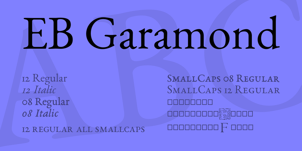
EB Garamond is elegant and editorial. It is better suited for luxury branding, publishing layouts, portfolio pages, and refined landing pages than for dense app interfaces.
4. Lato
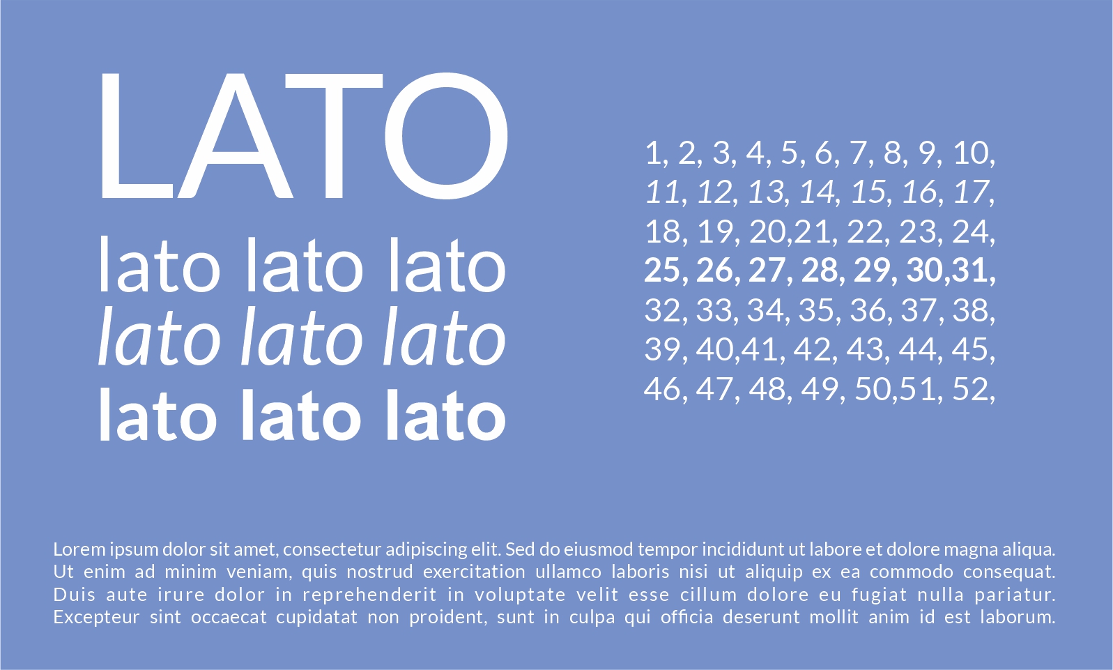
Lato is a balanced sans-serif font that works well for websites, dashboards, SaaS products, and mobile interfaces. It feels professional without becoming too cold or technical.
5. Abril Fatface
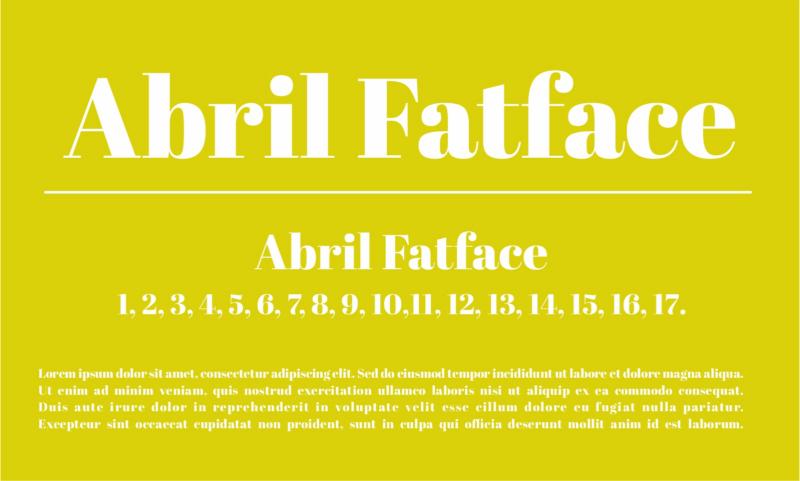
Abril Fatface is a high-contrast display font with a strong editorial feel. It works best for hero titles, campaign pages, fashion branding, and creative landing page concepts.
6. Zilla Slab
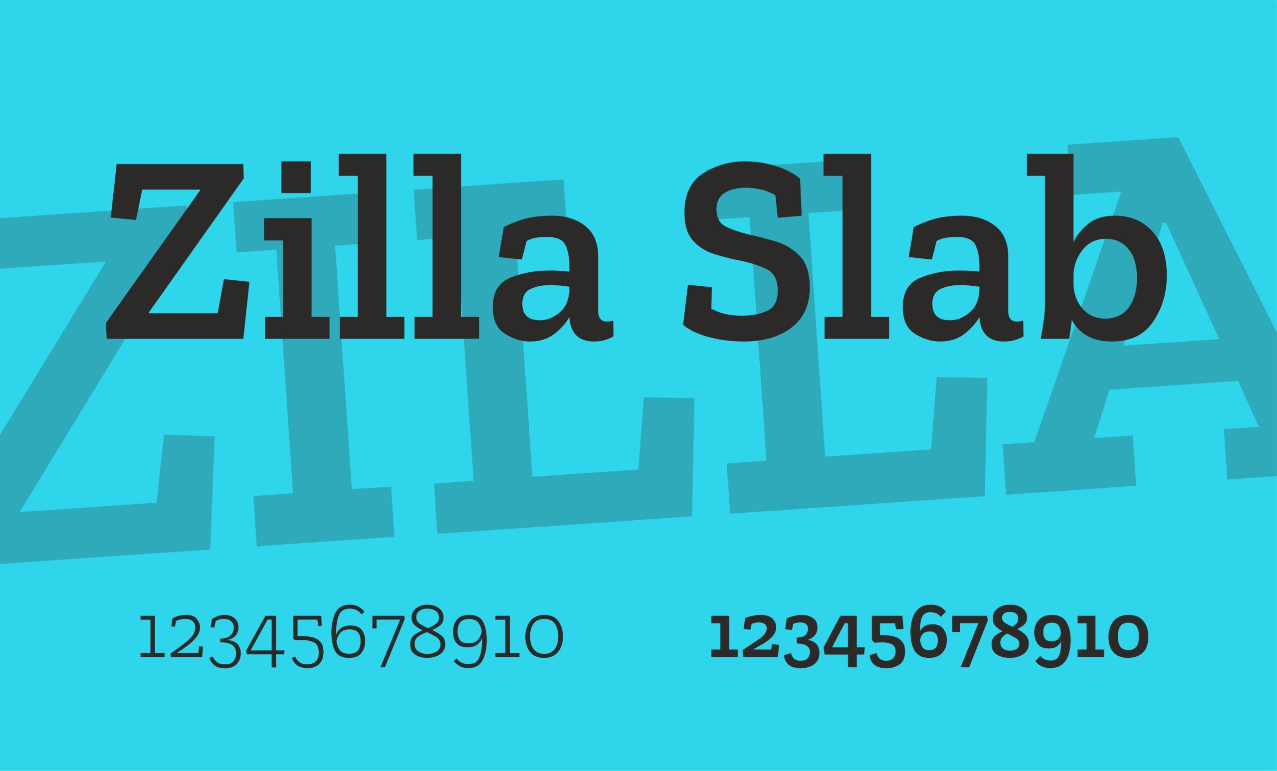
Zilla Slab brings a distinctive slab-serif character to UI and branding projects. It can work well for editorial interfaces, creative websites, and brand systems that need a slightly more unique voice.
7. Oswald
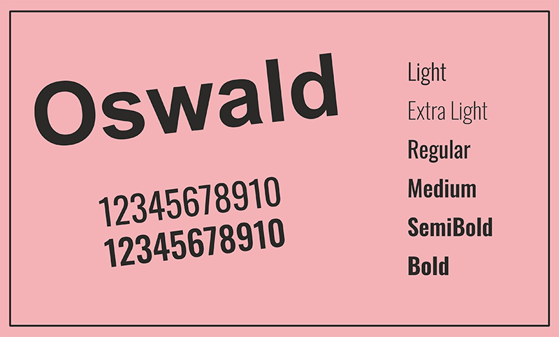
Oswald is condensed, strong, and useful for headlines, navigation, banners, and compact interface areas where space matters. It can add a bold, structured feeling to digital products.
8. Arima Madurai Font Family
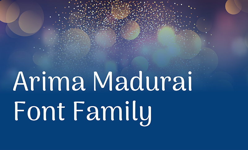
Arima Madurai has a warm and expressive personality. It can be useful for creative branding, cultural projects, event pages, and unique visual identities.
9. Grand Hotel

Grand Hotel is a script-style font that works best for decorative headings, hospitality branding, food-related projects, invitations, and warm lifestyle visuals.
10. Bitter

Bitter is a readable slab-serif font that can work well for blogs, editorial layouts, content-heavy websites, and interface sections where text clarity matters.
Conclusion
The best Figma fonts for UI projects are not always the most decorative or unusual. They are the fonts that make interfaces easier to read, easier to scan, and more consistent across screens.
For most UI projects, start with clean, flexible fonts like Inter, Roboto, Lato, Open Sans, or Nunito Sans. Then use more expressive fonts carefully for headlines, hero sections, campaigns, or brand-specific moments.
DesignRise regularly shares UI/UX design resources, Figma tips, typography inspiration, and creative tools for modern designers. Bookmark this guide and revisit it whenever you need font ideas for your next interface project.
Explore More Typography and UI Design Resources
- Best Powerful Logo Fonts for Strong Brand Identity
- Figma Auto Layout: The Secret to Building Responsive Designs
- UI/UX Design Resources and Tutorials
- Finger-Friendly UI Design: How to Create Better Mobile Interfaces
- Best 3D Illustration Libraries for UI Designers
Discover more from DesignRise
Subscribe to get the latest posts sent to your email.