









Figma Auto Layout is one of the most valuable skills a modern UI/UX designer can learn. It transforms static frames into structured interface systems that respond when content changes, labels become longer, cards receive additional information, navigation items are added, or a parent container is resized.
Without Auto Layout, a design can look perfect in one carefully arranged frame and immediately break when real content appears. A translated button label no longer fits. An error message pushes a form out of alignment. A product title wraps onto three lines. A pricing card becomes taller than the others. Every small content change creates another round of manual resizing and repositioning.
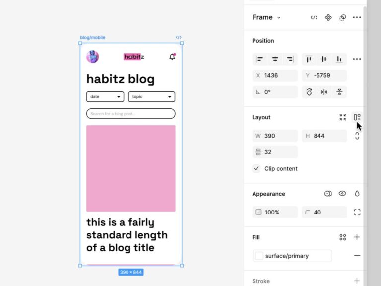
Auto Layout replaces much of that fragile manual work with reusable layout rules. Instead of positioning every layer independently, you define how the container should organize its children: horizontally, vertically, in a wrapping flow, or in a grid. You control padding, gaps, alignment, width, height, minimum and maximum dimensions, and the way nested elements respond to available space.
The result is not merely a cleaner Figma file. Properly structured Auto Layout helps designers create interfaces that are easier to test, scale, localize, maintain, explain, and hand off to development.
This guide goes beyond the basic “select layers and press Shift + A” instruction. You will learn how Auto Layout behaves, how Hug contents, Fill container, fixed dimensions, wrapping, grid flow, constraints, layout guides, and nested frames work together, and how to apply those concepts to buttons, cards, forms, navigation, responsive sections, dashboards, and design-system components.
You will also learn where Auto Layout stops being useful, why more nesting is not always better, how to debug layouts that refuse to resize correctly, and how to test components with realistic content before they reach development.
Explore More DesignRise Resources:
- Elevate Your Designs: The Ultimate Guide to Premium Figma Mockups
- Best Figma Presentation Templates — Free and Ready to Be Cloned
- Best Figma Fonts for UI Projects and How to Add Them
- How to Structure Figma Files for Seamless Team Collaboration
What Is Auto Layout in Figma?
Auto Layout in Figma is a layout system that automatically arranges layers inside a frame according to defined rules. When content changes, the frame and its children can grow, shrink, wrap, realign, or redistribute available space without requiring every layer to be repositioned manually.
A simple button demonstrates the idea clearly. A manually built button may consist of a rectangle placed behind a text layer. If the label changes from “Buy” to “Start Free Trial,” the rectangle remains the same width until the designer resizes it.
With Auto Layout, the button becomes a content-driven component. The label determines the required width, while horizontal and vertical padding protect the space around it. Change the text, and the button adapts automatically.
The same principle can be applied at increasingly larger scales:
- A badge adapts to a longer status label.
- A form field expands when helper or error text appears.
- A card grows when its description wraps onto more lines.
- A navigation bar redistributes available space.
- A collection of cards wraps into additional rows.
- A full page maintains consistent spacing as sections change.
Auto Layout is conceptually similar to layout systems used in frontend development, especially flexible rows, columns, padding, gaps, and grid-based structures. It is not a direct replacement for CSS, nor does it automatically define every production breakpoint. Its purpose is to help designers model content-driven and responsive behavior more realistically.
Why Auto Layout Matters More Than Perfect Static Screens
A static mockup can hide structural problems. Everything fits because the designer has selected the ideal text length, image ratio, viewport, number of menu items, and amount of content.
Real products are less predictable.
- Usernames can be five or fifty characters long.
- Prices can include additional currency or billing information.
- Navigation labels become longer after translation.
- Form fields display validation messages.
- Cards may contain optional tags, descriptions, or actions.
- Users increase their browser’s text size.
- A dashboard may contain unavailable or delayed data.
- A marketing team adds another pricing plan.
A responsive component should continue to communicate clearly under these conditions. Auto Layout helps designers model that behavior before the product reaches development.
Auto Layout Encourages Content-First Design
When a component responds to its content, designers are more likely to test realistic information instead of relying on carefully controlled placeholders. This exposes problems earlier and encourages decisions based on actual product behavior.
Auto Layout Makes Design Systems More Durable
A reusable component should support multiple instances without requiring local structural fixes. Proper Auto Layout allows a component to adapt while retaining the same spacing, hierarchy, alignment, and visual language.
Auto Layout Improves Collaboration
A structured frame communicates intent. Developers and other designers can see which elements belong together, what controls the spacing, and how the component is expected to resize.
Auto Layout Reduces Maintenance
If a spacing token changes from 16 to 20 pixels, a structured system can be updated predictably. In a manually positioned file, the same change may require dozens of individual adjustments.
The Four Auto Layout Flows
Auto Layout now supports several ways of arranging content. Choosing the correct flow is the first structural decision.
Horizontal Flow
A horizontal flow arranges children from left to right. It is useful for:
- Buttons containing icons and labels.
- Navigation menus.
- Toolbars.
- Tabs.
- Breadcrumbs.
- Rows in tables or lists.
- Groups of actions.
A horizontal frame does not have to remain one row forever. Depending on its settings, content may wrap when the available width becomes limited.
Vertical Flow
A vertical flow stacks children from top to bottom. It is useful for:
- Forms.
- Cards.
- Modal content.
- Sidebar navigation.
- Lists.
- Page sections.
- Mobile screen structures.
Vertical Auto Layout is often the foundation of full page designs because web and mobile content naturally forms a sequence of sections.
Wrap Flow
Wrapping allows items to move onto another line when the parent becomes too narrow. This is useful for:
- Tag collections.
- Filter chips.
- Flexible button groups.
- Responsive card collections.
- Skills or category lists.
- Thumbnail galleries.
Wrapping can simulate responsive behavior without creating separate manually arranged rows. However, the designer still needs to test how the final row behaves and whether the reading order remains logical.
Grid Flow
Grid Auto Layout is useful when elements need to follow both column and row logic. It can support:
- Product galleries.
- Dashboard widgets.
- Image collections.
- Application icon grids.
- Feature matrices.
- Data-heavy interface layouts.
Grid flow should not be confused with a layout guide. Grid Auto Layout controls the actual arrangement of children inside the frame. Layout guides provide visual columns, rows, or grid references that help designers align objects across a larger frame.
The Core Auto Layout Properties
Gap Between Items
The gap defines the distance between children inside an Auto Layout frame. A consistent gap is more reliable than manually positioning each element.
For example, a form could use:
- 4 pixels between a label and helper text.
- 8 pixels between a label and input.
- 16 pixels between related field groups.
- 24 or 32 pixels between major form sections.
Do not choose spacing values independently for every frame. Connect them to a consistent spacing scale such as 4, 8, 12, 16, 24, 32, and 48 pixels.
Padding
Padding controls the internal space between the container boundary and its content. It can be applied equally or set independently for the top, right, bottom, and left sides.
Padding is fundamental to:
- Button size.
- Card density.
- Input-field comfort.
- Modal structure.
- Navigation height.
- Section spacing.
Padding should communicate the intended density. A compact dashboard control and a premium editorial card may use very different values even when their content is similar.
Alignment
Alignment controls how children sit within the available space of the container. Depending on the flow, elements can align to the start, center, end, or stretch according to their resizing settings.
Alignment decisions should follow the content rather than visual habit. Text-heavy cards often benefit from left alignment. Icon-only controls may be centered. Navigation bars may need different alignment rules for branding, links, and account actions.
Distribution
A container can maintain a fixed gap between items or distribute remaining space between them. Distributed spacing is useful for structures such as a header with a logo on one side and account actions on the other.
Use distributed spacing carefully. It works well when the relationship between the elements is clear, but it can create unexpected gaps when additional items are introduced.
Canvas Stacking and Layer Order
Auto Layout determines the visual sequence of children, but the stacking order still matters when layers overlap. Check both the Layers panel and the visual result whenever a badge, floating icon, image, or decorative object needs to sit above another element.
Fixed, Hug Contents, and Fill Container Explained
Most Auto Layout problems come from resizing settings rather than spacing. Understanding the difference between Fixed, Hug contents, and Fill container is essential.
Use Fixed Dimensions Intentionally
Fixed dimensions are appropriate when an element genuinely requires a stable size. Icons should not stretch simply because a container grows. A standard input may keep a defined height. A thumbnail may need a consistent ratio.
The problem is not fixed sizing itself. The problem is using it everywhere without testing content growth.
Use Hug Contents for Content-Driven Components
Hug contents is ideal when the content should determine the component size. A tag labelled “New” should be narrower than one labelled “Awaiting approval,” while both retain the same padding.
Use Fill Container for Fluid Relationships
Fill container allows a child to take the available space inside its Auto Layout parent. It is useful for a search input beside a fixed button, a content column beside a fixed sidebar, or cards that should share a row.
A Layer Can Fill Only When the Parent Provides Space
If Fill container appears unavailable or behaves strangely, inspect the parent frame. A child cannot fill undefined space when the parent itself is hugging that same child in a circular dependency.
Minimum and Maximum Dimensions
Minimum and maximum dimensions help prevent flexible components from becoming unusably small or excessively wide.
Minimum Width
A flexible button may fill available space on mobile but still require a minimum width to preserve touch comfort and readable hierarchy.
Maximum Width
A content column can fill the viewport while stopping at a readable maximum width. This is useful for articles, forms, cards, modals, and desktop page containers.
Minimum Height
A card may need a minimum height to preserve balance across a row, even when one instance contains less content.
Maximum Height
A dropdown, notification panel, or modal body may need a maximum height before internal scrolling becomes necessary.
Min and max settings are particularly valuable in responsive systems because they allow flexibility within controlled boundaries.
How to Apply Auto Layout Step by Step
- Select two or more layers, a frame, or a component.
- Press Shift + A or choose Add Auto Layout in the properties panel.
- Select the appropriate flow: horizontal, vertical, wrap, or grid.
- Define the gap between children.
- Set the container padding.
- Choose the alignment and distribution.
- Define the width and height behavior of the parent.
- Define the resizing behavior of every important child.
- Add minimum or maximum dimensions where necessary.
- Resize the parent manually to test the result.
- Replace placeholder content with realistic short and long examples.
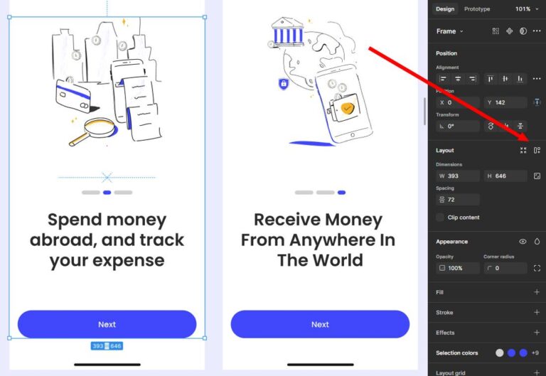
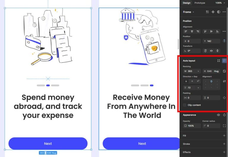
Do not stop after Auto Layout is applied. The feature only becomes useful after the parent and children receive correct resizing rules.
Build a Responsive Button With Auto Layout
A button is the best place to learn Auto Layout because it contains a small number of layers but demonstrates content-driven resizing clearly.
Step 1: Create the Label
Add a text layer such as “Continue.” Use a clear text style connected to the design system.
Step 2: Add an Optional Icon
Place the icon before or after the label. Keep the icon at a fixed width and height so it does not stretch.
Step 3: Apply Horizontal Auto Layout
Select the label and icon, then press Shift + A. Set a suitable gap, such as 8 pixels.
Step 4: Add Padding
Set horizontal padding and vertical padding according to the intended button size. For example:
- 12 pixels vertically.
- 16 or 20 pixels horizontally.
Step 5: Set Resizing
- Button width: Hug contents.
- Button height: Hug contents or a controlled fixed/minimum height.
- Label: Hug contents.
- Icon: Fixed.
Step 6: Test the Label
Replace “Continue” with:
- Buy
- Start Free Trial
- Continue to Secure Checkout
- Зберегти та продовжити
The component should retain balanced padding and alignment throughout the test.
Step 7: Create Variants
Once the structure works, create variants for:
- Primary and secondary styles.
- Small, medium, and large sizes.
- Default, hover, pressed, disabled, and loading states.
- Icon-only, text-only, and icon-plus-text versions.
Build a Flexible Content Card
A card is more complex because it combines fixed media, variable text, optional metadata, and actions.
Recommended Structure
- Outer card frame: Vertical Auto Layout.
- Image: Fixed ratio or controlled height.
- Content frame: Vertical Auto Layout.
- Tag or metadata row: Horizontal or wrapping Auto Layout.
- Title and description: Vertical Auto Layout.
- Action row: Horizontal Auto Layout.
Choose the Correct Text Behavior
A title may use a fixed or fill width with automatic height so the text wraps. A description should usually wrap rather than expand the card horizontally.
Decide What Happens With Unequal Content
Cards in the same row may have different title lengths. Possible strategies include:
- Allowing every card to have a natural height.
- Applying a shared minimum height.
- Keeping the action row at the bottom by allowing the middle content region to fill.
- Limiting text to a controlled number of lines in the final product.
The correct choice depends on whether visual alignment or complete content is more important.
Test Optional Elements
Hide and reveal tags, descriptions, secondary actions, and status indicators. The card should remain structurally coherent when optional content disappears.
Build a Form Field That Handles Errors
Forms frequently break when helper text, required labels, validation messages, or password controls appear.
Recommended Structure
- Create a vertical Auto Layout field group.
- Add a horizontal label row if the field includes a required marker or secondary action.
- Add the input container.
- Add helper or error text underneath.
- Use a small gap between related elements.
Input Structure
The input itself may use horizontal Auto Layout:
- Leading icon: Fixed.
- Text or placeholder: Fill container.
- Trailing action: Fixed.
Test Real States
- Default.
- Focused.
- Filled.
- Disabled.
- Error.
- Success.
- Loading.
The field should grow vertically when a validation message appears without overlapping the next field.
Build a Responsive Navigation Bar
Navigation demonstrates why nested Auto Layout is necessary. A header may contain three separate groups:
- Brand identity.
- Primary navigation.
- Account or conversion actions.
Desktop Structure
Use a horizontal parent frame. The logo can remain fixed or hug its contents. Navigation links may form another horizontal Auto Layout group. Actions can form a third group.
The parent can use distributed spacing or allow the central region to fill the available width.
Mobile Structure
Do not expect one desktop navigation frame to solve every mobile requirement automatically. Mobile navigation often represents a different interaction pattern with:
- A logo.
- A menu trigger.
- An optional primary action.
- A separate expanded menu state.
Auto Layout helps structure each version, while component variants can represent the relevant breakpoint or state.
Test Navigation Labels
Replace short labels with longer alternatives and translations. Check whether the navigation wraps unexpectedly or forces the actions outside the frame.
Build a Responsive Card Collection
A collection of cards can use wrapping or grid Auto Layout, depending on the intended structure.
Use Wrapping When
- Card widths may remain fixed or constrained.
- The number of items per row should change naturally.
- The final row may contain fewer items.
- The layout behaves like a flexible collection of tags or cards.
Use Grid Flow When
- Rows and columns need a stronger shared structure.
- Items should align consistently across both dimensions.
- The interface resembles a product gallery or dashboard.
- The designer needs explicit control over grid placement.
Test Narrow and Wide Parents
Resize the container through several realistic widths. Do not test only desktop and mobile extremes. Tablet widths and narrow desktop windows often reveal the most awkward transitions.
Build a Responsive Page System
A complete page should be treated as a hierarchy of containers rather than one enormous Auto Layout frame with dozens of unrelated children.
Recommended Page Hierarchy
- Page frame: Vertical Auto Layout.
- Section wrapper: Full width with controlled vertical padding.
- Content container: Fill available width with a maximum width.
- Section content: Vertical, horizontal, wrapping, or grid flow depending on the layout.
- Individual components: Their own internal Auto Layout structures.
Separate Full-Width Backgrounds From Content Width
A section background may extend across the viewport while its text and cards remain inside a narrower content container. This pattern mirrors many real websites and prevents text lines from becoming excessively long.
Use Maximum Width for Readability
A text column should not continue growing simply because the desktop viewport is large. Apply a maximum width that protects comfortable reading and visual hierarchy.
Use Section-Level Spacing
Do not simulate section spacing by adding empty rectangles or invisible layers. Use the parent frame’s gap or section padding.
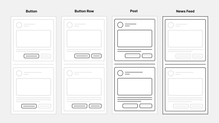
Auto Layout vs Constraints vs Layout Guides
These features are related, but they solve different problems.
Layers participating normally in Auto Layout are positioned by the flow rather than traditional constraints. When an element needs independent positioning, use Ignore auto layout and then define how that object should remain anchored.
When to Use Ignore Auto Layout
Ignore auto layout removes a child from the regular Auto Layout flow while keeping it inside the parent frame. This is useful for elements that need to overlap or float independently.
Appropriate Use Cases
- A notification badge over an avatar.
- A close button in the corner of a modal.
- A decorative shape behind a card.
- A floating status indicator.
- An image label positioned over a thumbnail.
- A fixed prototype control.
When Not to Use It
Do not use Ignore auto layout simply because normal resizing settings are confusing. If most children are removed from the flow, the parent loses the primary benefits of Auto Layout.
First check whether the correct solution is:
- A nested Auto Layout frame.
- Fill container.
- Distributed spacing.
- Different alignment.
- Wrapping.
- A grid flow.
Nested Auto Layout Without Unnecessary Complexity
Professional interfaces require nesting. A card may contain a content column, a metadata row, and an action row. Each group needs its own logic.
Nesting becomes a problem only when frames are added without a clear responsibility.
Every Frame Should Explain a Relationship
A useful Auto Layout frame usually answers one question:
- Which layers form the button label?
- Which text elements form the card content?
- Which controls belong in the action row?
- Which cards belong in the grid?
- Which sections form the page?
Avoid Frames That Only Repair Positioning
If a frame exists only to move one layer by a few pixels, review the padding, gap, alignment, or component structure first.
Name Structural Frames Clearly
Use names such as:
- Card / Content
- Card / Actions
- Field / Label Row
- Navigation / Links
- Section / Container
- Page / Main Content
Clear names make complex nesting easier to inspect during collaboration and handoff.
Content Stress Testing: The Step Many Designers Skip
A responsive component has not been tested until its content has been challenged.
Test Longer Text
- Replace short English labels with longer alternatives.
- Test languages that typically expand interface copy.
- Use realistic product names and descriptions.
- Check what happens when text wraps onto multiple lines.
Test Less Content
- Hide optional descriptions.
- Remove secondary actions.
- Test an empty card.
- Test missing metadata.
Test More Content
- Add additional navigation links.
- Add more tags.
- Display an error and helper text together.
- Add a fourth pricing plan.
Test Extreme Numbers
- 0
- 9
- 999
- 1,000,000
- Long currency formats
- Percentages with decimals
Test Different Images
Replace the ideal image with portrait, landscape, square, unusually bright, and low-contrast examples. Confirm that the frame, crop, overlay, and text hierarchy still work.
How Auto Layout Supports Design Systems
A design system depends on reusable logic. A component should not merely look consistent in the library; it should continue behaving consistently inside different products and contexts.
Connect Layout to Spacing Tokens
Use a defined spacing system rather than arbitrary gaps. Variables can help teams manage spacing values consistently across components and modes.
Build Flexible Component Properties
Components may allow users to:
- Change the label.
- Show or hide an icon.
- Switch size.
- Change hierarchy.
- Reveal helper text.
- Swap content.
Auto Layout should support these options without requiring instances to be detached.
Use Minimum and Maximum Dimensions
These boundaries protect components when they appear in fluid contexts. A card can fill its container without becoming excessively wide. A button can remain usable without shrinking below its minimum size.
Document the Intended Behavior
Explain whether a component should:
- Hug its content.
- Fill the parent.
- Wrap.
- Switch variants at a breakpoint.
- Truncate text.
- Increase height.
Auto Layout expresses the structure, but documentation communicates the product decision.
Auto Layout and Developer Handoff
Auto Layout can make a design easier to translate into code because both disciplines rely on relationships between containers and children. However, a visually responsive Figma frame is not automatically production-ready implementation documentation.
What Auto Layout Communicates Well
- Horizontal or vertical grouping.
- Internal padding.
- Gaps between children.
- Content-driven sizing.
- Flexible width relationships.
- Minimum and maximum dimensions.
- Wrapping and grid intentions.
What Still Needs Discussion
- Actual breakpoints.
- Semantic HTML structure.
- Keyboard and screen-reader behavior.
- Dynamic data.
- Loading and error states.
- Content truncation.
- Image loading and cropping.
- Animation and transitions.
- Performance limitations.
Avoid Designing Only for Dev Mode Inspection
A clean inspect panel is helpful, but the final objective is a reliable user experience. Discuss the intent behind the layout rather than assuming every generated value should be copied directly.
Common Figma Auto Layout Mistakes
1. Applying Auto Layout Without Setting Child Resizing
Adding Auto Layout is only the beginning. Every important child still needs an intentional width and height behavior.
2. Using Fixed Width Everywhere
Excessive fixed sizing prevents components from adapting to content and available space.
3. Using Hug Contents Everywhere
Hug contents is not automatically responsive. A text-heavy card may expand horizontally instead of wrapping when both parent and child hug their content.
4. Creating Circular Resizing Logic
A child tries to fill a parent while the parent tries to hug that child. Inspect the hierarchy and decide which layer should define the available space.
5. Adding Empty Layers for Spacing
Use gaps and padding instead of invisible rectangles or blank text layers.
6. Building One Giant Auto Layout Frame
Divide complex interfaces into meaningful nested groups with separate responsibilities.
7. Ignoring Text Wrapping
Check the text layer’s resizing behavior. A title that remains auto width may force the entire card to grow horizontally.
8. Using Ignore Auto Layout as a Shortcut
Independent positioning is appropriate for overlays, not for repairing every alignment problem.
9. Forgetting Minimum and Maximum Widths
Fluid layouts need boundaries. Otherwise, content can become too narrow to use or too wide to read.
10. Testing Only With Ideal Content
A component that works only with one short label is not a scalable component.
How to Debug Auto Layout Problems
The Child Will Not Fill the Parent
Check whether:
- The parent provides a defined or available width.
- The child is actually inside an Auto Layout parent.
- The parent is hugging the same child.
- Another sibling is consuming the available space.
- A maximum width is limiting the child.
The Text Will Not Wrap
Check whether:
- The text layer has a constrained width.
- The text is set to automatic height rather than automatic width.
- The parent has a defined or maximum width.
- The text is not inside a horizontally hugging chain.
The Card Becomes Too Wide
Look for a child with:
- A fixed width larger than the parent.
- Long unbroken text.
- Hug contents where Fill container is required.
- No maximum width.
Items Do Not Wrap
Confirm that:
- The correct flow is enabled.
- The parent width is limited.
- The children have appropriate width settings.
- The gap and minimum item width leave enough room.
The Action Row Will Not Stay at the Bottom
Create a vertical parent with a controlled height. Allow the content region to fill the available vertical space while the action row retains its natural height.
The Layout Looks Correct but Feels Overcomplicated
Temporarily inspect each nested frame and ask what relationship it represents. Remove frames that do not control meaningful spacing, alignment, resizing, styling, clipping, or component behavior.
Figma Auto Layout Best Practices
- Begin with the smallest reusable component.
- Use Auto Layout for relationships, not merely convenience.
- Choose the correct flow before adjusting individual positions.
- Use a consistent spacing scale.
- Prefer padding and gaps over invisible spacer layers.
- Set child resizing deliberately.
- Use minimum and maximum dimensions to create safe boundaries.
- Test short, long, missing, and translated content.
- Resize parent frames manually during design.
- Use Ignore auto layout only for genuine overlays.
- Name structural frames clearly.
- Keep icons and media at controlled dimensions.
- Use components and variants for repeated states.
- Review responsive intent with developers.
- Document behavior that cannot be communicated by layout alone.
Frequently Asked Questions About Figma Auto Layout
What is Figma Auto Layout?
Figma Auto Layout is a system for arranging layers inside frames and components according to rules for flow, spacing, padding, alignment, and resizing. Containers and children can adapt when content or available space changes.
What is the Auto Layout shortcut in Figma?
Select the relevant layers or frame and press Shift + A.
Is Auto Layout necessary for responsive design?
It is one of the most useful Figma features for modelling responsive behavior, but it does not replace breakpoint planning, content strategy, accessibility testing, or production code.
What is the difference between Hug contents and Fill container?
Hug contents makes a layer size itself according to its children and padding. Fill container makes a child use the available space provided by its Auto Layout parent.
Why is Fill container unavailable?
The layer may not be inside an Auto Layout parent, or the parent may not provide defined available space. Inspect the hierarchy and parent resizing settings.
What is the difference between Auto Layout and constraints?
Auto Layout controls the normal arrangement of children inside a frame. Constraints control how independently positioned layers remain anchored relative to a parent.
What is Ignore auto layout?
Ignore auto layout allows a child to remain inside an Auto Layout frame without participating in the regular flow. It is useful for badges, overlays, floating controls, and decorative elements.
Can Auto Layout create responsive card grids?
Yes. Wrapping is useful for flexible collections, while Grid Auto Layout provides stronger row-and-column organization.
Should every frame use Auto Layout?
No. Use it when a frame represents a meaningful content relationship or needs predictable resizing. Decorative compositions and freeform illustrations may not benefit from it.
Can Auto Layout replace variants?
No. Auto Layout manages structure and sizing. Variants represent distinct states, sizes, properties, or interaction conditions within a component family.
Can Auto Layout replace layout guides?
No. Auto Layout arranges actual layers. Layout guides provide visual alignment references for page-level columns, rows, and grids.
Does Auto Layout generate responsive code?
Auto Layout communicates layout intent and can support design-to-code workflows, but developers still need to define production structure, breakpoints, semantics, accessibility, data behavior, and performance.
Final Thoughts
Mastering Figma Auto Layout is not about adding more frames to a file. It is about replacing accidental positioning with intentional relationships.
A strong button understands its label. A form understands its error message. A card understands changing content. A navigation bar understands available space. A page understands the difference between full-width sections and readable content containers.
Start with simple components and learn how Fixed, Hug contents, and Fill container interact. Then add minimum and maximum dimensions, wrapping, grids, nested structures, component variants, and content stress testing.
Do not measure success by whether the frame resizes without an error. Measure it by whether the component remains understandable, accessible, maintainable, and visually balanced when real product conditions replace the ideal mockup.
Auto Layout does not make design decisions for you. It makes the consequences of those decisions visible much earlier.
For more practical Figma tutorials, UI/UX workflows, design-system guidance, and resources for scalable interface design, continue exploring DesignRise.
Discover more from DesignRise
Subscribe to get the latest posts sent to your email.


