








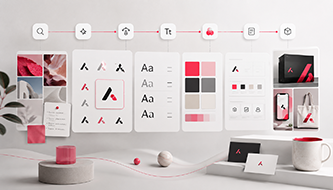
A strong brand identity is not a logo generated in five minutes. It is a connected system of strategy, visual rules, language, and reusable assets. This guide explains how to build that system with an AI brand identity workflow—from early research and positioning to logo development, typography, color, guidelines, mockups, and campaign-ready content.
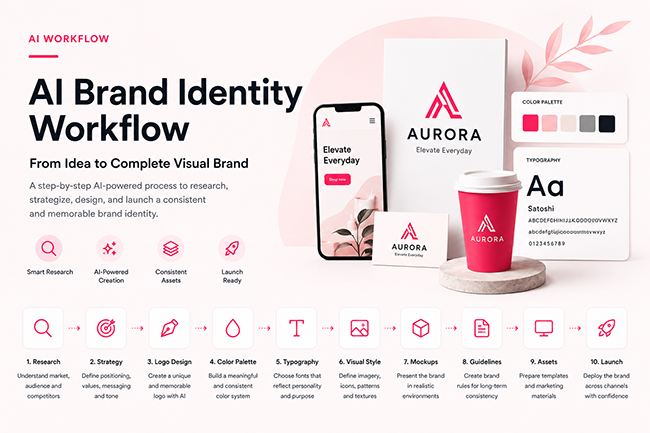
AI has made branding faster, but speed can create a new problem: businesses often produce polished assets before deciding what their brand should mean. The result is a visually attractive logo surrounded by inconsistent colors, random typography, generic imagery, and marketing materials that do not feel connected.
The better approach is to use AI as part of a structured process. Research tools can organize market information. Language models can turn rough ideas into positioning options. Image generators can explore visual directions. Brand-kit platforms can centralize approved logos, colors, fonts, and templates. Each stage should produce a clear output that becomes the input for the next stage.
What an AI Brand Identity Workflow Includes
An AI brand identity workflow is a repeatable sequence for creating, testing, documenting, and distributing a brand’s identity. It combines strategic work with visual production.
The order matters. A logo created before positioning may look polished but communicate the wrong personality. A color palette chosen before audience research may appeal to the founder instead of the customer. Templates built before typography rules are approved will have to be rebuilt later.
A brand identity becomes scalable only when visual decisions are converted into rules.
What AI does well
- organizing research and identifying repeated themes;
- generating alternative positioning statements;
- exploring moodboards and visual territories;
- creating early logo and typography concepts;
- testing color combinations;
- adapting approved assets into multiple formats;
- summarizing and documenting brand rules.
What still needs human judgment
- deciding what the brand should stand for;
- choosing the most valuable audience;
- evaluating originality and cultural meaning;
- checking trademark and licensing risk;
- protecting readability and accessibility;
- approving the final system.
Before You Start: Build a Useful Brand Brief
The quality of the workflow depends on the quality of the brief. “Create a modern brand for a startup” gives AI too much room to produce generic results. A useful brief narrows the problem without prescribing the answer.
Brand brief essentials
- Business: What does the company sell, provide, or enable?
- Audience: Who makes the purchase decision?
- Problem: What frustration or desire brings the audience to the brand?
- Difference: Why should someone choose this brand?
- Personality: Should it feel calm, bold, technical, warm, premium, playful, or direct?
- Context: Where will the identity appear most often?
- Constraints: Are there legal, cultural, technical, or production limits?
- Deliverables: Which files and templates must exist at the end?
Collect the company name, spelling rules, tagline options, product descriptions, audience notes, competitor links, examples the client likes, examples the client dislikes, and any existing visual assets.
Step 1: Use AI to Organize Brand Research
Brand research should reveal the visual and verbal patterns already used in the market. The aim is not to copy competitors. It is to understand what customers recognize, what has become repetitive, and where the brand can create meaningful difference.
Research four layers
Category conventions
List the colors, symbols, words, photography styles, and claims commonly used in the category. Conventions help customers identify the market, but using all of them produces sameness.
Direct competitors
Review businesses solving the same problem for a similar audience. Capture their logo style, palette, typography, website structure, price position, campaign visuals, and strongest repeated messages.
Indirect alternatives
Customers may solve the same problem without buying from a direct competitor. A productivity application also competes with spreadsheets, notebooks, agencies, and existing habits.
Audience language
Collect phrases from reviews, support questions, forums, search queries, interviews, and sales calls. Customer language often reveals clearer positioning than internal corporate language.
| Research area | Questions to answer | Useful output | Risk to avoid |
|---|---|---|---|
| Category | What codes signal this market? | Convention map | Rejecting every convention and losing clarity |
| Competitors | Where do brands look and sound alike? | Competitive matrix | Copying the market leader |
| Audience | Which outcomes and frustrations matter? | Audience language bank | Inventing personas without evidence |
| Culture | Do colors or symbols change meaning by market? | Cultural-risk notes | Using inappropriate imagery |
| Channels | Where will customers see the identity? | Touchpoint priority list | Designing only for a mockup |
Ask the AI assistant to separate evidence from assumptions. Keep the original notes and verify claims that influence the strategy.
Step 2: Turn Research Into Brand Strategy
Strategy converts information into choices. It defines the role the brand wants to occupy, the audience it prioritizes, and the impression the identity must create.
Create a positioning statement
For [specific audience], [brand] is the [category] that [primary value] because [credible reason to believe].
This is an internal tool, not necessarily public copy. It keeps visual decisions focused.
Translate personality into behavior
| Personality | Visual behavior | Verbal behavior | What it does not mean |
|---|---|---|---|
| Confident | Clear hierarchy, strong contrast, controlled spacing | Direct, specific statements | Aggressive language everywhere |
| Warm | Human imagery and softer shapes | Helpful, conversational explanations | Childish or careless design |
| Premium | Restraint, material quality, generous space | Precise language and fewer claims | Decorative luxury clichés |
| Experimental | Unexpected layouts and expressive type | Curious and provocative ideas | Random effects or poor usability |
Create message pillars
Choose three or four ideas the brand should consistently communicate. Each pillar should include the audience problem, the brand’s response, supporting proof, useful phrases, and claims that should not be made.
Use AI to generate alternatives, but avoid polished clichés such as “empowering the future,” “redefining innovation,” or “seamless solutions” unless the brand can make them specific and credible.
Step 3: Build Distinct Creative Directions
Before designing a logo, translate the strategy into two or three visual routes. Each direction should express the same strategy differently.
A sustainable skincare brand, for example, might explore:
- Scientific clarity: structured layouts, clinical typography, ingredient-focused imagery;
- Quiet nature: organic materials, soft daylight, restrained color;
- Modern ritual: editorial photography, stronger contrast, sophisticated typography.
Each direction should include
- a short concept statement;
- moodboard images;
- initial color territory;
- typographic references;
- shape and layout principles;
- photography or illustration style;
- sample headlines;
- one or two rough application mockups.
Choose a direction because it supports the strategy and works across touchpoints—not because it contains the most dramatic AI image.
Step 4: Explore and Refine the Logo System
AI can generate many logo ideas quickly, but raw output is rarely ready to become a final brand mark. Use it to explore different concepts, symbols, wordmarks, and typographic directions before refining the strongest option in a professional vector editor.
Tools such as Ideogram can support typographic and visual experimentation, while platforms such as Looka combine logo generation with broader brand-kit features. Before approval, test the selected mark for originality, scalability, readability, versatility, and potential trademark conflicts.
Explore several logo categories
- wordmark;
- monogram;
- symbol plus wordmark;
- abstract geometric mark;
- illustrative emblem;
- responsive logo family.
Practical logo tests
- Does it remain clear at favicon size?
- Does it work in one color?
- Is the wordmark readable?
- Is it too similar to a competitor?
- Does it work without mockup effects?
- Can it be reproduced in print, embroidery, and signage?
- Does it create unwanted cultural associations?
Prepare a primary lockup, stacked version, symbol, small-size version, monochrome version, light and dark variants, clear-space rules, and minimum-size guidance.
Step 5: Create a Functional Brand Color System
A palette should be built around use, not appearance alone. Every color needs a role.
- Primary color: the most recognizable accent;
- Secondary colors: controlled variety for campaigns and categories;
- Neutrals: backgrounds, text, cards, and borders;
- Functional colors: success, warning, error, and information;
- Data colors: charts and dashboards where needed.
For example, DesignRise uses
#fa0f46
as a vivid pink-red accent. A usable system around a strong color requires pale tints, dark text colors, and enough neutral space. The accent should direct attention rather than cover every surface.
Step 6: Build a Typography System
Typography controls the brand voice in nearly every communication. A practical system is more valuable than an impressive pairing that works only in a presentation.
Choose fonts by role
- display typeface for major headlines;
- primary text typeface for body copy and interfaces;
- optional accent typeface for limited campaigns;
- fallback fonts for email and unsupported environments.
Test real headlines, paragraphs, prices, navigation, capital letters, special characters, multiple languages, and small mobile sizes. Review font licensing for the actual use case. Access inside one platform does not automatically grant every type of distribution or embedding.
Document sizes, weights, line heights, letter spacing, capitalization, and maximum line lengths so different people can create consistent work.
Step 7: Define Photography, Illustration, and AI Image Style
Brands now generate visual content across many AI platforms. Without style rules, each campaign can look as if it belongs to a different company.
Document the visual language
- preferred subjects;
- camera distance and angle;
- lighting direction and softness;
- color temperature;
- background complexity;
- composition and negative space;
- human representation;
- retouching level;
- materials and textures;
- elements to avoid.
Adobe Firefly’s Style Kits are designed to help collaborators maintain a consistent generated style. Canva and Adobe Express both provide brand systems for storing approved logos, colors, fonts, and assets. These tools become most useful after the visual direction is approved.
Create separate rules for conceptual campaign imagery and documentary imagery. AI should not change the actual product, packaging, location, person, or result in a misleading way.
Step 8: Test the Identity With Realistic Mockups
A logo can look excellent on a blank artboard and fail on a mobile screen, package, invoice, or busy photograph. Mockups reveal whether the system works in context.
Choose mockups based on the business. A digital service may need a website header, app icon, dashboard, social profile, presentation, and email. A physical product brand may need packaging, a shipping box, a label at real size, a shelf view, a shopping bag, and marketplace thumbnails.
Use mockups to test, not hide. Foil, embossing, perspective, and dramatic lighting can make almost any logo look premium. Always include flat and small-scale tests.
Step 9: Turn Decisions Into Brand Guidelines
Brand guidelines explain how the identity should be used. They reduce subjective decisions and help teams remain consistent.
Looka describes guidelines as covering logo use, color, typography, sizing, and mockups. Canva’s Brand Kit centralizes logos, colors, fonts, and assets. Adobe Express lets teams add brand elements and apply approved colors and fonts across designs.
Essential guideline sections
- brand idea and positioning summary;
- logo versions and use rules;
- clear space and minimum size;
- incorrect logo use;
- color specifications;
- typographic hierarchy;
- layout and spacing principles;
- photography and illustration style;
- tone of voice;
- sample applications;
- file and template locations.
Make the guide practical. Include “do” and “do not” examples, edge cases, direct instructions, and links to downloadable master files.
Step 10: Produce the Complete Brand Asset Library
The workflow is complete only when approved decisions become usable files and templates.
Core identity files
- vector logo files;
- transparent PNG versions;
- light and dark variants;
- favicon and app icon;
- color swatches;
- font list and licenses;
- brand guidelines;
- image and icon library.
Everyday templates
- social media posts and stories;
- presentation deck;
- document cover;
- email signature;
- proposal or invoice;
- advertising formats;
- website components;
- video title cards;
- product or service one-pager.
Canva’s Brand Kit stores official brand assets in one place. Adobe Express supports uploaded logos, colors, fonts, and graphics and can apply brand colors and fonts across a design. Looka’s Brand Kit uses a logo, palette, and type choices to create branded marketing materials.
Recommended AI Tool Stack
| Stage | Tool category | Examples | Best use | Important check |
|---|---|---|---|---|
| Research | AI research and language tools | ChatGPT, Perplexity, spreadsheets | Organizing findings and themes | Verify facts and separate inference |
| Strategy | Language models and documents | ChatGPT, collaborative docs | Positioning and message alternatives | Avoid unsupported claims |
| Creative direction | Image generators and moodboards | Adobe Firefly, Ideogram, Canva | Exploring visual territories | Keep concepts tied to strategy |
| Logo exploration | Logo and text-image tools | Looka, Ideogram, vector editor | Generating concept routes | Redraw and check legal risk |
| Color | Palette and contrast tools | Coolors, accessibility checkers | Building a functional palette | Define roles and contrast |
| Typography | Font libraries and design apps | Adobe Fonts, Google Fonts | Exploring hierarchy and pairings | Check language and licenses |
| Brand kit | Brand-management platforms | Canva, Adobe Express, Looka | Centralizing approved assets | Keep master files organized |
| Marketing | Template and production systems | Canva, Adobe Express, Figma | Scaling approved design | Protect consistency and access |
Common AI Branding Mistakes
1. Starting with logo generation
Without strategy, the tool produces aesthetic options rather than relevant solutions.
2. Choosing the most impressive mockup
Dramatic presentation effects can hide weak proportions and typography.
3. Treating AI output as automatically original
Generated ideas may resemble existing marks or styles. Conduct visual, legal, and trademark checks.
4. Using too many visual directions
A brand needs a stable core and controlled variation, not a new aesthetic for every campaign.
5. Building a palette without roles
Attractive swatches are not a system. Define where and why each color is used.
6. Ignoring typography licensing
Confirm that the license covers websites, applications, documents, advertising, and team access.
7. Generating inconsistent imagery
Create a repeatable style specification, approved references, and a review process.
8. Automating before approval
Batch production multiplies both good decisions and errors. Approve representative assets first.
Final Brand Identity Quality Checklist
Strategy
- The audience is specific.
- The positioning is clear and credible.
- The personality is translated into behavior.
- Message pillars are supported by proof.
Logo
- The mark works at small sizes and in one color.
- The wordmark is readable.
- Primary and alternate versions are prepared.
- Similarity and trademark risks have been reviewed.
Color and typography
- Every color has a defined role.
- Important combinations remain readable.
- Typography supports real content and required languages.
- Font licenses match the intended use.
Imagery and assets
- Photography and AI-image rules are documented.
- Generated content does not misrepresent the brand.
- Master files are organized and backed up.
- Templates cover priority touchpoints.
- Someone owns future brand updates.
Frequently Asked Questions
Can AI create a complete brand identity?
AI can support every stage, but a credible identity still requires strategy, selection, refinement, legal checks, accessibility review, and documented rules.
What should be created first: the name or the logo?
The name, business context, audience, and positioning should normally be clear before logo development.
How many logo concepts should AI generate?
Three to five distinct concept territories are usually more useful than dozens of small variations.
Can an AI-generated logo be trademarked?
Trademark eligibility depends on jurisdiction, distinctiveness, ownership, similarity, and other legal factors. Seek qualified legal review.
How many brand colors are enough?
Many brands need one primary accent, a small supporting set, neutrals, and functional colors. Every color should have a purpose.
Should every business use a Brand Kit?
A centralized brand kit becomes valuable as soon as multiple people or tools create content.
How can AI-generated imagery remain consistent?
Use a documented style, reusable prompt components, approved references, consistent aspect ratios, and final human review.
How long should brand guidelines be?
They should be long enough to answer real production questions. A focused, usable guide is better than a long document nobody consults.
Final Thoughts
An effective
AI brand identity workflow
does more than generate attractive visuals. It connects research, strategy, design, testing, documentation, and production so each asset reinforces the same idea.
Begin with one clear brief, two or three creative directions, and a limited set of representative applications. Approve the core system, document the rules, and only then use AI to scale it across channels.
When strategy remains human-led and production becomes AI-assisted, branding can move faster without becoming generic. The result is not simply a logo package, but a complete visual brand that can be recognized, applied, and developed over time.
Turn Brand Strategy Into a Repeatable Creative System
Explore DesignRise for practical AI workflows, branding resources, design tools, and step-by-step guides for modern designers and growing businesses.
Official Resources Referenced
- Canva Help Center: Brand Kits
- Canva Help Center: Brand Kit Builder
- Adobe Firefly: Style Kits
- Adobe Express: Apply Brand Colors and Fonts
- Looka Brand Kit
- Looka Brand Guidelines
- Ideogram: Text and Typography
Discover more from DesignRise
Subscribe to get the latest posts sent to your email.