











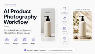
A polished ecommerce image no longer has to begin in a professional studio. With a careful shooting setup, the right AI tools, and a consistent quality-control process, a simple smartphone photo can become a clean catalog image, a branded lifestyle visual, and a marketplace-ready asset—without making the product look fake.
Last updated: August 2026
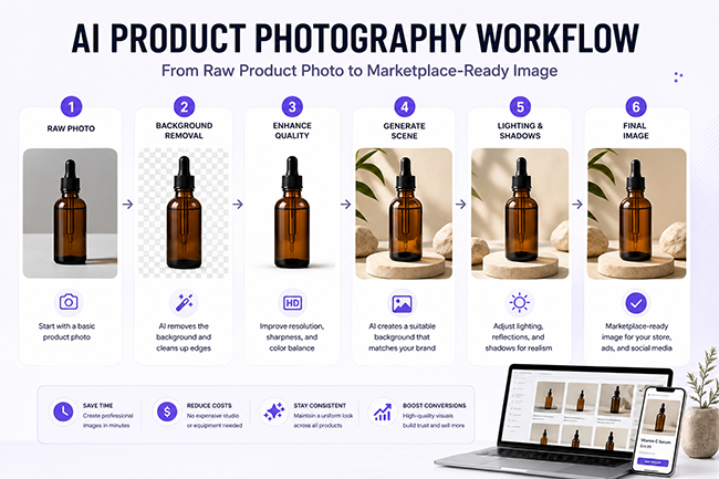
AI product photography is often marketed as a one-click replacement for a traditional photoshoot. In practice, the strongest results come from a workflow, not a single button. AI can remove a background, reconstruct missing edges, improve resolution, generate a setting, add shadows, and prepare multiple formats. But the quality of the final image still depends on the source photo, the accuracy of the product, the lighting direction, and the final human review.
This guide explains a repeatable process for turning a basic product photo into images suitable for a Shopify product page, an Amazon listing, an Etsy shop, social media, email campaigns, and paid ads. It also shows where AI saves time, where it introduces risk, and how to prevent generated details from changing the product customers will actually receive.
For fashion, beauty, homeware, accessories, and marketplace sellers, this workflow also supports more advanced AI commerce projects. Clean product photography makes it easier to create trustworthy lifestyle visuals, prepare assets for virtual try-on, build consistent product galleries, and connect creative production with personalization, recommendations, and paid advertising.
Best AI Tools for Product Photography in 2026.
Use that collection to choose a platform; use this workflow to decide what to do with it.
How to use this guide:
Start here when your store already has a product image and needs to turn it into a reliable ecommerce asset. If you are planning a wider AI commerce stack, also read our AI eCommerce tools guide. For apparel visualization, connect this image-preparation process with our AI virtual try-on workflow.
Why an AI Product Photography Workflow Matters
Traditional product photography combines several disciplines: capture, lighting, styling, retouching, color correction, file preparation, and art direction. AI does not eliminate those decisions. It compresses them into a faster digital process. That can reduce production time dramatically, especially for small ecommerce teams that need many variations from a limited number of source images.
The main advantage is not simply “creating photos faster.” It is the ability to build a reusable production system. One clean product cutout can become:
- a white-background catalog image;
- a lifestyle scene for a landing page;
- a vertical creative for Instagram Stories;
- a square image for an ecommerce collection page;
- a seasonal campaign image;
- a variation with space for ad copy;
- a localized visual for a different market.
Modern tools already support several parts of this pipeline. Photoroom documents AI backgrounds, product staging, shadows, and product beautification, while Pixelcut provides background removal, product-photo generation, upscaling, and batch editing. Shopify’s own media editor can also remove or replace image backgrounds. These capabilities make AI useful as a production layer, but every generated result still needs to be checked against the original product. Product staging systems themselves warn that complex shapes, patterns, and text can differ from the source image.
Use AI to change the presentation of the product—not the identity of the product.
Before You Begin: Define the Final Image Set
A common mistake is opening an AI editor before deciding where the image will be used. The correct workflow begins with deliverables. A hero image for a Shopify store, a main image for Amazon, and an Instagram ad do not have the same job.
For a single product, a practical starter set is:
- one clean main image;
- two alternate angles;
- one detail close-up;
- one scale or in-use image;
- two lifestyle variations;
- one vertical social version;
- one promotional version with negative space for text.
The complete workflow at a glance
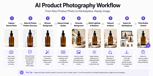
Step 1: Capture a Strong Raw Product Photo
AI can repair small imperfections, but it cannot reliably reconstruct a product that is hidden, blurred, distorted, or photographed from a confusing angle. The source image remains the foundation of the workflow. A modest smartphone photo with clean lighting will usually outperform a dramatic but poorly exposed image.
Use soft, directional light
Place the product near a large window or use a diffused light source. Soft directional light creates enough shape for the AI to understand the object while avoiding harsh highlights that may be mistaken for missing areas. Reflective products, glossy packaging, glass, metal, and jewelry require extra care because reflections are part of the product’s visual structure.
Keep the camera stable and the lens clean
Use a tripod, phone stand, or stable surface. Clean the lens before shooting. Avoid digital zoom because it reduces available detail. Photograph at the highest practical resolution and leave some space around the product so the background-removal tool can identify the full outline.
Photograph several useful angles
Take a front view, a three-quarter view, a side view, and one detail close-up. Even when the final image will be AI-generated, alternate angles help you verify whether the model has changed proportions, closures, labels, handles, texture, or packaging.
Use a simple temporary background
A plain wall, paper sweep, foam board, or uncluttered tabletop is enough. High contrast between the product and the temporary background improves segmentation. A transparent bottle on a similarly colored background, for example, is much harder to isolate cleanly.
Raw-photo checklist
- The entire product is visible and in focus.
- Brand names and packaging text are readable.
- The product color looks close to reality.
- There are no fingers, clips, dust, or distracting reflections.
- Important edges are not cropped.
- You have at least one reference photo from another angle.
Step 2: Select the Best Source Image and Protect Product Accuracy
Do not send every photo directly into the AI workflow. First, choose the frame with the most accurate proportions, cleanest edges, and most useful lighting. Then identify the details that must not change.
Create a short “accuracy map” for the product:
- exact silhouette;
- logo placement;
- label wording;
- number of buttons, pockets, handles, stones, or openings;
- material texture;
- color and finish;
- packaging quantity;
- included accessories.
This is especially important for cosmetics, food packaging, electronics, fashion, jewelry, homeware, and products with printed labels. Generative systems may redraw tiny text, smooth out seams, add reflections, remove hardware, or create a more symmetrical object than the real product.
If the product is apparel and the same images may later be used for fitting-room features, connect this step with a dedicated AI virtual try-on workflow. Fashion images need an even stricter product-truth layer because the AI must preserve silhouette, construction, fabric behavior, color, and customer trust.
Create a master product file
Save one high-resolution master image before any destructive editing. Keep the original photo, a cleaned cutout, and the final exports in separate folders. A simple file structure prevents accidental overwriting:
Product-Name/
├── 01-originals/
├── 02-cutouts/
├── 03-ai-scenes/
├── 04-approved/
└── 05-exports/
Step 3: Remove and Clean the Background
Background removal is usually the first AI-assisted stage. It separates the product from the original environment and creates a flexible asset for new compositions. Dedicated tools can do this automatically, but the result should be inspected at high zoom.
Check difficult edges
Pay attention to hair, fur, fine chains, translucent packaging, glass, steam, fabric fringes, shadows, and reflective edges. An automatic cutout may remove part of the object or leave a colored halo from the original background.
Decide whether to keep the original shadow
A natural shadow can help preserve realism, but it may conflict with a new background. Keep it only when the direction, softness, and color are compatible with the intended scene. Otherwise, remove it and create a controlled shadow later.
Export a transparent master
Save the isolated product as a high-resolution PNG or another format that preserves transparency. This cutout becomes the reusable core of the entire workflow. Do not repeatedly remove the background from compressed screenshots; always work from the cleanest source.
Photoroom and Pixelcut both provide automated background removal, and Shopify’s media editor can remove or replace backgrounds directly inside the commerce workflow. Pixelcut also documents batch background removal for multiple images, which can be useful when processing a catalog.
Step 4: Improve Resolution, Sharpness, and Color Carefully
Enhancement should recover clarity—not invent new product details. AI upscalers can improve the appearance of low-resolution images, but aggressive settings may create false texture, sharpen label edges incorrectly, or turn subtle material grain into a synthetic pattern.
Correct exposure before heavy enhancement
Adjust white balance, brightness, contrast, and highlights first. If the product is too dark, an upscaler may reinforce noise. If the highlights are clipped, AI may guess at missing information rather than recover it.
Upscale only as much as needed
Choose the export dimensions based on the destination. Shopify notes that square product images around 2048 × 2048 pixels usually display well, while Amazon recommends images at least 1,000 pixels on the longest side for zoom-related functionality. There is no benefit in generating enormous files when the source lacks genuine detail.
Compare texture at 100 percent
After enhancement, inspect fabric weave, engraved details, print, stitching, edges, and transparent materials. Compare the result side by side with the original. If the enhanced version looks more impressive but less accurate, reduce the strength.
Step 5: Generate a Background That Supports the Product
AI background generation is where the workflow becomes most creative. A clean cutout can be placed in a studio setup, a lifestyle environment, a seasonal campaign, or an abstract brand scene. The best prompt describes the environment, surface, lighting, camera perspective, mood, color palette, and available negative space.
Write prompts like an art director
A weak prompt:
Put this bottle in a nice bathroom.
A stronger prompt:
Minimal premium skincare bathroom, warm limestone vanity, soft morning window light from the left, muted beige and ivory palette, realistic contact shadow, eye-level camera, shallow depth of field, uncluttered background, negative space on the right for headline text.
The second prompt controls the details that affect composition and realism. It also gives the tool information about lighting direction, which will matter in the next step.
Match the perspective
If the product was photographed at eye level, do not generate a background viewed dramatically from above. The horizon, surface angle, and camera height must agree. Perspective mismatch is one of the fastest ways to make an AI composite look fake.
Choose backgrounds based on selling context
- Catalog: neutral, distraction-free, accurate.
- Luxury: restrained materials, directional light, generous negative space.
- Natural or sustainable: organic textures, soft daylight, credible props.
- Technology: clean surfaces, controlled gradients, subtle reflections.
- Food and beverage: believable ingredients and serving context, without creating claims the product cannot support.
Photoroom’s product staging documentation notes that generated scenes can differ from the original product, particularly when patterns, shapes, and text are complex. Treat every generated scene as a draft requiring verification.
Step 6: Match Lighting, Contact Shadows, and Reflections
A product can be perfectly cut out and still look pasted into the scene. Lighting integration is what makes the final image believable.
Identify the key light direction
Look at the brightest side of the product and the direction of existing highlights. The generated environment should use a similar light source. If the product is lit from the left but the background suggests strong light from the right, regenerate the scene or relight the product.
Add a contact shadow
The darkest part of a shadow is usually closest to the object. It becomes softer and lighter as it moves away. A floating product often needs only a subtle contact shadow directly below it. Avoid the generic dark oval that many automated tools create.
Use reflections only when the surface demands them
Glass, polished stone, glossy acrylic, or metal may produce a reflection. Wood, fabric, matte paper, and rough concrete usually do not. The reflection should follow the product shape and fade naturally.
Keep color spill believable
A bright colored wall may cast a slight tint onto the product. A warm sunset scene may add warmth to highlights. Total isolation from the environmental color makes the object look composited, but excessive color spill can change the product’s actual color.
Step 7: Retouch Artifacts Without Rebuilding the Product
Generative fill and object removal are useful for dust, small creases, unwanted props, and minor background problems. They become risky when applied directly over logos, packaging text, jewelry settings, product controls, or structural features.
Safe retouching tasks
- remove dust and temporary support materials;
- clean small background artifacts;
- extend a surface or wall;
- repair an incomplete shadow;
- remove a distracting reflection that was not part of the product;
- add more negative space around the composition.
High-risk retouching tasks
- redrawing labels or legal text;
- changing garment fit;
- making food portions larger;
- removing product seams, closures, or hardware;
- altering gemstones, screen content, connectors, or controls;
- changing color to a shade that is not sold.
For text-heavy packaging, keep the real label from the original photo whenever possible. Generate the scene around the product rather than asking the model to recreate the packaging from scratch.
Step 8: Resize and Adapt the Image for Each Marketplace
One final image should not be exported blindly to every channel. Build a master composition, then create channel-specific versions.
Shopify
Shopify accepts product and collection images up to 5000 × 5000 pixels or 25 megapixels, with files under 20 MB. Its documentation recommends approximately 2048 × 2048 pixels for square product images. Consistency across the catalog usually matters more than using the maximum size.
Amazon
Amazon’s image guidance emphasizes accurate product representation, clear unpixelated files, and sufficient dimensions. Main-image rules can vary by category, so sellers should confirm the current requirements in Seller Central before publishing. Keep a separate compliant catalog version rather than using a decorative lifestyle image as the main listing image.
Etsy and social platforms
For Etsy, show the product clearly in the first frame and use later gallery images for styling, scale, packaging, and process. For social media, prepare vertical and square crops separately. Do not rely on automatic cropping when the product sits close to the edge.
Build a safe crop zone
Keep important product details away from extreme edges. Leave room for mobile interfaces, ad copy, pricing labels, and platform overlays. Store a text-free master so the image can be reused for different regions and campaigns.
Step 9: Run a Final Marketplace-Ready Quality Check
The final review should happen at three levels: accuracy, visual quality, and channel compliance.
Product accuracy
- Does the silhouette match the real product?
- Are logos, labels, quantities, and accessories correct?
- Is the color realistic on multiple screens?
- Did AI add, remove, or redesign any feature?
Visual integration
- Do the perspective and camera angle match?
- Does the lighting come from one believable direction?
- Is the contact shadow natural?
- Does the background support rather than dominate the product?
- Are there duplicated props, melted edges, or impossible reflections?
Export quality
- Is the image large enough for the destination?
- Is the file compressed without visible artifacts?
- Is the crop safe on mobile?
- Is the filename descriptive?
- Is alt text written for the page where the image will appear?
Recommended AI Tool Stack by Workflow Stage
You do not need a different paid application for every step. A small store can often complete the workflow with one product-photo platform plus a general editor. A larger catalog may benefit from batch tools and reusable templates.
If product images are part of a broader conversion, personalization, or retention strategy, review our guide to AI tools for eCommerce to see how product visuals connect with search, recommendations, upsells, pricing, and customer journeys.
Choose tools based on your actual bottleneck. A store with clean product photos may need only background generation and resizing. A marketplace seller processing hundreds of supplier images may care more about batch removal, upscaling, and consistent cropping.
Three Practical AI Product Photography Workflows
Workflow A: Fast marketplace listing
Best for: resellers, small catalogs, secondhand products, and simple packaging.
- Capture the product against a plain background.
- Remove the background automatically.
- Correct exposure and color.
- Add a subtle contact shadow.
- Export a clean square image.
- Create one secondary lifestyle variation.
- Compare both versions with the physical product.
This workflow prioritizes accuracy and speed. Avoid decorative AI generation for the main image when marketplace rules require a neutral presentation.
Workflow B: Branded Shopify product gallery
Best for: direct-to-consumer brands, cosmetics, accessories, homeware, and packaged goods.
- Create a high-quality transparent cutout.
- Build a consistent brand background system.
- Generate two lifestyle scenes with the same palette and lighting language.
- Create one detail image using the real product photograph.
- Add a scale or in-use image.
- Export all images with consistent framing.
- Save the prompt, background references, and crop rules as a reusable style guide.
The goal is not for every image to use an identical background. Photoroom recommends similar rather than identical AI backgrounds across multiple designs because each scene is generated around the lighting, angle, shadow, and colors of the source image.
Workflow C: Campaign and paid-ad variations
Best for: seasonal launches, promotions, and rapid creative testing.
- Start from an approved product cutout.
- Create three visual directions: clean studio, lifestyle, and bold campaign.
- Generate landscape, square, and vertical compositions intentionally.
- Reserve negative space for copy.
- Test different backgrounds without changing the product.
- Use a consistent offer and landing page.
- Track which visual direction earns the strongest click-through and conversion rate.
AI makes variation inexpensive, but excessive variation can weaken brand recognition. Keep product scale, color treatment, typography, and visual hierarchy consistent.
Common AI Product Photography Mistakes
1. Asking AI to regenerate the entire product
This often changes packaging text, proportions, materials, and small structural details. Preserve the real product and generate the scene around it.
2. Starting with a poor source photo
Blur, clipped highlights, and missing edges create weak inputs. The tool may produce a polished image that is less truthful than the original.
3. Using an impressive but irrelevant background
A cinematic environment may attract attention but reduce clarity. The scene should communicate the use, quality, audience, or brand position of the product.
4. Ignoring light direction
Even non-designers notice when a shadow falls one way and the background light comes from another. Match the scene to the source image or relight carefully.
5. Treating AI upscale as real detail
Upscalers estimate detail. They cannot recover information that was never captured. Check texture, print, and tiny product features after enhancement.
6. Publishing only lifestyle images
Customers still need a clear, accurate view. Pair aspirational visuals with clean catalog images, alternate angles, and detail shots.
7. Forgetting marketplace rules
A visually beautiful image can still be rejected or perform poorly if it does not meet platform or category requirements.
8. Creating inconsistent products across a gallery
If the cap, label, color, or proportions shift from one image to the next, customers may lose trust. Use one approved master cutout whenever possible.
How to Scale the Workflow Across a Product Catalog
Once the process works for one product, turn it into a system. Document the decisions that should remain consistent:
- preferred camera angle;
- product scale within the frame;
- background palette;
- surface materials;
- shadow softness and direction;
- export dimensions;
- filename structure;
- alt-text pattern;
- approval checklist;
- which details must never be generated.
Create reusable prompt templates
Store prompts by visual purpose rather than by individual product:
- minimal catalog studio;
- warm natural lifestyle;
- premium stone pedestal;
- bold social campaign;
- seasonal holiday scene;
- vertical ad with negative space.
Then replace only the variables that genuinely need to change. This produces a recognizable visual system while preserving flexibility.
Use batch processing selectively
Batch tools are effective for standard tasks such as background removal, cropping, and upscaling. They are less reliable for products with transparent materials, complex edges, unusual packaging, or reflective surfaces. Flag these items for manual review instead of forcing the entire catalog through one automated preset.
Keep human approval at the end
A useful approval system includes a visual reviewer and, where needed, a product expert who knows the exact packaging or construction. The final sign-off should confirm that the image is attractive, truthful, and suitable for its destination.
SEO and Accessibility for AI Product Images
The visual workflow is only part of the publishing process. Images should also help the page load efficiently and make sense to search engines and users who rely on assistive technology.
- Use descriptive filenames such as
amber-skincare-serum-lifestyle-image.webp. - Write concise alt text that describes the product and relevant context.
- Do not stuff alt text with repetitive keywords.
- Export modern compressed formats where supported.
- Serve appropriately sized images rather than uploading the largest master everywhere.
- Include the product image near relevant page content.
- Use real captions when they provide additional context.
For an ecommerce page, useful alt text might be:
Amber glass facial serum bottle on a light stone surface with soft natural shadows.
That is more helpful than “AI product photography image best serum ecommerce photo 2026.”
Recommended Next Reads on DesignRise
- Best AI Tools for Product Photography in 2026 — compare dedicated platforms for background removal, product staging, AI scenes, and batch production.
- Best AI eCommerce Tools for Online Stores in 2026 — explore tools for personalization, search, recommendations, pricing, fraud prevention, and retention.
- AI Virtual Try-On Workflow for Fashion Ecommerce — build a controlled workflow for apparel visualization, product truth, customer trust, and scale.
- AI Virtual Try-On Platforms for Fashion Ecommerce — compare shopper-facing apps, enterprise APIs, AR tools, and AI fitting-room systems.
- How AI Is Changing Ecommerce Photography — understand the trust problem behind generative product imagery.
Frequently Asked Questions
Can AI completely replace a product photographer?
For straightforward catalog images and rapid lifestyle variations, AI can replace parts of the production process. Complex reflective products, luxury campaigns, food styling, people, exact color-critical work, and high-end brand launches may still benefit from professional photography and art direction.
What is the most important step in the workflow?
The source photo and final accuracy check are equally important. A strong input reduces correction work, while the final review prevents AI-generated errors from reaching customers.
Should the product be photographed on white?
A plain contrasting background is usually helpful, but it does not have to be pure white. The best temporary background makes the product outline easy to identify and avoids unwanted color reflections.
Can AI generate product labels and packaging text?
It can attempt to, but small text and exact branding are common failure points. Preserve the original label from a real photograph whenever accuracy matters.
Which image size should I export?
Export for the destination rather than using one universal size. Shopify notes that 2048 × 2048 pixels commonly works well for square product images. Amazon advises sufficiently large, clear images and often uses 1,000 pixels on the longest side as an important threshold for zoom-related functionality, but current category rules should always be checked.
Is AI product photography suitable for small businesses?
Yes. It is especially useful when the business has limited access to studio space, needs frequent campaign variations, or manages a growing catalog. The safest approach is to start with a simple workflow and add automation only after the visual standards are clear.
How many AI-generated variations should I create?
Create enough options to compare compositions, but do not confuse quantity with quality. Three to six purposeful variations for each visual direction are usually more useful than dozens of random scenes.
How can I keep images consistent across many products?
Use the same framing rules, palette, lighting direction, surface family, shadow style, export sizes, and approval checklist. Save reusable prompt templates and keep one approved master cutout for each product.
Final Thoughts
The strongest AI product photography does not call attention to the AI. It presents the product clearly, supports the brand, and gives customers a believable sense of what they are buying. A reliable workflow begins with an accurate source image, separates automated production from creative staging, and ends with a careful human review.
Start with one product and build the complete image set before scaling. Measure how long each stage takes, note where mistakes appear, and save the successful settings. Over time, the process becomes more than a way to create attractive images—it becomes a reusable visual production system for product pages, campaigns, marketplaces, and social content.
Build a smarter creative workflow with DesignRise. Explore practical AI workflows, curated tool collections, and design resources created for modern ecommerce teams, marketers, and visual creators.
Official references used for fact-checking
Discover more from DesignRise
Subscribe to get the latest posts sent to your email.