


")


Free Responsive Website Mockup Templates for UI Designers
A responsive website can look beautiful in Figma, Photoshop, Sketch, or Adobe XD — but clients often need to see how that design will actually appear on real screens. That is why free responsive website mockup templates are so useful for UI designers.
Instead of presenting a flat desktop layout, a responsive mockup lets you show your website design across smartphones, tablets, laptops, desktops, and browser frames. This makes your work easier to understand, more professional, and more realistic.
For UI designers, product designers, web designers, freelancers, and agencies, responsive mockups are not just decorative assets. They help explain layout behavior, visual hierarchy, spacing, and overall design quality across different screen sizes.
In this DesignRise guide, you’ll find a curated collection of free responsive website mockup templates for Figma, Photoshop, Adobe XD, Sketch, and browser-based presentations. These resources can help you improve client presentations, portfolio case studies, landing page previews, and design workflow.
You May Also Like:
- Collection of Vintage Fonts for Your Creative Projects
- 10 Figma Tricks I Wish I Had Known Earlier
- Moons and Stars Free Photoshop Brush Set
Why Responsive Website Mockups Matter
Modern websites are viewed on many devices. A design that looks great on a desktop screen may feel crowded on mobile or too empty on a large monitor. Responsive website mockups help designers present those different screen states clearly.
They are especially helpful when you need to show:
- Desktop website layouts inside realistic browser frames.
- Mobile UI screens on smartphones.
- Tablet versions for responsive design systems.
- Landing page previews for clients and stakeholders.
- Portfolio case studies with polished presentation visuals.
- Website redesign concepts before development begins.
A good responsive mockup can make a design feel more complete, even before the site is coded.
How Responsive Mockups Improve Your Design Workflow
Using responsive mockup templates can save time during presentation, review, and portfolio creation. Instead of manually building device scenes, you can quickly place your design into ready-made layouts.
They Help Clients Understand the Final Website
Clients do not always understand flat wireframes or isolated artboards. A responsive mockup shows the design in a realistic context, making feedback easier and more useful.
They Make Portfolios Look More Professional
Mockups help Behance projects, case studies, and personal portfolio pages feel polished. They add visual rhythm and make the design easier to scan.
They Save Time During Revisions
Many mockups use smart objects, linked layers, or editable frames. You can update the screen once and quickly export a new presentation.
They Support Better Responsive Thinking
When you see a website design across multiple devices, it becomes easier to notice spacing issues, hierarchy problems, and layout inconsistencies.
Quick Comparison: Free Responsive Website Mockup Templates
| Template | Best For | Format |
|---|---|---|
| Web Browser Mockup Templates | Browser-based website presentations | Figma |
| Responsive Resize Kit | Responsive transitions and layouts | Adobe XD |
| Smartphone & Notebook Mockups | Mobile and laptop website previews | PSD |
| Clay Device Mockup Templates | Minimal modern device scenes | Figma |
| Responsive Photoshop UI Mockup | Multi-device UI presentation | PSD |
| Dark Devices Sketch Mockups | Dark-themed interface previews | Sketch |
| Responsive Web Design Showcase | MacBook, iPad, and iPhone showcase | PSD |
| Responsive Mockup Templates | Multiple mockup variations | PSD |
| Responsive Mockup Template | Fast three-screen layout preview | PSD |
1. Web Browser Mockup Templates for Figma
Best for: realistic Chrome and Safari browser presentations
These web browser mockup templates are useful when you want to show a website design inside a familiar browser environment. They help clients understand how the final design may appear online instead of seeing only a flat frame.
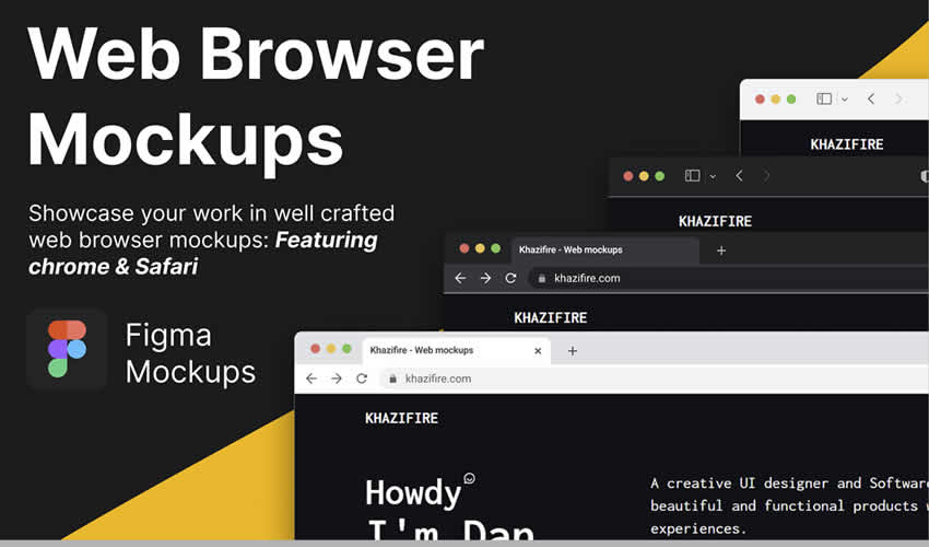
Why Designers May Like It
- Clean browser frame presentation.
- Useful for landing pages and website previews.
- Works well for portfolio case studies.
- Easy to use inside Figma workflows.
2. Responsive Resize Kit for Adobe XD
Best for: showing desktop, tablet, and mobile transitions
The Responsive Resize Kit is useful for designers who work in Adobe XD and need a clean way to present responsive layouts. It includes device-specific mockups that help show how a design adapts across different screen sizes.
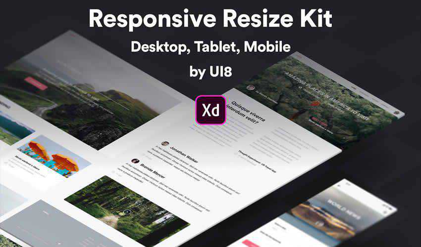
Why Designers May Like It
- Helpful for responsive UI design presentations.
- Includes desktop, tablet, and mobile layouts.
- Useful for explaining layout changes to clients.
- Good for Adobe XD users.
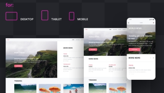
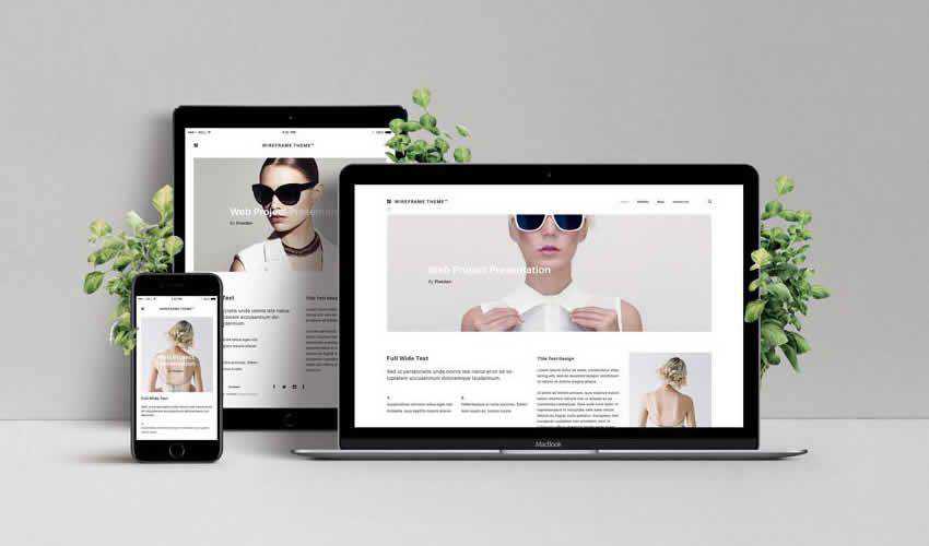
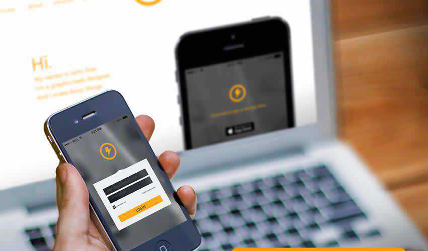
3. Smartphone & Notebook PSD Mockups
Best for: showing a website on mobile and laptop screens together
This set includes smartphone and notebook PSD mockups that help designers present mobile and desktop versions of a website in one scene. It is especially useful for responsive website projects where you need to show how the same design system works across devices.
Why Designers May Like It
- Shows smartphone and laptop screens together.
- Useful for responsive website case studies.
- Layered PSD format supports faster editing.
- Good for portfolio and client presentations.
4. Clay Device Mockup Templates for Figma
Best for: clean, minimal, modern UI presentations
Clay device mockups are popular because they keep the focus on the interface. Instead of using highly realistic device photos, clay mockups use simplified device forms that feel modern, clean, and flexible.
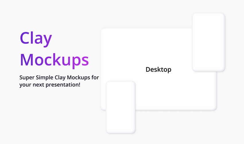
Why Designers May Like It
- Minimal device style keeps the UI readable.
- Great for SaaS, app, and portfolio presentations.
- Works well with modern design systems.
- Useful for Figma-based workflows.
5. Responsive Photoshop UI Mockup Template
Best for: high-resolution multi-device website presentations
This responsive Photoshop UI mockup template includes multiple device views such as desktop, laptop, tablet, and smartphone. It is useful when you want to present a complete responsive design system in one polished composition.
Why Designers May Like It
- Includes four device views.
- High-resolution layout for professional presentations.
- Useful for commercial website previews.
- Good for Photoshop users who need smart object editing.
6. Dark Devices Sketch Mockup Templates
Best for: dark-themed website and app previews
These dark device mockup templates are useful for designers who want dramatic, premium-looking UI presentations. Dark backgrounds can work especially well for tech products, SaaS dashboards, music apps, gaming interfaces, and futuristic website concepts.
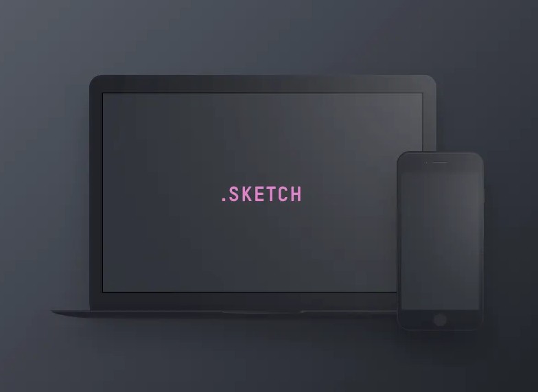
Why Designers May Like It
- Strong dark visual style.
- Good for modern app and website showcases.
- Useful for Sketch App users.
- Helps create bold portfolio presentations.
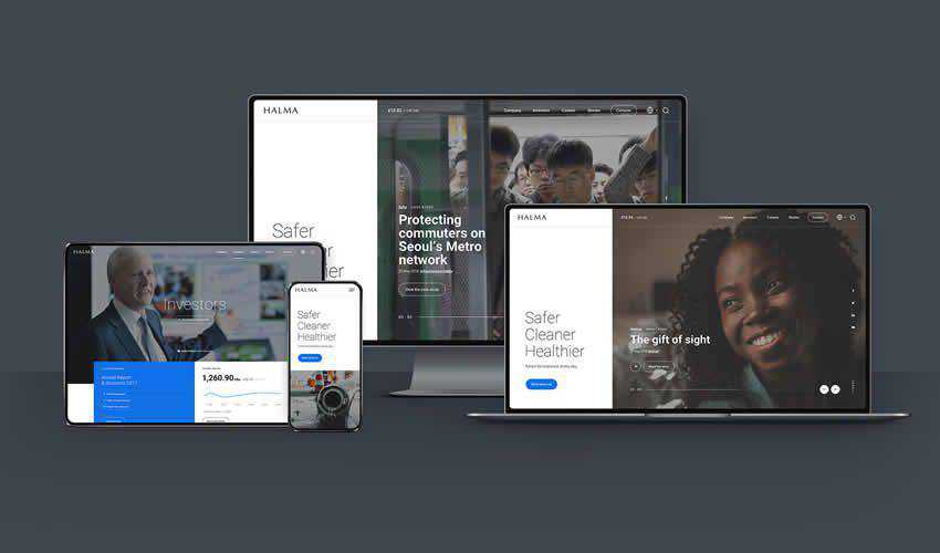
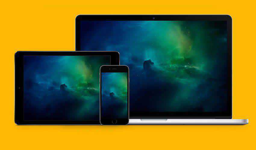
7. Responsive Web Design Showcase Mockup
Best for: MacBook, iPad, and iPhone website previews
This responsive web design showcase mockup includes several Apple-style devices in one scene. It is a practical option for showing how a website design adapts across desktop, tablet, and mobile screens.
Why Designers May Like It
- Shows multiple device sizes in one composition.
- Useful for responsive website redesigns.
- Smart object editing helps speed up updates.
- Good for client decks and portfolio pages.
8. Responsive Mockup Templates PSD
Best for: varied responsive website presentation scenes
This collection includes multiple responsive mockup templates with editable layers and flexible presentation styles. It is useful for designers who want more than one layout option for portfolios, landing pages, and client previews.
Why Designers May Like It
- Includes multiple mockup variations.
- Supports different responsive presentation needs.
- Editable layers make customization easier.
- Useful for quick website showcase graphics.
9. Responsive Mockup Template PSD
Best for: fast website layout showcasing
This simple responsive mockup template is useful when you need a quick layout preview with several screen sizes. It can help show desktop, tablet, and mobile design states without building a complex presentation from scratch.
Why Designers May Like It
- Simple and fast to use.
- Good for rapid website previews.
- Includes multiple screen sizes.
- Useful for quick client feedback.
How to Choose the Right Responsive Website Mockup
The best responsive website mockup template depends on the type of project you are presenting. A corporate website, mobile app landing page, SaaS dashboard, eCommerce homepage, and portfolio website may all need different presentation styles.
Before choosing a template, ask:
- Do I need a browser frame, device mockup, or full responsive showcase?
- Will the mockup make the design easier to understand?
- Does the visual style match the brand?
- Is the file format compatible with my workflow?
- Can I replace the screens quickly?
- Is the mockup clean enough for portfolio use?
- Does the license allow client or commercial work?
A mockup should support the design, not distract from it. Clean, realistic, and well-structured templates usually work better than overly decorative scenes.
Why These Templates Elevate Your Workflow
- Device flexibility: cover phones, tablets, laptops, desktops, and browser frames.
- Faster presentation: replace placeholder screens instead of building scenes manually.
- Multiple platforms supported: work across Figma, Photoshop, Adobe XD, and Sketch.
- High-resolution output: create sharper visuals for portfolios and client decks.
- Better storytelling: show how the design works in real device contexts.
- Reusable workflow: save your favorite mockups and use them across multiple projects.
Tips for Better Website Mockup Presentations
Use Real Content When Possible
A mockup with real headlines, product names, images, and UI states feels much stronger than one filled with placeholders.
Keep Device Styles Consistent
Mixing too many device styles can make a presentation feel messy. Use matching device frames and similar lighting when building a case study.
Show Both Mockups and Flat Screens
Mockups are great for storytelling, but flat screens are still important for showing details clearly. Use both in portfolio projects.
Optimize Images for Web
Responsive mockups can be large files. Compress images before publishing so your website loads faster.
Check Mobile Readability
Large device mockups may look great on desktop but too small on mobile. Preview your article or portfolio page on different screens before publishing.
Common Mistakes to Avoid
- Using low-resolution mockups: blurry previews make good designs look unprofessional.
- Choosing mockups that hide the UI: extreme angles can reduce readability.
- Overusing too many devices: sometimes one clean mockup is stronger than a crowded scene.
- Ignoring the license: always check whether free mockups can be used commercially.
- Forgetting responsive behavior: show meaningful layout differences, not just the same image scaled down.
- Not updating old device frames: outdated devices can make a modern project feel less current.
FAQ: Free Responsive Website Mockup Templates
What is a responsive website mockup template?
A responsive website mockup template is a presentation file that shows a website design across multiple screen sizes, such as desktop, tablet, and mobile devices.
Why should UI designers use responsive mockups?
Responsive mockups help UI designers present websites in realistic contexts. They make it easier for clients and stakeholders to understand how a design works across devices.
Are free responsive mockups good enough for client work?
Many free mockups are good enough for client presentations, portfolios, and early design previews. However, always check quality, file resolution, and usage license before using them commercially.
Which format is best for responsive website mockups?
It depends on your workflow. Figma mockups are great for UI design collaboration, PSD mockups are useful for realistic smart object editing, Adobe XD works well for XD users, and Sketch mockups are useful for Sketch-based teams.
Can I use PSD mockups in Figma?
Yes. You can edit the PSD mockup in Photoshop, export the final scene as an image, and then place it into Figma for a case study, presentation, or portfolio layout.
How do I make my mockup presentation look better?
Use consistent scenes, real content, clean spacing, high-resolution images, and a logical story. Avoid clutter and choose mockups that keep the design itself as the main focus.
Final Thoughts
Free responsive website mockup templates are valuable resources for UI designers who want to present websites more clearly and professionally. They help transform flat layouts into realistic previews across phones, tablets, laptops, desktops, and browser frames.
Whether you work in Figma, Photoshop, Adobe XD, or Sketch, the right mockup can save time, improve client communication, and make your portfolio stronger. Use these templates to show responsive behavior, explain design decisions, and make your website concepts feel closer to the final product.
The best mockup does not replace strong UI design. It helps strong UI design communicate better.
Explore more mockup templates, UI/UX resources, and creative tools on DesignRise.
Discover more from DesignRise
Subscribe to get the latest posts sent to your email.


