





Free Cyrillic fonts are essential for designers creating branding, websites, posters, packaging, editorial layouts, social media graphics, and digital products for audiences that use Cyrillic-based languages.
But good Cyrillic typography is not simply a Latin font with extra characters added at the end.
The Cyrillic alphabet has its own proportions, rhythm, letter relationships, and language-specific characters. A typeface may technically contain Cyrillic glyphs and still feel inconsistent when Latin and Cyrillic text appear together. Another font may look beautiful in Russian but be missing characters required for Ukrainian, Bulgarian, Serbian, or other languages.
That makes font selection especially important for multilingual design.
This DesignRise collection brings together 30 free Cyrillic fonts and free-to-download Cyrillic typeface resources covering modern sans serifs, elegant serif families, handwriting, script fonts, typewriter styles, geometric grotesques, vintage typography, experimental display fonts, and futuristic typefaces.
They can be explored for:
- Ukrainian and other Cyrillic-language branding.
- Logo and identity design.
- Websites and UI projects.
- Editorial layouts and magazines.
- Posters and advertising.
- Packaging and product labels.
- Social media graphics.
- Invitations and stationery.
- Technology and gaming projects.
- Luxury and fashion branding.
This guide also explains how to check Cyrillic language coverage, what Ukrainian designers should test before choosing a font, how to combine Latin and Cyrillic typography, how to choose between display and text families, and why font licensing should always be reviewed individually.
Licensing note: “free font” and “free download” do not automatically mean unrestricted commercial use. Some typefaces in this collection may offer commercial-friendly licensing, while others may provide only personal-use or demo versions. Always check the current license on the original source page before using a font in paid branding, client projects, packaging, merchandise, websites, apps, advertising, or products.
Explore More DesignRise Resources:
- New Free Mockup Templates for Branding and Design Projects
- Pixel Perfect: The Best Pixel Fonts Every Designer Should Try
- Best Figma Fonts for UI Projects and How to Add Them
- Explore More Font Collections on DesignRise
Free Cyrillic Fonts: What Designers Should Check First
Seeing the word “Cyrillic” on a download page is only the beginning.
Check the Exact Language You Need
Cyrillic support is not identical across languages.
For example, a Ukrainian project may require characters such as:
- Ґ ґ
- Є є
- І і
- Ї ї
A typeface designed primarily around another Cyrillic language may not include every character your project requires.
Test Latin and Cyrillic Together
Many contemporary brands use both scripts:
- Brand name in Latin.
- Product description in Ukrainian.
- Website navigation in Cyrillic.
- International campaign copy in English.
The two alphabets should feel like parts of the same type family rather than unrelated fonts forced together.
Check Numerals and Punctuation
Do not forget:
- Prices.
- Dates.
- Phone numbers.
- Currency symbols.
- Apostrophes.
- Quotation marks.
- Dashes.
These details become especially important in packaging, websites, editorial layouts, and commercial branding.
Which Cyrillic Font Style Should You Choose?
30 Free Cyrillic Fonts for Designers
1. Vetka Font
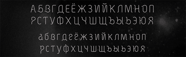
Best for: branding accents, invitations, social graphics, packaging, posters, stationery, and artistic typography.
Vetka is a handwritten Cyrillic typeface with an expressive and personal character. Its irregular movement makes it useful when a project needs warmth and individuality rather than strict geometric precision.
Use It as an Accent
A handwritten font can become much stronger when surrounded by clean typography. Try Vetka for the brand name or headline and use a neutral sans serif for supporting information.
2. Forum Font
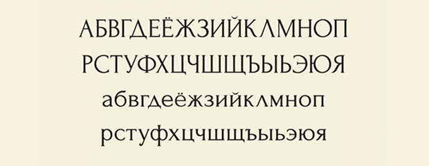
Best for: editorial design, cultural projects, luxury branding, invitations, packaging, book covers, and sophisticated titles.
Forum brings a more classical serif direction to the collection. It works naturally when a project needs authority, elegance, or a historical undertone without relying on highly decorative lettering.
Useful for Editorial Hierarchy
Pair a serif display title with a cleaner sans-serif body typeface to create contrast without sacrificing readability.
3. Ronduit Capitals Light Font
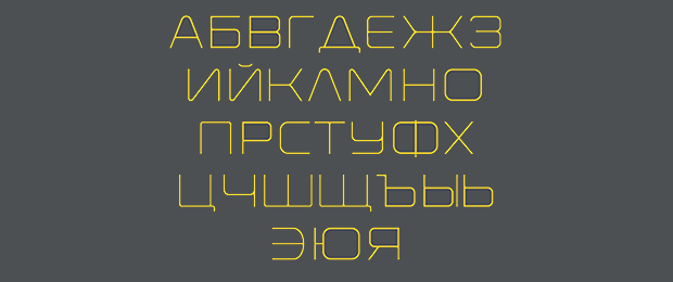
Best for: logos, poster titles, modern branding, magazine covers, labels, and minimalist compositions.
Ronduit Capitals Light works primarily as display typography. Its lighter proportions can create a more refined visual atmosphere than a heavy geometric headline.
Give thin letters enough contrast against the background, especially when the design will be viewed on mobile.
4. Marske Font
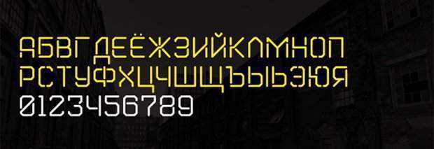
Best for: posters, music graphics, creative branding, packaging, event titles, and experimental layouts.
Marske has a stronger display personality than a conventional workhorse sans serif, making it useful where typography needs to become part of the visual concept.
5. Bad Script Font
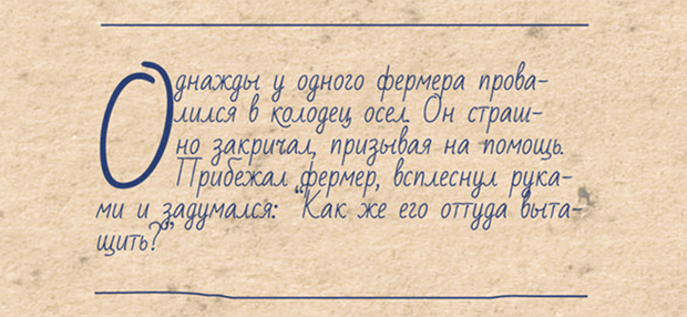
Best for: notes, quotes, invitations, personal branding, social media, greeting cards, and casual editorial accents.
Bad Script imitates natural everyday handwriting more than formal calligraphy. That makes it useful when the design should feel personal and approachable rather than luxurious or ceremonial.
6. Monitorica Font
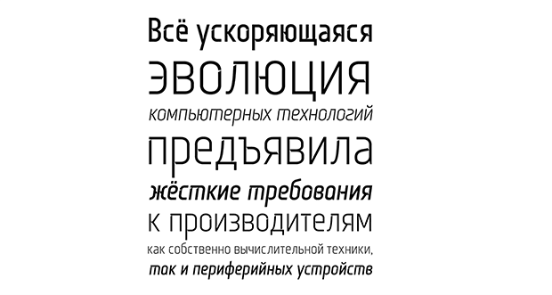
Best for: websites, interfaces, technology, presentations, modern branding, posters, and digital layouts.
Monitorica moves toward a cleaner geometric system and is therefore easier to integrate into contemporary digital projects than highly decorative Cyrillic display fonts.
Test It Beyond the Headline
If you plan to use a typeface for UI or websites, test navigation, buttons, numerals, short paragraphs, and mobile sizes rather than judging only the display specimen.
7. Toxigenesis Font
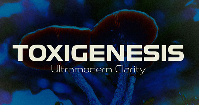
Best for: technology, science, automotive, gaming, product design, software, and futuristic branding.
Toxigenesis uses smooth superelliptical forms inspired by industrial and consumer-product design. Its character feels technical without becoming as aggressive as many sci-fi display fonts.
Let the Font Provide the Future
You may not need neon gradients, circuit graphics, chrome, and glitch effects around it. A restrained layout can make futuristic typography feel more contemporary.
8. Basenji Font Family
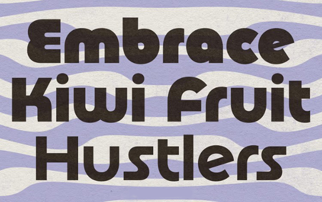
Best for: branding, lifestyle projects, packaging, editorial, posters, signage, and friendly modern identities.
Basenji combines geometric construction with softer rounded forms and a subtle 1970s influence. This makes it useful when a conventional geometric sans serif feels too cold.
9. Breamcatcher Font
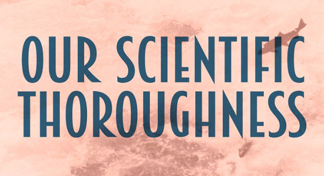
Best for: hospitality, music, editorial design, premium packaging, invitations, posters, and vintage-inspired branding.
Breamcatcher references 1930s Art Deco typography through slim proportions and a more relaxed decorative rhythm.
Keep the Surrounding Design Contemporary
A historically inspired font does not require every element around it to be vintage. Clean photography and modern layout can create a more interesting contrast.
10. Lemon Tuesday Font
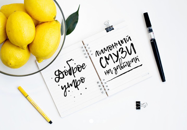
Best for: branding accents, social media, invitations, packaging, quotes, beauty, lifestyle, and casual posters.
Lemon Tuesday offers smooth brush-script movement while keeping the overall letterforms relatively clear.
Use it for short statements, names, labels, or highlighted words instead of forcing it into long copy.
11. Kyiv Machine Font
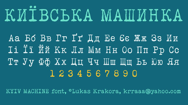
Best for: Ukrainian editorial graphics, retro posters, historical-inspired design, book covers, archives, cultural projects, and typewriter aesthetics.
Kyiv Machine uses a deliberately mechanical typewriter language and is especially relevant when the visual concept depends on printed, archival, documentary, or analog references.
License reminder: check the original source before commercial use, as the free version may have usage restrictions.
12. Vintage Mintage Font
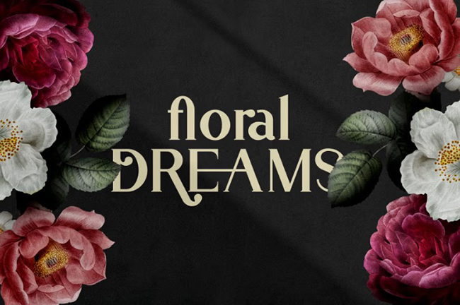
Best for: retro logos, labels, packaging, posters, café branding, handmade products, and nostalgic social graphics.
Vintage Mintage offers a warmer decorative direction for projects where a clean contemporary sans serif would feel too neutral.
License reminder: verify the current terms before professional or client use.
13. Fledgling Font
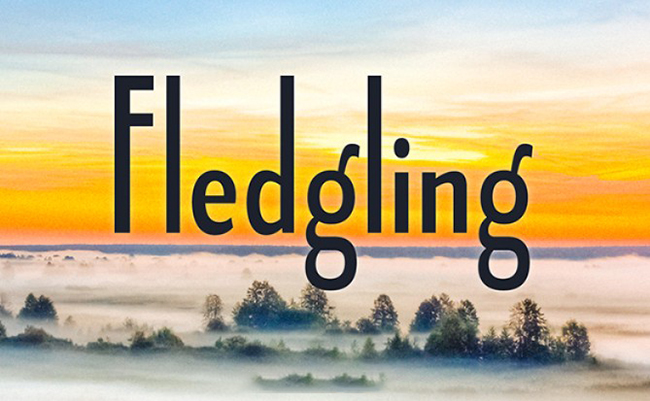
Best for: editorial design, luxury branding, fashion, magazines, packaging, logo concepts, and sophisticated digital layouts.
Fledgling uses refined proportions, a relatively low x-height, and graceful curves to produce a more distinctive personality than a neutral modern sans serif.
Useful When You Need a Family, Not Just a Display Font
Multiple weights and additional typographic features give a family more flexibility for building hierarchy across one visual system.
14. Slimamif Font
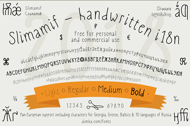
Best for: posters, experimental branding, social campaigns, packaging, titles, and distinctive logo concepts.
Slimamif relies on thin expressive forms that make it better suited to display use than dense text.
Use it large enough for its unusual character to remain visible.
15. Amorthe Font Family
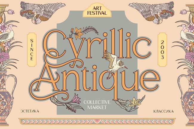
Best for: premium packaging, wine labels, beauty, fashion, perfume, skincare, magazines, and luxury identities.
Amorthe is a multilingual serif family with a broad weight range, making it significantly more flexible than a single decorative serif.
Build Luxury Through Typography, Not Effects
High-quality serif forms, controlled spacing, and strong photography can feel more premium than adding gold gradients and decorative frames everywhere.
16. Aukim II Font Family
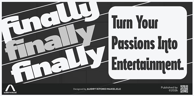
Best for: branding systems, editorial design, websites, packaging, advertising, presentations, and professional layouts.
Aukim II offers a cleaner and more restrained typographic direction. This type of family can support both visual identity and functional communication when a decorative font would be too limiting.
17. Pangi Font Family
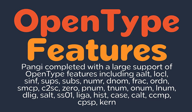
Best for: international branding, UI, digital products, editorial, posters, information design, and multilingual identities.
Pangi uses fundamental geometric construction while offering extensive multilingual coverage and a large glyph system.
Strong Choice for Complex Language Systems
When a project includes several alphabets, the quality and consistency of the family across languages can matter more than one particularly decorative headline.
Check the current commercial licensing terms before professional use.
18. Movavi Grotesque Font Family
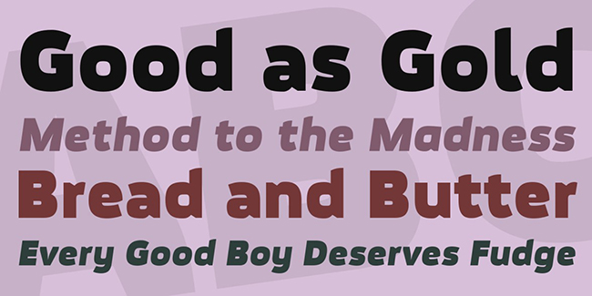
Best for: software branding, technology, video projects, digital campaigns, posters, interfaces, and creative advertising.
Movavi Grotesque has enough character for display typography while remaining connected to a functional digital environment.
19. Clofie Font Family
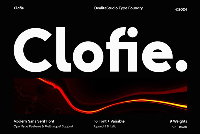
Best for: elegant branding, editorial layouts, websites, packaging, logo concepts, and clean social-media graphics.
Clofie moves toward a minimal modern aesthetic and works best where typography should support the visual identity without overpowering it.
License reminder: check the source page for current personal and commercial terms.
20. Renco Font Family
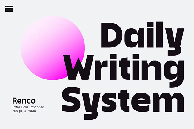
Best for: brand identities, packaging, editorial, web design, social campaigns, and corporate visual systems.
Renco is useful for projects that need a clean modern appearance without moving into a highly experimental typographic direction.
License reminder: verify the current demo and commercial-use conditions on the original page.
21. Chalga Outline Demo Font
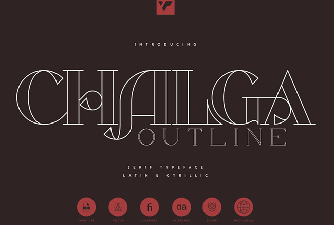
Best for: posters, packaging, magazine titles, hospitality, editorial graphics, and decorative branding.
Chalga combines vintage serif character with an outlined display treatment, making it more suitable for headlines than extended text.
License reminder: this is a demo resource, so confirm commercial rights before professional use.
22. Nolly Roho DEMO Font
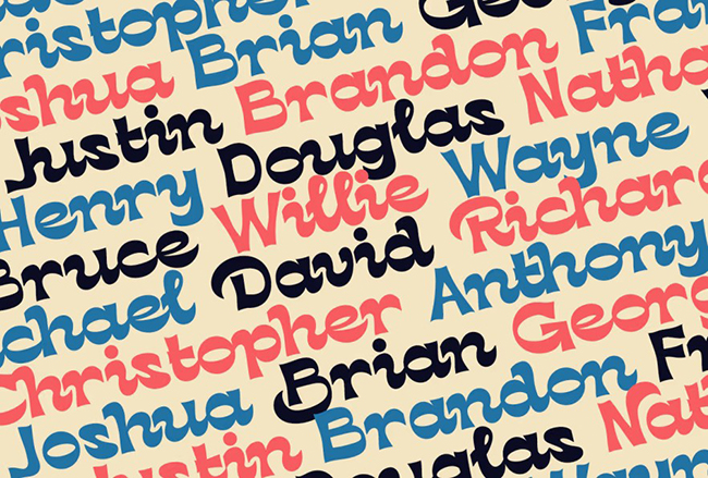
Best for: packaging, posters, handmade branding, social content, labels, invitations, and expressive headlines.
Nolly Roho offers a softer handcrafted display voice and works well where a perfectly geometric font would feel too impersonal.
License reminder: demo versions may not include commercial rights.
23. Salve Font
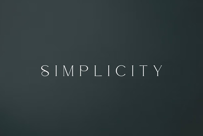
Best for: fashion, beauty, editorial covers, luxury packaging, invitations, logo design, and premium products.
Salve provides a more traditional refined serif direction and is useful when the visual identity needs to feel polished rather than experimental.
License reminder: check the current commercial-use terms before client work.
24. Minaeff Ect Font Family
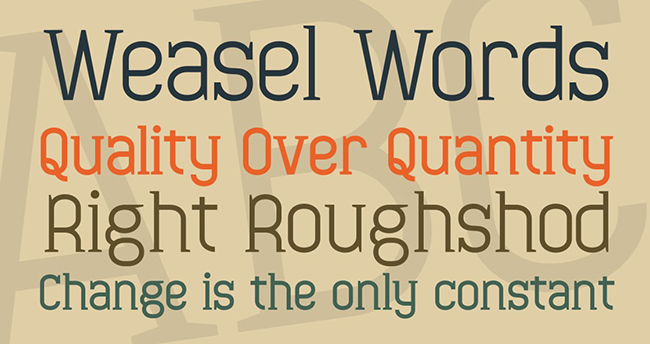
Best for: blogs, websites, CMS themes, interfaces, software, online magazines, and practical digital typography.
Minaeff Ect is one of the more function-oriented options in this collection, making it relevant when typography needs to work repeatedly across screens rather than only in one hero headline.
25. Cooltura Font
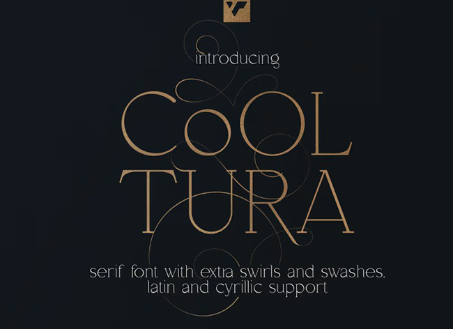
Best for: posters, music, packaging, stickers, youth branding, social media, and expressive display typography.
Cooltura offers a playful retro-influenced personality that can become the focal point of a design.
License reminder: check the original source page for current commercial-use conditions.
26. Caelia Demo Font Family
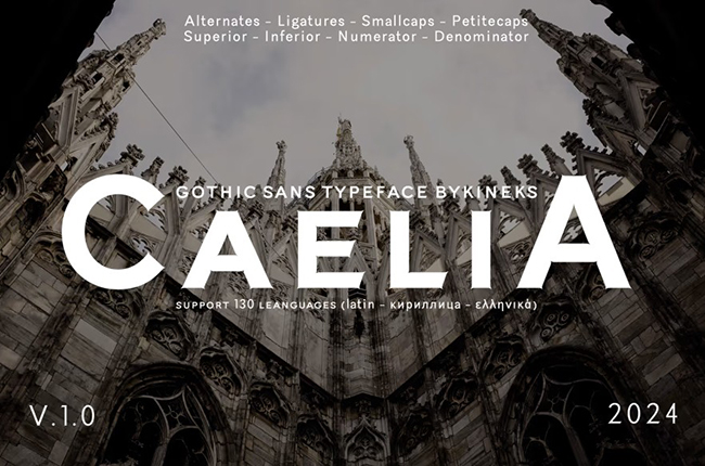
Best for: editorial design, sophisticated branding, luxury packaging, magazines, websites, and logo concepts.
Caelia is positioned as a more refined and versatile family, allowing it to move between display typography and smaller supporting text more easily than a one-style decorative font.
License reminder: demo availability is useful for testing, but verify professional licensing before final use.
27. February 2 Font Family
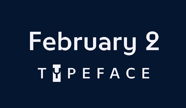
Best for: experimental branding, posters, editorial covers, digital products, logo concepts, and contemporary typography.
February 2 explores the contrast between oval forms and rounded rectangles, giving the grotesque structure more personality than a standard neutral sans serif.
28. Boujee Font Family
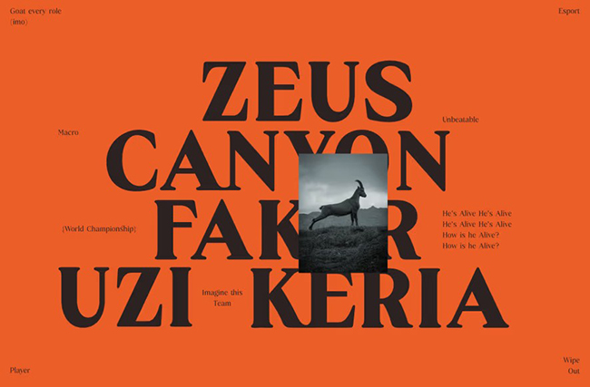
Best for: fashion, beauty, luxury products, cinematic titles, magazines, perfume, packaging, and premium branding.
Boujee combines high contrast, classical elegance, ligatures, small caps, and multilingual coverage to create a richer editorial toolkit.
Use Alternates Carefully
Special glyphs can make typography feel custom, but using too many decorative alternates in one word can reduce readability.
29. Vfu Font
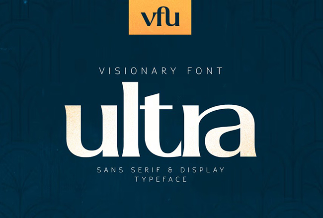
Best for: posters, logos, social media, packaging, experimental branding, advertising, and bold display typography.
Vfu is strongest where the type itself needs to become one of the primary graphic elements rather than simply support imagery.
License reminder: verify commercial licensing on the original source page.
30. Averno Font
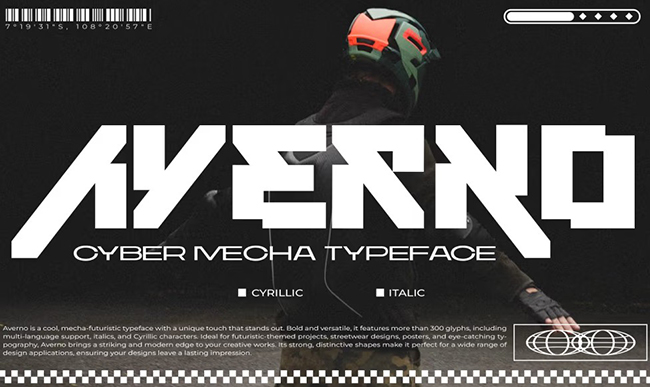
Best for: gaming, streetwear, music, album covers, technology, posters, logos, and avant-garde visual identities.
Averno closes the collection with one of the strongest futuristic directions. Mechanical forms and dense construction give it a more aggressive visual voice than the restrained sans-serif families earlier in the list.
Keep Supporting Typography Simple
When the display font already contains this much character, a neutral sans serif for information will create better hierarchy than adding another futuristic face.
How to Choose a Cyrillic Font for Ukrainian Design
For Ukrainian-language projects, simply checking that a typeface contains “Cyrillic” is not enough.
Test Ukrainian-Specific Characters
Create a small test string containing:
Ґ ґ Є є І і Ї ї
Then place those characters beside more common letters and check whether their:
- Weight.
- Width.
- Serifs.
- Stroke endings.
- Spacing.
feel consistent.
Test the Apostrophe
The apostrophe appears frequently in Ukrainian and should fit the typography naturally.
Use Real Ukrainian Words
Do not test the font only with an alphabet specimen. Use actual:
- Brand names.
- Headlines.
- Product descriptions.
- Dates.
- Navigation labels.
How to Combine Cyrillic and Latin Typography
Multilingual branding often requires both alphabets inside the same composition.
Compare Visual Size
Latin and Cyrillic uppercase characters may not appear equally large even when set at the same point size.
Compare Width
A Cyrillic translation may be significantly longer or shorter than its English equivalent.
Do Not Force Identical Line Breaks
Adapt the composition to the language rather than squeezing one translation into the exact shape of another.
Compare Character Personality
Check whether:
- Latin feels geometric while Cyrillic feels humanist.
- Cyrillic capitals are unexpectedly wider.
- Italic styles behave consistently.
- Weights match visually.
Cyrillic Fonts for Branding
For Clean Modern Brands
Test:
- Monitorica.
- Aukim II.
- Pangi.
- Clofie.
- Renco.
For Premium and Luxury Brands
Explore:
- Forum.
- Amorthe.
- Fledgling.
- Salve.
- Boujee.
For Friendly and Lifestyle Brands
Consider:
- Vetka.
- Bad Script.
- Basenji.
- Lemon Tuesday.
- Nolly Roho.
For Experimental Identities
Try:
- Toxigenesis.
- February 2.
- Vfu.
- Averno.
- Cooltura.
How to Test a Cyrillic Font Before Using It in a Logo
- Type the real brand name.
- Check uppercase and lowercase versions.
- Test Ukrainian-specific or other language-specific glyphs.
- Check numerals and punctuation.
- Compare Latin and Cyrillic if the identity needs both.
- Test black and white.
- Reduce the logo to social-avatar size.
- Print it at a small physical size.
- Check the license.
How to Test a Cyrillic Font for Websites and UI
Do Not Judge It at 60px
A font intended for digital products should be tested at actual interface sizes.
Check Navigation
Cyrillic words can be significantly wider than their English equivalents.
Check Buttons
Long translations can expose weaknesses in spacing and responsive layouts.
Check Numbers
Prices, percentages, dates, account balances, and statistics often appear beside Cyrillic labels.
Check Several Devices
Thin strokes and subtle serif details may behave differently across screens.
Display Cyrillic Fonts vs Text Cyrillic Fonts
Display Type
Choose a display font when the project needs:
- Poster titles.
- Brand names.
- Packaging names.
- Event identities.
- Social-media headlines.
Marske, Slimamif, Chalga, Cooltura, Vfu, and Averno are naturally closer to this role.
Text and System Type
For:
- Articles.
- Websites.
- UI.
- Catalogs.
- Presentations.
choose a family that has been designed to remain comfortable across smaller sizes and longer copy.
Common Cyrillic Typography Mistakes
1. Assuming All Cyrillic Fonts Support Ukrainian
Always check the required language-specific characters.
2. Testing Only Latin
A Latin specimen tells you very little about the quality of the Cyrillic design.
3. Using a Display Font for Paragraphs
Expressive typography is not automatically comfortable typography.
4. Forcing English and Ukrainian Into the Same Width
Translate the design, not only the words.
5. Ignoring Numerals
Prices, dates, statistics, and addresses can quickly expose inconsistencies.
6. Ignoring Italics
Some families may have strong regular Cyrillic support but weaker italic designs.
7. Choosing From a Screenshot Alone
Always install or test the actual font where licensing permits.
8. Using Two Highly Decorative Cyrillic Fonts Together
Let one typeface provide the personality.
9. Forgetting Mobile Readability
Thin and experimental forms may fail at small screen sizes.
10. Assuming Free Download Means Commercial Use
Licensing must be checked individually.
Cyrillic Font Licensing Checklist
- Is personal use allowed?
- Is commercial use allowed?
- Can the font be used for client work?
- Can it be used in logos?
- Is merchandise use permitted?
- Can it be embedded on websites?
- Can it be embedded in apps?
- Can it be used in templates?
- Is the download a demo?
- Is attribution required?
- Can the font file itself be redistributed?
Frequently Asked Questions About Free Cyrillic Fonts
What are Cyrillic fonts?
Cyrillic fonts are typefaces containing characters used by languages written with Cyrillic-based alphabets. Exact language support varies between fonts.
What are the best free Cyrillic fonts for designers?
The answer depends on the project. Monitorica, Aukim II, Pangi, and similar families suit cleaner modern systems; Forum, Amorthe, Salve, and Boujee provide more refined serif directions; Vetka, Bad Script, and Lemon Tuesday offer handwritten styles; while Toxigenesis, February 2, Vfu, and Averno are stronger for experimental display typography.
Do all Cyrillic fonts support Ukrainian?
No. Always confirm that the font includes the Ukrainian-specific characters required by your text, including Ґ, Є, І, and Ї in both uppercase and lowercase.
Can I use free Cyrillic fonts commercially?
It depends on the individual license. Some fonts may permit commercial use, while others may be personal-use or demo versions.
Which Cyrillic fonts work well for branding?
For broad identity systems, start by testing families with multiple weights and strong readability. More expressive display fonts can then be used where stronger personality is required.
Which Cyrillic fonts are good for luxury design?
Forum, Amorthe, Fledgling, Salve, and Boujee are examples from this collection that move toward serif, editorial, fashion, or premium typography.
Which Cyrillic fonts work for technology projects?
Toxigenesis, Pangi, Movavi Grotesque, February 2, and Averno are useful directions to explore depending on how technical or experimental the final design should feel.
Which fonts support both Cyrillic and Latin?
Many multilingual typefaces include both scripts, but support should be checked on the individual source page because the exact character set differs between families.
Can Cyrillic fonts be used in Photoshop, Illustrator, Figma, Canva, and other design software?
Standard desktop font files can generally be used in compatible design software after installation, subject to the software’s font support and the font license. Cloud-based applications may use different upload or font-library workflows.
What should Ukrainian designers check before downloading a font?
Test the full Ukrainian alphabet, especially Ґ, Є, І, Ї, apostrophes, quotation marks, numerals, punctuation, and any Latin characters required by the same identity.
Final Thoughts
The best free Cyrillic fonts are not simply the typefaces with the most unusual shapes or the largest character counts.
A useful font needs to solve the actual language and design problem.
Vetka, Bad Script, and Lemon Tuesday can make typography feel more personal. Forum, Amorthe, Salve, and Boujee offer more refined serif directions. Monitorica, Aukim II, Pangi, Clofie, and Renco work better when the project needs a structured modern system. Kyiv Machine creates an entirely different archival mood, while Toxigenesis, February 2, Vfu, and Averno move toward futuristic and experimental typography.
Most importantly, do not treat “Cyrillic support” as a checkbox.
Type real Ukrainian words. Check Ґ, Є, І, and Ї. Compare the Latin and Cyrillic versions of a brand name. Test numerals. Check mobile size. Compare regular and italic styles. Look at punctuation and spacing.
Then check the license before the typeface becomes part of a commercial project.
Good Cyrillic typography supports the language. Great Cyrillic typography makes the language feel as intentional as the rest of the design.
For more typography inspiration, font collections, mockups, Photoshop resources, and practical creative tools, continue exploring DesignRise.