


Fresh web design ideas are not only about making a website look modern. In real UX/UI work, fresh design means finding better ways to guide users, reduce friction, improve clarity, support business goals, and create digital experiences that feel useful, memorable, and easy to use.
Web design keeps changing because users keep changing. People expect websites to load quickly, work smoothly on mobile, explain value immediately, and help them complete tasks without confusion. At the same time, brands want websites that stand out, convert better, and feel different from the thousands of generic templates online.
This is where strong UX/UI design creates real opportunity. A designer who understands both creativity and usability can do more than decorate a page. They can shape how people move through a product, how they understand information, how they trust a brand, and how they decide to take action.
The best web design ideas are not random trends. They are creative responses to user behavior. Smooth interfaces, asymmetrical layouts, card-based structures, subtle motion, custom visuals, strong microcopy, collaborative design systems, and accessible patterns all matter because they help websites feel clearer, faster, and more human.
This guide explores practical web design ideas for UX/UI designers, freelancers, agencies, product teams, and business owners who want to build websites that are not only attractive, but also meaningful, usable, and conversion-friendly.
Explore More DesignRise Resources:
- Milk and Yogurt Packaging PSD Mockup
- How to Convert Your Figma Designs into Functional Web Apps Using Anima Playground
- Best 9 Figma Plugins for Designers
- Why Predictability Is Important for UX Design?
Why Fresh Web Design Ideas Matter for UX/UI
Creativity in web design is often misunderstood. Some people think creative design means unusual layouts, bold colors, complex animation, or visual effects that immediately grab attention. Those things can be useful, but only when they support the user experience.
In UX/UI design, creativity is valuable when it solves a problem. A creative layout can make content easier to scan. A bold visual direction can make a brand more memorable. A new interaction pattern can make a task feel simpler. A small animation can confirm that the system responded. A card layout can help users compare information faster.
The goal is not to make a website different just for the sake of being different. The goal is to make the website feel more useful, intuitive, credible, and alive.
Good Web Design Ideas Should Do at Least One of These Things
- Improve clarity: users understand the message faster.
- Reduce friction: users complete tasks with less effort.
- Increase trust: the website feels professional and reliable.
- Support conversion: users know what action to take next.
- Strengthen brand identity: the website feels recognizable and memorable.
- Improve accessibility: more people can comfortably use the interface.
- Make content easier to scan: users can quickly find what matters.
- Create emotional connection: the experience feels more human and intentional.
Quick Overview: Fresh Web Design Ideas and UX/UI Opportunities
Before we go deeper, here is a practical overview of the design ideas covered in this article and how each one can create UX/UI opportunities.
1. Smooth and Seamless Interfaces
A smooth interface is not only about visual softness. It is about making the user journey feel natural. When users move through a website without unnecessary pauses, confusion, or extra steps, the design feels professional even if they cannot explain why.
A seamless interface uses clear hierarchy, simple navigation, fast loading, readable content, visible calls-to-action, and consistent behavior. It does not force users to guess where to click or what to do next.
For UX/UI designers, this is one of the strongest areas of opportunity because many websites still look good but feel clumsy. They have too many competing sections, unclear buttons, heavy hero images, confusing menus, or unnecessary steps before the user can act.

How to Create a Smoother Interface
- Use one clear primary action per important section.
- Reduce unnecessary navigation layers.
- Keep layouts spacious and easy to scan.
- Use consistent button styles across the site.
- Make forms shorter and easier to complete.
- Use visual hierarchy to guide the eye naturally.
- Remove elements that do not support the user’s goal.
- Make mobile interactions feel as clear as desktop interactions.
Where This Works Best
Smooth interfaces are especially important for landing pages, SaaS websites, online booking pages, eCommerce product pages, membership websites, and any experience where users need to move from interest to action quickly.
2. Full-Width Landing Pages With Clear User Flow
Full-width landing pages continue to be useful because they give designers room to create strong visual rhythm. Large sections, bold imagery, clear text blocks, and focused CTAs can create an experience that feels immersive without becoming complicated.
The mistake many designers make is using full-width layouts only for visual drama. A wide layout should still guide the user. Each section needs a purpose: explain the offer, show proof, answer objections, compare options, highlight benefits, or move users toward the next step.
What a Strong Full-Width Page Needs
- A clear hero message: users should understand the offer immediately.
- A focused CTA: the main action should be obvious.
- Logical section order: content should answer questions in the order users ask them.
- Readable spacing: full-width does not mean crowded.
- Mobile adaptation: the experience must still feel smooth on small screens.
- Performance awareness: large visuals should be optimized so they do not slow the page.
UX/UI Opportunity
Designers can use full-width layouts to create stronger storytelling. Instead of stacking random blocks, think of the page as a guided conversation. What should users know first? What proof do they need? What fear might stop them? What action should feel natural at the end?
3. Asymmetrical Grids That Still Feel Usable
Asymmetrical grids are one of the most interesting web design ideas because they break away from predictable, perfectly balanced layouts. They can make a website feel more editorial, creative, modern, and memorable.
But asymmetry only works when the designer understands structure. If the layout feels random, users become confused. If the page has no hierarchy, the eye does not know where to go. If important content is placed in unexpected areas without enough contrast, users may miss it.
The best asymmetrical layouts use contrast, spacing, scale, and alignment carefully. They may look free, but they are still designed with intention.
How to Use Asymmetry Without Hurting UX
- Keep the most important message easy to find.
- Use whitespace to create breathing room.
- Balance large visuals with strong text hierarchy.
- Make sure CTAs are still visible and recognizable.
- Keep reading order clear on desktop and mobile.
- Do not sacrifice accessibility for artistic layout.
- Test whether users understand the page without explanation.
Best Use Cases
Asymmetrical grids work especially well for creative portfolios, agency websites, fashion brands, editorial projects, event pages, art platforms, architecture studios, and brands that want a more expressive identity.
4. Purpose-Driven UI That Guides Users With Less Effort
At the core of every strong user interface is one simple question: what does the user need to do next?
A beautiful interface is not enough if the user journey feels unclear. Purpose-driven UI focuses on helping users complete tasks with minimal friction. Every design decision should support a goal: reading, comparing, booking, buying, subscribing, contacting, exploring, or learning.
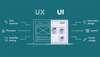
This is where UX and UI meet. UI gives users visual elements: buttons, cards, forms, typography, icons, color, spacing, and layout. UX decides how those elements work together to support user behavior.

Signs of Purpose-Driven UI
- Users always know where they are.
- Users can easily understand what each section is for.
- Buttons describe real actions, not vague commands.
- Forms ask only for necessary information.
- Important content appears before secondary details.
- Visual emphasis matches business and user priorities.
- Every page has a clear next step.
UX/UI Opportunity
Many websites need less decoration and more direction. Designers can create value by simplifying the journey, clarifying CTAs, improving content hierarchy, and removing elements that distract from the user’s main goal.
5. Optimized Animation That Supports the Experience
Animation can make a website feel polished, responsive, and alive. But animation can also become one of the fastest ways to damage UX when it is heavy, distracting, or meaningless.
The best modern motion design is subtle. It helps users understand what is happening. It gives feedback after an action. It draws attention to important changes. It supports storytelling without slowing the page or making users feel trapped inside effects.
Good Uses of Animation in Web Design
- Button hover states that confirm interactivity.
- Small loading states that reduce uncertainty.
- Progress indicators in multi-step flows.
- Accordion transitions that help users follow content changes.
- Microinteractions after successful actions.
- Subtle section reveals that support storytelling.
- Product animations that explain features more clearly.
When Animation Becomes a UX Problem
- It delays access to important content.
- It makes users wait before they can interact.
- It distracts from reading or decision-making.
- It causes motion discomfort.
- It slows down mobile performance.
- It hides essential information behind effects.
- It plays automatically without user control.
Motion should never be added only because it looks impressive in a prototype. It should answer a UX question: does this help the user understand, act, or feel more confident?
6. Sound Design Used Carefully
Sound design is rarely discussed in basic web design articles, but it can be powerful when used with care. A subtle sound can confirm an action, support an interactive experience, or create atmosphere in a digital product.
However, sound is risky. Automatic audio is one of the fastest ways to irritate users. People browse websites in public places, offices, schools, transport, and quiet environments. Unexpected sound can feel intrusive and unprofessional.
How to Use Sound Without Hurting UX
- Never autoplay sound without clear user control.
- Use audio only when it supports the experience.
- Keep sound effects subtle and optional.
- Provide mute controls immediately.
- Do not rely on sound as the only feedback method.
- Respect accessibility and user context.
For most standard websites, sound is not necessary. For games, immersive brand experiences, educational products, creative portfolios, or interactive storytelling, it can add value — but only when users remain in control.
7. Collaborative Design Workflows Between Designers and Developers
Modern web design is no longer a solo act. The strongest digital products are built through collaboration between designers, developers, content teams, marketers, product managers, and business stakeholders.
When design and development are separated too much, problems appear. A beautiful mockup may be hard to build. A coded page may lose the original design intention. Components may behave inconsistently. Spacing may change across screens. Accessibility may be forgotten. Performance may suffer because design decisions were made without technical awareness.
Collaborative design workflows help close that gap.

What Strong Collaboration Looks Like
- Designers involve developers early, not only at handoff.
- Teams use shared components and design systems.
- Design files include states, interactions, and responsive behavior.
- Developers give feedback on performance and feasibility.
- UX decisions are tested in real builds, not only static screens.
- Accessibility is discussed before launch.
- Content, design, and development decisions support the same user journey.
Why This Creates UX/UI Opportunity
Designers who understand development constraints become more valuable. Developers who understand UX become better product partners. Teams that collaborate earlier build cleaner, more consistent, and more scalable digital experiences.
8. Card-Based Interfaces for Scannable Content
Card-based UI design remains useful because it solves a common web design problem: how to organize many pieces of information without overwhelming users.
Cards work because they create small, digestible content units. Each card can contain an image, title, short description, category, price, status, CTA, or link to more detail. This makes them useful for content-heavy websites and responsive layouts.
Where Card-Based UI Works Well
- Blog layouts and news portals.
- eCommerce product grids.
- Course platforms.
- Portfolio case studies.
- Real estate listings.
- Travel and booking websites.
- Dashboards and analytics summaries.
- Feature comparison sections.
How to Design Better Cards
- Keep each card focused on one idea or item.
- Use consistent spacing and image ratios.
- Make the clickable area clear.
- Show only the most useful information.
- Use strong titles and concise descriptions.
- Keep CTA placement consistent.
- Make cards accessible by keyboard and screen readers.
Cards are not just a visual style. They are a way to help users scan, compare, and choose.
9. Personalized Visuals Instead of Generic Stock Photos
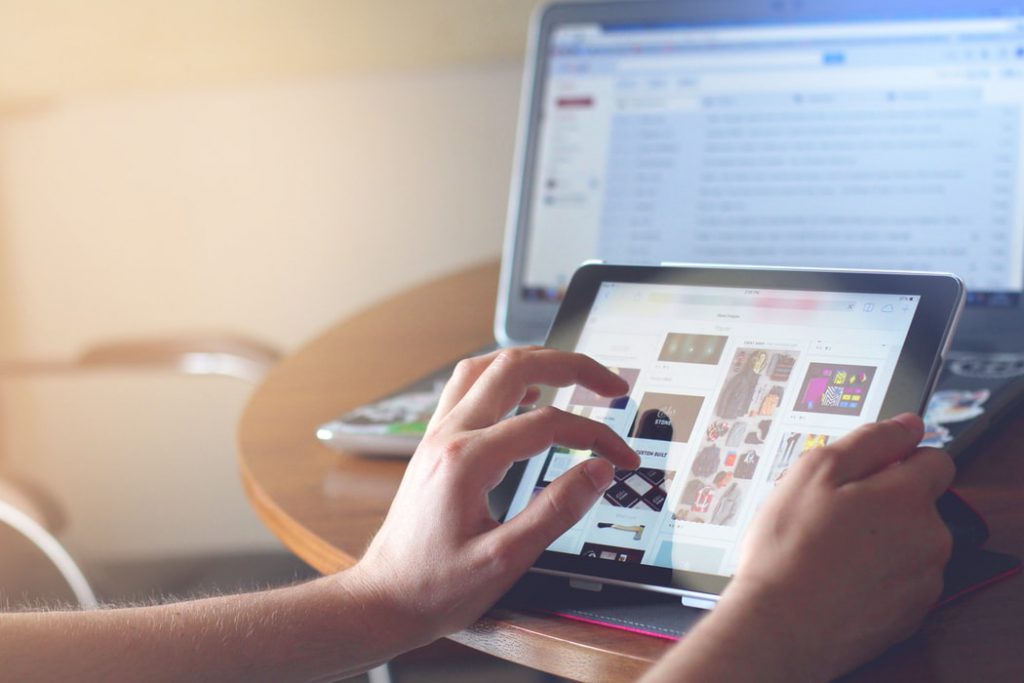
Generic stock photos are easy to recognize. They often look polished but emotionally empty. Users have seen the same smiling office teams, abstract laptops, handshake photos, and business people in glass rooms across hundreds of websites.
Fresh web design increasingly depends on personalized visuals: custom illustrations, branded photography, original graphics, real product images, founder photos, user-generated content, behind-the-scenes visuals, and unique art direction.
Custom visuals make a website feel more specific. They show personality. They create trust. They help users remember the brand.
Better Alternatives to Generic Stock Photos
- Real photos of the team, space, product, or process.
- Custom illustrations that match the brand voice.
- Abstract 3D visuals created for the specific page.
- Product screenshots with helpful annotations.
- Client work examples and case study visuals.
- User-generated content where appropriate.
- Branded icons and patterns.
- AI-assisted visuals refined with brand direction.
UX/UI Opportunity
Visuals should not only decorate the page. They should explain, reassure, demonstrate, or create emotional connection. If an image does not support the message, it may be adding weight without adding value.
10. Gradient-Rich Visual Systems
Gradients can add depth, energy, and emotion to a website. They are useful for hero backgrounds, cards, buttons, illustrations, product visuals, and brand systems. But like all visual trends, gradients need control.
A good gradient should support readability and mood. A bad gradient can reduce contrast, make text harder to read, and create visual noise.
How to Use Gradients Well
- Use gradients to support hierarchy, not compete with it.
- Keep text contrast strong.
- Choose colors that match the brand personality.
- Avoid placing small text over busy gradients.
- Use gradients consistently across the design system.
- Test appearance on mobile screens.
- Do not use gradients only because they are trendy.
Gradients work best when they feel intentional. They should add atmosphere, not confusion.
11. Strong Microcopy That Makes Interfaces Feel Human
Microcopy is one of the most underrated UX/UI opportunities in web design. Small pieces of text — button labels, form hints, error messages, empty states, tooltips, onboarding messages, and confirmation text — can dramatically affect how easy a product feels.
Good microcopy reduces anxiety. It explains what happens next. It helps users recover from mistakes. It makes the interface feel more thoughtful and human.
Examples of Better Microcopy
Microcopy is small, but it can make a website feel clearer, safer, and more professionally designed.
12. Accessibility as a Creative Advantage
Accessibility should not be treated as a boring checklist at the end of a project. It is part of good design. Accessible websites are often clearer, more readable, better structured, and easier to use for everyone.
Designers who understand accessibility have more opportunities because businesses increasingly need websites that work for broader audiences, different devices, assistive technologies, and legal expectations.
Accessible UX/UI Ideas That Improve the Whole Experience
- Use strong color contrast for text and buttons.
- Make headings clear and logically structured.
- Use readable font sizes and line spacing.
- Do not rely only on color to communicate meaning.
- Make interactive elements keyboard-friendly.
- Use descriptive link text.
- Add useful alt text for meaningful images.
- Keep forms clear and error messages helpful.
- Respect reduced motion preferences when using animation.
Accessibility does not limit creativity. It gives creativity a stronger foundation.
13. AI-Assisted Design With Human Judgment
AI is creating new opportunities in web design, but the strongest results still come from human judgment. AI can help with mood boards, content drafts, image ideas, layout variations, color exploration, and design research. But it cannot fully understand a brand, audience, business goal, or emotional context without direction.
Designers who use AI well do not simply accept the first output. They direct, edit, compare, refine, and test. They use AI to speed up exploration, not to replace strategy.
Useful Ways to Use AI in UX/UI Work
- Generate visual mood board directions.
- Explore hero image concepts.
- Create first-draft copy variations.
- Rewrite error messages or CTA labels.
- Generate icon or illustration style ideas.
- Summarize user research notes.
- Create layout variations for testing.
- Support accessibility and readability reviews.
What AI Should Not Replace
- User research.
- Brand strategy.
- Usability testing.
- Accessibility review.
- Final design judgment.
- Content accuracy.
- Original creative direction.
AI can make designers faster, but it does not automatically make design better. The value still comes from the designer’s decisions.
How to Turn Fresh Web Design Ideas Into Real UX/UI Opportunities
Ideas become valuable when they solve real problems. A trend is only useful if it improves the experience, supports the brand, or helps users move forward.
Before applying any web design idea, ask what the current website needs most. Does it need more personality? More clarity? Better mobile flow? Stronger CTA structure? Better content organization? Faster performance? More trust?
A Practical Design Decision Checklist
- What user problem does this idea solve?
- Does it make the page easier to understand?
- Does it support the main conversion goal?
- Will it work well on mobile?
- Can developers build it without hurting performance?
- Is it accessible?
- Does it fit the brand personality?
- Will users understand it without explanation?
- Does it add value, or only decoration?
Common Mistakes to Avoid
1. Following Trends Without Strategy
A design trend can make a website look current, but if it does not support the user journey, it may create more noise than value.
2. Choosing Beauty Over Clarity
A beautiful layout that users do not understand is not good UX. Clarity should come before decoration.
3. Overloading the Page With Effects
Animation, gradients, videos, and interactions can be powerful, but too many effects slow the site and distract from the message.
4. Forgetting Mobile Behavior
A layout that looks impressive on a large desktop screen may become confusing on a phone. Mobile should be tested early, not fixed at the end.
5. Ignoring the Developer Handoff
If a design cannot be built consistently, accessibly, and efficiently, it may lose quality during development. Design decisions should consider implementation.
Final Thoughts
Fresh web design ideas are most powerful when they combine creativity with purpose. A modern website should not only look attractive. It should help users understand, trust, explore, decide, and act.
Smooth interfaces reduce friction. Asymmetrical grids create memorable layouts. Purpose-driven UI guides users with less effort. Subtle animation adds feedback and polish. Collaborative design workflows improve consistency. Card-based interfaces make content easier to scan. Custom visuals build stronger brand identity. Microcopy makes interfaces feel clearer and more human. Accessibility makes the experience better for more people.
The real opportunity in UX/UI design is not to chase every trend. It is to choose the ideas that fit the user, the brand, and the goal of the website.
Great web design does not simply impress users for a moment. It helps them move forward with confidence.
For more practical UX/UI ideas, design resources, creative workflows, and modern web design inspiration, continue exploring DesignRise.
Discover more from DesignRise
Subscribe to get the latest posts sent to your email.


