")


Designing an admin dashboard from scratch can take a lot of time. You need to think about navigation, data cards, charts, tables, filters, user management, forms, alerts, calendars, permissions, responsive behavior, and overall usability. That is why free Figma admin dashboard templates are so useful for UI/UX designers, product designers, SaaS teams, startups, and freelancers.
A strong dashboard design is not only about making charts look attractive. It needs to help users understand data quickly, complete tasks efficiently, and make better decisions without feeling overwhelmed. A good Figma dashboard UI kit gives you a ready-made foundation with components, screens, layouts, and visual systems that you can customize for your own product.
Instead of building every card, sidebar, form, chart, table, and modal window manually, you can start with a professionally designed template and adapt it to your project. This can save hours of work, especially when you are creating a SaaS product, analytics dashboard, finance admin panel, CRM system, property management tool, payroll dashboard, or internal business platform.
In this DesignRise guide, you’ll find a curated collection of free admin dashboard templates for Figma. These resources include dashboard UI kits, design systems, chart components, finance dashboards, calendar dashboards, and admin system components that can help you build cleaner interfaces faster.
You May Also Like:
- Best Free Resume Figma Templates
- 7 Findings That Prove the Importance of Great UX
- Bokeh Photoshop Brushes Kit
Why Free Figma Admin Dashboard Templates Are Useful
Admin dashboards are complex because they usually contain many different types of information. A dashboard may include statistics, user data, charts, financial numbers, calendars, filters, tables, notifications, forms, settings, profile controls, reports, and action buttons.
When all of these elements are placed on one screen, the interface can quickly become confusing. That is why starting with a structured admin dashboard template for Figma can be helpful. It gives you a system that already has layout logic, visual hierarchy, spacing, and common dashboard components.
Using a free dashboard template can help you:
- Save design time by starting with ready-made screens and components.
- Create consistent layouts across dashboard pages.
- Build faster prototypes for SaaS, admin panels, and internal tools.
- Improve data presentation with better cards, charts, and tables.
- Learn dashboard structure from professionally designed UI kits.
- Customize components for your own product or brand.
- Prepare cleaner handoff files for developers and product teams.
The best dashboard templates do not replace UX thinking. They give you a strong foundation so you can focus on product logic, user tasks, and business goals.
What Makes a Good Admin Dashboard UI Kit?
Not every free template is suitable for real product design. Some dashboard templates look impressive in previews but are hard to edit, poorly organized, or not scalable. Before choosing a Figma admin dashboard UI kit, check whether it can support a real workflow.
| Feature | Why It Matters |
|---|---|
| Clean layer structure | Makes the file easier to edit, understand, and share |
| Reusable components | Helps update buttons, cards, forms, and navigation faster |
| Dashboard cards | Useful for metrics, summaries, KPIs, and quick actions |
| Chart components | Important for analytics, reports, finance, and business tools |
| Tables and filters | Essential for admin systems with large data sets |
| Light and dark modes | Useful for SaaS platforms and modern web apps |
| Auto Layout support | Makes components more flexible and responsive |
| Design system structure | Helps scale the dashboard across multiple screens |
| Clear licensing | Important for client, personal, and commercial projects |
A strong dashboard UI kit should be practical, not just beautiful. It should help you create screens that are readable, consistent, and useful for real users.
Quick Comparison: Best Free Admin Dashboard Templates for Figma
| Template | Best For | Main Use Case |
|---|---|---|
| Free Form UI Kit | Forms and clean admin layouts | Simple dashboards and form-heavy products |
| Property Management UI Kit | Real estate platforms | Property dashboards and task management |
| Untitled UI Kit | Large design systems | Scalable dashboards and SaaS products |
| Dashboard & Calendar UI | Team planning | Calendars, tasks, and collaboration dashboards |
| BankDash | Finance dashboards | Banking, analytics, and admin panels |
| Full Charts Components | Data visualization | Charts, stats, and KPI cards |
| Dashboard Payroll UI Kit | Payroll and HR finance | Employee finance and accounting dashboards |
| Admin System UI Kit | Custom admin systems | Navigation, modals, forms, and controls |
| Horizon UI | React admin templates | Web applications with light and dark modes |
| Free Admin Dashboard UI Kit | General dashboard design | Admin panels with variables and multiple screens |
How to Choose the Right Dashboard Template
The best free Figma admin dashboard template depends on the product you are designing. A finance dashboard needs different components than a calendar dashboard, property management tool, analytics platform, or SaaS admin panel.
Before choosing a template, ask:
- What is the main goal of the dashboard?
- Will users mostly read data, manage tasks, edit records, or make decisions?
- Does the template include the components I need?
- Are the charts, tables, and cards easy to customize?
- Does the visual style match the product?
- Is the file organized well enough for team use?
- Does it support light mode, dark mode, or both?
- Can it be adapted for desktop and smaller screens?
- Does the license allow the intended use?
Choosing the right template at the beginning can save a lot of cleanup work later.
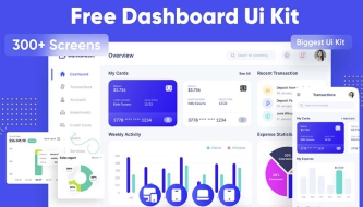
1. Free Form UI Kit for Figma
Best for: clean form-based dashboards and admin interfaces
The Free Form UI Kit for Figma uses a simple monochromatic color scheme that improves legibility and keeps the interface focused. This type of UI kit is useful when you are building dashboards with many forms, inputs, settings, filters, and admin controls.
Form-heavy dashboards often become visually noisy because they contain many labels, fields, buttons, dropdowns, and validation states. A clean form UI kit helps organize those elements into a more readable system.
Why It’s Useful
- Clean monochromatic style for better readability.
- Useful for form-heavy admin panels.
- Good for settings pages, profile forms, and management tools.
- Easy to adapt for simple dashboard projects.
Use It For
- Admin settings pages.
- User management forms.
- Internal business tools.
- Simple SaaS dashboard layouts.
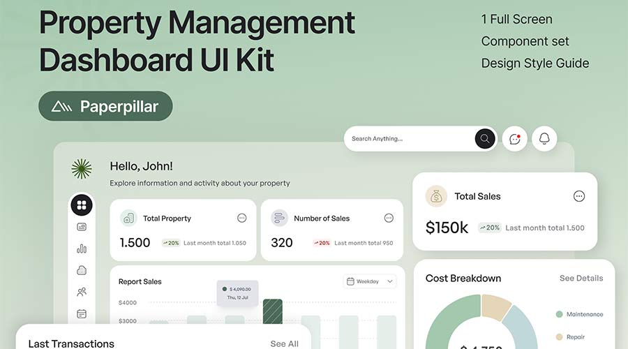
2. Property Management Free UI Kit
Best for: real estate, property management, and rental platforms
The Property Management Free UI Kit is designed for real estate and property management dashboards. It can help users track properties, tasks, activity, and important information in a more organized way.
Property management interfaces need to handle many types of data: addresses, tenants, tasks, payments, maintenance requests, occupancy status, messages, and documents. A focused dashboard template makes it easier to structure these details into a usable interface.
Why It’s Useful
- Built for property and real estate workflows.
- Includes dashboard screen structure.
- Useful for task and activity management.
- Comes with a component set and style guide.
Use It For
- Property management platforms.
- Real estate admin dashboards.
- Rental management tools.
- Maintenance tracking interfaces.
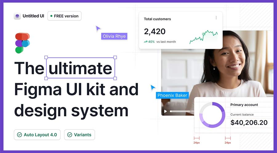
3. Untitled Figma UI Kit & Design System
Best for: scalable SaaS dashboards and large product systems
Untitled UI is a powerful Figma UI kit and design system with a large number of components, styles, and layout options. It is useful for designers who need a flexible foundation for complex dashboards, SaaS products, admin panels, and web applications.
Large dashboard projects often require more than one screen. You may need tables, navigation, filters, cards, settings, profile pages, empty states, modals, charts, and form states. A design system like Untitled UI gives you many building blocks to work with.
Why It’s Useful
- Large design system foundation.
- Useful for complex admin interfaces.
- Includes many reusable components and styles.
- Good for SaaS platforms and product dashboards.
Use It For
- SaaS admin dashboards.
- Enterprise tools.
- Product design systems.
- Multi-screen web applications.
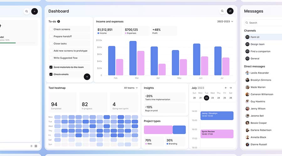
4. Dashboard & Calendar UI for Figma
Best for: calendar dashboards, team planning, and task management
The Dashboard & Calendar UI for Figma is a useful template for collaborative dashboards. It includes calendar-based views that can help users manage tasks, events, schedules, and project timelines.
Calendar dashboards are common in productivity apps, project management tools, booking systems, team platforms, education products, and business admin tools. A good calendar UI must show time, priorities, tasks, and actions without becoming too crowded.
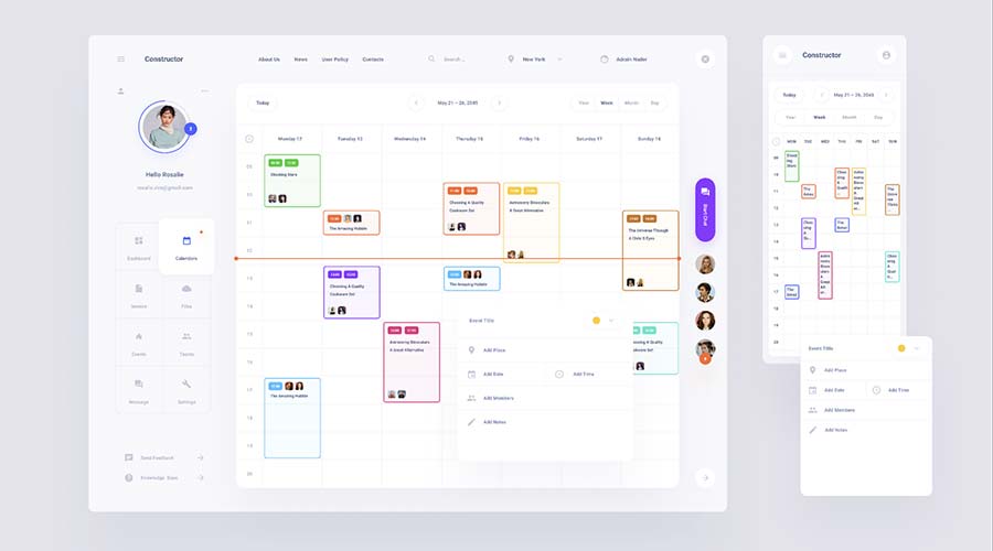
Why It’s Useful
- Includes calendar and task-based layouts.
- Useful for both mobile and desktop views.
- Helps organize scheduling workflows.
- Good for collaboration-focused products.
Use It For
- Task management dashboards.
- Booking platforms.
- Team calendars.
- Project planning tools.
5. BankDash Free Dashboard UI Kit
Best for: finance dashboards, banking interfaces, and analytics panels
BankDash is a free dashboard UI kit designed for finance-related products. It includes many screen layouts and uses modern Figma features such as variables and Auto Layout, making it a flexible option for different dashboard projects.
Finance dashboards require clear visual hierarchy because users need to understand balances, cards, spending, income, transactions, reports, and alerts quickly. A finance-focused UI kit gives you a strong structure for presenting sensitive and important data.
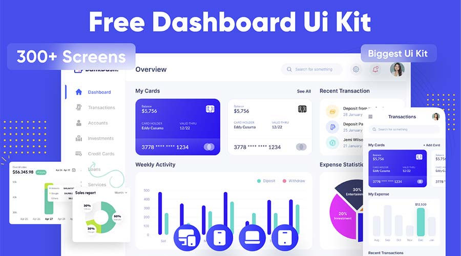
Why It’s Useful
- Designed for finance and banking dashboards.
- Includes many screen layout options.
- Uses modern Figma features.
- Useful for analytics, payments, and admin panels.
Use It For
- Banking dashboards.
- Finance admin panels.
- Payment platforms.
- Analytics products.
6. Full Charts Components for Figma
Best for: dashboard statistics, KPI cards, and data visualization
Full Charts Components for Figma is a useful resource when you need to create custom dashboard layouts with visual data cards. It includes chart components that can help designers display statistics, trends, performance metrics, and business information more clearly.
Charts are one of the most important parts of an admin dashboard. They help users understand change over time, compare values, identify problems, and make decisions faster. However, poorly designed charts can create confusion. Ready-made chart components can help improve consistency and readability.
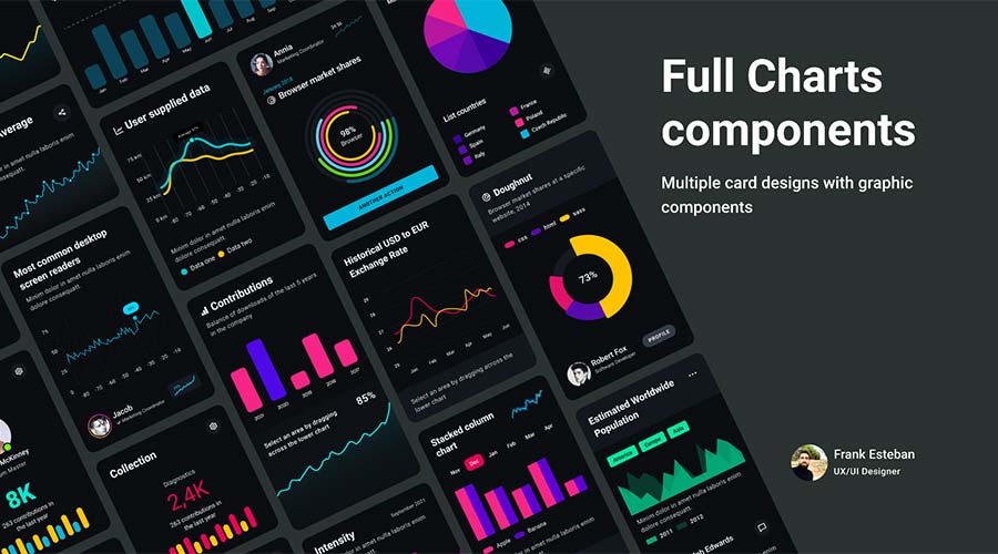
Why It’s Useful
- Includes flexible chart and stat card components.
- Useful for analytics dashboards.
- Helps visualize data quickly.
- Can be mixed with other dashboard templates.
Use It For
- KPI dashboards.
- Analytics reports.
- Business intelligence interfaces.
- Finance and marketing dashboards.
7. Dashboard Payroll Free UI Kit
Best for: payroll dashboards, HR tools, and employee finance systems
The Dashboard Payroll Free UI Kit focuses on finance and payroll-related workflows. It can be used for employee portals, accounting tools, HR dashboards, salary tracking, payment summaries, or internal finance systems.
Payroll interfaces must be easy to read because users often deal with important financial details. A clean UI kit can help organize numbers, employee information, payment status, and reporting sections in a more understandable way.
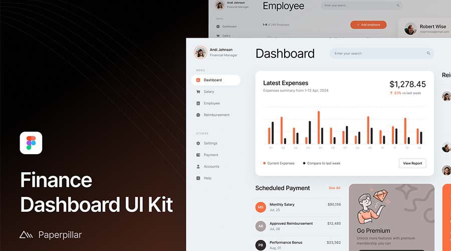
Why It’s Useful
- Designed for finance and payroll use cases.
- Clean and readable dashboard style.
- Useful for employee portals.
- Good for HR and accounting dashboards.
Use It For
- Payroll systems.
- HR dashboards.
- Employee portals.
- Accounting admin panels.
8. Admin System UI Kit for Figma
Best for: custom admin panels and web application interfaces
The Admin System UI Kit for Figma includes many common interface elements needed for dashboard projects. It provides components such as dropdowns, modal windows, navigation elements, charts, forms, and other UI building blocks.
This type of kit is especially useful when you are not just designing one dashboard screen, but a full admin system with multiple states and actions. Instead of searching for separate components, you can use one consistent kit as your base.
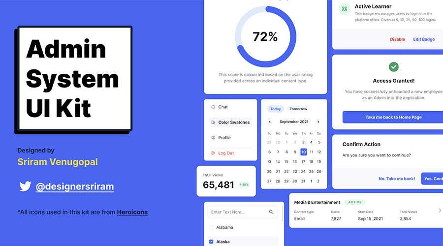
Why It’s Useful
- Includes many admin system components.
- Useful for custom dashboards and web apps.
- Good for navigation, forms, modals, and charts.
- Helps build functional interfaces faster.
Use It For
- Custom admin panels.
- SaaS web applications.
- Internal tools.
- Data management systems.
9. Horizon UI Free Admin Template Dashboard
Best for: React admin dashboards and modern web applications
Horizon UI is an open-source admin template designed to work with React. The Figma version is useful for designers who need to create dashboard concepts that may later connect to a real front-end implementation.
It includes multiple templates and components with light and dark versions, which makes it helpful for SaaS platforms, admin tools, analytics dashboards, and web apps that need a modern interface.
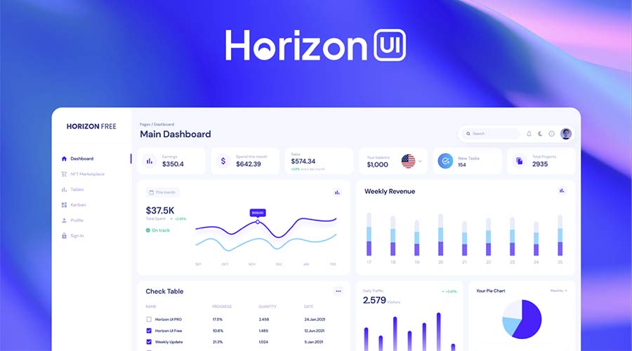
Why It’s Useful
- Designed with React admin dashboards in mind.
- Includes light and dark versions.
- Useful for modern web applications.
- Good for designer-developer workflows.
Use It For
- React admin dashboards.
- SaaS products.
- Developer-friendly UI concepts.
- Modern web app interfaces.
10. Free Admin Dashboard UI Kit
Best for: general admin dashboard design with light and dark modes
This Free Admin Dashboard UI Kit includes many elements needed to build a complete dashboard layout. It offers multiple screens in both light and dark modes and uses Figma variables for easier customization.
This makes it a practical choice for designers who need a flexible dashboard foundation. You can use it for admin panels, internal tools, analytics products, CRM systems, SaaS dashboards, and business applications.
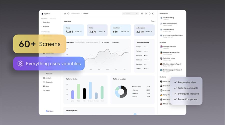
Why It’s Useful
- Includes multiple dashboard screens.
- Supports light and dark modes.
- Uses Figma variables for easier customization.
- Flexible enough for many admin projects.
Use It For
- General admin dashboards.
- CRM layouts.
- Analytics platforms.
- SaaS web apps.
Dashboard UX Principles Every Designer Should Remember
A dashboard is successful when users can understand information quickly and take action with confidence. Beautiful visuals are helpful, but usability is more important.
Prioritize the Most Important Data
Do not show every metric at the same visual weight. Decide which numbers matter most and make them easier to find.
Use Clear Visual Hierarchy
Headings, cards, charts, tables, and buttons should guide the user’s eye. A dashboard without hierarchy feels overwhelming.
Make Actions Easy to Find
Users should quickly understand what they can do next: add, edit, filter, export, approve, review, or open details.
Design for Scanning
Dashboard users rarely read everything word by word. Use short labels, clean cards, clear spacing, and meaningful icons.
Handle Empty and Error States
Dashboards need good empty states, loading states, and error messages. These states are part of the real product experience.
How to Customize Free Admin Dashboard Templates in Figma
After downloading a Figma admin dashboard template, customize it carefully so it fits your product. A template should feel like a foundation, not a final copied design.
Replace Placeholder Data
Use realistic numbers, names, charts, statuses, and labels. Realistic content makes the dashboard easier to evaluate.
Update the Color System
Change colors to match the brand. Make sure success, warning, error, and neutral states are consistent across the interface.
Refine Typography
Dashboard typography should be clear, readable, and consistent. Pay attention to labels, numbers, table text, and chart legends.
Adjust Components for Your Product
Not every template component will fit your use case. Remove unnecessary elements and create missing states where needed.
Check Table and Chart Readability
Tables and charts are often the most important dashboard elements. Make sure they are easy to scan and understand.
Prepare for Developer Handoff
Organize layers, name components, document states, and explain interactions. A clean Figma file makes development easier.
Common Mistakes to Avoid in Dashboard Design
- Showing too many metrics: too much information can make the dashboard harder to use.
- Using decorative charts: charts should explain data, not just add color.
- Ignoring empty states: dashboards must still work when there is no data.
- Mixing too many UI styles: inconsistent cards, icons, and buttons reduce trust.
- Using weak contrast: dashboards need strong readability, especially for data and labels.
- Forgetting responsive behavior: admin dashboards may still need tablet or smaller desktop layouts.
- Hiding key actions: users should quickly find the most important next step.
- Not checking accessibility: color, contrast, font size, and keyboard navigation matter.
Dashboard Design Workflow for Figma
Use this workflow when starting a dashboard project with a free Figma template:
- Define the dashboard goal: analytics, finance, CRM, property management, admin control, or task tracking.
- List user tasks: what should users do most often?
- Choose a matching template: pick a kit that fits the product category.
- Audit components: check buttons, cards, tables, forms, modals, charts, and navigation.
- Customize visual styles: update colors, typography, spacing, and icons.
- Add realistic content: use real or realistic data to test layout quality.
- Create missing states: loading, empty, success, error, permission, and disabled states.
- Test readability: check tables, charts, labels, and key metrics.
- Prepare handoff: organize pages, components, and notes for development.
FAQ: Free Figma Admin Dashboard Templates
What are Figma admin dashboard templates?
Figma admin dashboard templates are pre-designed interface files that include dashboard screens, components, cards, charts, tables, navigation, forms, and admin UI elements.
Are free Figma admin dashboard templates good for professional projects?
Yes, many free Figma admin dashboard templates can be useful for prototypes, portfolio projects, client presentations, and product concepts. Always check the license before using a template commercially.
Can I use these templates for SaaS products?
Yes. Many dashboard UI kits are suitable for SaaS platforms, analytics tools, CRM systems, finance dashboards, admin panels, and internal business applications.
What should an admin dashboard include?
A typical admin dashboard may include navigation, KPI cards, charts, tables, filters, user controls, forms, notifications, settings, reports, and action buttons.
How do I make a dashboard template look unique?
Customize the color system, typography, spacing, icons, data, charts, card structure, navigation, and component states. Replace placeholder content with realistic product data.
Should dashboards support dark mode?
Dark mode can be useful, especially for analytics tools, developer products, and modern SaaS platforms. However, it should be designed carefully with strong contrast and readable data labels.
Are dashboard templates beginner-friendly?
Yes. Templates are helpful for beginners because they show how dashboard layouts, components, and design systems are structured in Figma.
What is the biggest dashboard design mistake?
The biggest mistake is showing too much information at once. A dashboard should prioritize the most important data and guide users toward meaningful actions.
Final Thoughts
Free Figma admin dashboard templates are valuable resources for designers who want to build dashboards faster without sacrificing structure or usability. They provide ready-made components, layouts, charts, forms, navigation systems, and admin UI patterns that can speed up your workflow.
Whether you are designing a SaaS dashboard, finance panel, property management tool, payroll system, analytics platform, calendar dashboard, or internal admin system, the right template can help you start with a stronger foundation.
Use these templates as a starting point, then customize them carefully. Replace placeholder data, refine the visual system, improve hierarchy, test readability, and make sure the final design supports real user goals.
The best dashboard is not the one with the most charts. It is the one that helps users understand what matters and take action faster.
Explore more Figma resources, UI kits, mockups, and UI/UX design guides on DesignRise.
Discover more from DesignRise
Subscribe to get the latest posts sent to your email.