










Great UX is not just a design trend, a polished interface, or a nice extra feature for modern websites. It is one of the strongest factors that decides whether people trust your business, stay on your page, understand your offer, complete a form, make a purchase, or leave for a competitor.
Users today have more choice than ever. If a website feels slow, confusing, outdated, cluttered, or difficult to use, they rarely wait patiently. They go back to search results, open another tab, compare another company, or buy from a brand that makes the process easier.
This is why the importance of great UX is not only a design discussion. It is a business discussion. A poor user experience can quietly cost you leads, sales, trust, repeat visits, and customer loyalty. A better user experience can help your website feel more professional, more credible, and easier to use.
The challenge is that UX problems are often invisible to business owners until they start affecting results. A slow page, a vague headline, a weak CTA, a confusing form, or a poor mobile layout may look like small issues. But together, they can create enough friction to stop users from taking action.
Below are seven findings that show why great UX matters so much — and what you can do to improve your website experience before users decide to leave.

Explore More DesignRise Resources:
- Free High Resolution Carpet Textures
- Best Free Brush Fonts for Designers
- How to Convert Your Figma Designs into Functional Web Apps Using Anima Playground
- Why Predictability Is Important for UX Design?
Why Great UX Matters More Than Ever
Most businesses understand that a website should look professional. Fewer understand that a website also needs to feel easy, fast, predictable, and trustworthy from the user’s point of view.
A beautiful website can still fail if users cannot understand what the company does. A modern landing page can still lose leads if the CTA is weak. A high-quality product can still lose sales if the checkout experience feels risky. A strong brand can still look unreliable if the website is slow or broken on mobile.
User experience sits between business goals and user behavior. It connects design, content, speed, navigation, trust, accessibility, and conversion. When UX is strong, users move forward with less friction. When UX is weak, users hesitate, abandon, or choose another option.
What Great UX Actually Includes
- Clear messaging: users quickly understand what you offer and why it matters.
- Fast loading: pages respond quickly and do not make users wait.
- Mobile-friendly design: the experience works well on small screens.
- Simple navigation: users can find what they need without confusion.
- Readable content: text is easy to scan, understand, and act on.
- Strong CTAs: users know what step to take next.
- Trust signals: the website feels credible, safe, and professional.
- Accessibility: more people can use the experience comfortably.
Quick Summary: 7 UX Findings and What They Mean
Before going deeper, here is a practical summary of the seven findings covered in this article.
1. Users Form a First Impression in a Split Second
First impressions in digital products happen extremely quickly. Users may not consciously analyze every design choice, but they instantly form a feeling: trustworthy or questionable, modern or outdated, clear or confusing, professional or careless.
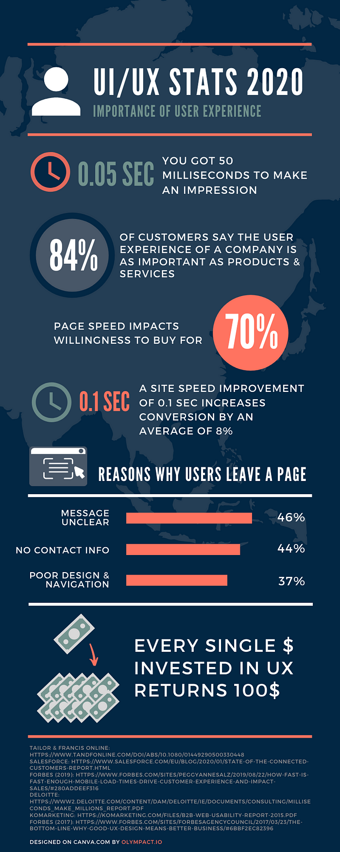
Research often cited in UX discussions found that users can form visual judgments about websites in around 50 milliseconds. That does not mean users understand your full offer in 0.05 seconds. It means the visual impression starts immediately.
This matters because the first screen sets the tone for the entire experience. If the page looks messy, loads slowly, uses poor typography, hides the main message, or feels visually outdated, users may not stay long enough to discover the value of your product or service.

What Users Judge Immediately
- Does this website look trustworthy?
- Can I quickly understand what this company does?
- Does the design feel modern and professional?
- Is the page organized or cluttered?
- Does the website load fast enough?
- Is there a clear next step?
How to Improve the First Impression
- Use a clear headline that explains the value of the page.
- Make the main CTA visible above the fold.
- Avoid clutter in the hero section.
- Use professional images that support the message.
- Make sure typography is readable on desktop and mobile.
- Show trust signals early when relevant: reviews, clients, guarantees, media mentions, certifications, or secure payment information.
- Optimize image sizes so the first screen loads quickly.
A strong first impression does not require a complicated design. It requires clarity, speed, relevance, and visual confidence.
2. Users Expect the Experience to Match the Product
A company may offer a great product, but users often judge that product through the website experience. If the website feels confusing, slow, inconsistent, or untrustworthy, users may assume the business itself is the same.
This is especially important for service businesses, SaaS companies, eCommerce brands, online education, healthcare, finance, agencies, and local businesses. The website is often the first serious interaction a potential customer has with the brand.
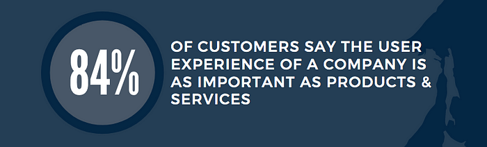
Salesforce customer research has repeatedly shown that customers treat experience as a major part of the value they receive from a company. In other words, users do not separate the product from the experience as much as businesses sometimes think.
What Creates a Strong UX Impression?
- Clear hierarchy: the page guides users from message to action.
- Readable content: users can scan and understand quickly.
- Mobile-friendliness: the experience works on the device users actually use.
- Fast load time: the site respects the user’s time.
- Helpful CTAs: users always know what to do next.
- Consistent design: the brand feels organized and reliable.
- Trust cues: users feel safe moving forward.
Why This Matters for Business
People often do not say, “This website has poor UX.” They say things like:
- “I don’t trust this site.”
- “I can’t find what I need.”
- “This looks old.”
- “The checkout feels weird.”
- “I’ll come back later.”
- “Let me check another company.”
That is the cost of weak UX. It does not always appear as a clear complaint. Sometimes it appears as silence, bounce rate, abandoned carts, low form submissions, and lost leads.
3. Mobile-Friendly UX Is No Longer Optional
Mobile experience is one of the clearest proofs of the importance of great UX. Many users do not first see your business on a desktop screen. They find you through mobile search, social media, maps, ads, messages, or links shared by other people.
If the mobile experience is uncomfortable, the user may never continue to desktop. They may simply leave.
A mobile-friendly website is not just a desktop website squeezed into a smaller screen. It needs its own UX thinking: readable text, comfortable tap targets, fast loading, simple forms, clear navigation, and content that does not require excessive zooming or scrolling just to understand the basics.
Common Mobile UX Problems
- Text is too small to read comfortably.
- Buttons are too close together.
- Forms are too long or difficult to complete.
- Popups block important content.
- Menus are hard to open or close.
- Images are too heavy and slow down the page.
- CTAs disappear below too much content.
- Important information is hidden compared with the desktop version.
How to Improve Mobile UX
- Test every important page on a real phone.
- Make primary buttons large enough to tap comfortably.
- Keep forms short and use the right mobile keyboard types.
- Use sticky CTAs only when they are helpful and not intrusive.
- Prioritize the most important information near the top.
- Compress images and reduce unnecessary scripts.
- Make contact options easy to access.
- Check spacing, line height, and readability.
Mobile UX is not a separate feature. For many users, mobile UX is the main experience.
4. Page Speed Optimization Can Increase Sales
Page speed is one of the most practical UX factors because users feel it immediately. Before they read your headline, compare your offer, or click your CTA, they experience how long the page takes to load.
If a page feels slow, users may assume the website is broken, outdated, unsafe, or not worth waiting for. Slow speed is not only a technical issue. It is an experience issue.
Google’s Core Web Vitals focus on loading performance, interactivity, and visual stability. A good experience should aim for Largest Contentful Paint within 2.5 seconds, Interaction to Next Paint of 200 milliseconds or less, and Cumulative Layout Shift of 0.1 or less.

Speed also affects commercial behavior. The Deloitte and Google study Milliseconds Make Millions found that even a 0.1-second improvement in mobile site speed was connected with improved user progression across the purchase funnel, including conversion and average order value improvements in several industries.

What Slows Websites Down?
- Large uncompressed images.
- Too many plugins or scripts.
- Heavy sliders and animations.
- Poor hosting performance.
- Unused CSS and JavaScript.
- Too many third-party tracking scripts.
- Unoptimized fonts.
- No caching or CDN setup.
How to Improve Page Speed
- Compress and resize images before uploading.
- Use modern image formats when possible.
- Remove unnecessary plugins and scripts.
- Enable caching.
- Use a reliable hosting provider.
- Reduce heavy animations and sliders.
- Minimize unused CSS and JavaScript.
- Test pages with PageSpeed Insights or Lighthouse.
“Page speed may be overlooked by many as one of the most important factors in gaining customer attention and retention.”
Every second of delay can quietly reduce trust, attention, and conversion. A faster website often feels more professional before users even read the content.
5. Poor UX Makes Users Leave
Users leave websites for many reasons, but poor UX often sits behind the decision. Sometimes the problem is visual. Sometimes it is structural. Sometimes it is content-related. Sometimes it is simply that the site does not answer the user’s main question quickly enough.
In B2B usability research, common reasons for leaving websites have included unclear messaging, missing contact information, poor navigation, intrusive media, small fonts, and disruptive elements. These are not minor details. They are signs that users cannot quickly understand, trust, or use the website.

UX Problems That Push Users Away
- Unclear messaging: users cannot tell what the company does.
- Missing contact information: users cannot easily reach the business.
- Poor navigation: users cannot find the page they need.
- Intrusive popups: users are blocked before they understand the offer.
- Automatic audio or video: users feel interrupted or annoyed.
- Small fonts: users struggle to read comfortably.
- Too much clutter: users cannot tell what matters most.
- Weak mobile experience: users cannot complete tasks on their device.
How to Reduce Abandonment
- Make your value proposition clear in the first screen.
- Use simple navigation labels.
- Put contact information where users expect it.
- Remove unnecessary sliders, animations, and interruptions.
- Use readable font sizes and sufficient contrast.
- Make the main CTA obvious.
- Check whether users can complete key tasks without help.
Poor UX does not always look broken. Sometimes it simply feels like too much work. And when a website feels like work, users often leave.
6. Better CTAs Improve UX and Conversion
A call to action is not just a button. It is a moment of decision. It tells users what step to take next and what result they can expect.
Many websites lose conversions because they do not clearly guide users. The page may explain the offer, show benefits, and build trust — but then fail to make the next step obvious. Users should not have to guess whether they should book, buy, subscribe, request a quote, download, call, or continue reading.
Strong CTAs improve UX because they reduce uncertainty.
What Makes a CTA Effective?
- Clear wording: the button explains the action.
- Strong placement: the CTA appears where users are ready to act.
- Visual contrast: the button stands out from surrounding content.
- Relevance: the CTA matches the user’s intent.
- Repetition: longer pages repeat CTAs at logical points.
- Mobile visibility: users can easily tap the CTA on small screens.
CTA Examples: Weak vs. Strong
Where CTAs Should Appear
- Above the fold when the offer is simple and clear.
- After key benefit sections.
- Near pricing or package information.
- After testimonials or proof points.
- At the end of service pages.
- In sticky mobile areas only when helpful.
- Inside product pages near buying decisions.
A good CTA does not pressure users. It helps them move forward when they are ready.
7. UX Improvements Can Boost ROI
Investing in UX can feel expensive at first. Research, redesign, testing, copywriting, accessibility work, and performance optimization all take time and money. But poor UX also has a cost — and it is often hidden.
Bad UX can increase support requests, reduce conversion rates, lower customer retention, damage trust, and make paid advertising less efficient. If you pay to bring traffic to a website that does not convert well, you are losing value from every click.
Research from Forrester has often been cited in discussions about UX ROI, including findings that better user interface and UX design can produce significant conversion improvements. While exact results depend on the product, traffic, audience, and baseline quality, the principle is clear: reducing friction in important journeys can produce measurable business value.

Where UX Improvements Often Create ROI
- Lead forms: fewer fields and clearer labels can increase submissions.
- Checkout flows: less friction can reduce cart abandonment.
- Landing pages: clearer hierarchy can improve paid ad performance.
- Mobile pages: better mobile UX can increase conversions from search and social traffic.
- Support flows: better self-service UX can reduce support costs.
- Onboarding: clearer first-use experiences can improve activation.
- Navigation: easier discovery can increase engagement with important pages.
How to Prioritize UX Fixes by Business Impact
Not every UX issue has the same value. Start with the parts of the experience closest to revenue, trust, or user success.
What These Findings Teach Us About Great UX
The seven findings all point to the same conclusion: great UX is not decoration. It is a competitive advantage.
Users judge websites quickly. They expect smooth experiences. They rely on mobile. They dislike slow pages. They leave when the message is unclear. They need strong CTAs. And they reward websites that make the journey simple, fast, and trustworthy.
“People ignore design that ignores people.” — Frank Chimero
The best way to improve UX is to look at your website through the user’s eyes. What do they need to understand first? What might make them hesitate? What feels unclear? What slows them down? What step asks too much too early? What information is missing at the moment they need it?
Practical UX Checklist for Better Website Performance
- Can users understand what you offer within a few seconds?
- Does the page load quickly on mobile?
- Is the main CTA visible and specific?
- Is your navigation simple and predictable?
- Are fonts readable on small screens?
- Are images optimized for speed?
- Do forms ask only for necessary information?
- Are trust signals visible near important decisions?
- Does the page avoid unnecessary popups, sliders, and distractions?
- Can users easily find contact, pricing, delivery, or service information?
Final Thoughts
The importance of great UX becomes obvious when you stop looking at a website as a collection of pages and start looking at it as a sequence of user decisions.
Every visitor is making small judgments: Do I understand this? Do I trust this? Is this worth my time? Can I find what I need? Is this easy enough to continue? Should I click, buy, book, subscribe, or leave?
Great UX helps users answer those questions with confidence. It reduces friction, improves clarity, supports mobile behavior, speeds up the journey, and makes the business feel more trustworthy.
For businesses, UX is not only about making a website look better. It is about making the website work better. Better for users. Better for conversions. Better for trust. Better for long-term growth.
The most valuable websites do not force users to work hard. They make the right action feel clear, natural, and worth taking.
For more practical thinking on UX, web performance, design clarity, and conversion-focused digital experiences, continue exploring DesignRise.
Discover more from DesignRise
Subscribe to get the latest posts sent to your email.


