





Best Free Notebook, Sketchbook & Notepad Mockups for Designers

The best free notebook mockups do more than place a logo on a blank cover. They help designers show how an identity, illustration, stationery system, editorial concept, or artwork behaves once it becomes a physical object.

That distinction matters.

A notebook cover may look perfectly balanced on a flat Photoshop canvas and suddenly feel too empty when wrapped around a realistic book. A logo that seems large enough in Illustrator may become visually weak once the notebook is surrounded by a pen, coffee cup, flowers, clips, paper texture, and natural shadows. An illustration may work beautifully as a full-page image but feel awkward when it crosses a sketchbook fold or approaches a spiral binding.

Mockups reveal those problems before printing.

They are also useful for something less technical but equally important: presentation storytelling. A minimal notebook on a clean desk communicates something very different from a sketchbook beside drawing tools or a floral notebook in a styled lifestyle scene. The environment changes how a client or portfolio viewer interprets the exact same artwork.

This DesignRise collection brings together 16 notebook, sketchbook, art-book, and notepad presentation resources for branding, stationery, illustration, editorial design, portfolios, product concepts, and client presentations. The collection includes clean cover scenes, open pages, spiral-bound formats, desk compositions, transparent covers, drawing-album presentations, and more atmospheric lifestyle setups.

Rather than treating them as interchangeable PSD frames, this guide explains what each mockup is particularly useful for, how to choose between a closed cover and an open spread, how to present stationery as a complete brand system, and how to avoid the small presentation mistakes that make good artwork look less professional.

Licensing note: the resources in this collection come from different creators and marketplaces, and usage conditions may vary. Some source pages provide PSD mockups while others include vector or other design resources. Always review the current license and file details on the original source page before using an asset in commercial work, client projects, templates, products, or redistribution.

Explore More DesignRise Resources:


Why Notebook Mockups Are So Useful for Designers

Stationery is deceptively simple. A notebook is basically a rectangle, but presenting one convincingly requires more than placing artwork inside that rectangle.

They Show Real Scale

A notebook puts typography, illustration, and logos into a familiar physical context. Viewers immediately understand whether the design feels bold, restrained, detailed, minimal, playful, or premium.

They Reveal Edge and Binding Problems

Spiral binding, rounded corners, transparent covers, page folds, and cropping can interfere with important details.

A realistic mockup helps you notice whether:

  • A logo sits too close to the binding.
  • An illustration loses an important detail near the edge.
  • A title is too small.
  • A full-bleed image needs more breathing room.
  • The composition becomes unbalanced after perspective is applied.

They Make Client Presentations Easier to Understand

A flat stationery layout is useful for technical review, but a realistic notebook scene gives the client a much faster impression of what the finished object could feel like.

They Create Better Portfolio Case Studies

A notebook mockup can turn a logo or pattern into a tangible application. That is particularly useful in branding projects where designers need to demonstrate that the identity works beyond the primary logo.

Choose the Mockup Based on What You Need to Prove

Mockup TypeBest ForWhat It Helps You Test
Closed notebookBranding, cover design, logos, patternsCover hierarchy, scale, logo placement and overall visual impact.
Open notebookEditorial pages, illustrations, planners, stationery systemsMargins, page balance, spreads and fold interaction.
Sketchbook sceneIllustration, lettering, logo sketches, art portfoliosHow artwork feels in an analog creative context.
Lifestyle desk sceneBrand storytelling and client presentationsMood, audience, visual context and brand personality.
NotepadCorporate stationery, lists, planners and office brandingFunctional layout, writing space and subtle branding.

16 Best Free Notebook Mockups, Sketchbooks & Notepads

The free notebook mockups below cover both product-style presentation and more contextual desk scenes. Choose according to the type of design you need to show rather than simply selecting the most decorative photograph.

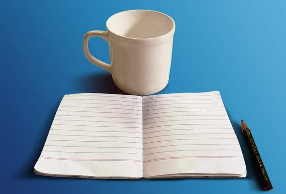
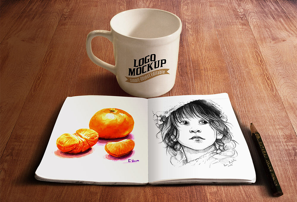
1. Sketchbook and Coffee Cup Mockup

Free notebook mockups featuring a sketchbook and coffee cup scene

Best for: illustration portfolios, creative branding, coffee and lifestyle brands, lettering, hand-drawn artwork, social media presentations, and portfolio case studies.

This is more than a neutral sketchbook presentation. The coffee cup immediately gives the scene a relaxed creative-workspace mood, which makes it particularly useful when the project should feel personal, artistic, approachable, or handmade.

Use the Environment to Support the Story

Do not add unrelated objects just because the scene feels empty. The coffee cup and sketchbook already create a clear narrative: someone is sitting down to draw, write, plan, or create.

That makes the mockup especially appropriate for:

  • Artist identities.
  • Illustration projects.
  • Café branding.
  • Creative workshops.
  • Journaling products.

Keep the artwork itself relatively clear so the complete composition does not become overly busy.

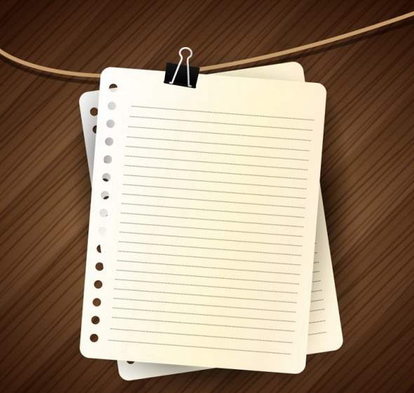
2. Notebook Pages

Notebook pages design resource for stationery presentation

Best for: planner concepts, educational graphics, note-taking layouts, presentation graphics, journals, infographics, and stationery compositions.

This notebook-page resource is useful when you need more freedom than a fixed photographic PSD scene. A page-based design can become part of a larger composition, infographic, planner layout, or custom stationery illustration.

Design the Page as a Functional Surface

Before decorating, decide what the page is for.

For example:

  • Writing.
  • Sketching.
  • Planning.
  • Tracking habits.
  • Taking meeting notes.
  • Presenting information.

The grid, spacing, lines, typography, and visual hierarchy should support that purpose.

3. Drawing Album / Art Book Mockup

Drawing album and art book Photoshop mockup

Best for: illustrations, art portfolios, children’s artwork, editorial concepts, typography, pattern design, and creative presentations.

An art-book mockup gives artwork more visual importance than a small notepad scene. It works particularly well when the image itself should occupy most of the page.

Use Full-Page Artwork Carefully

When an illustration reaches the edge of the page, check whether important details are lost near the binding, fold, or perspective distortion.

Leave critical elements away from:

  • The center fold.
  • Page edges.
  • Binding.
  • Areas heavily affected by shadow.

4. Realistic Notepad and Pen

Realistic notepad and pen design presentation resource

Best for: corporate stationery, office graphics, educational design, checklist concepts, productivity products, and presentation visuals.

The pen immediately suggests that the notepad is meant to be used rather than simply displayed.

Leave Space to Write

One common stationery mistake is filling every part of a notepad with branding.

A functional layout should usually reserve most of the page for the user.

Place branding in controlled areas such as:

  • The header.
  • Footer.
  • Corner.
  • Small side column.

The product feels more professional when branding supports use instead of interfering with it.

5. Vintage Desk Scene

Vintage desk scene for stationery and notebook presentation

Best for: heritage branding, editorial work, journals, books, writing projects, stationery, literary identities, and atmospheric portfolios.

This is the most contextual resource in the collection. It is less about showing one notebook perfectly and more about creating a complete analog workspace.

Use It When Mood Matters

A vintage desk can imply:

  • Writing.
  • History.
  • Research.
  • Craftsmanship.
  • Memory.
  • Analog creativity.

Use this scene when those associations support the project. For a highly minimal technology brand, a cleaner notebook mockup may communicate more effectively.

6. Realistic Notebook

Realistic notebook presentation resource for branding

Best for: stationery concepts, cover design, educational projects, branding, office graphics, and product presentations.

A relatively simple notebook scene is useful when you want the cover artwork to do most of the visual work.

Test Cover Hierarchy

At minimum, ask:

  • What should be noticed first?
  • Is the logo large enough?
  • Does the title need more space?
  • Does the pattern overpower the brand?
  • Would the design still work at physical notebook size?

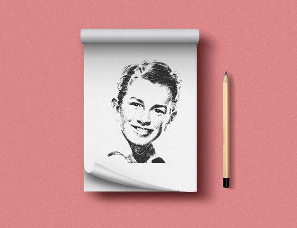
7. Notepad PSD Mockup

Free notepad PSD mockup for stationery design

Best for: office branding, agency stationery, corporate identities, memo pads, list pads, productivity products, and client presentations.

A notepad is one of the best places to show restraint in a brand system. Unlike a poster, the product must remain practical.

Use Branding as a Frame

Instead of placing an oversized logo in the middle of every sheet, use the visual identity to create a subtle framework around the writing area.

Small typography, brand color accents, structured lines, and a compact logo can make a simple notepad feel far more professional.

8. Pixeden Notepad Mockup

Pixeden notepad mockup for professional stationery presentations

Best for: branding systems, office stationery, agencies, hospitality, corporate identities, and presentation decks.

This type of clean notepad mockup is useful when you need a more neutral environment than a lifestyle scene.

Use Neutral Scenes for Client Comparison

If you are presenting several identity directions, use the same or similar neutral mockup for each concept.

That way, the client compares:

  • Typography.
  • Logo.
  • Color.
  • Layout.

rather than reacting to different photography.

9. Classic PSD Notebook Mockup

Classic PSD notebook mockup for cover and branding design

Best for: notebook covers, corporate stationery, personal brands, educational products, pattern collections, and merchandise concepts.

A classic notebook mockup is a reliable choice when the design itself needs to remain the focus.

Use It as a Baseline Test

Before placing the identity inside elaborate styled scenes, try it on a straightforward notebook.

If the design works there, additional props become optional rather than necessary.

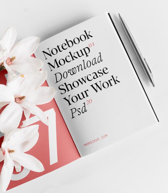
10. Notebook with Flowers Mockup

Notebook with flowers mockup for lifestyle stationery branding

Best for: beauty, wellness, weddings, stationery brands, lifestyle products, floral identities, journals, and feminine editorial concepts.

The flowers give this mockup a clear emotional direction. That makes it less neutral but potentially much stronger when the project fits the atmosphere.

Watch Color Competition

Styled props introduce their own colors.

If the notebook artwork uses equally strong florals or several saturated tones, the complete scene may become visually crowded.

Try a simpler cover with:

  • One logo.
  • A restrained pattern.
  • A calm background.
  • Minimal typography.

and let the surrounding flowers provide part of the visual richness.

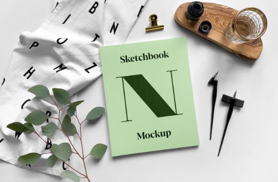
11. Sketchbook PSD Mockup

Sketchbook PSD mockup for illustration and creative branding

Best for: drawing, lettering, illustration, artist identities, architecture sketches, logos, and creative portfolio projects.

A sketchbook mockup creates an immediate connection between the design and the creative process.

Show Process, Not Only Final Artwork

For portfolio work, consider presenting:

  • Rough logo sketches.
  • Lettering studies.
  • Character exploration.
  • Thumbnail layouts.
  • Pattern experiments.

This can make a case study more informative than showing only polished final designs.

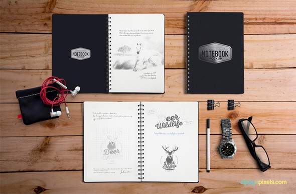
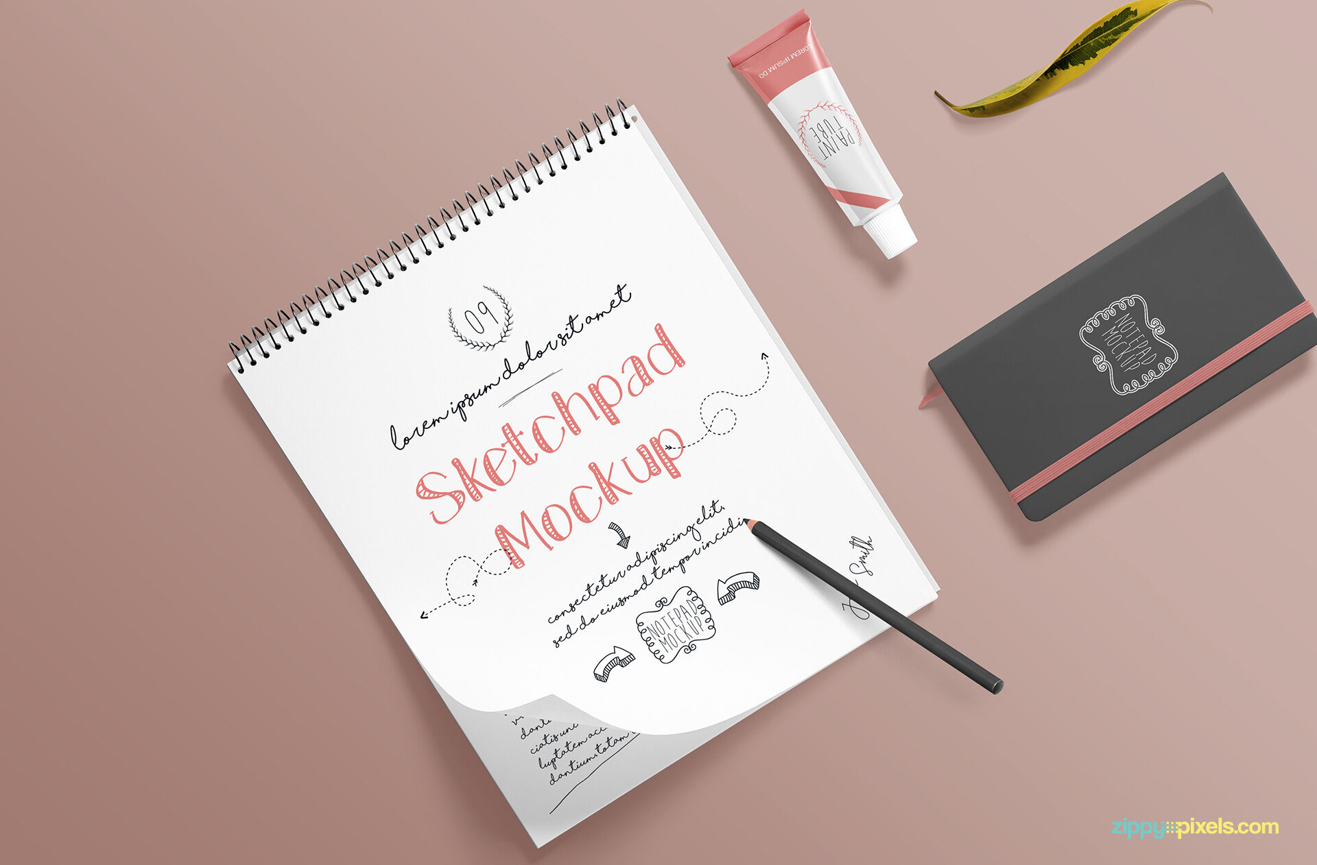
12. Ringed Notepad Desk with a Binder Clip Mockup
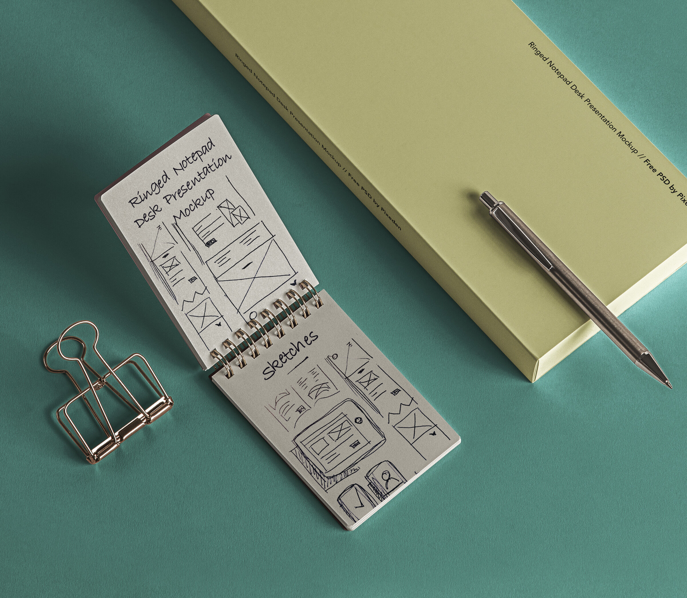
Ringed notepad desk mockup with binder clip

Best for: planners, productivity brands, office stationery, checklists, corporate identities, and organized desk presentations.

The ring binding and binder clip add functional details that make the scene feel less staged than a perfectly isolated notebook.

Respect the Binding

Do not place important text too close to the rings.

The binding naturally creates a visual margin, and the design should respond to it rather than ignoring it.

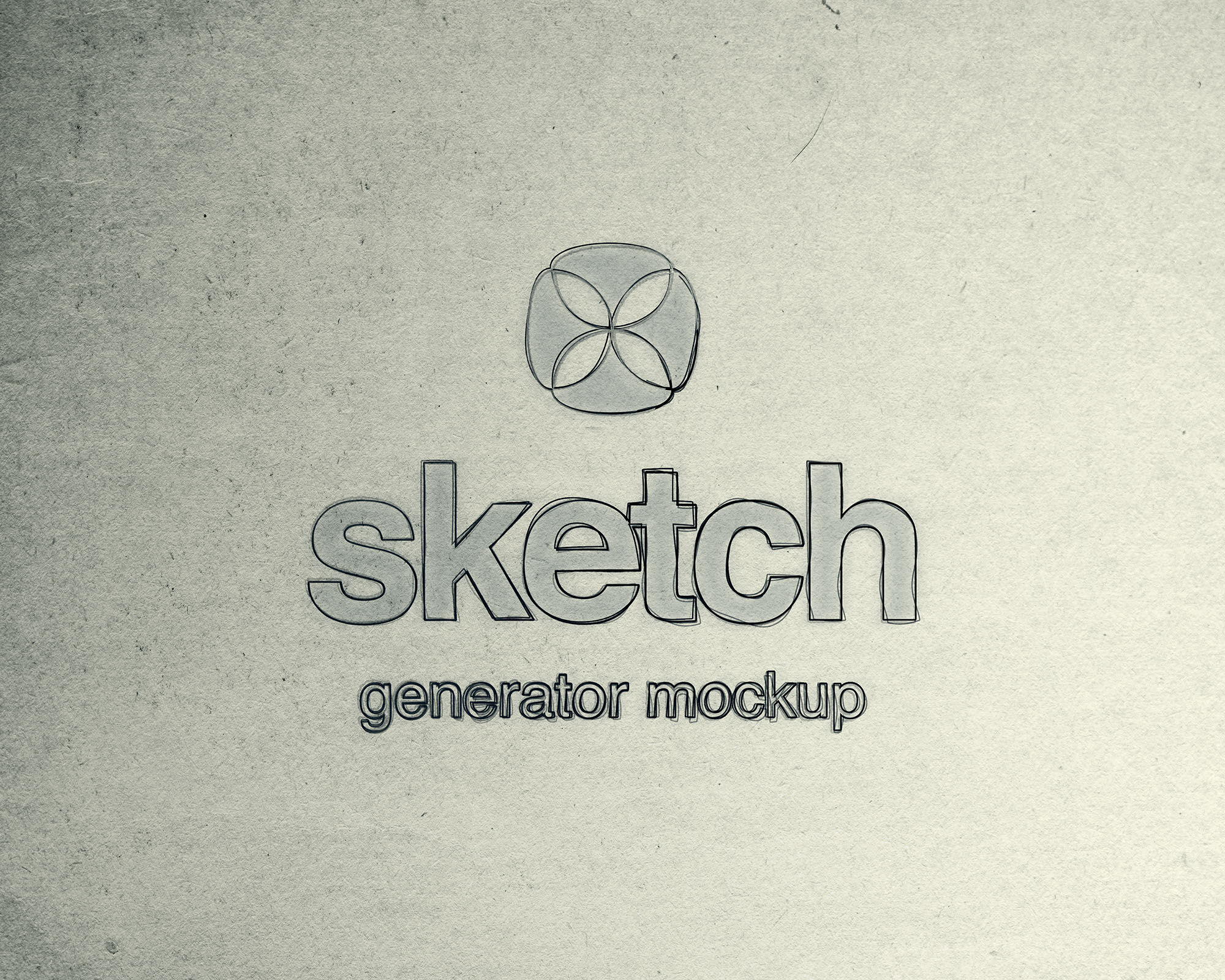
13. Sketch Generator Mockup

Sketch generator Photoshop mockup for branding concepts

Best for: logo presentations, identity process pages, concept development, lettering, architecture, and portfolio case studies.

A sketch generator serves a different purpose from a normal notebook mockup. It can help turn clean digital artwork into a presentation that references the drawing and ideation stage.

Do Not Present Generated Sketches as Genuine Process

If the effect is being used decoratively, treat it as presentation styling rather than pretending it represents the actual development process.

For a stronger case study, combine the effect with genuine sketches or explain the concept-development stage separately.

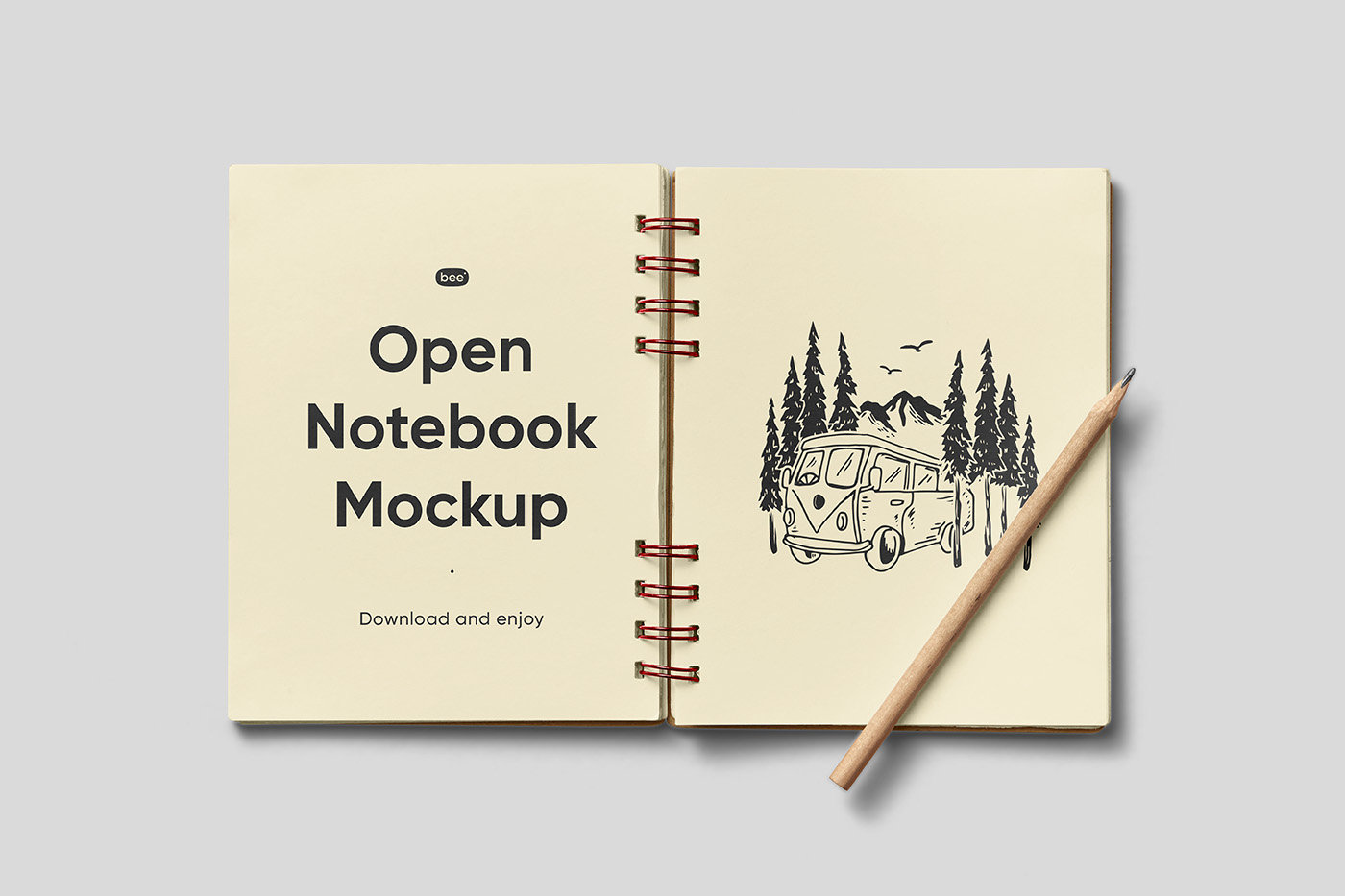
14. Open Notebook Mockup with Pencil

Open notebook mockup with pencil for stationery and editorial design

Best for: planners, journal spreads, illustrations, editorial layouts, educational products, and handwritten-style branding.

An open notebook gives you two pages, which creates both opportunity and risk.

Design the Spread as One Composition

Do not automatically treat the left and right pages as separate posters.

Consider:

  • One image crossing the spread.
  • A headline on one page and supporting content on the other.
  • Illustration paired with notes.
  • A consistent grid across both pages.

Keep important details away from the center fold.

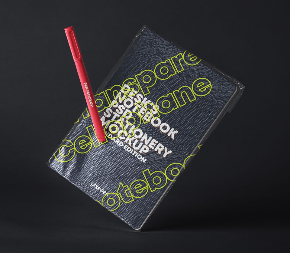
15. PSD Notebook Transparent Cover Mockup

Transparent cover notebook PSD mockup

Best for: contemporary stationery, experimental branding, student products, creative portfolios, typography, and layered cover concepts.

A transparent cover creates a design opportunity that a normal notebook does not have: two visible layers can interact.

Design With Overlap

Try separating information between the transparent cover and underlying page.

For example:

  • Logo on the transparent layer.
  • Pattern underneath.
  • Title on top.
  • Illustration beneath.

The most interesting result often comes from designing the layers together rather than treating the transparent cover as a normal opaque surface.

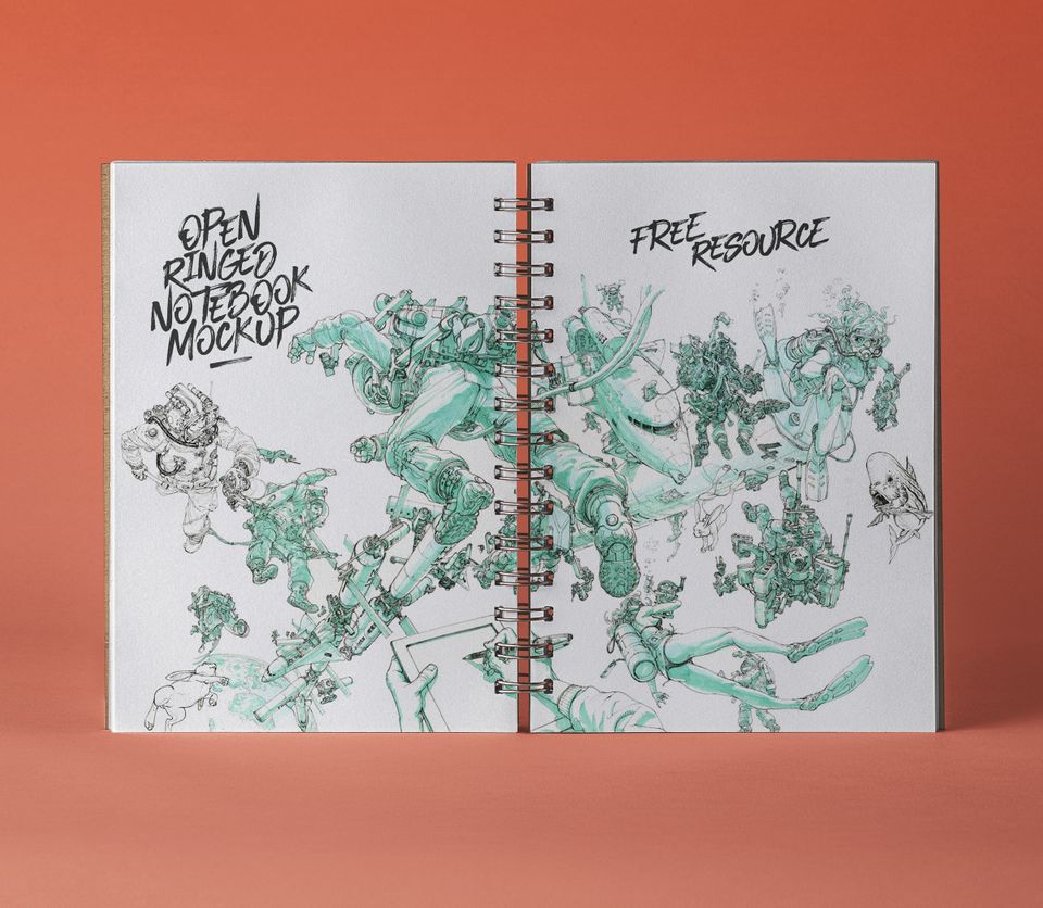
16. Open PSD Ringed Sketchbook Mockup

Open ringed sketchbook PSD mockup for illustration and layout design

Best for: illustration, art direction, logo development, visual identity presentations, drawing portfolios, and creative editorial layouts.

The combination of an open spread and visible ring binding makes this resource particularly useful for authentic sketchbook-style presentations.

Let the Spiral Affect the Composition

The rings create a strong visual element down the middle of the spread.

Avoid placing:

  • Faces.
  • Important letters.
  • Logos.
  • Fine illustration details.

directly underneath the binding.

Use the two-page structure deliberately instead.

Closed Notebook vs Open Notebook: Which Should You Use?

Use a Closed Cover When…

  • The brand mark is the hero.
  • You are presenting packaging-like surface design.
  • The project includes a pattern.
  • You want a simple portfolio image.
  • The notebook itself is the product.

Use an Open Spread When…

  • Interior design matters.
  • You need to show editorial hierarchy.
  • The product is a planner or journal.
  • You are displaying illustrations.
  • You want to demonstrate how a system behaves across multiple pages.

Use Both for a Complete Product Presentation

If the notebook is an actual product concept, showing one closed cover and one open spread is usually more useful than presenting five nearly identical cover mockups.

How to Use Smart Object Notebook Mockups in Photoshop

1. Open the PSD

Before making changes, inspect the Layers panel and identify the editable artwork layer.

Common names include:

  • Your Design.
  • Place Artwork Here.
  • Cover.
  • Page Design.
  • Smart Object.

2. Open the Smart Object

Double-click the thumbnail of the relevant Smart Object.

3. Place Your Artwork

Insert the design at the intended proportions.

Do not distort a rectangular artwork simply to fill a differently proportioned cover.

4. Save the Smart Object

Save the opened Smart Object document and return to the main PSD.

The mockup should update while retaining its perspective and scene effects.

5. Check More Than the Artwork

Inspect:

  • Shadows.
  • Highlights.
  • Cover texture.
  • Binding.
  • Depth of field.
  • Background color.
  • Props.

Your design should feel integrated into the complete scene.

How to Make Notebook Mockups Look More Realistic

Do Not Destroy Existing Surface Texture

Paper and notebook covers are rarely perfectly smooth.

Preserve subtle texture from the mockup wherever possible.

Match the Lighting

If the original notebook sits in warm natural light, a bright blue-white design can feel unnaturally detached from the scene.

Respect Perspective

Use the provided Smart Object transformation rather than manually pasting a flat image over the notebook.

Watch the Edges

A design that reaches the cover edge should appear to follow the perspective and physical form of the notebook.

Do Not Make Everything Perfectly Sharp

If part of the original photograph is slightly out of focus, your inserted artwork should respect the same depth of field.

How to Present a Complete Stationery Brand

A notebook mockup becomes more valuable when it is part of a larger identity rather than an isolated logo application.

Build a Small Stationery System

For example:

  • Notebook.
  • Notepad.
  • Business card.
  • Letterhead.
  • Envelope.
  • Pen.
  • Folder.

Keep the Identity Rules Consistent

Across all items, maintain:

  • Logo size logic.
  • Typography.
  • Color palette.
  • Margins.
  • Pattern treatment.
  • Photography style.

Do Not Put the Logo in the Center of Everything

A strong brand system should have several ways to express itself.

One notebook may use a logo. Another could use a pattern. A notepad may use only a small header. The identity should remain recognizable without repeating the exact same composition.

Notebook Mockups for Logo Presentations

A notebook is a common branding application because it feels realistic without overwhelming the identity.

Use a Logo at Plausible Scale

Making the logo occupy 70% of the notebook may look dramatic in a Behance image but may not reflect how a real branded notebook would be produced.

Create More Than One Application

Consider:

  • Centered logo.
  • Small corner logo.
  • Deboss-style mark.
  • Pattern cover.
  • Large typographic statement.

Show the Flat Logo Separately

Mockups demonstrate application. They should not be the only place where the viewer can examine the actual identity.

Notebook Mockups for Pattern Design

Notebook covers are excellent surfaces for evaluating repeat patterns.

Check Pattern Scale

A pattern that looks attractive on a 2000-pixel artboard may become far too small once placed on a real notebook.

Check Cropping

Important motifs should not disappear awkwardly around corners or underneath binding.

Create Coordinated Variations

A stationery range can use:

  • One hero pattern.
  • One secondary pattern.
  • One solid-color version.

This creates variety without losing visual consistency.

Notebook Mockups for Illustration Portfolios

Choose a Sketchbook Instead of a Corporate Notepad

The physical object should match the creative discipline.

Show Detail at the Right Scale

Large illustrations may need an art-book or open-sketchbook mockup rather than a small notebook cover.

Combine Final and Process Work

A strong portfolio sequence could include:

  1. Final illustration.
  2. Sketchbook development.
  3. Close-up detail.
  4. Applied notebook or printed product.

How to Use Notebook Mockups in a Portfolio Case Study

Start With the Actual Design

Show enough clean artwork that the viewer can evaluate the typography, illustration, branding, or pattern without perspective distortion.

Use One Hero Mockup

Choose the strongest notebook scene for the main visual.

Add a Second Mockup Only When It Shows Something New

For example:

  • Cover first.
  • Interior spread second.

That tells the viewer more than two different photographs of the same cover.

Keep Mockup Photography Consistent

A bright floral lifestyle scene followed by a dark industrial desk and then a highly minimal studio render can make one project feel visually fragmented.

Select environments that support the same art direction.

How to Choose a Notebook Mockup for a Client Presentation

Ask Who the Product Is For

A children’s sketchbook, corporate conference notebook, luxury journal, wellness planner, and artist notebook need different presentation environments.

Choose the Scene After the Brand Direction

Do not design the brand around whichever mockup happens to look attractive.

Show Realistic Usage

A notebook designed for executives may look more credible in a minimal desk scene. A creative journal may benefit from pencils, coffee, flowers, or drawing tools.

Use Mockups to Explain, Not Distract

The environment should make the concept easier to understand.

Common Notebook Mockup Mistakes

1. Using Too Many Mockups

Three meaningful applications are better than twelve images showing essentially the same thing.

2. Choosing Props That Do Not Match the Brand

Flowers, coffee, vintage objects, pencils, and clips all create associations. Use them deliberately.

3. Making the Logo Unrealistically Large

Show how the stationery could actually exist.

4. Ignoring the Binding

Keep important content away from spiral rings, folds, and other physical interruptions.

5. Stretching Artwork to Fit

Adapt the design to the notebook ratio rather than distorting the original layout.

6. Flattening the Mockup Effects

Preserve lighting, paper texture, shadows, and perspective when they help integrate the design.

7. Showing Only Mockups

Include flat design views as well.

8. Using Decorative Cover Design for Functional Notepads

A writing surface still needs enough clear space to function.

9. Assuming Every Resource Has the Same File Type

Collections can mix PSD mockups, vectors, and other design files. Check the original resource details before downloading.

10. Assuming Free Means Commercially Licensed

Always check the current usage terms on the original source page.

Notebook Mockup Licensing Checklist

Before using a downloaded resource professionally, confirm:

  • Whether commercial use is allowed.
  • Whether client presentation is allowed.
  • Whether attribution is required.
  • Whether the asset can be modified.
  • Whether source files can be shared with a client.
  • Whether the resource may be included in templates.
  • Whether redistribution is prohibited.
  • Whether print-on-demand or product use requires another license.

Save the source link and licensing information with the project files.

Frequently Asked Questions About Free Notebook Mockups

What are notebook mockups?

Notebook mockups are presentation resources that place cover designs, logos, patterns, illustrations, or page layouts into realistic notebook, sketchbook, journal, or notepad scenes.

What can free notebook mockups be used for?

Free notebook mockups are useful for branding presentations, stationery systems, cover design, illustration portfolios, patterns, planners, editorial layouts, client presentations, and product concepts.

What is the difference between a notebook and sketchbook mockup?

A notebook mockup is often better for branding, stationery, or cover design, while a sketchbook presentation naturally suits drawing, lettering, illustration, logo development, and other visual creative work.

Should I use an open or closed notebook?

Use a closed notebook when the cover is the main design. Use an open notebook when you need to show interior layouts, illustrations, spreads, planner pages, or functional stationery design.

How do I edit a PSD notebook mockup?

Most editable PSD mockups use Smart Objects. Open the relevant Smart Object, place your artwork inside, save it, and return to the main PSD to see the updated result.

Can notebook mockups be used for logo presentations?

Yes. They are particularly useful for showing how a visual identity behaves on practical branded stationery.

Can I use notebook mockups for pattern design?

Yes. Notebook covers are useful surfaces for testing pattern scale, crop, colorways, and repeat density.

How many notebook mockups should I use in a portfolio?

Use as many as the project genuinely needs, but avoid repetitive scenes. A closed cover, an open spread, and one contextual lifestyle application may be enough for many case studies.

Are all resources in this collection PSD files?

No universal file-format claim should be made for the complete collection. Some source resources are presented as PSD mockups while others may be vector or other design assets. Check the individual source page before downloading.

Are free notebook mockups allowed for commercial projects?

That depends on the individual license. Free download availability does not automatically grant unrestricted commercial use.

Final Thoughts

The best free notebook mockups are not necessarily the most decorative ones. The right mockup is the one that makes the design easier to understand.

A closed notebook can prove that a cover works. An open spread can reveal whether interior hierarchy is balanced. A sketchbook gives illustration and creative process a more natural context. A notepad can demonstrate that a brand identity remains useful rather than decorative. Lifestyle desk scenes can communicate audience and personality.

Choose the mockup after the design direction is established.

Then use it as a diagnostic tool. Check logo scale. Look at the binding. Test pattern size. Examine the margins. Make sure the artwork follows the perspective. Preserve realistic lighting and paper texture. Zoom out and ask whether the design still feels balanced at physical-product scale.

For portfolios and client presentations, resist the temptation to show every mockup you download. Select the scenes that add information to the project story.

A good notebook mockup makes the presentation attractive. A great one helps prove that the design would work as a real object.

For more free mockups, textures, Photoshop resources, typography collections, and practical presentation tools for designers, continue exploring DesignRise.

Leave a Reply

Your email address will not be published. Required fields are marked *

Thank you!

Your design project request has been sent successfully.

We received your brief and will review the details shortly. If we need any additional information, we will contact you by email.

DesignRise