



Free elegant fonts can completely change the personality of a design without requiring a complicated visual system. A refined serif can make a fashion identity feel more sophisticated, a flowing script can transform an invitation, while a geometric display font can give an editorial cover or logo a much more distinctive presence.
But “elegant” does not describe one single typography style.
Elegant type can be minimal and geometric, expressive and calligraphic, retro and decorative, thin and editorial, or warm and handwritten. The right choice depends on what the typography needs to communicate — not simply on whether the font looks beautiful in a specimen image.
This DesignRise collection brings together 50 free elegant fonts and free font resources covering modern sans serifs, fashion-inspired typefaces, calligraphy, handwritten scripts, geometric display fonts, vintage lettering, condensed styles, and decorative typography.
They can be explored for:
- Brand identities and logo concepts.
- Wedding and event stationery.
- Fashion and beauty projects.
- Editorial covers and magazines.
- Packaging.
- Posters and advertising.
- Social media graphics.
- Hospitality and lifestyle branding.
- Creative portfolio projects.
Rather than treating this as a simple download gallery, the guide also explains how to choose an elegant font for branding, when script typography works — and when it does not — how to pair decorative fonts with cleaner typefaces, and what licensing details to check before using a free download professionally.
Licensing note: these typefaces come from different designers, foundries, portfolio pages, and font websites. “Free download” does not automatically mean unrestricted commercial use. Some fonts may be fully free, while others may be personal-use versions, demos, promotional releases, or subject to specific licensing conditions. Always review the current terms on the original source page before using a font in paid client work, logos, merchandise, packaging, apps, websites, templates, or other commercial products.
Explore More DesignRise Resources:
- Free Christmas Fonts – Festive Typefaces for Your Holiday Designs
- Fish Patterns Collection for Your Design
- Free Set MockUp
- Explore More Font Collections on DesignRise
Free Elegant Fonts: What Actually Makes Typography Feel Refined?
Elegance in typography is often confused with thin strokes or script lettering, but there is much more to it.
Proportion
Well-proportioned letters create visual rhythm. Tall capitals, long ascenders, narrow widths, generous counters, and carefully controlled curves can all make typography feel more deliberate.
Contrast
High contrast between thick and thin strokes can create a fashion or editorial character, while low-contrast geometric typography can feel more contemporary and restrained.
Spacing
Elegant typography usually needs room to breathe. Generous tracking and negative space can completely change the way even a simple sans serif feels.
Restraint
A decorative font loses much of its sophistication when every other element in the layout is equally decorative.
One elegant headline paired with a quiet supporting font is often more effective than three competing display typefaces.
Which Elegant Font Style Should You Choose?
50 Free Elegant Fonts for Designers
1. Accent Font
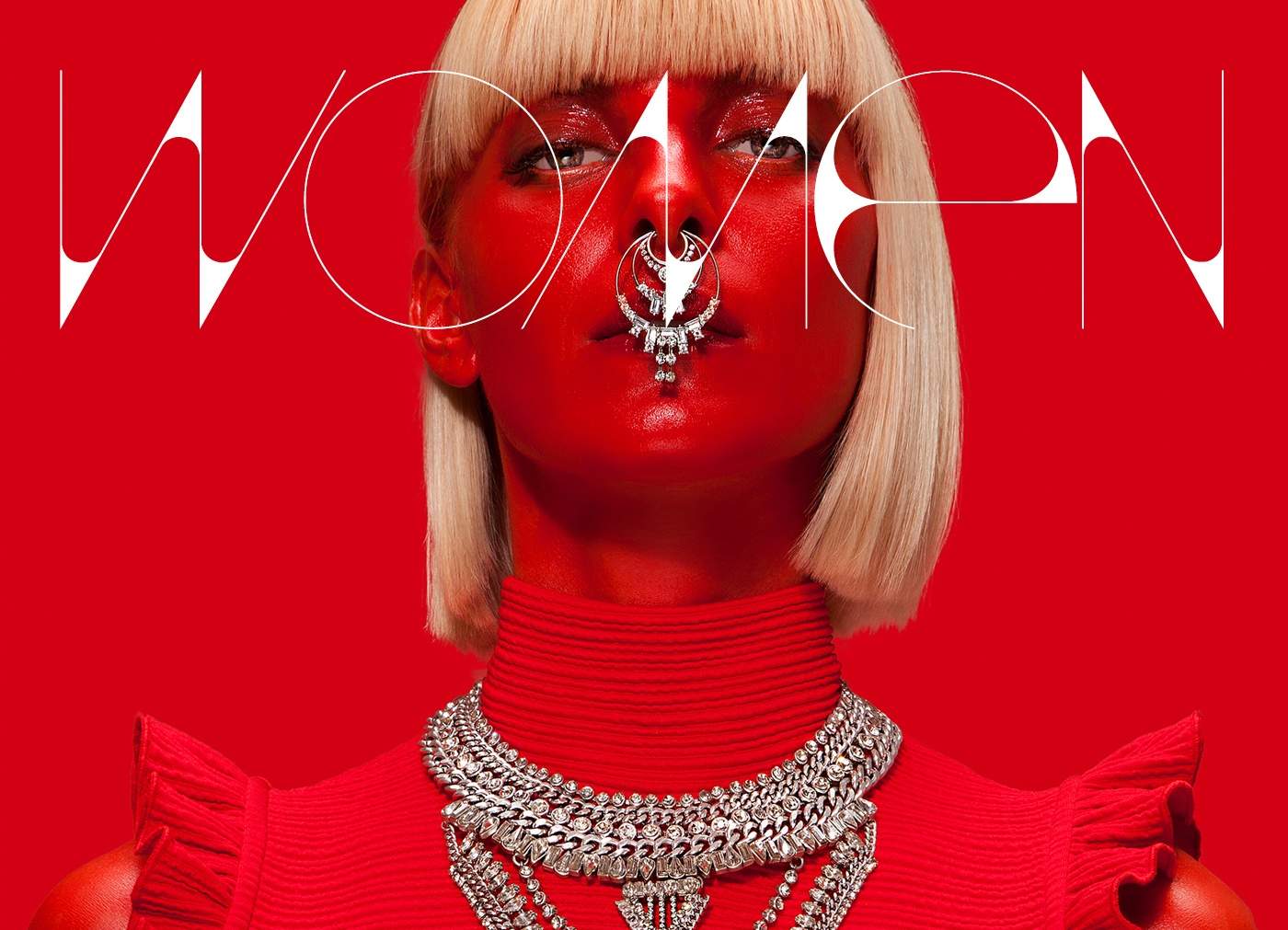
Best for: modern branding, posters, labels, fashion graphics, editorial titles, and minimalist layouts.
Accent by Nelson Balaban is a clean display typeface built around crisp lines and bold simplicity. It works particularly well when typography needs to become an architectural part of the layout rather than simply communicate information.
Use It With Plenty of Negative Space
Accent has enough personality to carry a short title by itself. Avoid surrounding it with several additional display fonts or excessive effects.
2. Halo Handletter Font
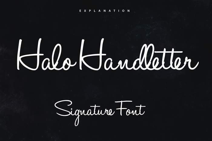
Best for: lifestyle brands, quotes, invitations, social media, stationery, and creative packaging.
Halo Handletter by Mario Arturo balances handwritten personality with relatively clear letterforms. Brush-inspired uppercase characters give it energy, while the lowercase adds a softer handmade rhythm.
Use it for short phrases rather than dense paragraphs.
3. Coco Font
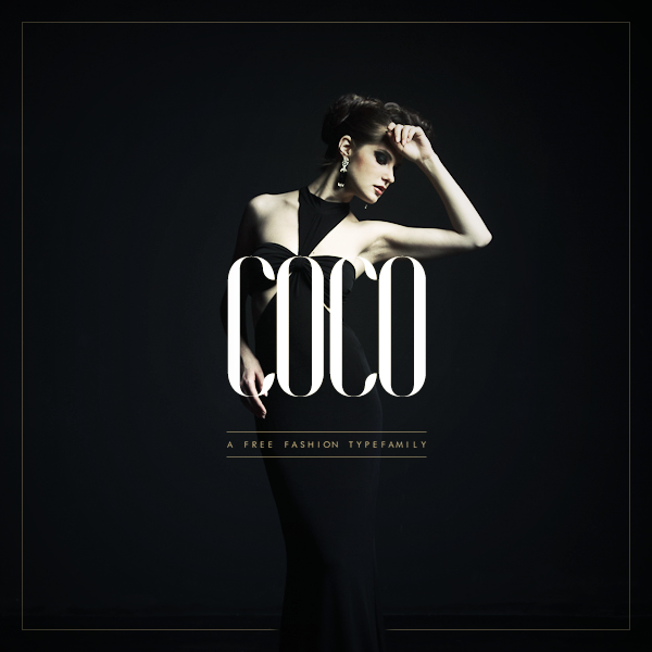
Best for: fashion branding, editorial covers, beauty, luxury campaigns, posters, and identity concepts.
Coco by Hendrick Rolandez uses tall, fashion-oriented letterforms that immediately bring a stronger editorial personality to headlines.
Let the Typography Carry the Luxury
Rather than automatically adding gold effects or ornate frames, try Coco with black-and-white photography and generous whitespace.
4. Castro Script Font
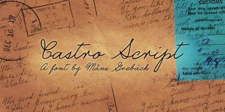
Best for: invitations, wedding stationery, romantic branding, beauty projects, and decorative headlines.
Castro Script by Måns Grebäck uses hand-drawn curves and graceful swashes to create a distinctly formal calligraphic character.
Use the strongest flourishes selectively. They become more elegant when given enough surrounding space.
5. Vanity Font
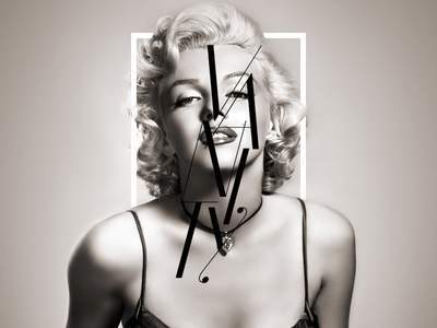
Best for: fashion magazines, beauty identities, editorial covers, upscale branding, and campaign typography.
Vanity by Hendrick Rolandez combines elongated forms with distinctive details that give it a recognizable fashion-editorial character.
It is strongest in headlines and large applications where those subtle details remain visible.
6. Parisienne Font
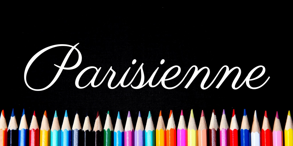
Best for: feminine branding, wedding stationery, editorial accents, beauty, cafés, and elegant invitations.
Parisienne has a flowing cursive structure with a slightly informal rhythm. That prevents the script from feeling excessively formal while still giving layouts a graceful character.
7. Balqis Font
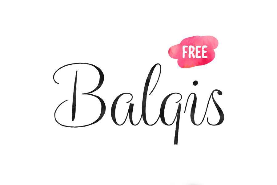
Best for: weddings, beauty branding, fashion, stationery, romantic packaging, and short titles.
Balqis combines calligraphic movement with more upright letterforms, helping it retain readability while still feeling decorative.
8. Nickainley Script Font
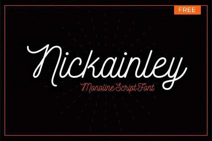
Best for: logos, cafés, badges, packaging, vintage-inspired branding, invitations, and lifestyle products.
Nickainley combines thin strokes, gentle curves, and a subtle vintage character. It is particularly effective when the project needs nostalgia without heavy decorative ornament.
9. Moon Font
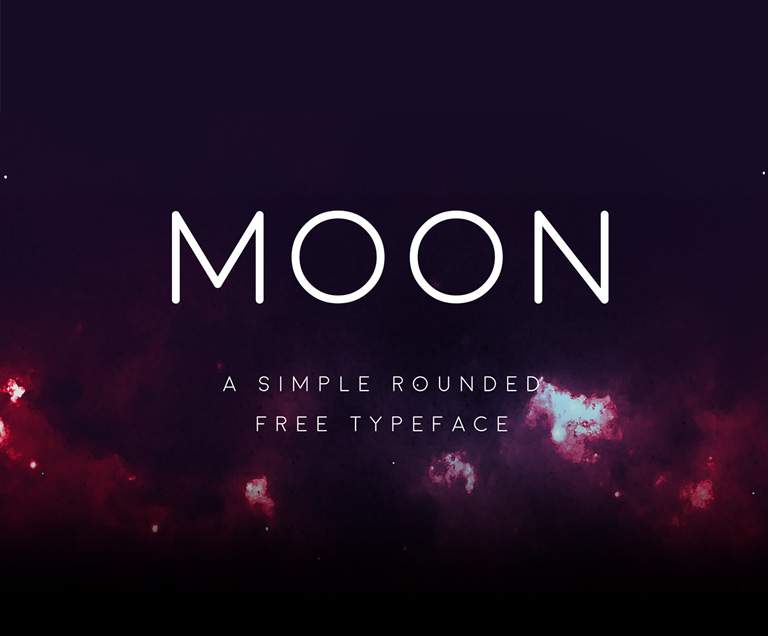
Best for: minimal branding, posters, editorial graphics, web design, packaging, and contemporary presentation design.
Moon by Jack Harvatt is one of the cleaner geometric choices in the collection. Straight lines and rounded forms make it useful when you want elegance through simplicity rather than decoration.
10. One Day Font
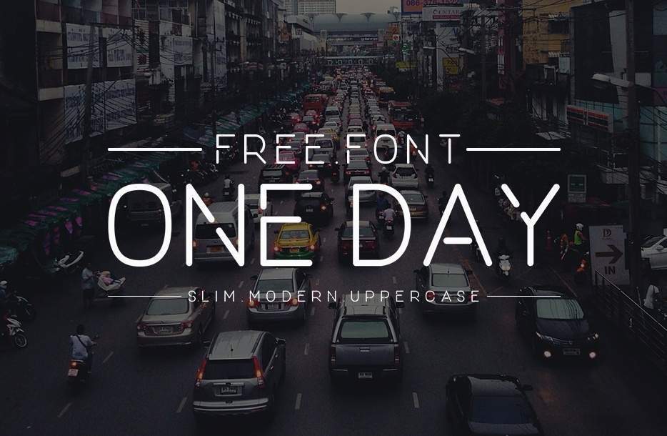
Best for: logos, titles, minimal branding, fashion, posters, and geometric identity concepts.
One Day by Navas Munir uses uppercase geometric construction to create a clean and confident display voice.
Short brand names and compact headlines are the natural use case.
11. Geomanist Font
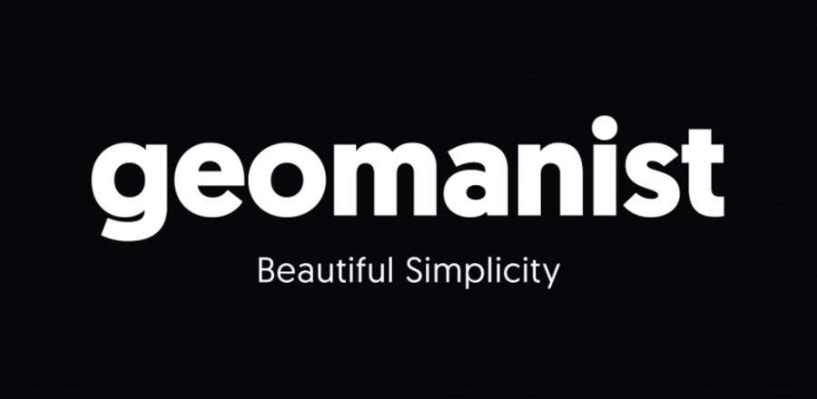
Best for: complete brand systems, web design, editorial layouts, packaging, presentations, and clean typography.
Geomanist by Atipo is valuable because it can handle more than a decorative headline. A broader family gives designers more opportunities to create real hierarchy within one consistent typographic system.
12. Abrakatebra Font
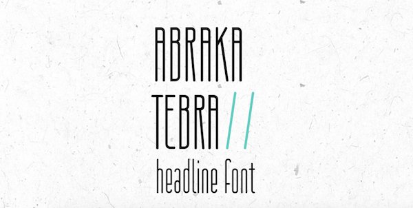
Best for: editorial titles, modern posters, fashion, minimal layouts, and sophisticated display typography.
Abrakatebra by Sanja Stojkov uses thin strokes and elongated proportions. It is best treated as display typography rather than small functional text.
13. Braxton Font
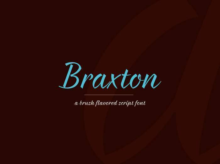
Best for: artistic headlines, branding accents, fashion, posters, invitations, and expressive packaging.
Braxton’s brush-style character makes it more decorative than many fonts in the collection. Use it large enough that the details remain clear.
14. Brotherhood Font
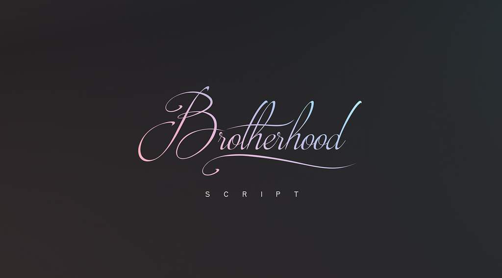
Best for: wedding invitations, stationery, quotes, romantic branding, greeting cards, and decorative titles.
Brotherhood by Youssef Habchi has a pronounced italic rhythm and warm handwritten character. Pair it with restrained supporting typography for a cleaner result.
15. Monastic Font

Best for: fashion magazines, covers, editorial titles, luxury campaigns, and contemporary display typography.
Monastic uses geometric structure and high stroke contrast to create a fashion-oriented look. Use it at larger sizes where the thin details remain visible.
16. Valencia Font
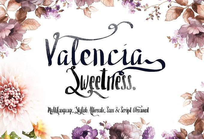
Best for: invitations, wedding designs, beauty, romantic stationery, quotes, and personal branding.
Valencia offers a soft handwritten rhythm and works best when a project needs a personal rather than highly formal kind of elegance.
17. Lovelo Font
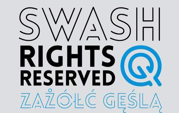
Best for: branding, posters, geometric layouts, event graphics, editorial titles, and contemporary campaigns.
Lovelo’s geometric construction gives it a much more architectural personality than the script options surrounding it in this collection.
18. Savoye Font
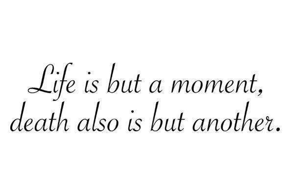
Best for: invitations, blogs, stationery, feminine branding, and graceful decorative typography.
Savoye uses thin flowing strokes and tall ascenders. Give it generous scale and spacing so the elegance does not turn into visual fragility.
19. Lavanderia Font

Best for: restaurants, packaging, invitations, hospitality, personal brands, and signature-style lettering.
Lavanderia by James T. Edmondson has a condensed, slanted rhythm that gives typography the feel of confident hand lettering.
20. Clicker Script Font
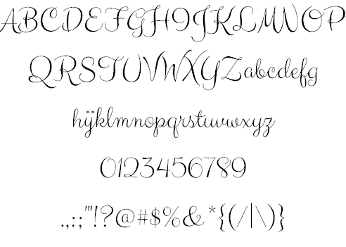
Best for: friendly invitations, cafés, social media, lifestyle branding, cards, and playful script accents.
Clicker Script by Astigmatic combines thin strokes with a more casual handwritten movement, making it less formal than traditional calligraphy.
21. Cylburn Font
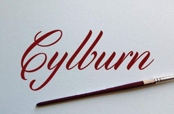
Best for: formal invitations, correspondence, wedding design, vintage stationery, and elegant display text.
Cylburn draws on Roundhand script traditions while keeping its strokes relatively controlled. It works particularly well when the project needs formality without excessive ornament.
22. Coneria Script Font
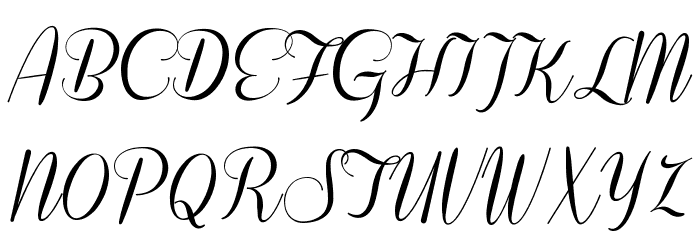
Best for: weddings, luxury branding, beauty, stationery, invitations, and decorative logos.
Coneria by Måns Grebäck follows a refined script direction suitable for short pieces of display typography. Check the licensing of the demo version before commercial use.
23. Matilde Font
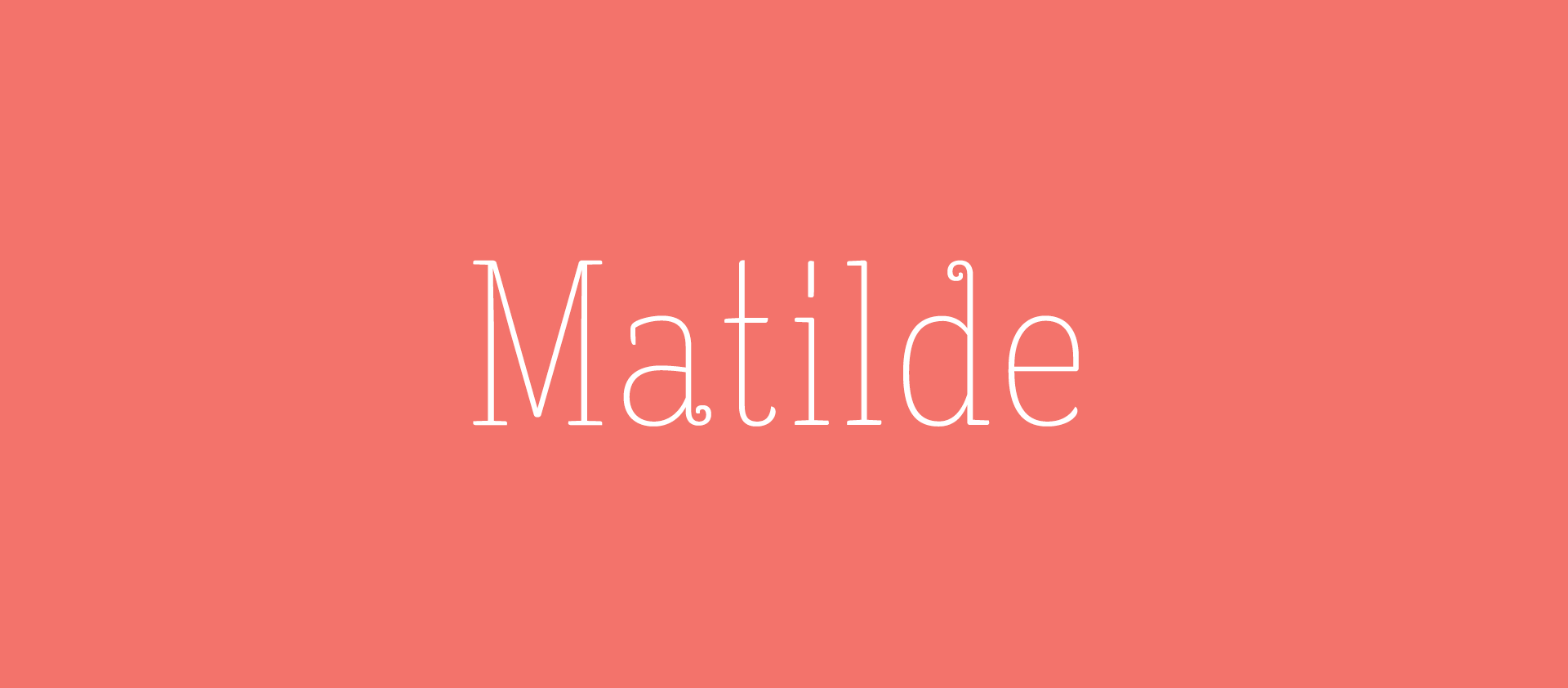
Best for: children’s books, playful editorial design, stationery, friendly branding, and creative titles.
Matilde by Type Depot combines tall thin forms with curled details, producing a softer and more whimsical interpretation of elegance.
24. Roselina Script Font

Best for: logos, invitations, packaging, vintage branding, stationery, and decorative headlines.
Roselina blends calligraphic, vintage, and contemporary characteristics, making it more adaptable than a script tied to only one historical style.
25. Metropolis Font
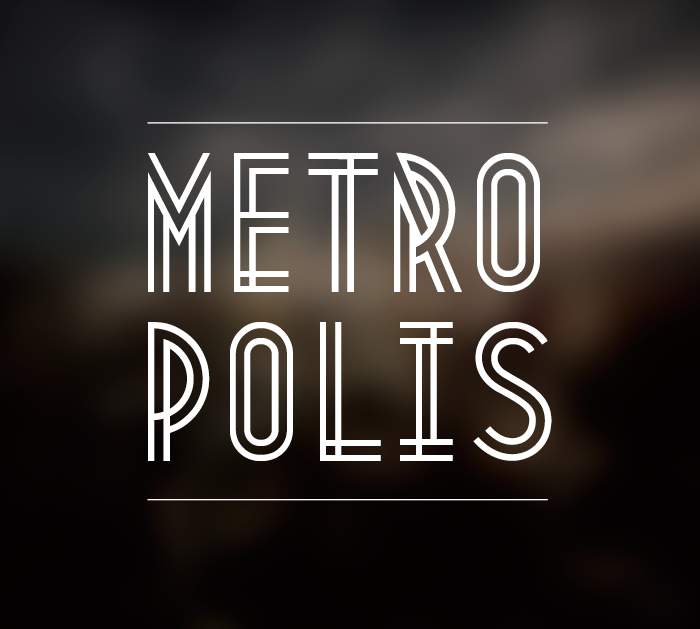
Best for: Art Deco-inspired work, posters, events, editorial covers, luxury hospitality, and vintage identities.
Metropolis by Josip Kelava references 1920s geometry through a distinctive double-line structure.
Use the Era as Inspiration, Not a Costume
Try combining Metropolis with modern photography and a restrained palette instead of repeating every possible Art Deco motif.
26. Gratitude Script Font
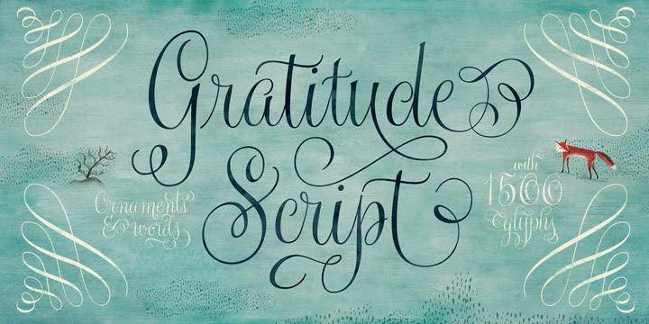
Best for: weddings, greeting cards, beauty, lifestyle branding, quotes, and stationery.
Gratitude Script balances whimsical details with a formal calligraphic foundation. Short names and phrases give the letterforms room to show their character.
27. Vevey Font
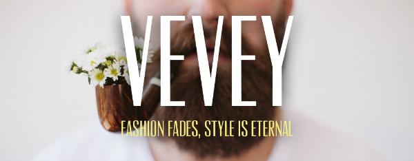
Best for: magazine covers, posters, editorial design, fashion, titles, and large typographic layouts.
Vevey uses tall uppercase forms to create impact without depending on complex decorative details.
28. Wisdom Font
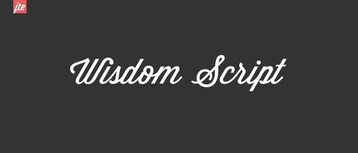
Best for: logos, posters, badges, packaging, hospitality, and retro-inspired branding.
Wisdom has a distinctive angled rhythm that gives even simple words a stronger graphic silhouette.
29. Glamor Font
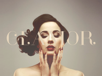
Best for: fashion, beauty, luxury identities, editorial covers, packaging, and sophisticated campaign typography.
Glamor by Hendrick Rolandez uses strong contrast and distinctive terminal details to establish an unmistakably fashion-oriented visual language.
30. Bear & Loupe Font
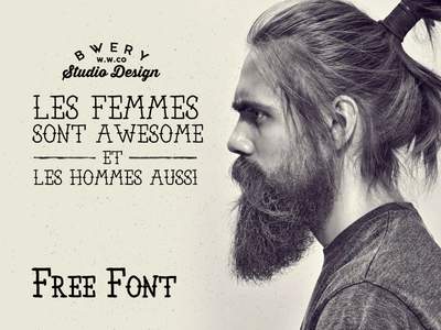
Best for: editorial graphics, lifestyle brands, posters, packaging, labels, and warm contemporary identities.
Bear & Loupe intentionally preserves subtle imperfections, helping it avoid the sterile appearance that some ultra-clean display fonts can have.
31. DitaSweet Font
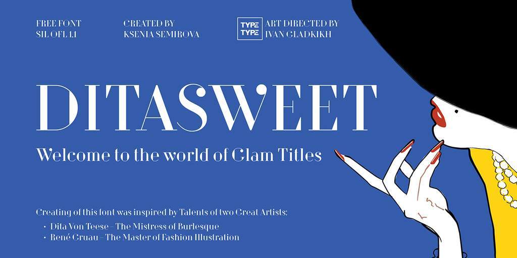
Best for: fashion magazines, beauty projects, luxury editorial design, covers, posters, and chic brand identities.
DitaSweet combines minimalist forms with distinctive ball terminals, allowing relatively restrained typography to retain a recognizable personality.
32. Carosello Font
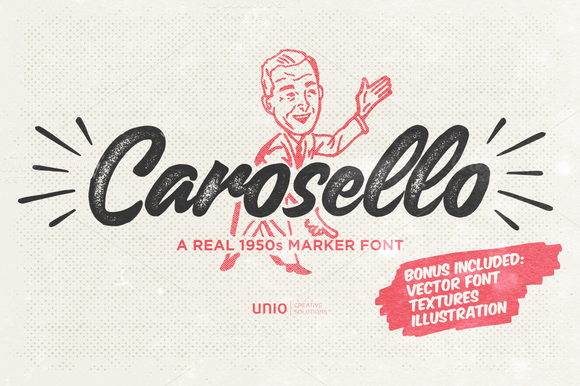
Best for: food branding, cafés, vintage packaging, signage, posters, hospitality, and retro lifestyle design.
Carosello draws inspiration from 1950s advertising lettering and is one of the strongest options here when the goal is authentic mid-century personality.
33. Break Font
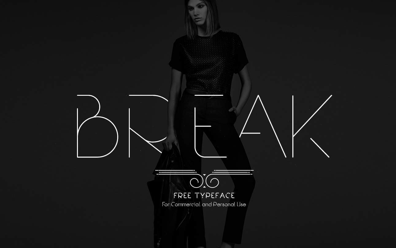
Best for: fashion, modern posters, editorial titles, experimental branding, and social campaigns.
Break by Rajesh Rajput uses deliberate interruptions in its letterforms. Those gaps make it more appropriate for large display typography than small functional text.
34. Devious Font
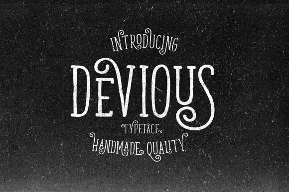
Best for: editorial headlines, logos, posters, fashion, packaging, and expressive typography.
Devious by Graptail combines uppercase display forms with decorative ligatures and curved terminals. Explore alternate characters before settling on the first default composition.
35. Streetwear Font

Best for: apparel, cafés, retro packaging, logos, badges, posters, and vintage-inspired branding.
Streetwear by Artimasa takes inspiration from 1970s fashion and lettering, making it a natural choice when the project needs retro confidence rather than formal elegance.
36. London Font
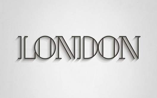
Best for: magazine covers, fashion campaigns, headlines, contemporary branding, posters, and editorial work.
London by Antonio Rodriguez Jr. combines geometric structure with a sleek fashion-oriented appearance.
37. Badhead Font
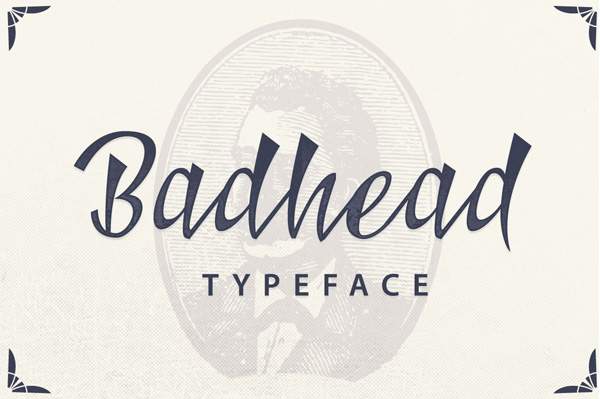
Best for: logos, apparel, packaging, badges, posters, and expressive display lettering.
Badhead by Ian Mikraz uses distinctive ligatures and alternative characters. Fonts like this become much more useful when you actively explore their alternates instead of typing with default glyphs only.
38. Serendipity Font
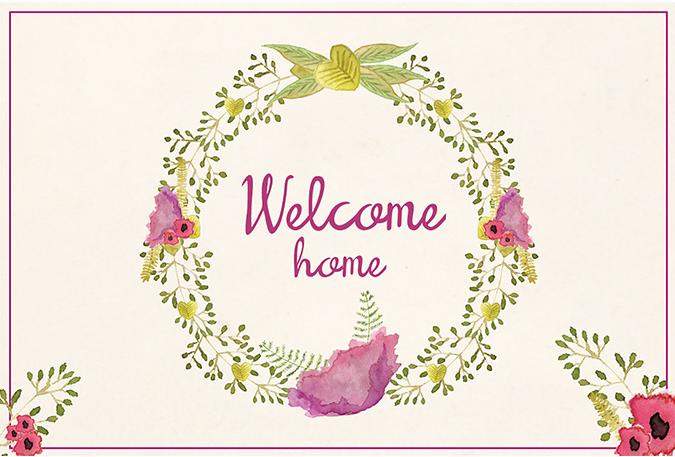
Best for: logos, invitations, lifestyle brands, cards, quotes, and gentle handwritten typography.
Serendipity keeps its handwritten forms relatively upright, giving it a softer and more approachable appearance than highly slanted calligraphy.
39. Valkyrie Font
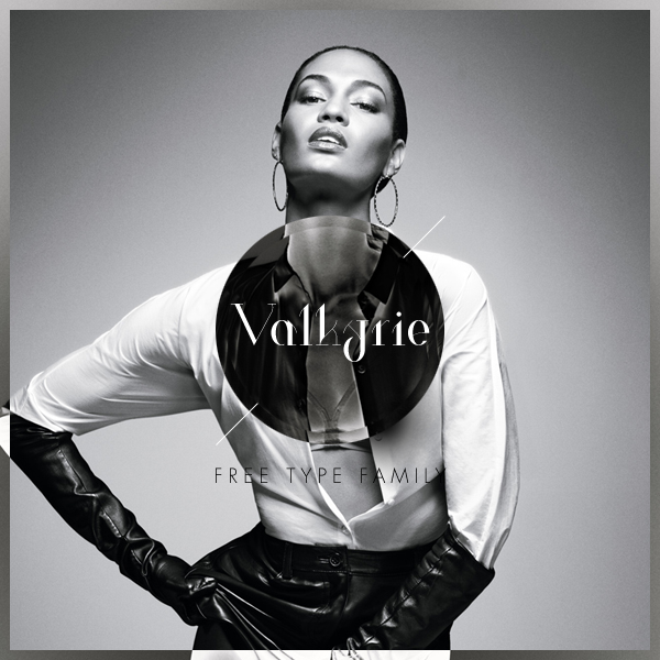
Best for: fashion magazines, blogs, editorial covers, luxury campaigns, and contemporary branding.
Valkyrie by Hendrick Rolandez uses geometric details to create a fashion-forward display style while remaining cleaner than an ornate serif or script.
40. Construthinvism Font

Best for: experimental posters, architecture, technology, exhibitions, editorial titles, and conceptual design.
Construthinvism uses geometric forms and skewed lines, making it less conventionally elegant but particularly useful when a project needs a more architectural interpretation of refinement.
41. Banthers Font
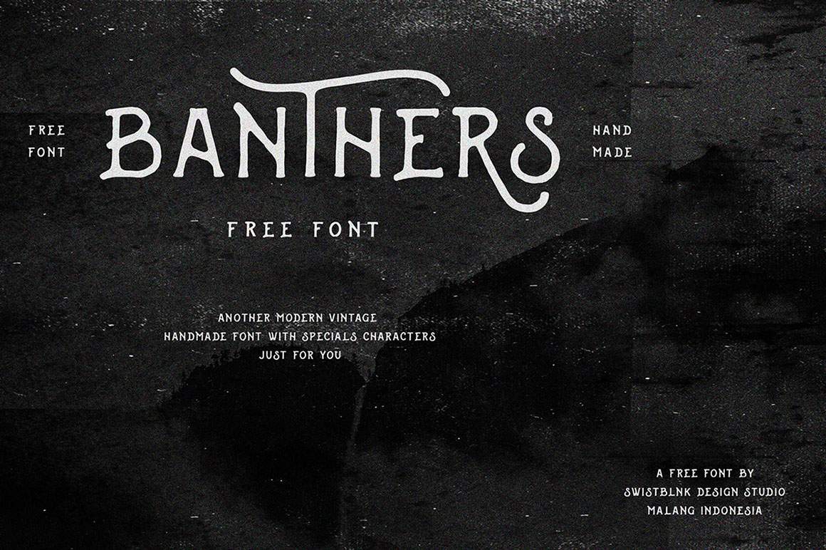
Best for: branding, editorial, posters, fashion, packaging, labels, and contemporary vintage projects.
Banthers combines modern construction with vintage references and includes alternative characters that help designers avoid repetitive word shapes.
42. Bleakerst Font

Best for: invitations, fashion blogs, branding, editorial titles, lifestyle graphics, and elegant vintage compositions.
Bleakerst works in the space between old-world influence and contemporary design, which makes it useful when a completely historical typeface would feel too literal.
43. Poiret Font
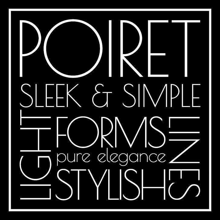
Best for: minimalist branding, editorial layouts, posters, architecture, cultural projects, and contemporary titles.
Poiret by Denis Masharov uses clean geometric shapes and thin linework. Its elegance comes from proportion and simplicity rather than decorative flourishes.
44. Roicamonta Font
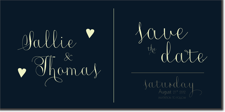
Best for: wedding cards, invitations, beauty projects, feminine branding, stationery, and delicate typography.
Roicamonta by Aga Silva uses very thin cursive forms. Keep the background simple and avoid reducing it too far, especially for print.
45. Distorted Fashion Font
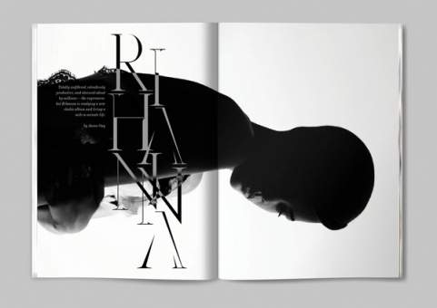
Best for: fashion covers, experimental branding, posters, beauty campaigns, editorial graphics, and large titles.
Distorted Fashion by Scribblez Grafix uses intentional gaps and interruptions to make relatively minimalist letterforms feel more unconventional.
46. Handletter Font
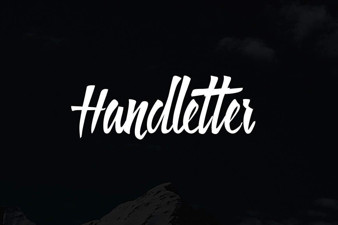
Best for: lifestyle design, posters, personal branding, packaging accents, quotes, and social graphics.
Handletter by Sasha Kodzio provides an intentionally handmade voice that works best as contrast against cleaner supporting typography.
47. Lombok Font
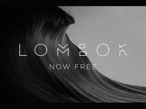
Best for: branding, architecture, fashion, technology, posters, editorial titles, and minimal identity systems.
Lombok by Alexandre Pietra is one of the strongest geometric display options in this collection. Its recognizable construction can give very simple layouts an immediate visual signature.
48. Blenda Script Font
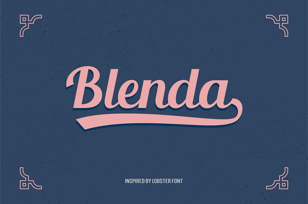
Best for: retro branding, restaurants, cafés, packaging, posters, apparel, and badge-style identities.
Blenda by Seniors Studio combines vintage script character with alternative glyphs that can make logos and short headlines feel much more custom.
49. Brayden Font
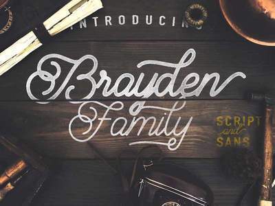
Best for: quotes, logos, headlines, packaging, vintage branding, and editorial projects.
Brayden uses retro-inspired details and distinctive initial and terminal letterforms. Those special characters are especially useful when creating logo-like typography from an existing font.
50. Shintia Font

Best for: logos, posters, Instagram graphics, lifestyle brands, packaging, invitations, and vintage-inspired design.
Shintia by Seniors Studio closes the collection with a classic script direction that combines decorative movement with relatively crisp letterforms.
How to Choose an Elegant Font for Branding
Start with the brand personality rather than the font library.
Luxury and Fashion
Explore fonts with:
- High stroke contrast.
- Tall proportions.
- Generous spacing.
- Distinctive terminals.
Fonts such as Coco, Vanity, Glamor, DitaSweet, and Monastic naturally move in this direction.
Modern and Minimal
Moon, One Day, Geomanist, Poiret, Lombok, and Lovelo can support cleaner contemporary identities.
Romantic and Personal
Castro Script, Parisienne, Balqis, Valencia, Lavanderia, Cylburn, Coneria, and Roicamonta offer more handwritten or calligraphic character.
Retro and Hospitality
Nickainley, Metropolis, Wisdom, Carosello, Streetwear, Blenda, and Brayden can work well for cafés, restaurants, packaging, events, and nostalgic identity systems.
How to Pair Elegant Fonts
Script + Neutral Sans Serif
This is one of the safest combinations.
For example:
- Balqis + clean sans serif.
- Parisienne + geometric sans.
- Lavanderia + simple grotesk.
- Blenda + neutral supporting typeface.
Fashion Display + Simple Sans
Fonts such as Glamor or Vanity already provide enough personality. Let body copy stay quiet.
Geometric Display + Readable Text Family
Lombok or One Day can handle a hero title while a functional text family handles paragraphs and navigation.
Avoid Pairing Two Fonts That Both Demand Attention
If both typefaces have elaborate swashes, unusual terminals, dramatic contrast, or strong historical references, they may compete instead of creating hierarchy.
How to Use Script Fonts Without Making a Design Look Dated
Use Less of Them
One short script line often feels more contemporary than an entire composition set in calligraphy.
Pair With Modern Layout
Combine script with:
- Clean grids.
- Generous whitespace.
- Modern photography.
- Minimal color systems.
Avoid Stacking Decorative Effects
Script + gold foil + ornamental frame + floral background + shadows can quickly become visually heavy.
How to Test a Font Before Using It in a Logo
- Type the real brand name.
- Try uppercase and lowercase variations.
- Check alternative glyphs and ligatures.
- Test black and white.
- Reduce the logo to favicon or social-avatar size.
- Print it at business-card scale.
- Check the full license.
What to Check Before Downloading a Free Font
Character Set
Check whether you have:
- Uppercase.
- Lowercase.
- Numbers.
- Punctuation.
- Currency symbols.
- Accented characters.
Language Support
A beautiful font becomes much less useful when the required language is missing.
Weights and Styles
One display style may be enough for a poster, but a brand or website often benefits from a larger family.
License
Personal-use permission is not the same as commercial permission.
Free Font Licensing Checklist
- Is commercial use allowed?
- Can the font be used in a logo?
- Can it be used for paid client work?
- Can it be used on physical merchandise?
- Is webfont embedding permitted?
- Can it be embedded in an app?
- Can the font be used in templates for resale?
- Is attribution required?
- Is the download only a demo?
- Can the actual font file be redistributed?
Common Elegant Typography Mistakes
1. Using Script for Long Paragraphs
Most decorative scripts are display fonts, not reading fonts.
2. Making Everything Thin
Thin typography can feel elegant, but a complete hierarchy still needs contrast.
3. Using Too Many Decorative Fonts
Let one typeface provide the personality.
4. Using Huge Tracking Everywhere
Wide spacing can work beautifully with uppercase display typography, but it is not universally elegant.
5. Choosing a Font Only From the Preview Image
Always test your actual words.
6. Ignoring Numbers
This becomes a problem later when a project needs pricing, dates, addresses, or statistics.
7. Ignoring Accented Characters
Especially important for multilingual brands.
8. Using Effects to Manufacture Luxury
Gold gradients cannot fix weak typography.
9. Treating Every Elegant Brand as Feminine
Elegance can be geometric, architectural, minimal, bold, industrial, or restrained.
10. Assuming a Free Download Means Free Commercial Use
Always check the actual license.
Frequently Asked Questions About Free Elegant Fonts
What are free elegant fonts?
Free elegant fonts are downloadable typefaces with refined visual characteristics such as balanced proportions, sophisticated curves, geometric construction, calligraphic movement, high contrast, or carefully controlled spacing.
What are elegant fonts best used for?
They are commonly used in branding, logos, wedding invitations, fashion design, editorial covers, packaging, beauty, hospitality, stationery, posters, and premium social-media graphics.
What is the best elegant font for a luxury brand?
Luxury projects often benefit from high-contrast or fashion-oriented typefaces such as Coco, Vanity, Glamor, DitaSweet, or Monastic, but the correct choice depends on the specific brand personality.
What elegant fonts work for modern branding?
Moon, One Day, Geomanist, Lovelo, Poiret, and Lombok offer cleaner geometric directions that can work well in modern identity systems.
What elegant fonts work for weddings?
Castro Script, Parisienne, Balqis, Valencia, Cylburn, Coneria, and similar calligraphic or handwritten styles naturally suit wedding and event stationery.
Can elegant script fonts be used in logos?
Yes, when the font license allows logo use and the lettering remains distinctive and legible at the required sizes.
Can I use two script fonts together?
Usually it is easier to create hierarchy by pairing one script font with a neutral serif or sans serif instead of using two decorative scripts.
Are all 50 fonts free for commercial use?
No universal commercial-use claim should be made for the full collection. Licensing varies by designer and source, and some downloads may be personal-use or demo versions.
How many fonts should a branding project use?
Many branding systems work perfectly with one flexible family or two complementary typefaces. Additional fonts should have a specific role.
What is the difference between an elegant font and a luxury font?
Luxury is one possible application of elegant typography. Elegant design is broader and can include restrained geometric sans serifs, handwritten fonts, calligraphy, fashion serifs, retro display faces, and minimalist type.
Final Thoughts
The best free elegant fonts are not necessarily the thinnest, most decorative, or most luxurious-looking typefaces.
Elegance comes from appropriate choice and controlled use.
A font like Geomanist can create refinement through simplicity. Coco, Vanity, Glamor, and DitaSweet can add fashion-oriented sophistication. Parisienne, Balqis, Lavanderia, and Cylburn can introduce calligraphic movement. Lombok and One Day create geometric elegance, while Carosello, Streetwear, Blenda, and Brayden provide richer retro character.
The important question is not:
“Which font looks the most elegant?”
It is:
“Which kind of elegance belongs to this project?”
Test the actual words. Check small sizes. Explore alternate characters. Build a real hierarchy. Pair decorative fonts with something quieter. Verify language support. And always review the license before using a free font professionally.
Good typography makes a design attractive. Great typography makes its personality feel intentional.
For more free fonts, typography inspiration, mockups, textures, brushes, and practical resources for designers, continue exploring DesignRise.