



Free poster mockups help graphic designers present artwork in realistic environments instead of showing every poster as a flat rectangle on a screen.
That change in context can completely transform a presentation.
A concert poster placed on a concrete city wall feels very different from the same artwork displayed in a minimal interior frame. A museum poster needs another visual context entirely, while an advertising campaign may look most convincing in a large outdoor frame or street environment.
For designers, poster mockups are useful for much more than decoration. They can help evaluate scale, contrast, readability, framing, visual hierarchy, and how the artwork responds to the environment around it.
This DesignRise collection brings together 20 free poster mockups and poster presentation resources for advertising, branding, events, exhibitions, movies, restaurants, art prints, campaigns, typography, photography, and portfolio projects.
Inside the collection you will find:
- Outdoor poster frames.
- Urban street posters.
- Movie poster presentations.
- Large-format advertising posters.
- Floor-standing framed posters.
- Minimal interior poster mockups.
- Concrete wall presentations.
- Multiple-poster compositions.
- Isometric poster scenes.
- Wooden poster hangers.
- Horizontal frames.
- Rolled poster presentations.
- Restaurant wall mockups.
- Canvas poster scenes.
- Hand-held posters.
- Museum-style wall presentations.
Some resources are layered Photoshop PSD files with Smart Objects, while editing methods, resolutions, and licensing differ between creators. Always check the original source page if you require a particular format, Photoshop version, print resolution, or commercial-use license.
Licensing note: a free download does not automatically mean unrestricted commercial use. Review the current license on the original resource page before using a mockup for paid client projects, advertising, templates, commercial products, or resale.
Explore More DesignRise Resources:
- Free PSD Billboard Mockups for Outdoor Advertising
- Free Catalog Mockups for Designers
- Free Restaurant Branding Mockups
Why Poster Mockups Are Useful for Graphic Designers
A poster is designed to exist in an environment.
It may appear:
- On a street wall.
- Inside a frame.
- At a bus stop.
- In a restaurant.
- Inside a gallery.
- At an exhibition.
- In a shop window.
- On a studio wall.
Showing the artwork in an appropriate environment helps communicate how it is intended to be experienced.
Mockups Show Realistic Scale
A title that looks enormous on an artboard may actually be appropriate when the poster is viewed from several meters away.
Likewise, small supporting text that looks perfectly readable at 100% zoom may become almost invisible once the artwork is shown at realistic scale.
Mockups Reveal Contrast Problems
A pale poster may look beautiful on a clean white artboard but disappear against a bright wall or city environment.
Mockups Improve Portfolio Context
A realistic scene allows viewers to understand whether the project was designed for:
- An exhibition.
- A movie.
- A cultural event.
- An advertising campaign.
- A restaurant.
- A fashion brand.
- An art print.
Which Poster Mockup Style Should You Choose?
20 Free Poster Mockups for Designers
1. Outdoor Poster Frame Mockup

Best for: outdoor advertising, events, retail campaigns, cultural posters, fashion, and public promotions.
An outdoor frame immediately gives the artwork a commercial advertising context. It is useful for testing whether the composition has enough impact to attract attention in a public environment.
Check the Poster From a Distance
Reduce the mockup significantly on screen and ask whether you can still understand:
- The main headline.
- The brand or event.
- The focal image.
- The most important information.
2. Man Holding Red Carpet Movie Poster Mockup

Best for: film posters, entertainment campaigns, movie events, premieres, festivals, and promotional artwork.
A human figure provides an immediate sense of scale and can make entertainment artwork feel more connected to a real promotional event.
Source note: this is an older external resource. Check current availability and licensing on the original page before relying on it for a new commercial project.
3. Urban Poster Mockups
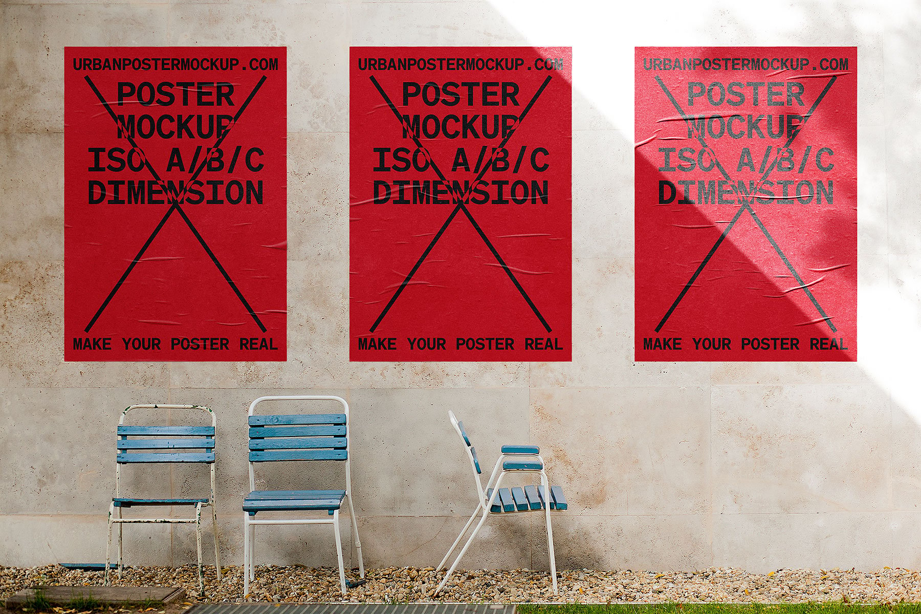
Best for: music, fashion, streetwear, festivals, cultural campaigns, exhibitions, and experimental graphic design.
An urban environment adds texture, imperfections, architecture, and visual noise around the artwork.
That makes this type of mockup particularly useful for testing whether a poster can still attract attention in a busy real-world setting.
4. Side-by-Side Framed Street Posters Mockup PSD

Best for: poster series, campaigns, product launches, exhibitions, movie promotions, and brand advertising.
Two adjacent frames give designers an opportunity to show how several posters work together rather than evaluating only one composition.
Create a Campaign System
Try keeping:
- Grid.
- Typography.
- Logo position.
- Image treatment.
consistent while changing the central message or artwork.
5. Huge Poster With People Mockup

Best for: large-format campaigns, fashion, advertising, events, exhibitions, retail launches, and public branding.
The presence of people makes the scale of the poster immediately understandable.
Large-format design often benefits from:
- Fewer words.
- Larger typography.
- One clear focal point.
- High contrast.
6. Floor Frame Poster Mockup PSD

Best for: art prints, typography, interior branding, photography, illustration, and minimalist poster design.
A frame resting on the floor creates a relaxed contemporary interior presentation and keeps attention primarily on the artwork.
7. Stylish Poster Mockup

Best for: graphic art, editorial posters, contemporary branding, photography, typography, and portfolio presentations.
A carefully styled environment can help position artwork as premium or editorial, particularly when the poster design itself is minimal.
Match the Scene to the Project
A stylish interior can strengthen a luxury or art project but may feel inappropriate for a raw street campaign.
8. Concrete Paper Poster Mockup

Best for: urban campaigns, typography, exhibitions, music, architecture, streetwear, and contemporary graphic design.
Concrete provides a neutral but textured environment that can make clean digital artwork feel more physical without overwhelming the composition.
9. Thin Wall Frame Poster Mockup

Best for: gallery posters, photography, illustrations, quotes, editorial artwork, and interior design presentations.
Thin frames add structure without becoming the main visual element. This makes them useful for artwork where color, typography, or photography should remain dominant.
10. Three Vertical Poster Mockup

Best for: poster collections, campaigns, exhibitions, branding systems, photography series, and event graphics.
Three frames are ideal for demonstrating how one visual system expands across several messages.
Do Not Make Every Poster Identical
A good campaign needs consistency without repetition.
You can vary:
- Image.
- Headline.
- Color emphasis.
- Supporting graphic.
while maintaining the same underlying structure.
11. Isometric Poster Mockup
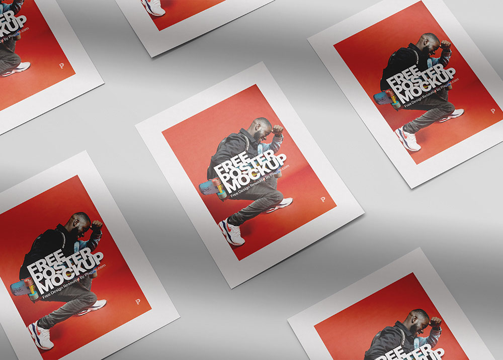
Best for: portfolio hero images, graphic posters, typography, art prints, campaigns, and presentation covers.
An isometric angle creates more visual depth than a straight-on wall frame and can help a flat poster feel like a physical printed object.
12. Wooden Hanger Poster Mockup

Best for: art prints, quotes, illustration, educational posters, home décor, photography, and natural branding.
A wooden hanger creates a softer presentation than a traditional black or metallic frame.
It works particularly well with:
- Botanical art.
- Minimal illustration.
- Natural color palettes.
- Hand-drawn typography.
13. Horizontal Poster Frame Mockup
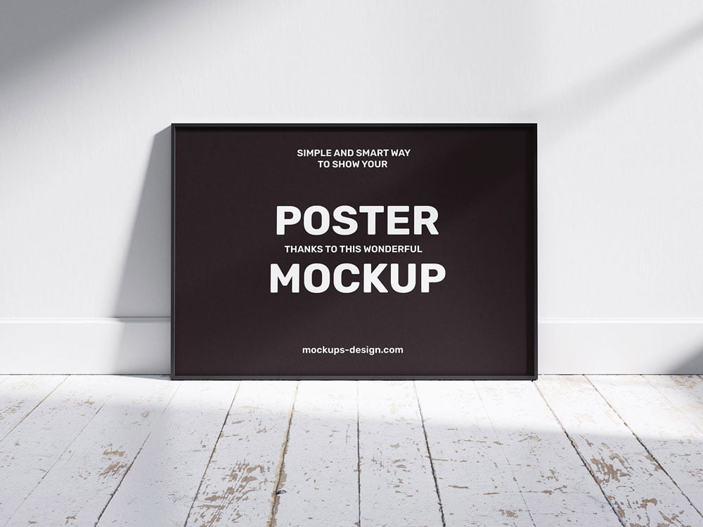
Best for: landscape photography, wide-format advertising, panoramic illustration, editorial art, and interior posters.
Not every poster needs to be portrait-oriented. A horizontal mockup is useful when presenting panoramic photography, landscape graphics, or campaign artwork created specifically for wider formats.
14. Rolled Poster Mockup

Best for: print products, posters for sale, art prints, typography, photography, and e-commerce presentations.
A rolled poster communicates the physical quality of printed paper and can be particularly useful when presenting artwork as a product rather than advertising mounted in an environment.
15. Urban Poster Mockup

Best for: nightlife, festivals, cultural events, streetwear, music, independent brands, and creative advertising.
Urban scenes are useful for artwork that was designed to compete with a visually complex environment.
Check whether the most important message remains clear when surrounded by architecture, texture, shadows, and other city details.
16. Portrait & Landscape Poster Mockup

Best for: flexible campaigns, advertising sets, exhibitions, photography, typography, and multi-format branding.
Showing portrait and landscape artwork together can demonstrate that a visual system is flexible rather than dependent on one canvas shape.
Adapt the Composition
Do not simply crop the portrait artwork into a horizontal frame.
Reconsider:
- Headline position.
- Image crop.
- Whitespace.
- Logo position.
17. Restaurant Wall Poster Mockup

Best for: restaurants, cafés, bars, menus, hospitality campaigns, food photography, and interior branding.
A restaurant environment gives posters a clear hospitality context.
It can be used for:
- Seasonal campaigns.
- Food photography.
- Brand storytelling.
- Special offers.
- Decorative artwork.
18. Canvas Poster Mockup

Best for: artwork, photography, illustration, print products, home décor, and portfolio presentations.
A canvas presentation creates a more tactile and decorative impression than standard paper inside a frame.
Use it when the artwork is intended to be perceived as wall décor or a physical art product.
19. Man Holding Poster Mockup
Best for: event campaigns, announcements, social movements, fashion, advertising, festivals, and promotional posters.
A hand-held poster communicates human scale immediately and can make a campaign feel more active and social than a poster displayed alone on a wall.
20. Museum Poster Frames Mockup

Best for: museums, galleries, cultural institutions, exhibitions, photography, typography, and art campaigns.
A museum-style presentation gives artwork a more curated and institutional context.
It is particularly effective when presenting:
- Exhibition identities.
- Cultural programs.
- Art series.
- Photography.
- Editorial typography.
How to Choose the Right Poster Mockup
Do not choose a scene only because it looks attractive.
Start with the intended environment of the poster.
Advertising Campaign
Choose:
- Outdoor frames.
- Street posters.
- Large-format scenes.
Art or Illustration
Choose:
- Minimal frames.
- Museum scenes.
- Wooden hangers.
- Canvas presentations.
Music or Festival
Choose:
- Urban walls.
- Concrete backgrounds.
- Large outdoor posters.
Hospitality
Use restaurant or interior wall scenes where the environment supports the brand.
Poster Sizes Designers Should Consider
Your actual production size should always come from the printer or project specifications, but common poster formats may include A-series and other standard print proportions.
Before inserting a design into a mockup, check whether the artwork and the mockup use similar proportions.
Avoid Blind Cropping
If the proportions do not match, do not simply stretch the artwork.
Instead:
- Adjust the crop.
- Reposition typography.
- Change margins.
- Create a dedicated variation.
How to Make a Poster Readable From a Distance
Create One Main Focal Point
The viewer should immediately know where to look.
Limit the Number of Messages
A poster is not a brochure.
Prioritize:
- Main message.
- Important visual.
- Essential supporting information.
- Brand or CTA.
Use Strong Contrast
Typography should remain readable against photography, textures, and environmental backgrounds.
Typography for Poster Design
Display Typography
Posters provide room to experiment with:
- Oversized type.
- Condensed fonts.
- Experimental lettering.
- Serif display faces.
- Custom typography.
Supporting Information
Dates, addresses, websites, prices, and schedules should remain practical and readable.
Do Not Use Five Different Fonts to Create Hierarchy
Size, weight, spacing, alignment, and color can create hierarchy without adding another typeface.
How to Build a Poster Series
A campaign often needs more than one poster.
Create a system that can change while remaining recognizable.
Keep Consistent
- Grid.
- Typography.
- Logo position.
- Overall art direction.
Allow Variation
- Images.
- Headlines.
- Colors.
- Illustrations.
The goal is to create a family rather than duplicate one poster twenty times.
How to Use Poster Mockups in a Portfolio
Show the Flat Poster
Let viewers see the actual composition without perspective, reflections, or environment.
Add One Hero Mockup
Choose the scene that best communicates the intended use.
Show the Campaign
If several posters exist, use multi-frame mockups to show the system together.
Add Close-Up Details
Highlight:
- Typography.
- Illustration.
- Texture.
- Photography treatment.
Poster Mockup Workflow
- Complete the flat poster design.
- Confirm the intended format.
- Select a mockup with similar proportions.
- Insert the artwork using the available editable method.
- Check perspective and scale.
- Review readability at reduced size.
- Check surrounding contrast.
- Export a high-quality presentation image.
Common Poster Presentation Mistakes
1. Choosing the Wrong Environment
A gallery poster does not necessarily need a gritty city wall, while a streetwear campaign may feel too polished inside a luxury interior.
2. Showing Only Mockups
Always include the flat design somewhere in the project.
3. Making Small Text Too Important
If it cannot be read from the intended viewing distance, reconsider the hierarchy.
4. Stretching Artwork to Fit the Frame
Maintain the original proportions or create a dedicated format.
5. Using Too Many Mockups
A portfolio does not need six nearly identical wall scenes.
6. Letting the Environment Overpower the Poster
The mockup should support the design, not become the main attraction.
7. Ignoring Realistic Scale
A small indoor print and a huge outdoor campaign require different typography decisions.
8. Using Low-Resolution Artwork
A high-resolution PSD will not make a pixelated poster sharp.
9. Using the Same Layout for Portrait and Landscape
Adapt the composition to each format.
10. Assuming Every Free Poster Mockup Allows Commercial Use
Always check the current license on the original resource page.
Poster Mockup Licensing Checklist
- Is personal use allowed?
- Is commercial use allowed?
- Can the mockup be used for paid client presentations?
- Can the resulting image be used in advertising?
- Can it appear in a portfolio?
- Is attribution required?
- Can the PSD be modified?
- Can the source file be redistributed?
- Can it be included in templates or products for resale?
Frequently Asked Questions About Free Poster Mockups
What are poster mockups?
Poster mockups are presentation templates that place poster artwork into realistic frames, walls, urban environments, galleries, interiors, and other scenes.
What are free poster mockups used for?
Free poster mockups can be used for portfolio presentations, campaign concepts, advertising, exhibitions, movie posters, events, art prints, typography, photography, and client presentations.
What is the best poster mockup for advertising?
Outdoor frames, urban street scenes, and large-format poster presentations usually provide the most appropriate context for advertising campaigns.
Which poster mockups work best for artwork?
Minimal interior frames, museum scenes, wooden hangers, canvas mockups, and floor-standing frames can keep attention focused on the artwork itself.
Do all poster mockups use Smart Objects?
No. Many Photoshop PSD mockups do, but editing structures vary between creators and resources.
Can poster mockups be used commercially?
Only when the individual resource license permits the intended commercial use.
Should I show the flat poster as well as the mockup?
Yes. A flat view allows viewers to evaluate the actual graphic design, while the mockup demonstrates how the artwork behaves in context.
What is the difference between a poster mockup and a billboard mockup?
Poster mockups generally present smaller printed formats on walls, frames, interiors, streets, or display structures. Billboard mockups are intended for much larger outdoor advertising surfaces and require different considerations for viewing distance and scale.
How many poster mockups should I use in one portfolio project?
Use only the views that add useful context. One strong hero scene, a campaign view, and a clean flat poster may be enough for many projects.
Can I use one poster design in both portrait and landscape mockups?
You can use the same visual system, but the composition should usually be adapted rather than stretched or automatically cropped.
Final Thoughts
The best free poster mockups do more than place artwork inside an attractive frame.
They show how the design behaves in the environment it was created for.
An urban wall can test whether a music poster survives visual noise. A gallery scene can position an illustration as artwork. A large outdoor presentation reveals whether typography remains powerful from a distance, while a restaurant wall gives hospitality graphics an immediate real-world context.
Choose the mockup based on the project rather than the appearance of the mockup itself.
Check the proportions. Test readability. Preserve the original artwork quality. Show flat poster designs alongside realistic presentations. Use multiple-poster scenes when you need to demonstrate a complete campaign system.
And always review the original resource license before commercial use.
A strong poster mockup should give the design meaningful context without taking attention away from the poster itself.
For more poster resources, mockups, fonts, Photoshop assets, textures, and practical inspiration for designers, continue exploring DesignRise.