


Free retro mockups can do something modern presentation templates often cannot: give a design a believable sense of time, material, and cultural context.
A poster shown on a perfectly clean contemporary wall communicates one thing. The same poster placed beside worn paper, a vintage television, a VHS cassette, an old IBM desktop, a motel sign, or a weathered number plate immediately begins telling a different story.
That is why retro mockups are useful far beyond obvious “vintage” projects. They can support music artwork, fashion campaigns, restaurant branding, nostalgic packaging, film promotions, editorial concepts, heritage identities, photography portfolios, album releases, event posters, merchandise, and even modern brands that want one deliberately analog touch inside an otherwise contemporary visual system.
The important part is choosing the right kind of nostalgia.
A 1950s roadside motel sign, a 1970s-inspired print layout, an old typewriter, a VHS cassette, and a beige desktop computer do not belong to the same visual era. Mixing all of them indiscriminately may produce something that looks vaguely “retro,” but not necessarily convincing.
Professional retro design works better when the designer understands what each object contributes: material, period, cultural reference, color, texture, technology, and mood.
This DesignRise collection brings together 16 retro-style Photoshop mockups, including vintage posters, flyers, desks, televisions, VHS cassettes, vehicles, wooden frames, classic computers, storefronts, Polaroid photography, torn paper, typewriters, motel signage, number plates, and grunge walls.
Along the way, this guide explains how to choose a retro mockup by era, how to prevent a modern design from looking pasted onto an old photograph, how to use Smart Objects correctly, how to control texture and color, and how to build a retro-inspired presentation that feels intentional instead of costume-like.
Licensing note: these resources come from different creators and websites. Download availability and usage terms can change. Always check the current license on the original source page before using a mockup in client work, advertising, templates, commercial products, or other professional projects.
Explore More DesignRise Resources:
- Great Mockups of Rubber Stamps PSD
- Best Free Brush Fonts for Designers
- Free Snake Skin Textures
- Explore More Mockup Templates on DesignRise
What Makes a Retro Mockup Feel Convincing?
Retro presentation is not created by adding grain and lowering saturation. The most convincing mockups combine several signals that belong together.
Material
Paper, wood, plastic, glass, metal, CRT screens, magnetic tape, faded paint, and old printing surfaces all respond differently to light and age.
A design placed on a VHS cassette should not have the same perfectly clean surface treatment as artwork displayed on a modern OLED screen.
Technology
Objects such as typewriters, VHS tapes, Polaroid photographs, CRT televisions, and early desktop computers immediately identify a broader technological period.
That context can become part of the message rather than simply decoration.
Color
Retro does not automatically mean sepia.
Depending on the intended era and design direction, useful palettes may include:
- Mustard and brown.
- Burnt orange and cream.
- Avocado green.
- Muted burgundy.
- Dusty blue.
- Warm beige.
- Faded red.
- Black and off-white.
- Pastel pink and turquoise.
- High-contrast neon for later retro periods.
Typography
A clean contemporary grotesk can work beautifully in a retro scene when the contrast is deliberate. Alternatively, a period-inspired display face can reinforce the historical direction.
The mistake is using several obviously nostalgic fonts at once.
Imperfection
Real older objects show wear differently depending on material. Paper creases. Ink fades. Metal scratches. Plastic yellows. Paint chips.
Good mockups reproduce some of those qualities naturally, which means the designer should not add every possible distress effect on top.
Choose the Retro Era Before Choosing the Mockup
One of the easiest ways to make nostalgic design more coherent is to define a broad period first.
16 Best Free Retro Mockups for Photoshop
The free retro mockups below cover very different visual periods and materials. Use them as presentation environments rather than treating all sixteen as one interchangeable vintage style.
1. Torn Street Poster Mockup
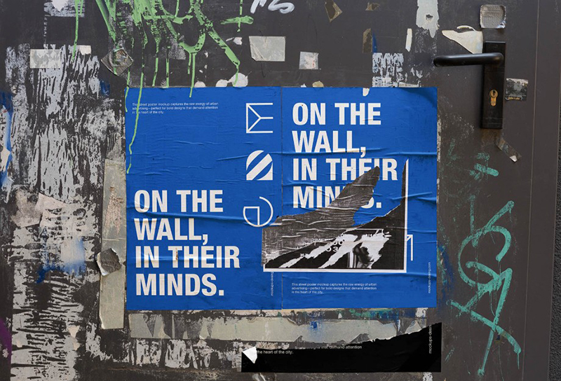
Torn Street Poster Mockup is a realistic PSD template designed to give posters, campaign graphics, and branding visuals a raw urban character. The ripped edges, wrinkled paper, worn surface, and layered street details make the artwork feel naturally integrated into a real city environment rather than placed inside a perfectly clean presentation scene.
Best for: music promotions, streetwear branding, underground events, editorial graphics, cultural campaigns, fashion posters, nightlife visuals, and bold portfolio presentations.
Why This Mockup Works for Retro and Urban Design
The distressed paper and weathered street surface already provide plenty of texture, so the strongest approach is often to keep the inserted artwork relatively controlled. Clean typography, strong color blocks, vintage-inspired illustration, or simple poster layouts can create more convincing contrast than adding additional grunge effects everywhere.
This mockup is especially useful when you want a design to feel as though it has been physically posted, exposed to the street, and naturally aged over time. According to the source, the file is compatible with Photoshop and is available for commercial use without required attribution.
2. Retro Style Flyer Mockup
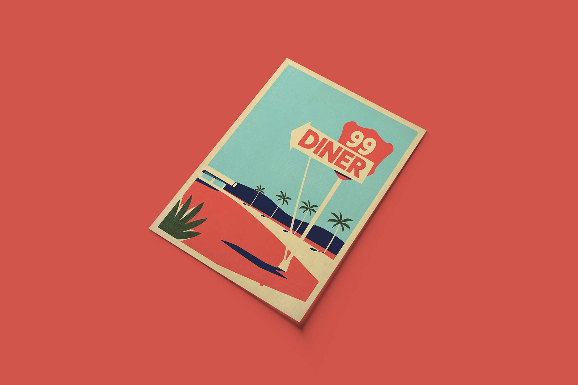
Best for: club flyers, music events, promotions, restaurant graphics, retro parties, exhibitions, and small-format print design.
Flyer mockups are particularly useful because they show how typography behaves at a smaller physical scale than posters.
Test Real Print Size
Do not judge the artwork only while zoomed in.
Important information such as:
- Date.
- Venue.
- Ticket price.
- Website.
- Contact information.
should remain readable when the flyer is shown at realistic size.
3. Free Vintage Desk Video Mockup

Best for: editorial storytelling, book design, stationery, photography, portfolio work, creative brands, and atmospheric presentations.
A desk scene is useful when the goal is not simply to show one object but to create a complete creative environment.
Use the Scene to Suggest a Story
A vintage desk can imply writing, correspondence, research, memory, craftsmanship, or analog creativity.
This makes it particularly effective for:
- Author branding.
- Editorial projects.
- Wedding stationery.
- Photography.
- Heritage brands.
Keep the inserted design consistent with the surrounding objects rather than forcing a highly futuristic identity into the scene without a clear conceptual reason.
4. Vintage TV Mockup
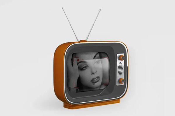
Best for: music visuals, film campaigns, retro technology, experimental branding, motion design, social media, and entertainment projects.
A CRT television is more than a screen frame. It immediately introduces associations with broadcast television, analog video, scan lines, static, and pre-flat-screen media.
Do Not Place Perfect Modern Screen Content Into an Old TV
A perfectly sharp 4K image inside an aged CRT can look pasted in.
Depending on the project, consider subtle:
- Softness.
- Noise.
- Scan-line texture.
- Reduced contrast.
- Screen glow.
- Color bleed.
Keep these effects controlled. The goal is integration, not a caricature of old television.
5. Vintage VHS Cassettes Mockup

Best for: film projects, album artwork, music releases, 1980s and 1990s campaigns, horror graphics, merchandise, and nostalgic entertainment branding.
VHS is one of the strongest retro signals in this collection because the object itself carries a specific cultural association.
Design the Label, Not Just the Image
Real VHS packaging and cassette labels often contain small technical details, recording information, branding, numbers, and practical typography.
Adding controlled secondary information can make the presentation feel far more believable than placing one large logo in the middle.
6. Black Hipster Van PSD Mockup
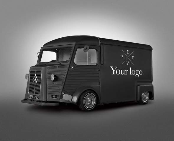
Best for: food trucks, cafés, craft brands, mobile businesses, outdoor events, automotive graphics, lifestyle branding, and merchandise.
A vintage vehicle is useful because it brings the identity into a physical branded environment rather than leaving it on paper.
Think Like Vehicle Graphics
A logo that works beautifully on a business card may become too detailed when enlarged onto a van.
Prioritize:
- Simple brand marks.
- Large readable typography.
- Limited color.
- Strong contrast.
- Clear placement around doors and windows.
7. Retro Vintage Wooden Photo Frame Mockup
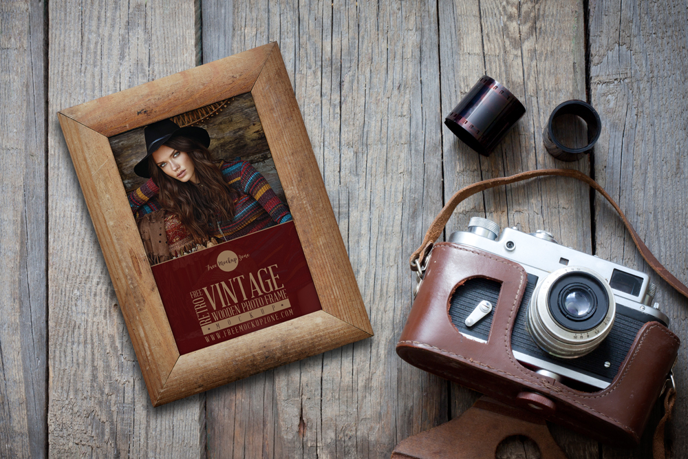
Best for: photography, illustration, art prints, wedding projects, heritage branding, family-oriented products, and editorial presentations.
The wooden material adds warmth that a minimal black frame cannot provide.
Match the Artwork to the Physical Frame
A heavily futuristic neon composition can work through contrast, but a more natural match may use:
- Warm photography.
- Botanical illustration.
- Muted posters.
- Editorial artwork.
- Heritage typography.
Let the wood grain remain visible instead of overwhelming it with additional texture overlays.
8. Free Vintage Storefront Mockup
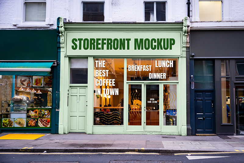
Free Vintage Storefront Mockup is a stylish Photoshop presentation template for showcasing logos, signage, restaurant identities, café branding, boutique concepts, and retro-inspired storefront designs in a realistic street setting.
The vintage architecture gives the scene much more personality than a neutral modern storefront, making it especially useful when a brand should feel established, nostalgic, handcrafted, or connected to classic city culture. Instead of showing a logo on a blank background, this mockup lets you see how the identity behaves as part of a complete physical environment.
Best for: cafés, restaurants, bakeries, bars, boutiques, hotels, vintage retail, local businesses, hospitality branding, and retro-inspired identity presentations.
Turn the Storefront Into a Complete Brand Scene
Do not treat the storefront as a place to display only one logo. A stronger presentation can use the scene to demonstrate several parts of the visual identity at once — primary signage, window graphics, secondary lettering, opening information, promotional messages, or other small branded details.
Keep those elements visually connected through the same typography, colors, and spacing rules. The result should feel like a real business location rather than several unrelated graphics placed onto one photograph.
Why It Works for Retro Branding
The vintage setting already provides the nostalgic character, so the actual identity does not need to be overloaded with distressed textures or decorative retro effects. A clean wordmark or restrained modern logo can create particularly attractive contrast against the older architecture.
The mockup includes Smart Object layers for inserting artwork, along with editable color and background options, an isolated shadow, and adjustable light intensity, giving you more control over how the final branding presentation integrates with the scene.
9. Retro Store View Mockup
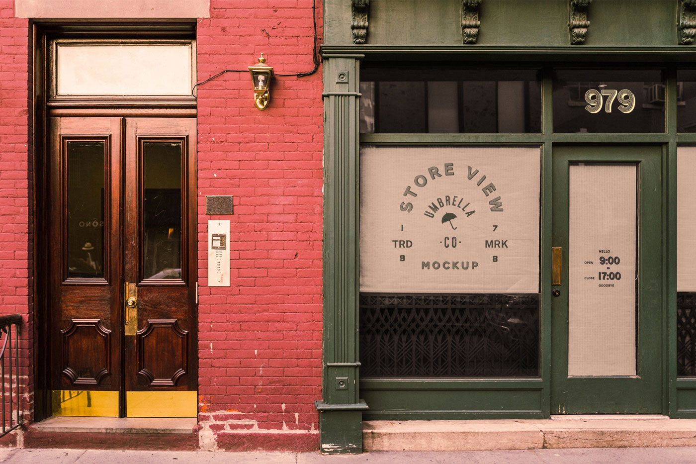
Best for: cafés, boutiques, restaurants, salons, vintage retail, hospitality, and local business branding.
A storefront mockup demonstrates something a poster cannot: how a complete identity interacts with architecture and physical space.
Think Beyond the Logo
A convincing storefront identity may include:
- Main signage.
- Window graphics.
- Opening hours.
- Secondary decals.
- Posters.
- Product messages.
Use the mockup to show the visual system rather than repeating the logo everywhere.
10. 3 Shots of Polaroid Frame Mockup
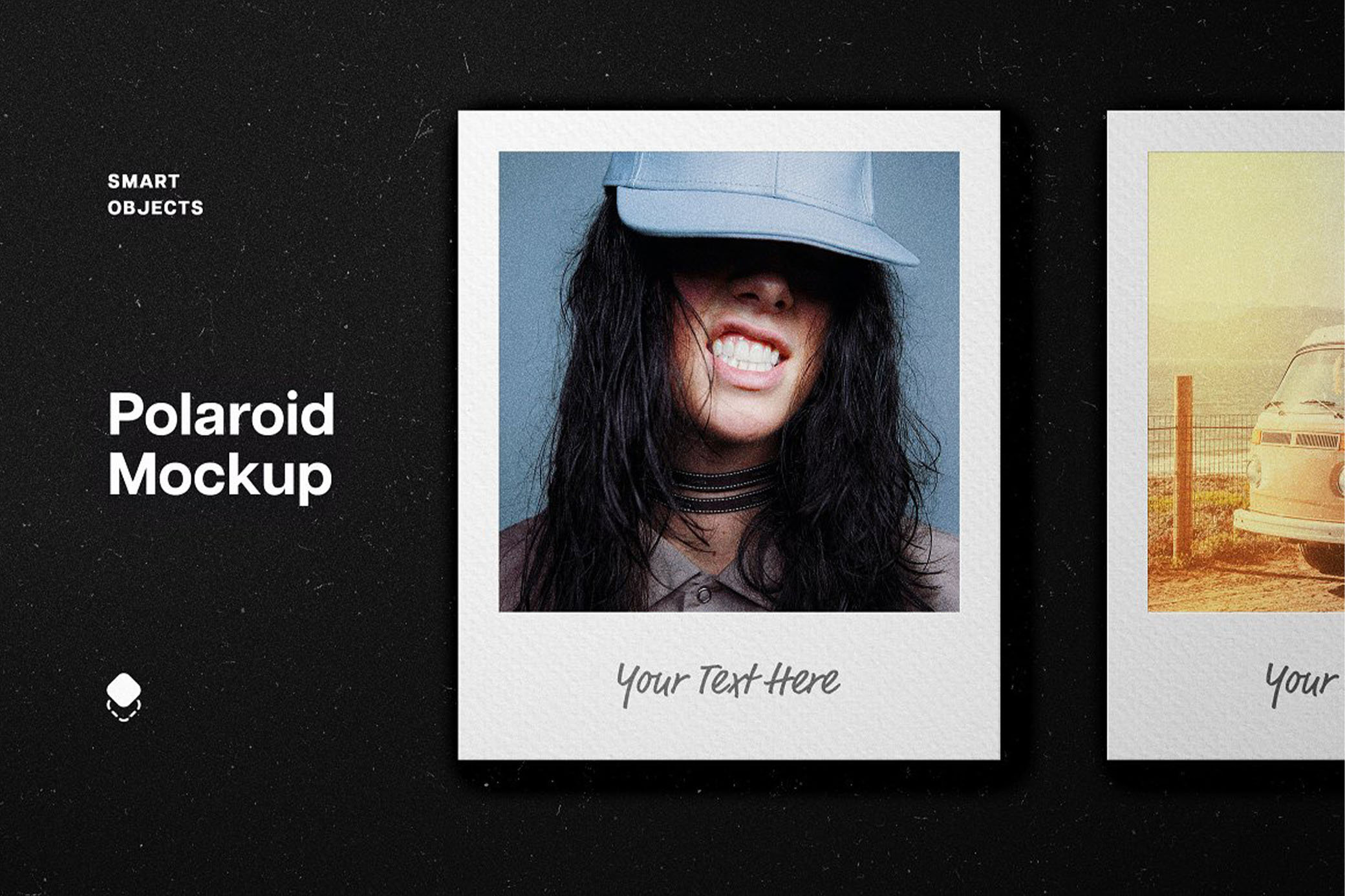
Best for: photography, travel, fashion, moodboards, social media, wedding design, editorial stories, and album artwork.
Polaroid-style frames communicate immediacy and personal memory. They feel less formal than a traditional print and can create a sense of documentation or found photography.
Use Different Images With One Visual Language
When several frames appear together, use photographs with:
- Compatible color grading.
- Related lighting.
- A coherent story.
- Similar grain treatment.
Three unrelated images can make the mockup feel like a random collage rather than an intentional series.
11. Craft Paper Printing Logo Mockup
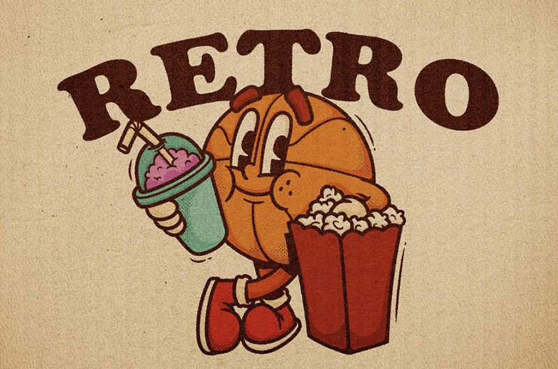
Craft Paper Printing Logo Mockup is a vintage-inspired PSD presentation template designed to give logos, typography, posters, and branding graphics the tactile appearance of printing on aged craft paper. Creases, folds, paper texture, and subtle imperfections create a natural analog character that works especially well for projects that should feel handmade, archival, nostalgic, or intentionally imperfect.
Best for: logo presentations, heritage branding, cafés, craft products, packaging concepts, editorial graphics, posters, merchandise, handmade brands, and vintage-inspired identity systems.
Why Craft Paper Works So Well for Retro Branding
Unlike a digital retro effect applied directly to the artwork, textured paper gives the design a believable physical surface. The typography and logo interact visually with folds, fibers, wrinkles, and variations in the paper instead of appearing as a perfectly clean graphic floating above a vintage background.
This makes the mockup particularly useful when the brand should communicate craftsmanship, authenticity, heritage, or analog production without relying on excessive decorative elements.
Keep the Artwork Cleaner Than the Paper
The paper already provides plenty of visual character, so avoid adding heavy distress textures to every part of the logo. Clean typography or a simple brand mark can create stronger contrast against the worn craft surface.
Try black, deep brown, muted burgundy, dark green, or another restrained ink-like color before adding multiple effects. A limited palette usually makes the simulated printing feel more convincing.
The Pixelbuddha resource includes a PSD mockup with three high-resolution vintage paper textures, giving you several surface variations for presenting the same identity or print design. :contentReference[oaicite:1]{index=1}
12. Front View of Torn Papers Mockup

Best for: editorial graphics, music posters, fashion campaigns, zines, protests, cultural events, streetwear, and collage design.
Torn paper is especially useful because it connects retro print culture with contemporary collage aesthetics.
Use the Tear as Composition
Do not simply place a full poster behind the paper.
Use the torn edge deliberately:
- Reveal a second color.
- Show another photograph.
- Expose alternative typography.
- Create a before/after concept.
- Separate two parts of the message.
The physical tear can become part of the layout itself.
13. Old Typewriter on a Desktop with White Roses

Best for: literature, editorial work, wedding stationery, poetic branding, publishing, author promotions, heritage campaigns, and romantic visual concepts.
A typewriter carries clear associations with writing, journalism, manuscripts, and analog communication.
Do Not Overuse Typewriter Fonts
Placing typewriter-style typography inside a real typewriter scene may become too literal.
A clean serif or restrained sans can create more sophisticated contrast while the object itself provides the nostalgic reference.
14. Vintage Motel Signs Mockup
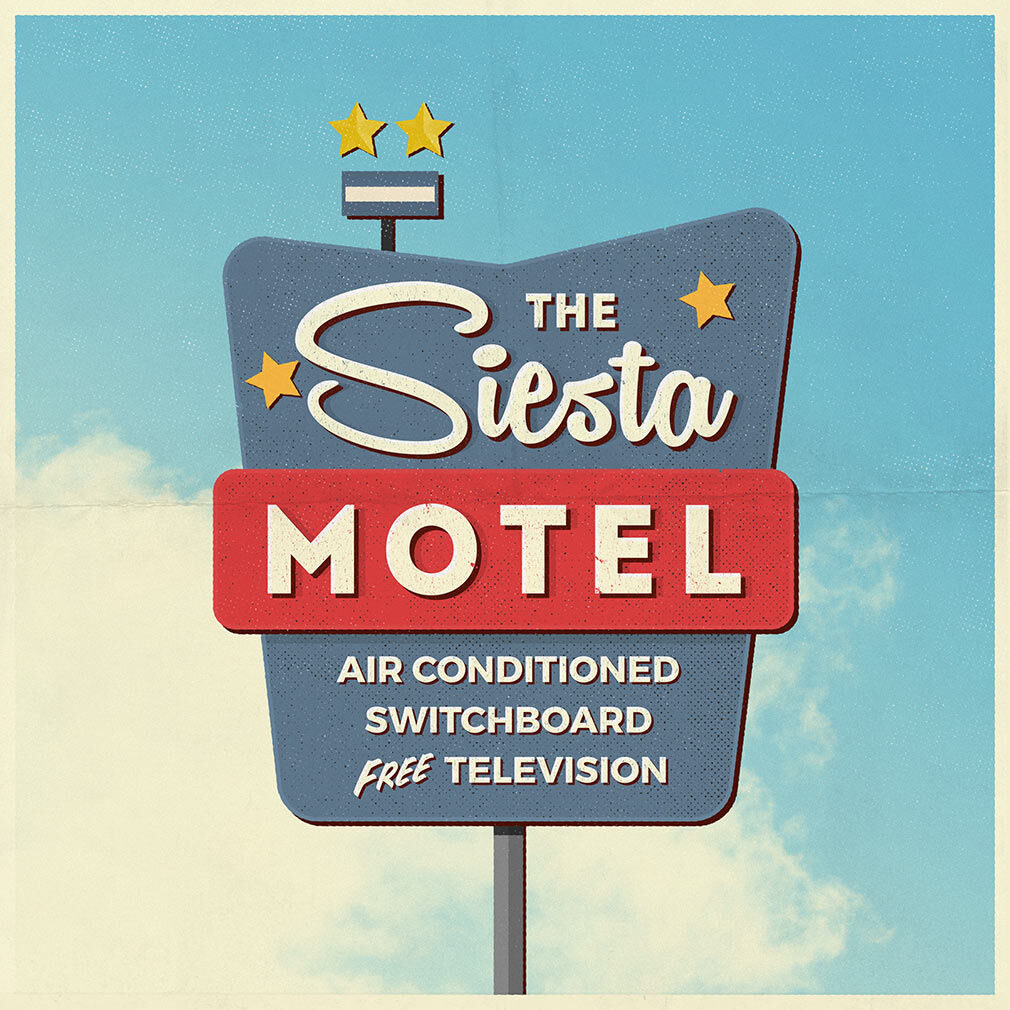
Best for: hospitality, restaurants, bars, travel, events, roadside-inspired branding, entertainment, and apparel graphics.
Vintage motel signage has a particularly recognizable American roadside visual language. Shape, border, typography, lighting, and architecture all contribute to the effect.
Design the Sign Shape and Lettering Together
A motel sign is not simply a rectangle containing a logo. The physical silhouette is part of the identity.
Consider:
- Short brand names.
- Large display typography.
- Simple iconography.
- Limited color combinations.
- Strong border shapes.
Complex corporate lockups usually feel less convincing in this format.
15. Vintage Number Plate Mockup / Text Effect
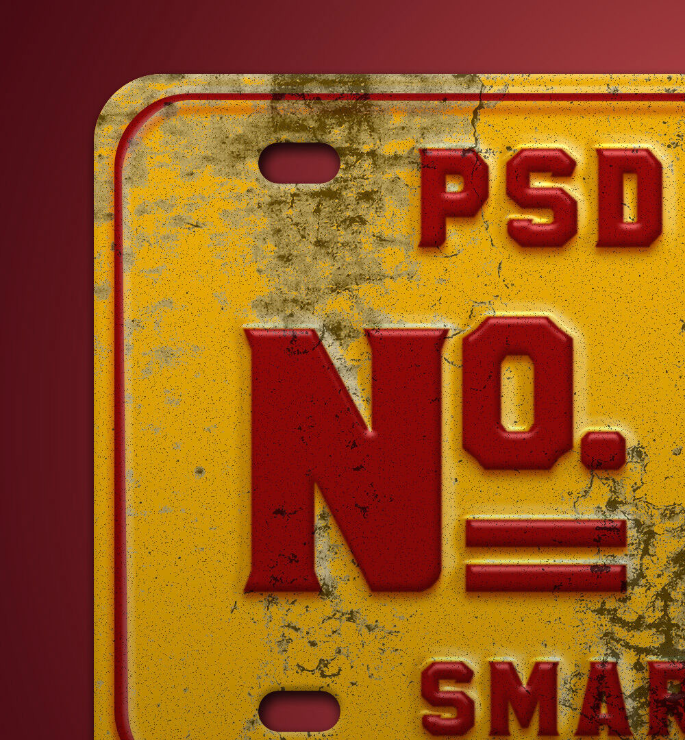
Best for: automotive branding, apparel, bars, cafés, events, sports graphics, merchandise, and industrial identities.
The worn metal surface gives this mockup a physicality that paper-based templates do not have.
Let the Material Do the Distressing
If the plate already contains scratches, rust, worn paint, and physical texture, keep the inserted typography relatively clean.
Adding distressed texture to both the lettering and the object can reduce contrast and make the effect look artificial.
16. Floppy Disk Mockup
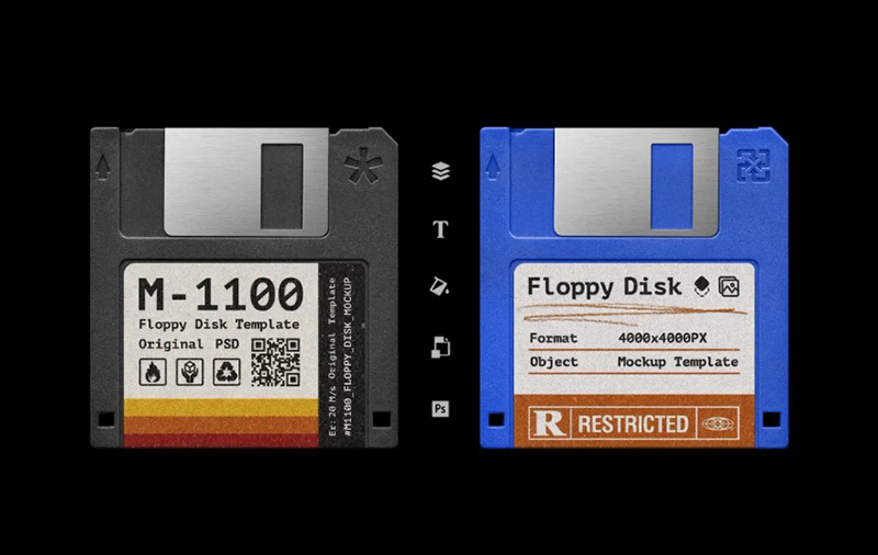
Floppy Disk Mockup is a retro-tech presentation resource for showcasing logos, labels, digital artwork, music graphics, software-inspired branding, and nostalgic visual concepts on one of the most recognizable objects from the early personal-computing era.
Best for: Y2K-inspired branding, retro technology projects, music releases, gaming visuals, software concepts, experimental identities, digital nostalgia, poster campaigns, and creative portfolio presentations.
Why a Floppy Disk Works So Well in Retro Design
A floppy disk instantly introduces a recognizable technological reference without needing additional vintage decoration. Its simple plastic shape, physical label area, and association with early computers make it especially effective for projects built around digital nostalgia, old software, data storage, hacker culture, and retro computing.
Instead of treating the disk as a generic background object, use the label as part of the design system. A short project title, serial number, logo, release name, small technical details, or deliberately minimal typography can make the final presentation feel much more believable.
Keep the Design Simple
The limited label area naturally favors short, focused graphics. Avoid shrinking a complete poster or complicated logo system onto the disk. A stronger result usually comes from one recognizable mark, a compact title, and a few carefully placed supporting details.
For a more authentic retro-tech direction, pair the mockup with restrained colors, monospace or pixel-inspired typography, simple numbering, or software-style labeling. For a more contemporary result, use a clean modern identity and let the floppy disk itself provide the nostalgic contrast.
How to Use Retro Mockups in Photoshop
Most editable retro PSD templates follow a similar Smart Object workflow.
1. Open the PSD and Inspect the Layers
Look for layers labelled:
- Place Your Design.
- Replace Here.
- Artwork.
- Smart Object.
- Your Design.
2. Open the Smart Object
Double-click the Smart Object thumbnail rather than painting over the main PSD.
3. Insert the Artwork
Place your design inside the opened Smart Object document.
Adapt the layout to the actual proportions rather than stretching a design made for another format.
4. Save the Smart Object
Save and return to the main mockup. The design should update automatically.
5. Inspect the Existing Effects
Many mockups already include:
- Shadows.
- Highlights.
- Texture.
- Blur.
- Discoloration.
- Perspective.
- Surface wear.
Do not immediately add more.
How to Make a Modern Design Belong in a Retro Mockup
One common problem is a technically correct Smart Object replacement that still looks pasted into the photograph.
Match Contrast
Older printed or displayed surfaces may not have the same deep blacks and luminous whites as a modern digital artwork.
Match Sharpness
If the surrounding photograph is slightly soft or textured, an ultra-sharp inserted image may feel artificial.
Preserve Environmental Lighting
Keep highlights, reflections, shadows, and color casts from the original scene wherever possible.
Adjust Saturation Carefully
Not every vintage look needs desaturation. Instead, compare the inserted design to the surrounding material and reduce only what feels disconnected.
Add Age According to Material
Paper, metal, glass, wood, plastic, and CRT screens age differently.
A single universal “grunge texture” over every mockup rarely looks believable.
Retro Design Without the Clichés
Do Not Use Every Retro Signal at Once
A composition rarely needs:
- Grain.
- Halftones.
- Paper texture.
- Script lettering.
- Distressed type.
- Sepia.
- Faded colors.
- Old photographs.
- Retro illustrations.
all at the same time.
Use One Strong Historical Reference
A VHS cassette already communicates a period. A typewriter already communicates analog writing. An IBM computer already communicates early digital technology.
Allow the object to do part of the visual storytelling.
Combine Old Context With New Typography
A contemporary font inside a vintage setting can create a more interesting result than a completely period-correct recreation.
Use Nostalgia as a Concept
Ask why the project should feel retro.
Possible reasons include:
- Brand heritage.
- Childhood memory.
- Analog craftsmanship.
- Music history.
- Old technology.
- Travel nostalgia.
- Rebellion against digital perfection.
A clear reason creates stronger design decisions.
How to Create a Cohesive Retro Brand Presentation
Choose One Period
Avoid using an IBM computer, 1950s motel sign, Victorian typography, and 1990s VHS aesthetic in one identity unless the collision is intentionally part of the concept.
Choose Three Mockups Maximum for the Main Presentation
For example:
- Vintage poster for the hero visual.
- Storefront for real-world branding.
- Polaroid frames for photography or campaign imagery.
Additional mockups can appear later in the case study.
Repeat the Same Design Language
Maintain consistent:
- Typography.
- Color.
- Logo treatment.
- Photography.
- Illustration.
- Texture intensity.
Show Flat Artwork Too
A professional portfolio should not hide the actual design inside mockups.
Include clean artwork so viewers can evaluate the typography, composition, and branding system directly.
Five Practical Retro Mockup Workflows
1. Retro Music Release
- Create the album or single artwork.
- Use the VHS mockup for a physical-media concept.
- Use the CRT television for a visualizer.
- Add Polaroids for artist photography.
- Use a grunge poster for promotional material.
2. Vintage Café Identity
- Design a simple wordmark.
- Use the storefront mockup.
- Apply the identity to the vintage van.
- Use a motel-style sign for an alternative exterior application.
- Keep the rest of the system clean and functional.
3. Editorial or Publishing Project
- Create the cover or editorial artwork.
- Use the typewriter scene for storytelling.
- Add a wooden frame for art or photography.
- Use torn paper for promotional graphics.
- Keep colors and typography connected across all applications.
4. Retro Technology Campaign
- Design an interface inspired by early software.
- Place it inside the IBM desktop.
- Use CRT imagery for secondary campaign visuals.
- Introduce pixel or monospace typography selectively.
- Pair the retro interface with modern branding for contrast.
5. Streetwear Campaign
- Create one bold typographic system.
- Use the grunge wall for posters.
- Use the worn number plate for merchandise graphics.
- Add the van for mobile branding.
- Use Polaroid images for campaign photography.
How to Control Retro Color Without Making Everything Brown
Build the Palette From the Mockup
Sample two or three colors already present in the photograph.
Then add one controlled accent from the brand.
Use Off-White Instead of Pure White
A warm off-white can integrate more naturally with old paper and aged environments.
Keep Black When You Need Contrast
Retro does not require every black to become brown.
Strong black typography can create useful contrast against worn or faded surfaces.
Use One Saturated Accent
A controlled bright red, turquoise, orange, pink, or green can give nostalgic artwork energy without turning it into a full rainbow palette.
Common Retro Mockup Mistakes
1. Making Every Project Sepia
Retro design includes many periods and palettes. Sepia is only one possible treatment.
2. Combining Unrelated Eras
A VHS cassette and a motel sign can coexist conceptually, but not automatically. Define the visual story first.
3. Adding Texture Everywhere
Use the texture already present in the mockup before adding more.
4. Ignoring the Material
Design should behave differently on paper, metal, television glass, wood, plastic, and fabric.
5. Using Too Many Vintage Fonts
One expressive typeface is often enough.
6. Making Every Logo Distressed
A clean brand mark can create stronger contrast inside an aged environment.
7. Presenting Only Mockups
Show the actual design as well.
8. Using Nostalgia Without a Reason
Retro aesthetics work best when they support the message, product, history, audience, or creative concept.
9. Forgetting Readability
Authentic-looking distress should never destroy important information.
10. Assuming Free Means Commercially Licensed
Always check the original resource terms before professional use.
Mockup Licensing Checklist
Before using a downloaded PSD professionally, confirm:
- Whether commercial use is allowed.
- Whether client presentations are allowed.
- Whether portfolio use is allowed.
- Whether attribution is required.
- Whether modifications are permitted.
- Whether the PSD can be shared with a client.
- Whether the source file can be included in another downloadable product.
- Whether resale or redistribution is prohibited.
Keep the original source URL and licensing information with the project files.
Frequently Asked Questions About Free Retro Mockups
What are retro mockups?
Retro mockups are presentation templates that place designs inside vintage, nostalgic, analog, or historically inspired objects and environments such as old posters, VHS cassettes, CRT televisions, typewriters, classic computers, signage, and worn physical surfaces.
What can free retro mockups be used for?
Free retro mockups can be used for branding presentations, posters, album artwork, packaging concepts, editorial projects, advertising, social media, fashion campaigns, cultural events, photography, merchandise, and portfolio case studies.
Do retro mockups have to use retro designs?
No. Contemporary design inside an old physical environment can create compelling contrast. The important part is making the combination feel intentional.
How do I edit a retro PSD mockup?
Most editable Photoshop mockups use Smart Objects. Open the relevant Smart Object, place your artwork, save it, and return to the main PSD to see the updated scene.
How can I make an inserted design look more realistic?
Match the surrounding sharpness, contrast, brightness, texture, and color. Preserve the original scene’s shadows, reflections, and material effects.
Which retro mockup is best for music projects?
VHS cassettes, CRT televisions, Polaroids, grunge walls, posters, and torn paper can all work well depending on the music genre and intended historical reference.
Which retro mockups work for branding?
Storefronts, vans, motel signs, posters, number plates, and vintage desk environments can support broader identity presentations.
Can I use retro mockups in a portfolio?
Yes. Use them selectively and show the flat artwork as well so viewers can evaluate the actual design.
How many mockups should I use in one case study?
There is no fixed number, but three to five strong, purposeful mockups are usually more effective than a long sequence of repetitive scenes.
Are all retro mockups free for commercial work?
Not necessarily. Free download availability and commercial licensing are different things. Check each original source page before professional use.
Final Thoughts
The strongest free retro mockups do not simply make a project look older. They provide context.
A VHS cassette communicates analog entertainment. An IBM computer creates early-digital nostalgia. A motel sign suggests roadside culture. A typewriter introduces writing and editorial history. Torn paper creates physical collage. A grunge wall makes the artwork feel public and discovered rather than perfectly displayed.
Choose the object because of what it adds to the idea.
Then integrate the design carefully. Match the surface. Preserve the lighting. Control the texture. Keep typography readable. Avoid combining every retro effect you know simply because the scene is old.
When building a client presentation or portfolio case study, use the mockups as supporting evidence rather than decoration. Show that the same visual identity can move through several believable applications while retaining one consistent voice.
The best retro presentation does not look like a modern design covered in vintage effects. It feels as though the design genuinely belongs to the object and story around it.
For more free PSD mockups, vintage design resources, textures, typography collections, and practical presentation tools for designers, continue exploring DesignRise.