







UI UX trends 2026 are moving far beyond attractive layouts, polished gradients, and fashionable interface styles. Visual quality still matters, but the strongest digital products are now judged by how intelligently they behave, how quickly they help users reach value, how inclusive they feel, and how well they adapt to real human context.
The next wave of UI/UX trends is not only about aesthetics. It is about product behavior, trust, accessibility, performance, personalization, and the designer’s ability to create experiences that feel useful instead of just impressive.
For designers, this shift is important. A beautiful screen can still fail if it loads slowly, overwhelms users, hides important choices, ignores accessibility, or uses AI in a way that feels confusing. In 2026, great design will be less about decoration and more about designing systems that respond to people with clarity, respect, and purpose.
This guide explores the UI/UX trends that will shape 2026 — not as a shallow trend list, but as a practical design guide for modern product designers, UX strategists, web designers, creative teams, and digital brands that want to build better experiences.
Explore More DesignRise Resources:
- Crafting Your First UX Design Portfolio: A Step-by-Step Guide
- Free Admin Dashboard Templates for Figma
- 45 Free Headline Fonts to Make Your Designs Stand Out
- AI-First UX/UI in 2026: Skills Designers Need
Why UI/UX Trends in 2026 Are Different
Many design trend articles focus on surface-level changes: colors, typography, layout styles, gradients, cards, animations, and visual effects. Those details can be useful, but they rarely explain what is actually changing in digital experience.
The deeper shift in 2026 is behavioral. Products are becoming more adaptive, more automated, more personalized, and more context-aware. Users expect faster answers, fewer unnecessary steps, better accessibility, stronger privacy controls, and interfaces that feel more human without becoming intrusive.
This means designers need to think about more than what a page looks like. They need to think about:
- how the interface responds to user intent;
- how AI suggestions are explained;
- how much control users keep;
- how content adapts to different needs;
- how motion affects attention and comfort;
- how performance shapes trust;
- how sustainability connects to lighter digital experiences;
- how inclusive design supports different abilities and cognitive styles.
In 2026, UI/UX is not only about creating a clean interface. It is about creating a product experience that feels intelligent, respectful, fast, inclusive, and strategically useful.
Trend Map: What Will Matter Most in 2026
| Trend Area | What Is Changing | Why It Matters |
|---|---|---|
| AI-assisted design | AI becomes part of research, ideation, copy, layout, and testing | Designers need better judgment, not just faster output |
| Zero UI | More interactions happen through voice, gestures, sensors, and automation | Designers must prototype experiences, not only screens |
| Personalization | Interfaces adapt to context, behavior, and skill level | Personalization must feel helpful, not invasive |
| Story-driven scrolling | Scroll becomes a pacing and narrative tool | Content must guide attention, not overwhelm users |
| Accessibility and neurodiversity | Design supports different cognitive, sensory, and interaction needs | Inclusive UX becomes a quality standard |
| Performance and sustainability | Fast, lightweight products become part of good UX | Heavy interfaces hurt users, SEO, and digital footprint |
| Trust and ethics | AI, personalization, and data use require transparency | Users need clarity and control |
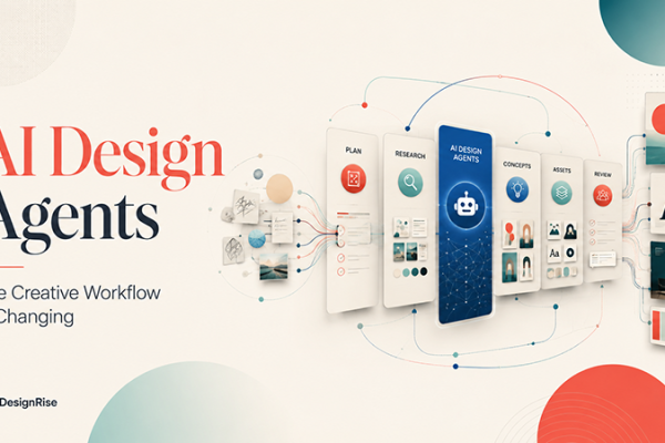
1. AI Takes the Lead — But Designers Remain the Directors
AI is no longer a side experiment in design workflows. It is becoming part of research synthesis, wireframing, copywriting, layout exploration, design critique, accessibility review, and content generation.
But that does not mean AI should replace the designer’s judgment. In fact, the more AI produces, the more important human direction becomes.
The strongest designers in 2026 will not be the ones who simply generate the most options. They will be the ones who know how to guide AI, evaluate output, reject weak directions, refine ideas, and connect design choices to user needs and business goals.
What Is Changing
- Designers use AI to explore layouts faster.
- UX teams use AI to summarize research and generate testing ideas.
- Content designers use AI to draft microcopy variations.
- Product teams use AI to create early prototypes and user flow alternatives.
- Designers become editors and directors of AI-generated output.
Why This Matters
AI can create a layout, but it does not automatically understand brand nuance, user anxiety, accessibility, business priorities, conversion strategy, or emotional tone. Designers still need to decide what works, what feels generic, what should be simplified, and what supports the real user journey.
How Designers Should Use This Trend
- Use AI for early exploration, not final decisions.
- Ask AI for multiple directions, then compare them strategically.
- Use AI to identify weak points in a flow.
- Use AI to draft copy, then rewrite it for brand voice.
- Document how AI helped the process in your portfolio.
Risk to Avoid
The biggest risk is letting AI create generic design. If every designer uses the same prompts, many websites and apps will start to look and sound the same. Human taste, context, and critique become the differentiators.
2. Zero UI Becomes More Practical
Zero UI does not mean there is no interface at all. It means the interface becomes less visible. Instead of relying only on buttons, menus, and forms, products may respond through voice, gestures, sensors, smart defaults, automation, or environmental context.
In 2026, users will interact with more products without always thinking, “I am using an interface.” They may speak, glance, move, confirm, approve, or let the system handle repetitive decisions quietly in the background.
Examples of Zero UI Thinking
- A car adjusts temperature and seat settings based on the driver profile.
- A smart home system suggests routines based on time and behavior.
- A fitness app reduces manual input by recognizing patterns.
- A voice assistant completes simple tasks without requiring screen navigation.
- A productivity tool suggests next steps before the user searches for them.
Why This Matters
Traditional UI design assumes the screen is the center of the experience. Zero UI shifts the focus to intent, context, and feedback. The designer needs to think less about “Where does the button go?” and more about “How does the user know what happened?”
Design Questions to Ask
- Does the user understand what the system did?
- Can the user correct or undo the action?
- Is automation saving effort or creating uncertainty?
- What feedback is needed when there is no visible screen?
- Does the experience work in noisy, busy, or stressful environments?
Risk to Avoid
Invisible interaction can become confusing if feedback is weak. When the UI disappears, confirmation, explanation, and recovery become even more important.
3. Hyper-Personalization With Respect for Privacy
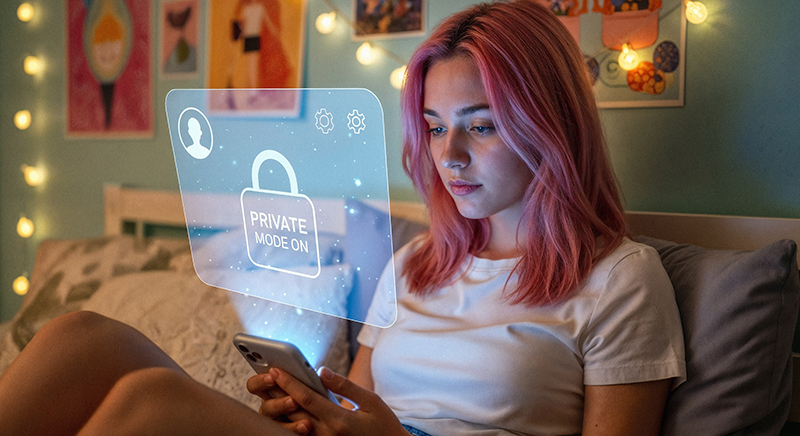
Personalization has been around for years, but in 2026 it is becoming more sensitive and more advanced. Users want products that remember preferences, reduce effort, and adapt to their needs. At the same time, they do not want to feel tracked, manipulated, or watched.
The winning formula is personalization without creepiness.
What Is Changing
- Interfaces adapt to skill level, behavior, and user context.
- Onboarding changes based on what the user already knows.
- Dashboards show different levels of detail depending on user role.
- Products allow users to control personalization settings.
- AI suggestions are explained more clearly.
Good Personalization Feels Like:
- “This saves me time.”
- “This understands my goal.”
- “This helps me focus.”
- “I can change this if I want.”
- “I know why this recommendation appears.”
Bad Personalization Feels Like:
- “How does it know that?”
- “Why did the interface change?”
- “Where did my usual option go?”
- “I feel pushed into this choice.”
- “I cannot control what is happening.”
Practical Design Tip
Add personalization controls where they matter. Let users adjust recommendation depth, notification frequency, content preferences, dashboard complexity, or automation level. Control builds trust.
4. Scroll Becomes a Storytelling System
Scrolling is not going away. But in 2026, scroll is becoming more intentional. Instead of simply stacking content vertically, designers are using scroll to pace information, reveal story, build anticipation, and guide users through a narrative.
This is especially important for landing pages, editorial websites, product launches, SaaS storytelling, portfolios, and brand experiences.
What Story-Driven Scrolling Can Include
- content revealed in stages;
- scroll-triggered visual changes;
- sticky sections that explain complex ideas;
- progressive storytelling for product benefits;
- interactive comparisons;
- motion that supports understanding instead of decoration;
- clear checkpoints and CTA moments.
Why This Matters
Users do not read every word. They scan, pause, compare, and decide whether to continue. Story-driven scroll helps organize attention. It creates rhythm and gives users a reason to keep moving through the page.
Risk to Avoid
Do not confuse storytelling with heavy animation. If scrolling becomes slow, dizzying, or unpredictable, the experience can become frustrating. Motion should help comprehension, not compete with content.
5. Voice Interfaces Become More Natural
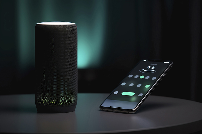
Voice interfaces are becoming more natural because users increasingly expect products to understand plain language. Voice is especially useful when hands are busy, eyes are occupied, or typing is inconvenient.
But voice UX is not just about speech recognition. It is about conversation design, confirmation, error recovery, privacy, tone, and context.
Where Voice UX Works Best
- driving and navigation;
- cooking and home tasks;
- accessibility support;
- quick commands;
- search and filtering;
- smart home controls;
- health and fitness tracking;
- workflows where typing is slow or unsafe.
Design Questions for Voice Interfaces
- What should the system say back?
- How does the user know the command was understood?
- What happens if the system misunderstands?
- Can the user switch from voice to screen?
- Is voice appropriate in private or public settings?
- Does the assistant sound helpful without becoming annoying?
Practical Design Tip
Design voice and visual feedback together. A voice command often needs a visible confirmation, especially when the action matters.
6. Designing for Neurodiversity and Cognitive Inclusion

Accessibility is expanding beyond screen readers and color contrast. Those remain essential, but designers are also paying more attention to cognitive inclusion: how interfaces affect attention, memory, stress, focus, comprehension, and sensory comfort.
In 2026, inclusive UI/UX means designing for different minds, not only different devices.
What Cognitive Inclusion Can Include
- reduced motion options;
- clear language;
- predictable navigation;
- less visual noise;
- focus modes;
- animation sensitivity settings;
- simple error messages;
- better form guidance;
- fewer disruptive popups;
- layouts that do not overload working memory.
Why This Matters
Many users struggle with cluttered interfaces, aggressive animations, unclear instructions, too many choices, or unexpected changes. Designing for cognitive inclusion helps people with ADHD, dyslexia, anxiety, sensory sensitivity, and also many users who are simply tired, distracted, or using a product under pressure.
Practical Design Tip
Offer calm modes, reduce unnecessary motion, make layouts predictable, and give users control over density and animation. A calmer product is often a better product.
7. Anti-Design 2.0: Personality Against Sameness
For years, many websites started to look the same: clean cards, soft gradients, rounded buttons, predictable hero sections, and interchangeable illustrations. Anti-design pushes back against this sameness by using bolder layouts, unexpected typography, raw visual energy, and more expressive brand personality.
In 2026, anti-design is becoming more intentional. It is not about making things ugly for attention. It is about using controlled disruption to create memorability.
Where Anti-Design Can Work
- creative portfolios;
- fashion and culture brands;
- music and entertainment websites;
- experimental digital magazines;
- event websites;
- brands that want to feel rebellious or unconventional.
Where It Can Fail
- banking apps;
- healthcare platforms;
- government services;
- complex SaaS dashboards;
- checkout flows;
- any product where clarity and trust matter more than visual shock.
Practical Design Tip
Break one rule at a time. Use experimental typography, unusual layout, or bold color — but do not sacrifice readability, navigation, or accessibility.
8. Humor Becomes a UX Feature
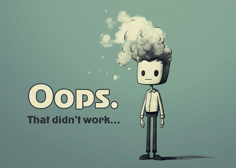
Microcopy can make an interface feel human. In 2026, more brands are using humor, warmth, and personality in empty states, loading messages, onboarding, confirmations, and error screens.
But humor in UX is delicate. A funny message can create delight when the situation is low-stress. The same joke can feel irritating when the user is angry, paying, blocked, or dealing with something serious.
Good Places for Humor
- empty states;
- success messages;
- light onboarding moments;
- friendly loading states;
- playful product tours;
- brand moments in low-risk flows.
Bad Places for Humor
- payment failure;
- security errors;
- health-related information;
- account access problems;
- serious form errors;
- moments where the user is already frustrated.
Practical Design Tip
Use humor to support the user, not to show off the brand’s personality. If the joke slows down understanding, remove it.
9. Spatial and 3D Design Become More Practical

Spatial and 3D design are no longer limited to gaming, VR headsets, or experimental product demos. More everyday interfaces are using depth, layers, perspective, interactive product previews, and 3D-like components to make digital experiences feel more tangible.
This trend is especially useful for ecommerce, product configurators, education, architecture, fitness, gaming, and immersive brand experiences.
Common Uses
- AR product previews;
- 3D product cards;
- interactive object rotation;
- depth-based hero sections;
- spatial dashboards;
- immersive onboarding;
- interfaces that feel more physical.
Why This Matters
Spatial design can help users understand size, shape, relationship, and interaction. It can make products more engaging and reduce uncertainty before purchase.
Risk to Avoid
3D effects can quickly become heavy, slow, or distracting. Use them where they improve understanding, not simply because they look modern.
10. Sustainability Becomes a Design Principle
Sustainable digital design is becoming part of the UI/UX conversation. A website or app can feel beautiful but still be unnecessarily heavy, slow, energy-intensive, and frustrating for users on weaker devices or slower connections.
In 2026, lightweight design is not only a performance concern. It is a user experience concern and a brand responsibility.
What Sustainable UI/UX Can Include
- smaller image files;
- optimized video use;
- fewer unnecessary animations;
- lighter pages;
- system fonts where appropriate;
- cleaner code and fewer unused scripts;
- dark mode where it makes sense;
- reduced data transfer;
- faster loading experiences;
- content that avoids unnecessary digital waste.
Why This Matters
Performance, accessibility, and sustainability often support one another. A lighter website usually loads faster, works better on mobile, uses less data, and creates less friction for users.
Practical Design Tip
Before adding a heavy visual effect, ask: does this improve user understanding or only decorate the page? If it does not improve the experience, simplify it.
11. Trust-Centered UX Becomes a Competitive Advantage
As interfaces become more personalized, AI-assisted, and automated, trust becomes one of the most important design materials. Users want convenience, but they also want to understand what is happening.
Trust-centered UX means designing experiences where users feel informed, respected, and in control.
Trust-Centered Design Includes:
- clear privacy settings;
- transparent AI suggestions;
- plain-language explanations;
- honest error states;
- visible undo options;
- clear pricing and subscription rules;
- no dark patterns;
- accessible support paths;
- consistent interface behavior.
Why This Matters
Users may forgive a product for being simple. They rarely forgive a product for feeling deceptive. In 2026, brands that design for trust will stand out more than brands that only chase visual novelty.
12. Performance-First UX Becomes Non-Negotiable
Performance is part of UX. A slow website makes users wait, interrupts attention, increases frustration, and can reduce trust before the content even appears.
In 2026, designers need to think about performance earlier in the design process, not only after development.
Design Choices That Affect Performance
- large hero videos;
- heavy image galleries;
- multiple custom fonts;
- unnecessary animation libraries;
- large background effects;
- too many third-party scripts;
- overdesigned pages with no clear content priority.
Practical Design Tip
Design with performance budgets. Decide early how heavy a page can be, which media is truly necessary, and what can be simplified for mobile users.
How Designers Should Respond to These UI/UX Trends
Knowing trends is not enough. Designers need to translate them into better decisions.
Move From Screens to Systems
Think about how the experience behaves across user states, devices, contexts, and repeated interactions.
Design for Control
As AI and personalization grow, users need clear ways to adjust, reject, undo, or understand what the system is doing.
Treat Accessibility as Quality
Accessibility is not a checklist added at the end. It is part of whether the product is usable by real people.
Use Motion With Purpose
Motion should guide attention, communicate change, or support storytelling. It should not distract or overwhelm.
Prioritize Speed and Clarity
Fast, lightweight, clear interfaces often create more value than heavy visual effects.
Make AI Feel Understandable
If AI is involved, users need to know why something appears, what data is used, and what they can do next.
UI/UX Trend Checklist for 2026 Projects
Use this checklist before presenting or launching a modern digital product.
AI and Personalization
- Does AI solve a real user problem?
- Are AI suggestions explained clearly?
- Can users edit, reject, or undo AI-assisted actions?
- Does personalization feel helpful rather than invasive?
- Can users adjust personalization settings?
Accessibility and Inclusion
- Is the interface readable and predictable?
- Are motion effects optional or reduced when needed?
- Does the design support keyboard and assistive technology needs?
- Are forms and error messages clear?
- Does the design avoid unnecessary cognitive overload?
Performance and Sustainability
- Are images and videos optimized?
- Are heavy effects necessary?
- Does the page load quickly on mobile?
- Are unnecessary scripts avoided?
- Does the design support a lighter digital experience?
Trust and Business Value
- Is pricing or product value clear?
- Are privacy and data choices easy to understand?
- Are dark patterns avoided?
- Does the experience support user trust?
- Does the design connect beauty with measurable user value?
Common Mistakes Designers Should Avoid in 2026
Following Trends Without a Strategy
A trend is only useful if it supports the product goal. Do not add 3D, AI, motion, or anti-design just because it feels modern.
Overloading the Interface
Too many effects, animations, suggestions, and personalization layers can make a product feel chaotic. Clarity should win.
Ignoring User Control
Automation without control can damage trust. Users should know what is happening and be able to change it.
Designing Only for Ideal Users
Real users are distracted, tired, rushed, neurodiverse, on mobile, using slow internet, or trying to complete a task under pressure.
Treating Accessibility as a Final Check
Accessibility should influence layout, content, motion, forms, navigation, and interaction from the beginning.
Making Sustainability an Afterthought
A lighter, faster interface often improves user experience and reduces waste at the same time.
Final Word: The Future of UI/UX Is Human, Adaptive, and Useful
UI/UX trends in 2026 are less about chasing shiny visuals and more about building intelligent, inclusive, and trustworthy experiences. The best products will not simply look modern. They will feel easier to use, more respectful, more responsive, and more aligned with real human behavior.
The strongest designs will be:
- smart enough to anticipate needs;
- clear enough to explain themselves;
- inclusive enough to support different minds and abilities;
- fast enough to respect attention;
- light enough to reduce unnecessary digital waste;
- human enough to build trust.
If you are still judging design only by colors, cards, and corner radius, it is time to zoom out. The future of design is not about pixels alone. It is about people, behavior, systems, and meaningful digital experiences.
Beautiful screens may attract attention. Useful experiences create lasting value.
Explore more UX strategy, AI design workflows, and modern design resources on DesignRise.
Discover more from DesignRise
Subscribe to get the latest posts sent to your email.


