





Free fonts for headlines can completely change the impact of a design. A strong headline typeface does more than make words larger — it establishes hierarchy, attracts attention, sets the visual tone, and gives the viewer a reason to keep reading.
That matters whether you are designing a poster, social media graphic, magazine cover, sports campaign, website hero section, packaging concept, event identity, or advertising layout.
A weak headline can disappear even when the rest of the design is technically excellent. A strong one creates an immediate visual entry point.
But the best headline font is not always the boldest font available.
Sometimes a condensed sans serif creates more impact because it allows the headline to become larger. A delicate high-contrast typeface may be more effective for a fashion campaign. A rounded display face can communicate friendliness, while an athletic font immediately creates energy and competition.
This DesignRise collection brings together free fonts for headlines covering bold sans serifs, geometric fonts, athletic typefaces, Art Deco styles, modern display fonts, playful lettering, retro typography, condensed families, and elegant headline fonts.
You will also find practical guidance on choosing headline typography, creating hierarchy, pairing display fonts with body typefaces, testing readability, controlling line length, and avoiding the common mistakes that make large typography look impressive in a font preview but weak inside a real layout.
Licensing note: these fonts are hosted by different designers, foundries, font websites, and portfolio platforms. A free download does not automatically guarantee unrestricted commercial use. Always check the current license on the original source page before using a font for paid client work, logos, merchandise, websites, apps, advertising, or products.
Explore More DesignRise Resources:
- Photoshop Brushes with Spray Effect
- A Selection of Metallic Textures for Your Design
- Free Vintage Logos PSD
- Explore More Fonts on DesignRise
Free Fonts for Headlines: What Makes a Typeface Work?
A headline font has a different job from a body font.
Body typography should disappear into the reading experience. Display typography is allowed — and often expected — to be noticed.
Strong Silhouette
Good headline fonts remain recognizable even when the viewer sees the complete word before examining individual letters.
Clear Hierarchy
The typography should immediately establish where the reader begins.
Appropriate Personality
A technology headline, fashion cover, sports poster, children’s campaign, and luxury invitation should not automatically use the same style of display typography.
Readability at the Required Size
Decorative details that look beautiful at 100 px may disappear when the headline is reduced for mobile.
Which Headline Font Style Should You Choose?
Best Free Fonts for Headlines
1. Adam.CG Pro Font

Best for: modern branding, technology, editorial titles, posters, websites, architecture, and presentation design.
Adam.CG Pro is a clean geometric sans serif inspired by the visual logic of Futura. Its simple construction makes it useful when you want a modern headline without distracting decorative elements.
Use Scale Instead of Effects
Try setting Adam large with generous negative space rather than adding shadows, gradients, or outlines.
2. Zebrazil Font

Best for: luxury branding, fashion covers, beauty, editorial titles, invitations, and premium campaigns.
Zebrazil uses tall proportions, delicate strokes, and serif details to create a more refined headline style.
Give Thin Letterforms Room
Use it at larger sizes and keep enough contrast between the lettering and background so delicate details remain visible.
3. Anson Font

Best for: editorial headlines, branding, posters, packaging, websites, and understated modern layouts.
Anson combines clean sans-serif construction with subtle character in its curves and letter cuts. That gives it more personality than a completely neutral grotesk while keeping the headline readable.
4. Promesh Font

Best for: sports promotions, team branding, fitness, events, posters, merchandise, and energetic campaigns.
Promesh combines bold athletic lettering with a mesh-inspired texture, giving the font an immediately competitive character.
Use the Textured Version Selectively
Texture adds personality at large sizes, but a cleaner version may work better for smaller headings or busier backgrounds.
5. Calendas Plus Font
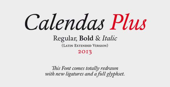
Best for: editorial covers, luxury, hospitality, cultural projects, invitations, and sophisticated branding.
Calendas Plus provides a more classical headline option. Calligraphic details and serif construction create elegance while maintaining stronger readability than a highly decorative script.
6. Summit Font

Best for: retro-modern posters, outdoor branding, packaging, editorial graphics, and identity systems.
Summit’s layered styles make it useful when you need depth and nostalgia without constructing multiple text effects manually.
7. Building Font

Best for: architecture, hospitality, Art Deco-inspired branding, events, posters, and editorial titles.
Building by Leonardo Gubbioni draws from Art Deco architecture and metallic structures, giving it a strong vertical silhouette.
8. Peyo Font
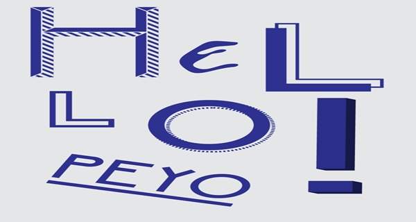
Best for: children’s graphics, food, entertainment, casual brands, social media, and playful campaigns.
Peyo balances geometric structure with soft rounded forms, giving it a friendly appearance without becoming completely informal.
9. Glamor Font

Best for: fashion, beauty, luxury campaigns, magazines, editorial covers, and sophisticated branding.
Glamor is a chic display family built around high-contrast letterforms and elegant details. Its range of styles makes it useful for creating hierarchy within a fashion-oriented visual system.
10. Franchise Font

Best for: posters, promotions, sports, editorial, advertising, events, and bold typographic layouts.
Franchise uses tall condensed forms to create maximum visual impact within relatively little horizontal space.
Ideal for Short, Large Headlines
Condensed fonts are particularly useful when the headline needs to feel oversized without becoming several lines long.
11. Gabo Font

Best for: bold branding, editorial headlines, fashion, posters, and modern campaigns.
Gabo’s thick construction is softened by small internal cuts and distinctive letter details. That makes it more memorable than a generic bold sans serif.
12. League Gothic Font

Best for: editorial layouts, posters, newspapers, campaigns, web hero sections, and high-impact headings.
League Gothic is a classic condensed sans serif with a strong editorial character. Its narrow proportions make it especially practical for long headlines.
13. Ostrich Sans Font

Best for: editorial graphics, posters, branding, fashion, social media, and typographic systems.
Ostrich Sans is useful because the family includes several stylistic directions such as lighter, heavier, rounded, inline, and decorative variations.
Build Hierarchy Within One Family
Instead of adding several unrelated fonts, use different Ostrich styles for headline, subheading, and supporting display text.
14. Junction Font
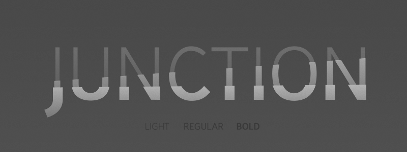
Best for: editorial, websites, branding, presentations, informative layouts, and restrained headlines.
Junction is a humanist sans serif with subtle curves that create more warmth than a rigid geometric face.
15. Blackout Font

Best for: posters, activism, music, editorial graphics, streetwear, events, and dramatic statements.
Blackout removes much of the internal negative space normally found in letterforms, creating dense blocks of typography that command attention immediately.
16. Knewave Font
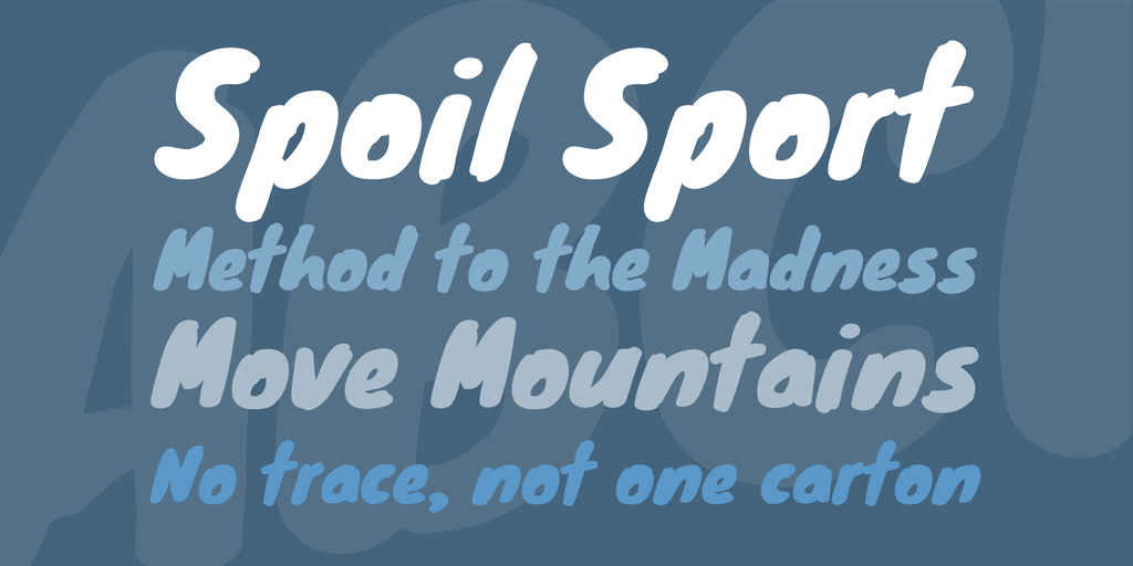
Best for: music, events, kids graphics, streetwear, food, posters, and energetic social content.
Knewave has a bold hand-drawn character with visible brush-like texture. It works especially well when a polished geometric font would feel too corporate.
17. Raleway Font

Best for: modern websites, branding, editorial, beauty, fashion, presentations, and clean headline systems.
Raleway offers a more refined interpretation of sans-serif display typography. Its slim proportions and distinctive details make it useful when a bold condensed face would feel too aggressive.
18. Orbitron Font

Best for: technology, sci-fi, gaming, digital products, futuristic posters, and cyber-inspired branding.
Orbitron uses geometric construction and science-fiction references without becoming completely unreadable.
Avoid the Futuristic Cliché Stack
You do not automatically need neon blue, grids, chrome, and glitch effects simply because you use Orbitron.
19. Chunk Font

Best for: retro posters, food branding, packaging, editorial titles, Americana-inspired design, and merchandise.
Chunk uses heavy slab-serif construction that recalls wood type and historic newspaper headlines.
20. Sniglet Font

Best for: children’s content, casual branding, food, entertainment, stickers, and friendly social campaigns.
Sniglet’s rounded forms create immediate softness and playfulness. It works best when the message itself is informal.
21. Big Noodle Titling Font

Best for: posters, movie graphics, sports, editorial, event branding, and large uppercase titles.
Big Noodle Titling is a narrow uppercase sans serif that works particularly well where vertical scale is more important than horizontal width.
22. Megalopolis Extra Font

Best for: playful posters, events, food, entertainment, packaging, and bold graphic identities.
Megalopolis Extra combines heavy weight with unusual curves that keep the typeface from feeling rigid.
23. Academic M54 Font

Best for: sports jerseys, university graphics, team branding, events, fitness, and athletic merchandise.
Academic M54 uses bold collegiate-inspired forms that immediately communicate sports and competition.
24. Matiz Font
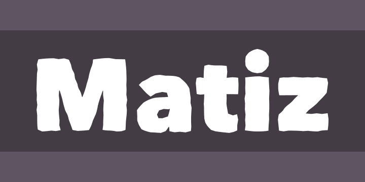
Best for: creative branding, posters, handmade products, lifestyle campaigns, and editorial display typography.
Matiz keeps the structure of a sans serif while introducing enough irregularity to feel more handmade and individual.
25. Coolvetica Font

Best for: branding, retro-modern posters, editorial, entertainment, social media, and packaging.
Coolvetica takes inspiration from the modified Helvetica-style lettering widely seen in the 1970s, retaining easy readability while adding more personality.
26. Telegrafico Font

Best for: clean posters, branding, websites, modern editorial graphics, and restrained campaigns.
Telegrafico is a relatively straightforward sans serif, making it useful when photography or illustration already carries most of the visual personality.
27. Speakeasy Font

Best for: hospitality, bars, events, Art Deco graphics, vintage posters, and themed identities.
Speakeasy mixes sharp points with rounded details, giving the typeface an Art Deco personality without relying on excessively ornate construction.
28. Kilogram Font

Best for: experimental posters, music, editorial graphics, branding concepts, and expressive campaigns.
Kilogram combines sharp geometry, unexpected curves, and unusual character construction, making it a stronger choice when the headline itself needs to become the visual concept.
29. Minstrel Poster WHG Font

Best for: posters, culture, events, retro-modern editorial graphics, and unusual display typography.
Minstrel Poster contains strongly individualized letterforms, which means the exact word you type can significantly affect how successful the font feels.
30. Age Font

Best for: futuristic branding, technology, gaming, posters, experimental graphics, and event identities.
Age combines rounded forms with sharp cuts and linear structure, giving it a futuristic personality without relying on a conventional sci-fi stencil aesthetic.
31. Qhytsdakx Font

Best for: minimal posters, mid-century-inspired branding, editorial titles, packaging, and cultural design.
Qhytsdakx uses clean even strokes and a quieter mid-century personality. It works particularly well when the headline should feel distinctive without dominating every other element.
32. Nevis Font

Best for: bold branding, web heroes, posters, advertising, corporate campaigns, and uppercase headlines.
Nevis offers strong weight without becoming overly aggressive, making it a useful general-purpose display sans serif.
33. Code Font

Best for: technology, minimal branding, editorial graphics, digital products, posters, and contemporary layouts.
Code uses simple geometric construction that makes it particularly useful when you want the headline to feel modern without introducing a strong historical reference.
34. Nexa Font

Best for: branding, advertising, web design, editorial, presentations, and modern campaign typography.
Nexa is a clean geometric sans serif with enough distinctive curves to avoid feeling completely generic.
35. Airbag Font

Best for: colorful posters, retro campaigns, editorial graphics, packaging, events, and display typography.
Airbag uses built-in dimensional treatment and structural shadow detail, making it useful when a headline needs to feel illustrated rather than simply typeset.
36. Bariol Font

Best for: approachable branding, apps, websites, education, lifestyle, editorial, and friendly campaigns.
Bariol has softer rounded forms than many bold headline fonts, making it appropriate when the message needs confidence without harshness.
37. Governor Font

Best for: hospitality, events, posters, Art Deco-inspired branding, packaging, and entertainment graphics.
Governor takes inspiration from Miami Beach Art Deco signage. Its simple heavy forms make it easy to combine with quieter supporting typography.
How to Make a Headline More Powerful Without Changing the Font
A font is only one part of headline typography.
Increase Size Contrast
If the headline is only slightly larger than the paragraph below it, hierarchy will remain weak.
Adjust Line Breaks
Compare:
Design Better Digital Experiences
with:
Design Better
Digital Experiences
The same typeface can create a completely different composition.
Control Line Length
Very long headline lines can lose impact, especially on wide desktop layouts.
Use Weight Deliberately
Not every word needs to be bold.
You can emphasize:
- One keyword.
- One number.
- One phrase.
How to Pair a Headline Font With Body Text
Bold Display + Neutral Sans
This works for:
- Promesh.
- Blackout.
- Franchise.
- Chunk.
Elegant Display + Simple Sans
Use this approach with:
- Zebrazil.
- Glamor.
- Calendas Plus.
Retro Display + Modern Sans
Building, Speakeasy, Governor, Chunk, and Coolvetica can become much more contemporary when paired with modern supporting typography.
Playful Display + Functional Body Font
Peyo, Sniglet, Knewave, and Megalopolis benefit from calm body typography.
Headline Typography for Posters
Start With the Viewing Distance
A poster designed for a wall needs a different hierarchy from a social post viewed in someone’s hand.
Use the Headline as a Shape
Think about the complete silhouette of the title rather than treating it as a sentence sitting above the design.
Crop Intentionally
Oversized letters touching or extending beyond the edge can make simple typography feel much more dynamic.
Headline Typography for Websites
Check Mobile First
A four-line desktop hero may become eight lines on a narrow phone.
Avoid Very Thin Display Fonts at Small Sizes
Fine strokes can lose clarity on smaller screens and weaker displays.
Do Not Sacrifice Loading Performance
If a headline only needs one style, loading a complete family with many unused weights may be unnecessary.
Headline Typography for Social Media
Design for the Thumbnail
Your artwork may first appear very small inside a feed.
Keep the Message Short
A strong headline plus one supporting line often performs visually better than placing the complete caption inside the graphic.
Use Contrast
Typography should remain clear over photography and colorful backgrounds.
A Practical Headline Font Testing Workflow
- Write the real headline.
- Test five very different fonts.
- Choose the best two directions.
- Test them in the real layout.
- Check desktop and mobile.
- Reduce the artwork to thumbnail size.
- Test uppercase and title case.
- Adjust spacing and line breaks.
- Only then choose the final font.
How to Test a Headline Font Properly
Use Real Words
A specimen may contain carefully selected letters that flatter the font.
Test Long and Short Headlines
A font that looks excellent for “MOVE” may struggle with “A Better Way to Build Your Brand.”
Check Numbers
Important for:
- Events.
- Dates.
- Prices.
- Statistics.
- Promotions.
Check Punctuation
Quotes, apostrophes, question marks, colons, and ampersands may become prominent at display sizes.
Check Language Support
If a campaign may need multilingual versions, verify the required characters before the layout is approved.
Common Headline Typography Mistakes
1. Choosing a Font Only Because It Is Bold
Weight alone does not create effective hierarchy.
2. Using Too Many Words
A display font cannot rescue a headline that contains unnecessary copy.
3. Using Decorative Fonts Too Small
Give distinctive details enough scale.
4. Making Every Text Element Bold
Hierarchy requires contrast.
5. Centering Everything Automatically
Alignment should follow the composition rather than habit.
6. Ignoring Line Breaks
Where a line ends can change both readability and visual rhythm.
7. Applying Effects Before the Typography Works
The headline should look strong before adding gradients, shadows, textures, or distortions.
8. Using Two Competing Display Fonts
One strong headline typeface is usually enough.
9. Ignoring Mobile
Typography must survive much narrower layouts.
10. Assuming Free Means Commercial Use
Always verify the individual font license.
Free Font Licensing Checklist
- Is commercial use allowed?
- Can the font be used in client work?
- Can it be used in logos?
- Is web embedding permitted?
- Can it be used inside apps?
- Is merchandise allowed?
- Can it be used in templates for resale?
- Does the download include only a demo version?
- Is attribution required?
- Can the actual font file be redistributed?
Frequently Asked Questions About Free Fonts for Headlines
What are the best free fonts for headlines?
The right choice depends on the project. League Gothic, Franchise, Nevis, Big Noodle Titling, and Blackout are useful for stronger bold headlines; Zebrazil, Glamor, and Calendas Plus offer more elegant directions; while Promesh and Academic M54 work well for athletic typography.
What makes a good headline font?
A strong headline font needs a clear silhouette, appropriate personality, enough readability for the intended size, and sufficient contrast from surrounding text.
Are sans serif fonts good for headlines?
Yes. Sans serif fonts are particularly versatile for modern headline typography and can range from neutral and minimal to bold, condensed, geometric, playful, or futuristic.
What is the best font for a bold poster headline?
Fonts such as Franchise, Blackout, League Gothic, Nevis, Big Noodle Titling, Promesh, and Chunk are worth testing for bold poster work.
What headline fonts work for fashion?
Zebrazil, Glamor, Raleway, and other refined display fonts can work well when the design needs a more fashion-oriented or premium visual tone.
What fonts work for sports headlines?
Promesh and Academic M54 naturally reference athletic and collegiate typography, while Franchise and Big Noodle Titling can also work well for high-impact sports graphics.
Should headlines always be uppercase?
No. Uppercase can create authority and graphic impact, but title case or lowercase may feel more approachable, elegant, editorial, or conversational.
Can I use more than one headline font?
You can, but most layouts are stronger when one display font establishes personality while another quieter typeface handles supporting information.
Are all these fonts free for commercial use?
No universal licensing claim should be made. The resources come from different creators and websites, so check each font’s current license individually.
How large should a headline be?
There is no universal size. It depends on format, viewing distance, screen width, hierarchy, font proportions, and the length of the message.
Final Thoughts
The best free fonts for headlines are not simply the heaviest or most unusual typefaces you can find.
A successful headline font supports the message.
Promesh and Academic M54 create athletic energy. Zebrazil and Glamor offer a more refined fashion direction. League Gothic, Franchise, and Big Noodle Titling solve space problems through condensed proportions. Blackout creates density and confrontation. Peyo and Sniglet feel more approachable. Orbitron and Age introduce futuristic character, while Building, Speakeasy, and Governor bring historical references into contemporary layouts.
The strongest choice becomes clear only after the font is placed into the real design.
Test the actual headline. Try different line breaks. Zoom out. Check mobile. Compare uppercase with title case. Evaluate contrast. Remove unnecessary effects. Pair the headline with quieter body typography.
Then ask one simple question:
Does the headline attract attention because it supports the message — or only because the font itself is unusual?
When typography and message work together, the headline stops feeling like decoration and becomes part of the communication.
For more font collections, typography inspiration, Photoshop resources, mockups, brushes, and practical design guides, continue exploring DesignRise.
Nice fonts, thanks!
Nice selection of fonts. Lots that matched my design)))))