






10 Free Cardboard Logo Mockups & PSD Effects for Branding
Cardboard logo mockups are a simple way to give a flat logo presentation more texture, depth, and physical context. Instead of showing an identity only on a white background, designers can place the logo onto corrugated cardboard, kraft-style surfaces, pressed paper, packaging boxes, or cut-out materials to create a more realistic branding presentation.
Cardboard is particularly useful because it immediately communicates material.
Its visible fibers, natural color, corrugated structure, folds, shadows, and imperfect surface can make branding feel more tactile than a perfectly clean digital presentation.
This DesignRise collection brings together 10 free cardboard logo mockups and related PSD effects for branding, packaging, logo presentations, portfolios, and client work.
The selection includes:
- Cardboard cut-out logo effects.
- Corrugated packaging box logo mockups.
- Cardboard typography effects.
- Close-up textured logo presentations.
- Pressed and debossed cardboard logos.
- Kraft paper letterpress effects.
- Corrugated cardboard branding.
- Cardboard and metal material comparisons.
These resources can be useful for brands connected with packaging, handmade products, food, coffee, retail, sustainability, shipping, craft goods, natural products, or any identity where paper and cardboard materials are relevant.
Important: the resources in this collection come from different creators. File structure, Smart Object support, Photoshop requirements, resolution, and licensing may differ. Check the original resource page before using any file for commercial work.
Explore More DesignRise Resources:
- Free Collection of Textures for Photoshop
- Best Retro Fonts to Improve Your Design
- Free Seamless Patterns for Designers
Why Use Cardboard Logo Mockups?
A logo is normally designed as a clean vector mark, but real brands rarely exist only as vectors.
They appear on:
- Packaging boxes.
- Shipping materials.
- Product labels.
- Tags.
- Retail displays.
- Printed inserts.
- Paper stationery.
Cardboard mockups allow designers to explore how an identity might behave in some of those physical environments.
They Add Texture Without Requiring a Complex Scene
Cardboard already contains natural texture, so even a relatively simple logo presentation can feel more physical.
They Can Reveal Logo Reproduction Problems
Very thin lines, tiny lettering, subtle gradients, or intricate symbols may look excellent on screen but become less convincing when simulated on a rough printed surface.
They Work Well for Packaging Brands
For brands that actually use cardboard packaging, the mockup can represent a realistic application instead of a purely decorative effect.
When Cardboard Branding Makes Sense
10 Free Cardboard Logo Mockups & Effects
1. Cardboard Cutout Logo Mockup

Best for: handcrafted brands, packaging concepts, creative studios, food products, sustainable branding, and portfolio presentations.
This mockup creates a physical cut-out appearance rather than simply printing the logo flat onto cardboard.
The effect is particularly useful for simple symbols and wordmarks because the depth and shadows become part of the presentation.
Use Simple Logo Shapes
Cut-out effects usually work best when the identity does not depend on extremely fine details.
Try bold wordmarks, monograms, geometric symbols, and compact badges. A complicated illustration can lose clarity once converted into a physical-looking cut-out.
2. Corrugated Box Logo Mockup PSD

Best for: e-commerce, delivery brands, packaging, retail products, subscription boxes, food brands, and shipping concepts.
This is one of the most practical resources in the collection because the logo is shown on an actual corrugated box rather than only on a flat cardboard texture.
It can help designers visualize how an identity might appear when a product reaches the customer’s home.
Think Beyond the Logo
Shipping packaging may also contain a website URL, social handle, short brand message, handling icons, or a supporting pattern. Keep the hierarchy simple so the package does not become visually overloaded.
3. Cardboard Text Effect PSD

Best for: typography, headlines, packaging graphics, promotional artwork, logos, and creative Photoshop effects.
Note: this resource is a cardboard text effect rather than a traditional product mockup.
Instead of placing artwork onto a photographed package, it transforms text or graphic artwork into a cardboard-inspired effect.
When a Text Effect Is More Useful
Use this resource when you need a campaign headline, decorative title, cardboard-style logo treatment, social media graphic, or packaging presentation graphic.
For professional logo presentations, always show the clean original logo as well so the effect does not hide the actual identity.
4. Close-Up Logo Mockup Template

Best for: logo details, branding portfolios, client presentations, typography, badges, and identity concepts.
A close-up mockup places more attention on the interaction between the logo and the material.
This makes it useful for examining logo edge quality, small typography, embossed depth, and surface texture.
Do Not Use Only Close-Up Views
A close crop can make almost any logo application look dramatic. For a complete branding case study, combine it with a cleaner view that shows the whole application and the original flat identity.
5. Pressed Cardboard Logo Mockup

Best for: letterpress-inspired branding, handmade products, packaging, stationery, sustainable brands, and minimalist logos.
This resource creates a pressed effect in the cardboard surface, giving the logo the appearance of being physically debossed rather than simply printed on top.
That makes it especially effective for monochrome identities, simple wordmarks, minimal symbols, and craft-oriented branding.
6. Cardboard Logo Mockup PSD
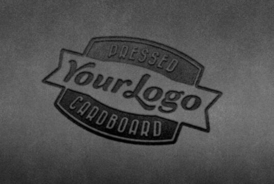
Best for: branding agencies, packaging concepts, logo portfolios, craft brands, eco-oriented identities, and natural product design.
This close-up cardboard logo mockup uses a PSD smart layer, allowing designers to insert their own logo while preserving realistic surface texture, perspective, and depth.
The background surface can also be adjusted, which makes the resource useful for creating several variations without changing the core logo treatment.
Best for Simple One-Color Logos
The cardboard texture already contains a lot of visual detail, so simple monochrome symbols and wordmarks usually remain easier to read than highly detailed artwork.
7. Kraft Paper Letterpress Logo Mockup PSD
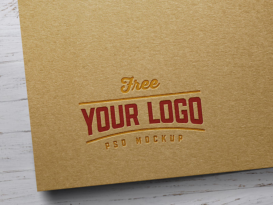
Best for: sustainable branding, coffee packaging, handmade goods, food brands, stationery, craft products, and premium natural identities.
This kraft paper logo mockup creates a letterpress-style presentation and includes a layered PSD with Smart Object insertion.
Designers can customize the paper color, lighting, and background while using either monochrome or colored logo artwork.
Use It for Packaging-Led Brand Identities
The kraft-paper texture makes this resource especially suitable when the brand already uses natural cardboard, recycled paper, kraft bags, or other uncoated packaging materials.
8. Cardboard & Metal Sheet Logo Mockup PSD
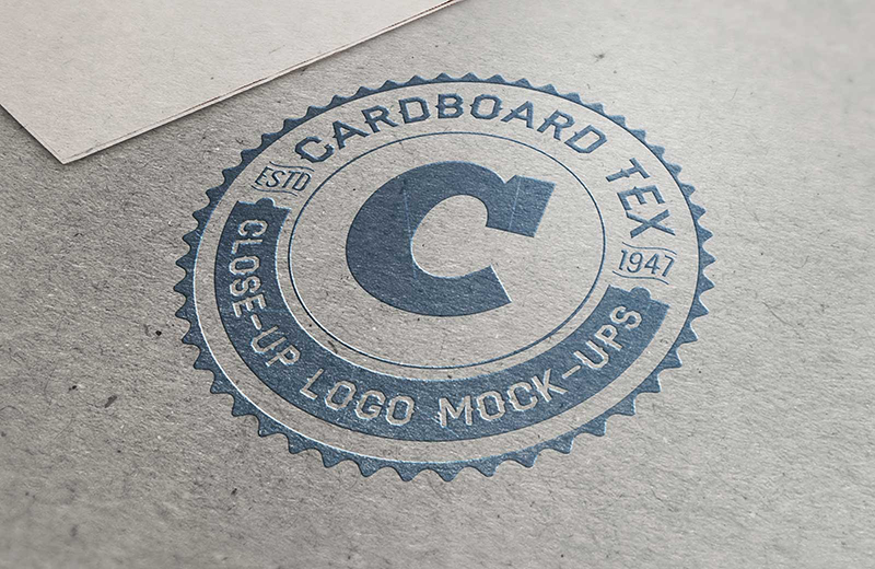
Best for: logo presentation comparisons, industrial branding, packaging, creative studios, product brands, and identity case studies.
This resource includes two different material presentations: a cardboard logo mockup and a scratched metal surface.
That makes it particularly useful for showing how the same identity changes depending on material.
Compare Brand Personality Across Materials
The cardboard treatment can feel warmer, handcrafted, and natural, while the metal version creates a more industrial or technical impression.
Using both versions in a branding exploration can help demonstrate how strongly material affects the perceived personality of the same logo.
9. Cardboard Paper Logo Mockup
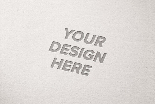
Best for: debossed logos, sustainable brands, packaging, natural products, typography, and minimalist visual identities.
This high-resolution cardboard paper PSD creates a debossed presentation for text or vector logos.
Its smart layer allows designers to place the artwork quickly while the mockup handles surface depth and texture.
Use Debossing for Subtle Branding
Unlike a brightly printed logo, a debossed identity relies on shadow, depth, and surface changes.
This can create a refined result, but extremely fine elements may become harder to distinguish.
10. Debossed Cardboard Logo Mockup
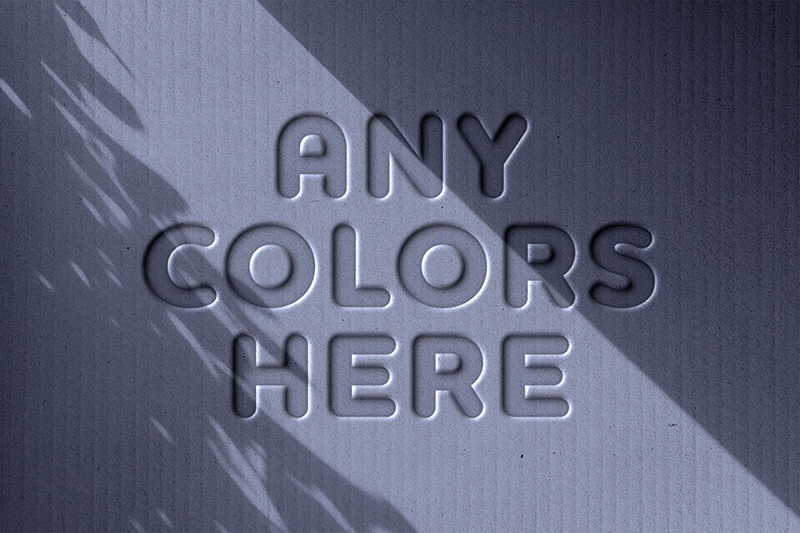
Best for: eco-friendly brands, handmade products, packaging, labels, craft businesses, and tactile identity presentations.
This PSD combines a realistic corrugated cardboard texture with a debossed logo effect, making the artwork appear pressed directly into the material.
The resource uses Smart Object layers, so designers can replace the sample artwork with a custom logo or text while keeping the realistic shadows and cardboard texture.
Ideal for Eco & Craft Branding
A natural corrugated surface can support brands associated with handmade goods, small-batch products, packaging, organic products, and sustainability-focused positioning.
Cardboard Logo Mockup vs Paper Logo Mockup
Although both use fiber-based materials, the visual impression can be very different.
Cardboard
Often feels:
- More tactile.
- More industrial.
- More packaging-oriented.
- More natural or raw.
Clean Paper
Often feels:
- More corporate.
- More editorial.
- More refined.
- More suitable for stationery.
Choose the material according to the actual brand experience rather than simply selecting whichever mockup has the most dramatic effect.
Printed Logo vs Pressed Logo on Cardboard
Printed Logo
A printed identity can use color and usually provides stronger contrast.
Pressed or Debossed Logo
A pressed effect relies more on depth, light, shadow, and material texture.
This can create a subtle premium effect, but it may not be appropriate for every production budget or packaging method.
How to Choose Colors for Cardboard Branding
Natural cardboard already has a strong base color.
Instead of treating it like white paper, consider how inks will interact with the brown or kraft surface.
Black
Often provides excellent contrast and works well for simple branding.
White
Can create a clean contemporary contrast when the actual production method supports opaque white printing.
Dark Green
Can support natural, food, outdoor, and sustainability-oriented identities.
Limited Brand Colors
One or two strong colors can often be more effective than a complex full-color composition on raw cardboard.
How to Use Cardboard Mockups in a Branding Portfolio
Start With the Clean Logo
Show the primary logo, symbol, typography, and brand colors before introducing material effects.
Then Show the Material Application
Use one or two cardboard mockups to demonstrate how the identity behaves physically.
Add Real Packaging When Relevant
If the brand sells physical products, pair the logo treatment with boxes, labels, paper bags, or shipping materials.
How to Make Cardboard Logo Mockups Look More Realistic
Keep the Logo at a Plausible Size
A huge logo filling every centimeter of a shipping box may look impressive in Photoshop but unrealistic in production.
Respect the Surface Texture
The logo should interact with fibers, folds, shadows, and corrugation rather than appearing as a perfectly flat digital overlay.
Use Realistic Print Colors
Bright RGB colors may change significantly when printed on uncoated cardboard.
Think About Production
If the mockup shows embossing, cutting, or letterpress effects, ask whether that production method makes sense for the actual project.
Common Cardboard Branding Mistakes
1. Making the Logo Too Detailed
Rough materials often favor simpler shapes.
2. Ignoring the Cardboard Color
The natural surface influences every printed color placed on top.
3. Using Effects That Cannot Be Produced
A mockup should represent a plausible production technique whenever it is shown to a client.
4. Showing Only the Mockup
Always include a clean version of the identity.
5. Using Cardboard for an Irrelevant Brand
The material should support the brand strategy.
6. Adding Too Much Packaging Information
Logo, product information, handling icons, and marketing messages still need hierarchy.
7. Assuming Every Mockup Has the Same License
Check each resource individually.
Cardboard Mockup Licensing Checklist
- Is personal use allowed?
- Is commercial use allowed?
- Can the mockup be used in client presentations?
- Can the resulting image appear in advertising?
- Is attribution required?
- Can the PSD be modified?
- Can the source file be redistributed?
- Can the resource be included in products for resale?
Frequently Asked Questions About Cardboard Logo Mockups
What are cardboard logo mockups?
Cardboard logo mockups are presentation templates that place a logo, wordmark, badge, or typography onto cardboard, corrugated packaging, kraft surfaces, or pressed paper effects.
What are cardboard logo mockups used for?
They can be used for packaging presentations, brand identity projects, e-commerce concepts, shipping boxes, food branding, sustainable products, and portfolio case studies.
Are cardboard mockups good for packaging design?
Yes, particularly when cardboard or corrugated packaging is actually part of the intended product experience.
What is the difference between a cardboard mockup and a cardboard text effect?
A mockup places existing artwork into a realistic physical scene. A text effect changes the appearance of the artwork itself to imitate cardboard, cutting, embossing, or another material treatment.
Do cardboard PSD mockups use Smart Objects?
Many do, but the editing structure depends on the individual resource.
What logos work best on cardboard?
Simple wordmarks, symbols, monograms, and strong monochrome marks often reproduce well because the material itself already contains significant texture.
Can I print a white logo on brown cardboard?
It may be possible depending on the printing process and supplier, but the real production method should be confirmed before presenting it as the final packaging specification.
Can cardboard logo mockups be used commercially?
Only when the license of the individual resource allows the intended commercial use.
Should I show the flat logo too?
Yes. The mockup provides context, while the flat logo lets clients and portfolio viewers evaluate the actual design without texture, depth, or lighting effects.
Final Thoughts
The best cardboard logo mockups do more than apply a texture to a logo.
They help designers explore how an identity might behave on a physical material that is widely used in packaging, shipping, food, retail, and handmade products.
A corrugated box can demonstrate a realistic e-commerce application. A pressed cardboard effect can show how a simple logo responds to depth and shadow. A cut-out treatment can highlight the silhouette of a mark, while kraft paper and debossed textures can create a more natural or handcrafted visual direction.
Choose the mockup according to the brand and its likely real-world applications.
Keep the logo readable. Respect the texture. Use realistic scale. Think about how the design could actually be printed, pressed, cut, or produced.
And always review the individual license before using a resource commercially.
The material should strengthen the brand presentation — not compensate for weaknesses in the logo itself.
For more logo mockups, packaging resources, Photoshop assets, fonts, textures, and design inspiration, continue exploring DesignRise.