







Free modern fonts for designers can do far more than make a project look contemporary. The right typeface can define a brand personality, establish hierarchy, transform an ordinary poster into a strong typographic composition, or give a website, package, presentation, or social graphic a much more distinctive visual voice.
But “modern font” is an extremely broad category.
Modern typography can be geometric and minimal, experimental and futuristic, condensed and architectural, soft and humanist, retro-modern, modular, or strongly display-oriented. A typeface that works perfectly on a poster may be completely unsuitable for body copy, while a versatile sans serif designed for digital interfaces may feel too neutral for an expressive campaign headline.
This DesignRise collection brings together 50 free modern fonts for designers, including geometric sans serifs, experimental display typefaces, Art Deco-inspired lettering, condensed fonts, modern serifs, futuristic styles, modular typography, and versatile families for both print and digital work.
You can explore them for:
- Brand identities and logo concepts.
- Website and UI design.
- Editorial layouts and magazine covers.
- Posters and event graphics.
- Packaging and labels.
- Social media campaigns.
- Fashion and beauty projects.
- Technology and futuristic design.
- Presentation design.
- Experimental typography.
This guide also explains how to choose a modern typeface, how to distinguish a useful font family from a one-purpose display font, how to pair geometric typography, how to test fonts before using them in branding, and which licensing details should be checked before using a free download commercially.
Licensing note: the fonts in this collection come from different designers, foundries, portfolio pages, and download websites. A resource being available as a free download does not automatically mean unrestricted commercial use. Some may be open-source, some may include only one free weight, and others may have personal-use or promotional terms. Always review the current license on the original source page before using a typeface in paid client work, branding, merchandise, applications, websites, templates, advertising, or products.
Explore More DesignRise Resources:
- Collection of Free Patterns for Photoshop
- Free Selection of Plaid Patterns
- Free Hipster Fonts Collection for Your Creative Projects
- Explore More Font Collections on DesignRise
Free Modern Fonts for Designers: What Makes a Typeface Feel Contemporary?
There is no single visual formula for modern typography. What feels contemporary often comes from the relationship between proportions, spacing, geometry, contrast, and the context in which the font is used.
Geometric Construction
Circles, squares, straight lines, repeated angles, and modular structures remain common in modern typography because they create order and visual consistency.
Controlled Simplicity
A modern typeface does not need to be extremely minimal, but unnecessary details are often removed so the remaining forms feel deliberate.
Distinctive Details
The strongest modern fonts usually contain at least one recognizable feature:
- An unusual lowercase “g”.
- Cut terminals.
- Broken strokes.
- Geometric counters.
- Extended proportions.
- Alternative characters.
Strong Relationship Between Form and Function
A headline font can be experimental. A body typeface needs greater restraint. Modern typography works best when its visual personality matches its role.
Which Modern Font Style Should You Choose?
50 Free Modern Fonts for Designers
1. Lombok Font

Best for: architecture, modern branding, fashion, technology, editorial design, posters, and minimalist identities.
Lombok is a geometric display typeface with broken strokes and a highly recognizable construction. Its character comes from what is removed as much as from what remains.
Use It at Display Scale
The gaps and geometric details need space to remain visually clear. Lombok is far stronger as a logo, headline, or poster title than as paragraph text.
2. Ailerons Font
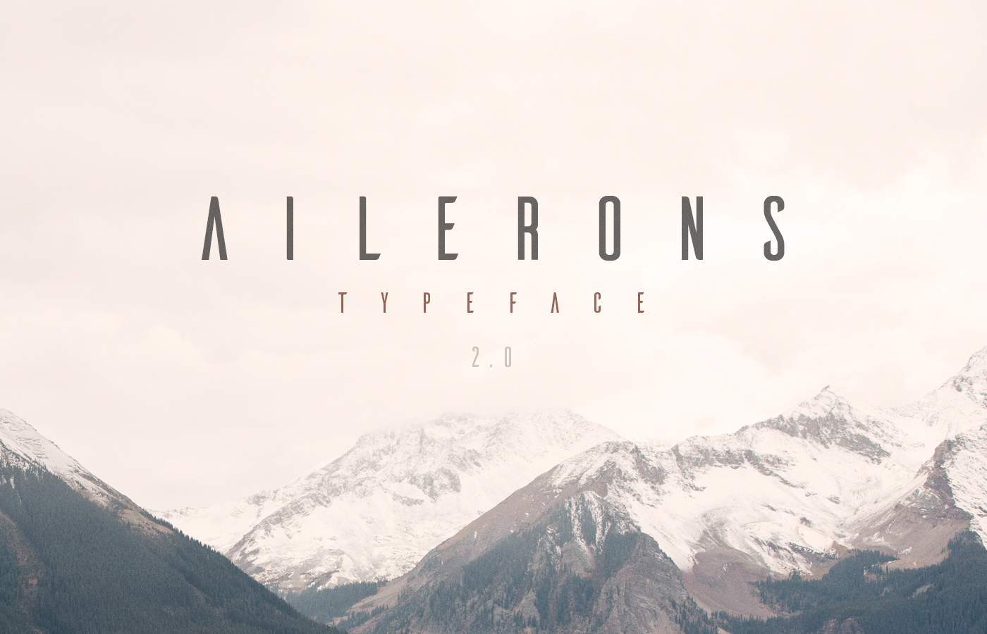
Best for: aviation, technology, posters, futuristic identities, fashion, editorial covers, and event branding.
Ailerons by Adilson Gonzales de Oliveira Junior takes inspiration from aircraft forms of the 1940s. Slightly angled and curved terminals give otherwise simple letterforms a recognizable aerodynamic character.
3. One Day Font

Best for: logo concepts, modern posters, editorial, minimal branding, fashion, and architectural layouts.
One Day by Nawras Moneer combines thin uppercase construction with rounded forms and intentionally interrupted strokes.
It is particularly effective when the letters themselves need to function as graphic shapes.
4. Cooper Hewitt Font

Best for: editorial systems, museums, cultural branding, websites, exhibitions, presentations, and information design.
Cooper Hewitt was developed as part of the visual identity surrounding the Cooper Hewitt Smithsonian Design Museum and works especially well when typography needs to feel functional without becoming anonymous.
5. Aqua Font

Best for: branding, poster design, editorial graphics, fashion, social media, and modern titles.
Aqua by Laura Pol contrasts straight angular uppercase construction with smoother rounded lowercase forms, creating an interesting tension within the same typeface.
6. Kolikö Font

Best for: bold headlines, multilingual graphics, branding, posters, editorial, and clean digital layouts.
Kolikö is a geometric sans serif family with Latin and Cyrillic support and a clean structural approach.
Useful for Multilingual Design
Character support becomes particularly important in branding systems that need to work across several languages.
7. Polya Font

Best for: 3D-inspired graphics, technology, gaming, posters, event design, and experimental branding.
Polya by Adrien Coquet is constructed around a polygonal mesh concept associated with low-poly 3D modeling.
The structure feels bold while remaining visually light because much of each character is defined by line rather than solid mass.
8. Radnika Font

Best for: brand systems, editorial, websites, corporate design, packaging, signage, and presentations.
Radnika was conceived as a typographic “workhorse” that bridges expressive historic forms and stricter contemporary construction.
That makes it more versatile than many display-only fonts in this collection.
9. Modeka Font

Best for: fashion, poster design, editorial titles, branding, packaging, and sophisticated modern layouts.
Modeka by Gatis Vilaks combines sharp angles with rounded connecting details, resulting in a light geometric display style.
10. Higher Font
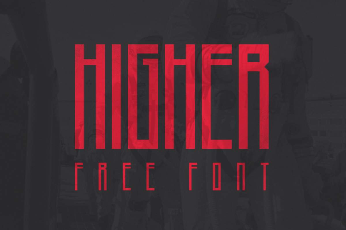
Best for: headlines, posters, fashion, editorial graphics, event promotion, and large typography.
Higher by Marisa Passos is a display-oriented typeface developed specifically to work at headline scale.
Build the Composition Around the Type
When using an expressive display face like Higher, try making the title one of the main structural elements of the design rather than placing it into leftover space.
11. Nordic Font
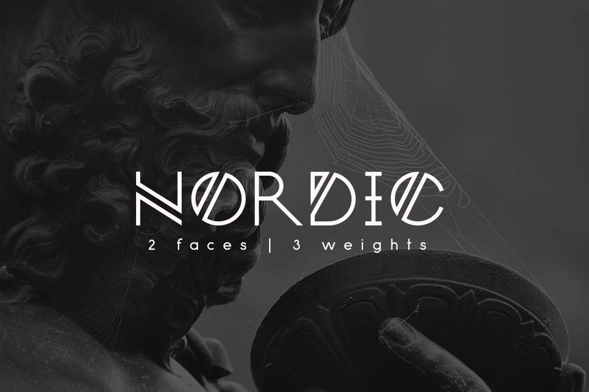
Best for: fantasy, music, cultural projects, fashion, posters, gaming, and experimental branding.
Nordic by Yana Bereziner draws inspiration from Norwegian runic forms, producing an experimental visual language rather than a conventional neutral sans serif.
12. Komoda Font

Best for: fashion headlines, magazine covers, posters, packaging, editorial, and chic display typography.
Komoda by Asia Ang uses narrow proportions and clean linear construction, making it especially effective where a headline needs vertical scale without occupying excessive width.
13. Kollektif Font

Best for: branding, posters, digital layouts, packaging, presentations, and modern editorial systems.
Kollektif was created as an alternative to low-contrast contemporary sans serifs, giving designers a clean typeface with a somewhat stronger personality.
14. Achi Font

Best for: Art Deco-inspired design, fashion, hospitality, posters, events, and experimental titles.
Achi by Shibu PG uses double stems and linear details that introduce a subtle Art Deco influence into an otherwise contemporary display style.
15. Parley Font

Best for: posters, editorial, branding, cultural graphics, and modern display typography.
Parley uses diagonal lines that cut through letters and numbers, sometimes altering the main structure and sometimes functioning as additional detail.
16. Aroma Font

Best for: packaging, lifestyle branding, editorial graphics, posters, and retro-modern projects.
Aroma by Laura Pol combines curved and angular forms with subtle retro and calligraphic influences.
17. Boxing Font
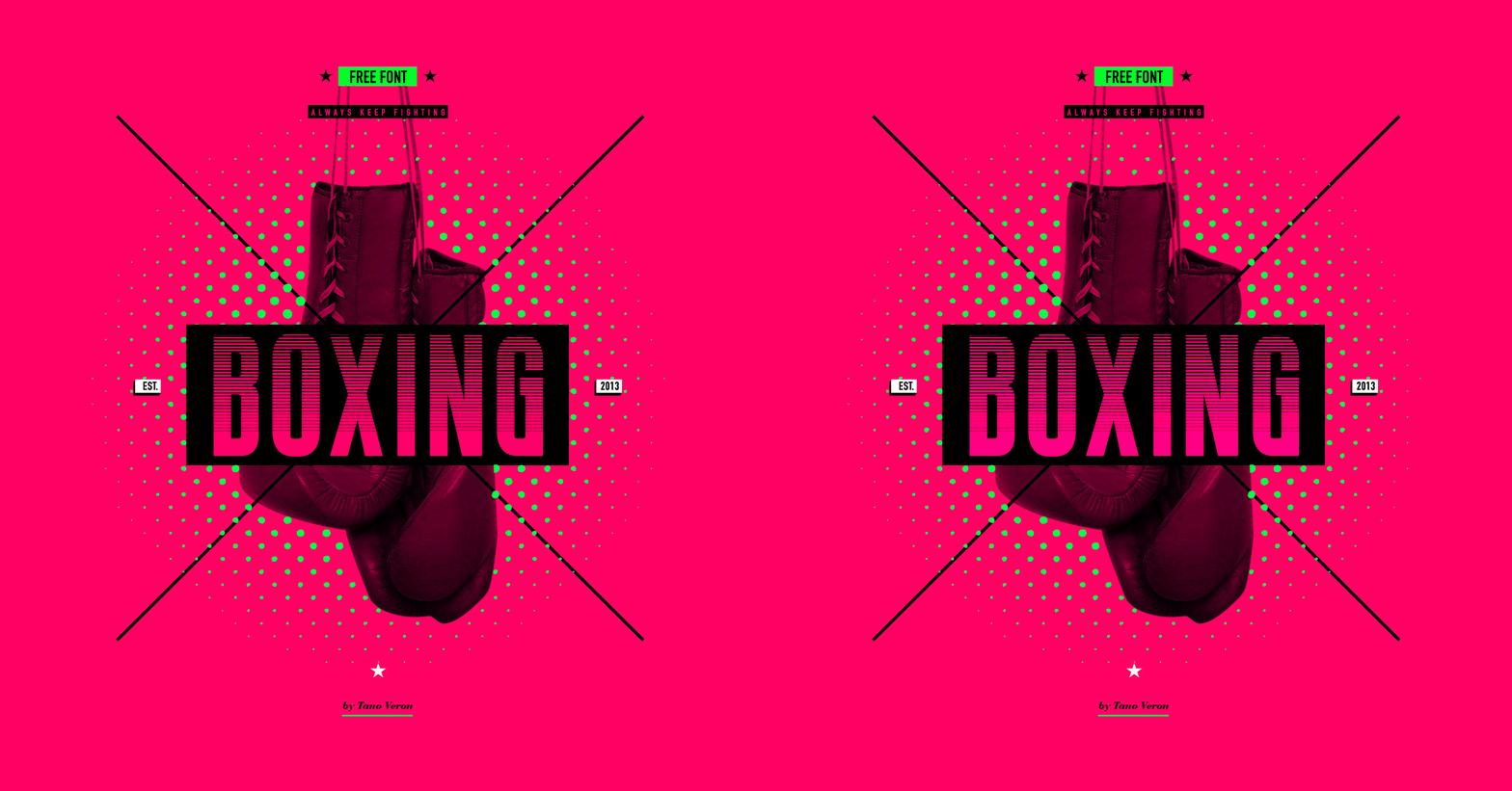
Best for: sports, posters, fitness, retro campaigns, events, and editorial headlines.
Boxing by Tano Veron takes inspiration from vintage boxing posters, using thin, elongated, condensed construction.
18. Minimalust Font

Best for: retro-modern branding, packaging, editorial titles, posters, and lifestyle projects.
Minimalust by Pratama Yudha combines minimalist sans-serif construction with inspiration from hand lettering and vintage printing.
19. Hyped Font
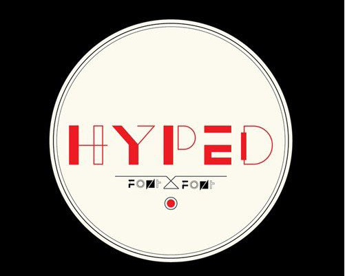
Best for: fashion, experimental posters, music, events, editorial covers, and bold branding.
Hyped mixes geometric forms with generous spacing and references that move between Art Deco and more postmodern visual directions.
20. Metria Font
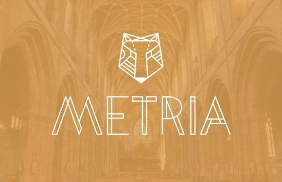
Best for: modern branding, architecture, posters, editorial graphics, and geometric design systems.
Metria by Jake Lunde is built around repeated angles and imperfect circular forms, creating tension between rigid geometry and organic curves.
21. Arenq Font
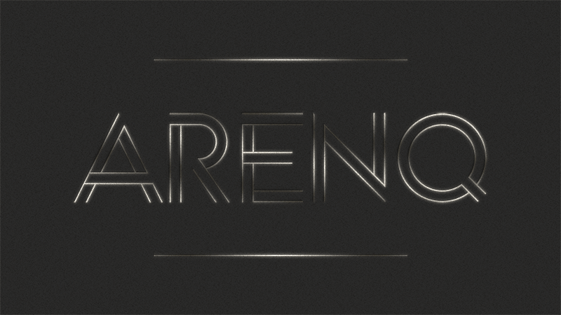
Best for: retro-futuristic posters, technology, gaming, nightlife, events, and experimental typography.
Arenq by Paulo R uses double-line construction that can read as both retro and futuristic depending on the surrounding art direction.
22. Fontaine Font

Best for: movie titles, detective themes, Art Deco design, posters, hospitality, and vintage advertising.
Fontaine combines clear readable forms with a subtle dramatic Art Deco character.
23. Brassie Font
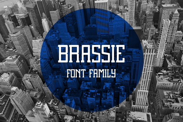
Best for: editorial, cultural branding, packaging, publishing, posters, and sophisticated headlines.
Brassie by Ryan Welch introduces small serifs without losing a contemporary appearance, making it a useful alternative to an all-sans-serif modern system.
24. Moka Font
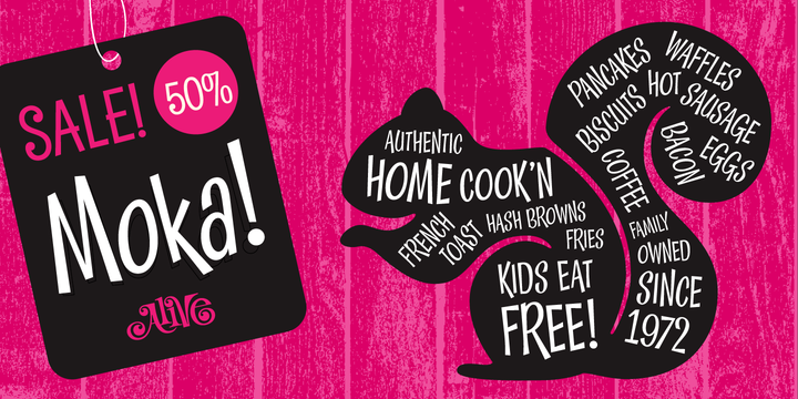
Best for: coffee branding, packaging, cafés, food, hospitality, and lifestyle design.
Moka by Liz Withers originated as lettering for a coffee logo concept. Its relatively large forms and lightly hand-drawn quality make it useful for brands that need modern structure without feeling too polished.
25. Perfograma Font
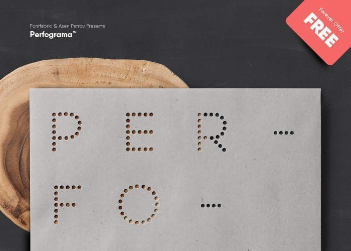
Best for: technology, computing history, experimental posters, exhibitions, and digital culture projects.
Perfograma takes inspiration from punched-tape systems associated with early electromechanical computing, creating a distinctive technological historical reference.
26. Ministry Font
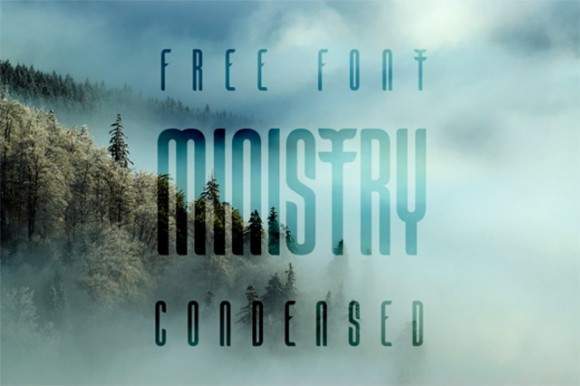
Best for: fashion, editorial covers, branding, posters, and sophisticated modern typography.
Ministry by Victor Tongollo uses elongated forms, smooth lines, and distinctive terminals to create a lighter elegant display voice.
27. Unik2 Font
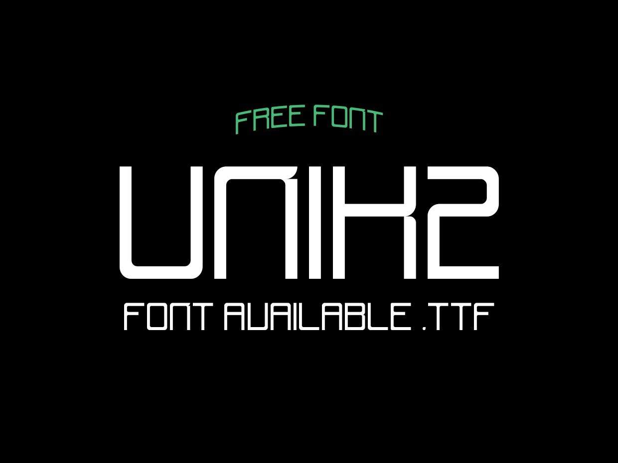
Best for: futuristic identities, posters, entertainment, gaming, music, and digital campaigns.
Unik2 combines angular construction with softened rounded terminals, producing a hybrid retro-futuristic appearance.
28. Nagasaki Font
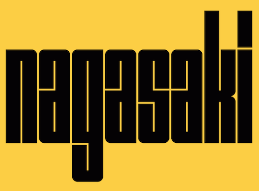
Best for: poster design, cultural projects, exhibitions, editorial graphics, and experimental typography.
Nagasaki by Sasha Lakoba draws inspiration from Wim Crouwel’s 1957 Hiroshima poster, placing the font within a strong modernist graphic-design context.
29. Hyperbola Font
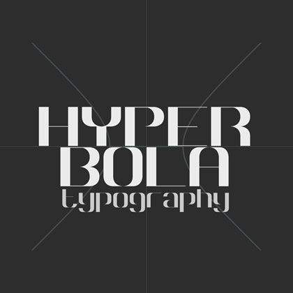
Best for: mathematics, technology, architecture, posters, conceptual branding, and geometric experiments.
Hyperbola by Tarin Yuangtrakul applies geometric and mirrored properties of mathematical hyperbolas to typographic construction.
30. Reckoner Font

Best for: industrial branding, technology, posters, architecture, events, and contemporary editorial design.
Reckoner by Alex Dale draws from industrial sans-serif typography while applying a cleaner contemporary interpretation.
31. Stoked Font

Best for: posters, fashion, editorial graphics, events, culture, and distinctive display typography.
Stoked by Marie-Michelle Dupuis introduces serif structure into a collection dominated by geometric sans serifs, making it a useful choice when contrast is needed.
32. QG Font

Best for: hospitality, editorial design, posters, identity concepts, and creative display typography.
QG by Anthony James uses simple curves and abstract lines with a balance between angular detail and softer shapes.
33. Qontra Font
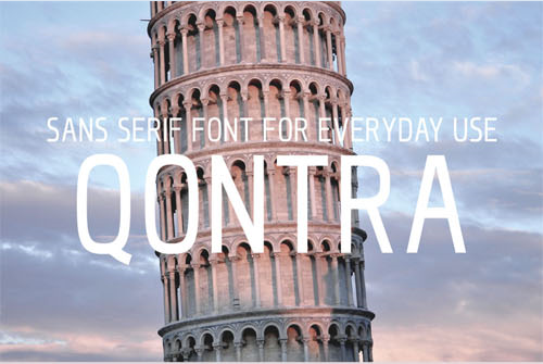
Best for: headlines, editorial, posters, web layouts, branding, and space-efficient typography.
Qontra by Tomaz Hrastar is a low-contrast condensed sans serif with relatively smooth curves.
Useful When Width Is Limited
Condensed fonts can create larger headlines without forcing the layout into multiple lines.
34. Disclaimer Font

Best for: posters, fashion, editorial headlines, architecture, events, and strong vertical typography.
Disclaimer uses modular construction, condensed forms, and a high x-height to produce a highly visible display face.
35. Orkney Font
Best for: websites, editorial, branding, interfaces, presentations, print, and everyday design systems.
Orkney was designed around the idea of combining a distinctive visual character with enough functionality to work across print and digital projects.
36. Prime Font
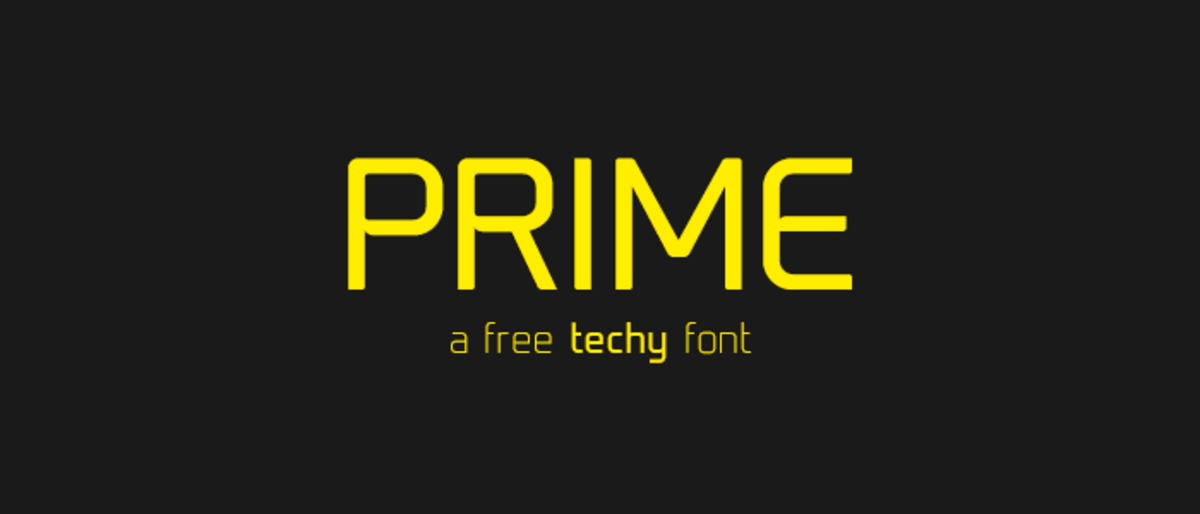
Best for: technology, interfaces, posters, branding, digital products, and contemporary editorial design.
Prime by Max Pirsky uses strict geometric construction with a subtle technical character while remaining comparatively restrained.
37. Matey Font

Best for: posters, retro-modern campaigns, music, editorial covers, and large headlines.
Matey by Andreas Leonidou combines condensed geometry with a slightly retro personality. Its proportions make it strongest at larger display sizes.
38. Decurion Font
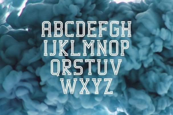
Best for: posters, editorial titles, merchandise, packaging, sports, and bold identities.
Decurion uses heavy block serifs that give typography a strong physical presence.
39. Blanka Font

Best for: minimal posters, experimental branding, fashion, technology, editorial titles, and architectural layouts.
Blanka by Emmeran Richard uses disappearing and reduced letter elements to create a highly abstract minimalist result.
40. Maddac Font

Best for: branding, posters, editorial graphics, architecture, packaging, and geometric identity systems.
Maddac follows a controlled corner system: selected corners remain rounded while their opposites remain hard. The restriction creates consistency across the alphabet.
41. Leoscar Font

Best for: sophisticated branding, fashion, editorial, packaging, magazines, and minimal layouts.
Leoscar by Faridul Haque combines serif and sans-serif directions with a light, elegant construction.
42. Amsterdam Superstar Font
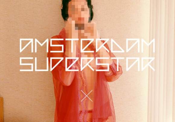
Best for: technology, futuristic design, posters, music, games, events, and modular visual identities.
Amsterdam Superstar uses line- and angle-based construction with characters occupying a relatively square visual footprint.
43. Rodus Font

Best for: modular branding, posters, technology, editorial systems, and experimental typography.
Rodus explores the relationship between square forms and softened rounded corners through several stylistic variations.
44. Distrito Font

Best for: architecture, cultural projects, posters, editorial, exhibitions, and urban identities.
Distrito by Carlo Pico is a geometric modular typeface inspired by the historic center of Bogotá, using angled curves to introduce stronger visual drama.
45. Etna Font
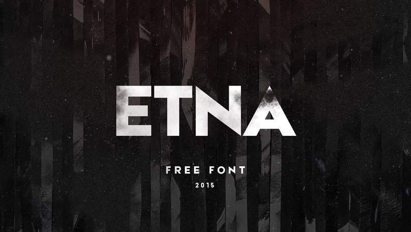
Best for: bold branding, posters, editorial titles, advertising, packaging, and general display typography.
Etna by Krisjanis Mezulis offers a large, bold, relatively clean construction suitable for projects where clarity and visual weight are both important.
46. Intro Font
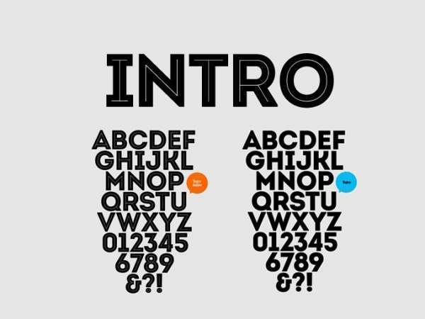
Best for: branding, headlines, posters, advertising, packaging, digital campaigns, and modern identity systems.
Intro uses fundamental geometric forms — circles, squares, and triangles — to build a strong and highly structured visual language.
47. Manifesto Font

Best for: architecture, editorial graphics, exhibitions, fashion, cultural design, and modern posters.
Manifesto by Tomaz Leskovec is inspired by Italian Rationalist ideas of structure and space, which appear in the positioning and removal of letter elements.
48. Noir Font
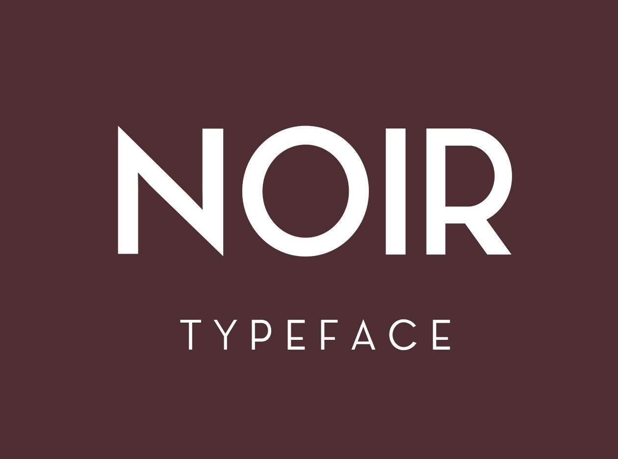
Best for: branding, editorial, websites, corporate design, presentations, and minimal visual systems.
Noir by Matthias Guggisberg is a straightforward geometric sans serif built around functionality and readability.
49. Glober Font

Best for: branding, corporate design, websites, editorial layouts, advertising, and presentation systems.
Glober takes inspiration from classic grotesk typography while using softened geometric forms and distinctive character details.
50. Canter Font
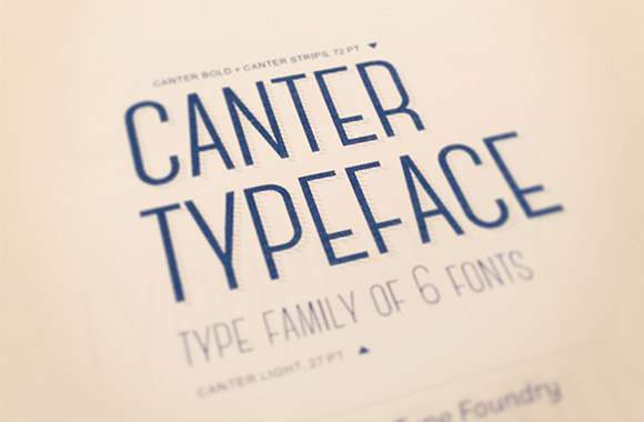
Best for: editorial covers, titles, posters, fashion, event graphics, and large headline systems.
Canter by Christopher J. Lee is a condensed display family designed for titles, headlines, and posters.
Its narrow proportions make it an effective way to create oversized typography while keeping line lengths under control.
How to Choose a Modern Font for Branding
A modern visual style does not automatically mean choosing the most geometric font available.
Start With Brand Personality
Ask whether the brand should feel:
- Technical.
- Premium.
- Friendly.
- Experimental.
- Architectural.
- Futuristic.
- Cultural.
- Playful.
For Minimal and Architectural Brands
Explore Lombok, One Day, Metria, Blanka, Manifesto, Distrito, or Poiret-like geometric directions.
For Functional Brand Systems
Radnika, Cooper Hewitt, Orkney, Glober, Prime, and similar families are easier to extend across many touchpoints.
For Futuristic and Technology Brands
Arenq, Amsterdam Superstar, Polya, Unik2, Perfograma, Age-like forms, and Hyperbola provide a more experimental digital character.
For Fashion and Editorial Work
Modeka, Komoda, Ministry, Leoscar, One Day, and more elongated display styles naturally support a more image-led editorial direction.
Display Font vs Workhorse Font
This distinction is extremely useful when evaluating free fonts.
Display Font
A display typeface is primarily useful for:
- Headlines.
- Logos.
- Posters.
- Cover titles.
- Large labels.
Lombok, Polya, Higher, Arenq, Blanka, and Achi fit naturally into this category.
Workhorse Font
A workhorse typeface provides enough readability and variation to handle broader communication.
Radnika, Cooper Hewitt, Orkney, Prime, and Glober are more useful when the font needs to survive across multiple sizes and formats.
How to Pair Modern Fonts
Experimental Display + Neutral Sans Serif
For example:
- Lombok + simple grotesk.
- Polya + neutral sans.
- Blanka + restrained text face.
- Arenq + simple body typography.
Condensed Display + Wider Body Font
Komoda, Qontra, Matey, Disclaimer, and Canter can create strong headlines while a wider text typeface improves readability below.
Modern Serif + Sans Serif
Brassie or Stoked can provide contrast inside a collection otherwise dominated by sans serifs.
Do Not Pair Two Fonts With the Same Job
Two experimental display faces usually compete. Give each typeface a clearly defined purpose.
How to Make Geometric Fonts Feel Less Generic
Geometric sans serifs are extremely common, which makes the surrounding art direction important.
Use Scale
Large typography can turn a familiar geometric font into a graphic element.
Use Unexpected Cropping
Allow letters to move beyond the edge of the frame.
Control Tracking
Wide tracking can feel elegant and architectural. Tight tracking can create greater density and energy.
Pair With Strong Photography
The font does not always need to carry the complete identity by itself.
How to Use Experimental Fonts Without Sacrificing Readability
Use Them for Short Text
The stronger the visual experiment, the shorter the copy should generally become.
Increase Scale
Broken strokes and unusual counters need enough space to be understood.
Use a Clean Companion Font
Let the experimental font provide personality and a functional typeface handle information.
Modern Font Testing Workflow
- Type the real brand or headline.
- Test uppercase and lowercase.
- Check numbers and punctuation.
- Try the smallest required size.
- Test the typeface in black and white.
- Place it over real imagery.
- Test desktop and mobile.
- Check multilingual characters if needed.
- Compare at least three different typographic directions.
- Review the license before final approval.
How to Test a Font for a Logo
Check the Complete Word Shape
A logo is perceived as a silhouette before every letter is read individually.
Look for Weak Character Combinations
Try real letter pairs inside the brand name rather than relying on the font specimen.
Test Tiny Sizes
The same logo may need to work as:
- A browser favicon.
- Social avatar.
- Packaging mark.
- Business card.
- Website navigation logo.
Do Not Depend on Effects
The typography should work before gradients, metallic treatments, shadows, outlines, or 3D effects are applied.
Modern Typography for Website Design
Use Display Fonts Strategically
An experimental font can work beautifully in a hero section without being appropriate for navigation or paragraphs.
Watch Font Weight
Extremely thin letterforms may perform poorly on small screens.
Check Performance
Only load the font weights and styles the website actually requires when possible.
Test Real Content
A typeface that works for a four-word marketing headline may not work for product names, buttons, pricing, or multilingual content.
Modern Typography for Posters
Think of the Headline as an Image
Large typography can establish:
- Direction.
- Rhythm.
- Scale.
- Contrast.
- Negative space.
Experiment With Cropping
A letter does not always need to remain entirely inside the page.
Use One Strong Typographic Idea
A broken geometric font plus distortion plus outline plus 3D plus texture often weakens the original typeface.
Common Modern Font Mistakes
1. Assuming Modern Means Geometric
Contemporary typography can also be serif, humanist, experimental, condensed, or retro-inspired.
2. Choosing From the Specimen Alone
Always test the actual project name or headline.
3. Using Display Fonts for Long Paragraphs
Visual character is not the same as reading comfort.
4. Pairing Several Experimental Fonts
One strong visual voice is usually enough.
5. Making Every Font Extremely Thin
Modernity does not require fragile typography.
6. Ignoring Numbers
They matter for dates, pricing, interfaces, statistics, and events.
7. Ignoring Multilingual Support
This can become a major problem after a brand system has already been approved.
8. Using Effects to Make Typography Interesting
Choose a better font or composition before adding effects.
9. Treating Every Free Font as a Complete Family
Some downloads may include only one weight or style.
10. Assuming Free Means Commercially Licensed
Always review the source license.
Free Font Licensing Checklist
- Is commercial use allowed?
- Can the font be used in a logo?
- Can it be used for paid client projects?
- Can it be embedded on a website?
- Can it be embedded in an app?
- Is merchandise use permitted?
- Can it be included in templates for resale?
- Is attribution required?
- Does the free download include the full character set?
- Can the original font files be redistributed?
Frequently Asked Questions About Free Modern Fonts for Designers
What are free modern fonts for designers?
Free modern fonts for designers are downloadable typefaces with contemporary visual characteristics such as geometric construction, restrained proportions, experimental modular forms, modern serifs, condensed structures, or updated retro influences.
What are the best modern fonts for branding?
The best option depends on the brand. Radnika, Cooper Hewitt, Orkney, Prime, Glober, and similar functional fonts can support broader identity systems, while Lombok, One Day, Blanka, and Manifesto are stronger for distinctive display typography.
What modern fonts work for posters?
Polya, Higher, Nordic, Komoda, Achi, Arenq, Disclaimer, Canter, Blanka, and other display-oriented styles are especially suited to poster-scale typography.
What fonts work for technology branding?
Prime, Perfograma, Arenq, Amsterdam Superstar, Hyperbola, Polya, Reckoner, and other geometric or modular fonts naturally support technology-focused visual systems.
What fonts work for fashion and editorial projects?
Modeka, Komoda, Ministry, One Day, Leoscar, Metria, and other lighter geometric display faces can work well for fashion and editorial design.
Are geometric fonts still modern?
Yes, but they are now common enough that typography alone may not make a design distinctive. Layout, spacing, photography, motion, and color often determine whether the final result feels generic or contemporary.
Can modern display fonts be used for body text?
Some can, but many experimental fonts are designed primarily for larger sizes. Test extended paragraphs before using any display typeface for reading text.
Are all 50 fonts free for commercial use?
No universal claim should be made. The fonts come from different creators and sources, and usage terms can vary.
How many fonts should I use in one design?
Many projects can be completed with one versatile family or two complementary fonts. Additional typefaces should have a clearly defined purpose.
How do I know whether a modern font is good?
Test the real words, required sizes, numerals, punctuation, language support, and use cases rather than judging only the promotional specimen.
Final Thoughts
The best free modern fonts for designers are not necessarily the typefaces with the most unusual construction.
The strongest fonts are the ones that solve a real communication problem.
Lombok and Blanka can become graphic elements inside minimalist layouts. Cooper Hewitt, Radnika, Orkney, Prime, and Glober provide broader functionality. Polya, Hyperbola, Perfograma, and Amsterdam Superstar explore technology and geometry. Modeka, Komoda, Ministry, and Leoscar move toward fashion and editorial typography. Fontaine, Achi, Boxing, Minimalust, and Matey introduce historical influences without requiring an entirely vintage visual system.
The collection is useful because these fonts do not all define “modern” in the same way.
Some are modern because they remove unnecessary detail. Others feel contemporary because they reinterpret old typographic ideas. Some turn letters into geometric systems, while others introduce small imperfections that prevent digital typography from feeling sterile.
Before choosing one, test the actual project.
Type the real name. Try the real headline. Check the numbers. Reduce the scale. Increase the scale. Pair it with real body copy. Place it on a phone screen. Print it. Check its language support and licensing.
The right modern font should not simply make the project look current. It should make the visual idea clearer.
For more font collections, typography inspiration, mockups, patterns, textures, and practical design resources, continue exploring DesignRise.