







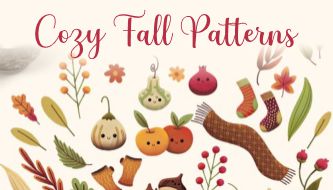
Cozy fall patterns are one of the easiest ways to give a design an immediate seasonal identity, but the strongest autumn work goes far beyond placing orange leaves and pumpkins on a cream background. A successful pattern needs rhythm, scale, color balance, usable negative space, and enough flexibility to work across the formats the project actually requires.
A pattern that looks beautiful as a large digital background may become visually chaotic on a coffee cup. Tiny leaf details that work perfectly on wrapping paper may disappear when printed on fabric. A dense harvest repeat can give packaging personality, while the same density behind text can destroy readability.
That is why professional surface design begins with the application rather than the motif.
This collection brings together 20 autumn pattern resources covering watercolor leaves, vintage botanical motifs, forest illustrations, florals, harvest graphics, earthy ethnic patterns, leaf imprints, wreaths, and vector repeats. Some resources are free, while others are premium marketplace products. The source formats include AI, EPS, SVG, PSD, JPG, and PNG depending on the individual collection.
The guide also explains how to choose an autumn pattern for packaging, textiles, branding, social media, stationery, and digital backgrounds; how to control scale and color; how to combine several seasonal patterns without creating visual clutter; and what to check before sending patterned artwork to print.
Licensing note: free availability does not automatically mean unrestricted commercial use. Premium marketplace licenses can also differ depending on whether the final design is used for client work, merchandise, templates, fabric, print-on-demand products, or resale. Review the current license on the original resource page before professional use.
Explore More DesignRise Resources:
- Explore More Patterns on DesignRise
- An Extravagant Collection of Floral Patterns for Design Needs
- Selection of Pizza Box Mockups PSD
- Seamless Bamboo Textures for Natural Design Projects
What Makes an Autumn Pattern Feel Cozy Rather Than Generic?
“Cozy” is not a motif. It is a combination of visual decisions.
A pumpkin can feel playful, rustic, elegant, childish, premium, vintage, or minimalist depending on its illustration style, scale, color, surrounding elements, and typography.
Warm Color Relationships
Traditional fall palettes often use combinations of:
- Terracotta.
- Burnt orange.
- Mustard.
- Deep burgundy.
- Chocolate brown.
- Olive green.
- Muted forest green.
- Warm beige.
- Cream.
- Dusty rose.
A convincing autumn palette does not require all of them at once. Three or four controlled colors usually create a stronger system than a full collection of unrelated earthy tones.
Organic Shape Variation
Perfectly repeated leaves at identical angles tend to feel digital. Stronger patterns vary scale, direction, spacing, or motif shape enough to create visual movement while preserving the repeat.
Texture
Watercolor edges, paper grain, rough leaf imprints, hand-drawn outlines, and irregular pigment can make a seasonal design feel tactile even when the final product is digital.
Negative Space
A dense pattern is not automatically more seasonal. Empty space allows motifs to breathe and becomes especially important when typography, logos, product information, or photographs need to appear over the pattern.
Choose the Pattern Based on the Final Product
20 Cozy Fall Patterns for Seasonal Design
The cozy fall patterns below cover several visual directions, from traditional harvest illustration to watercolor leaves, florals, ethnic-inspired graphics, and more neutral earthy repeats.
1. Fall Watercolor Pattern
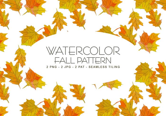
Best for: stationery, invitations, seasonal social graphics, greeting cards, lifestyle branding, and decorative backgrounds.
Watercolor is one of the easiest ways to create a softer autumn mood because the irregular edges and pigment variation keep the design from feeling overly mechanical.
This resource works especially well when a project needs seasonal warmth without the heavy visual density of a fully illustrated harvest pattern.
Design Direction
Use the watercolor pattern behind a cream or lightly tinted content panel rather than placing text directly over the busiest areas. Muted burgundy, olive, ochre, and warm grey typography can feel more sophisticated than default dark brown.
2. 12 Free Autumn Vector Patterns Set
Formats: AI, PSD, JPG, PNG
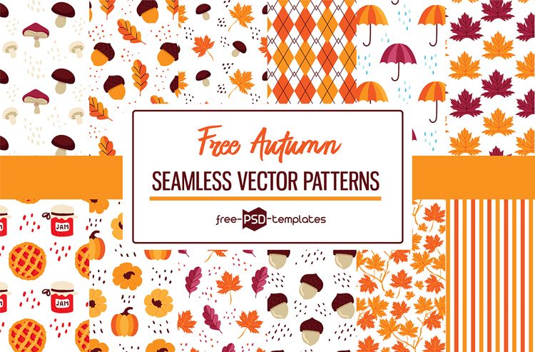
Best for: packaging concepts, seasonal marketing, printable stationery, social media, and mixed digital/print projects.
A set containing several coordinated repeats is valuable when a campaign requires visual variation without changing its overall seasonal language.
Use one pattern as the primary hero treatment, then introduce the others in smaller applications such as stickers, tissue paper, social stories, or card backs.
Why Multiple Formats Matter
Vector files are preferable when the pattern needs significant scaling or color modification. PSD, JPG, and PNG versions are useful for faster raster workflows and mockups.
3. Vintage Autumn Patterns
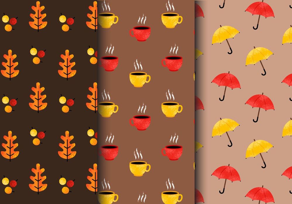
Best for: heritage-inspired packaging, cafés, seasonal menus, editorial design, posters, and nostalgic branding.
Vintage-style patterns can make autumn graphics feel less predictable than highly polished modern vector leaves. Their charm often comes from illustration character and slightly less perfect forms.
Keep the Vintage Treatment Controlled
Do not automatically add paper stains, distressed edges, sepia filters, and retro fonts at the same time. One vintage pattern can already carry significant historical personality.
4. Hello Autumn Vector Seamless Pattern
Formats: AI, EPS, PNG
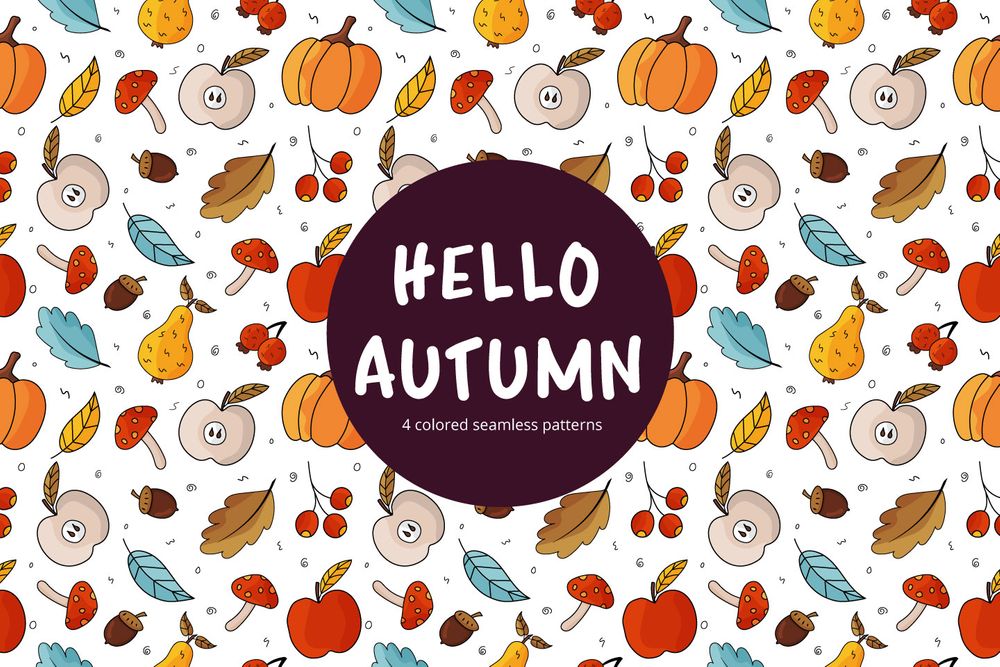
Best for: gift wrap, cards, seasonal promotions, fabric concepts, digital backgrounds, and craft projects.
A seamless vector repeat is particularly useful when the final dimensions are not known in advance. The pattern can be extended across larger surfaces without visible edges when the repeat has been prepared correctly.
Scale Before Decorating
Test the pattern at 50%, 100%, and 200% relative size. The same artwork can feel delicate, playful, or bold purely through scale.
5. Watercolor Autumn Vector Seamless Pattern
Formats: AI, EPS, PNG
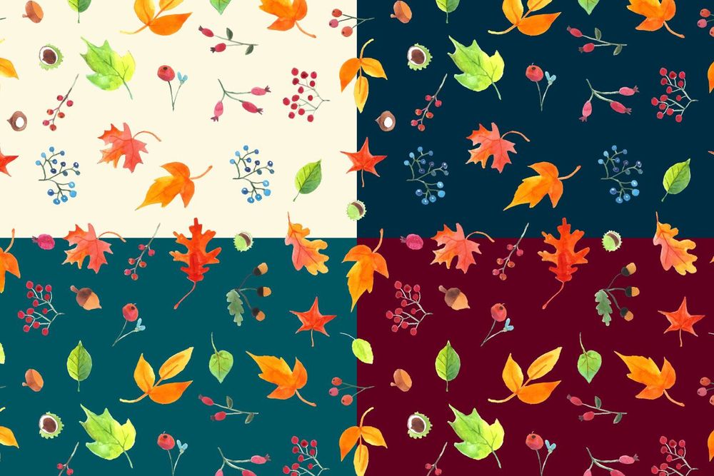
Best for: wedding stationery, seasonal packaging, feminine lifestyle brands, cards, and editorial backgrounds.
This resource combines the scalability of vector-based production with a softer watercolor visual direction.
Use Muted Backgrounds
Warm ivory, soft peach, dusty green, or pale beige can create more depth than placing watercolor motifs on pure white.
6. Autumn Forest Free Vector Seamless Pattern
Formats: AI, EPS, PNG
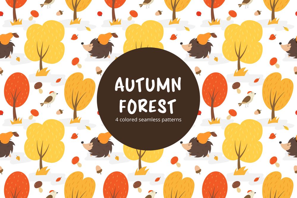
Best for: outdoor brands, kids products, seasonal packaging, nature campaigns, and illustrated surfaces.
Forest motifs provide a stronger narrative than isolated leaves. They can suggest exploration, weather, woodland life, and a specific environment rather than generic seasonality.
Create a Seasonal Family
The same pattern structure can often be recolored into late summer, early autumn, deep fall, and winter-preparation variants, allowing a brand to maintain consistency across several campaigns.
7. Autumn Is Coming Pattern
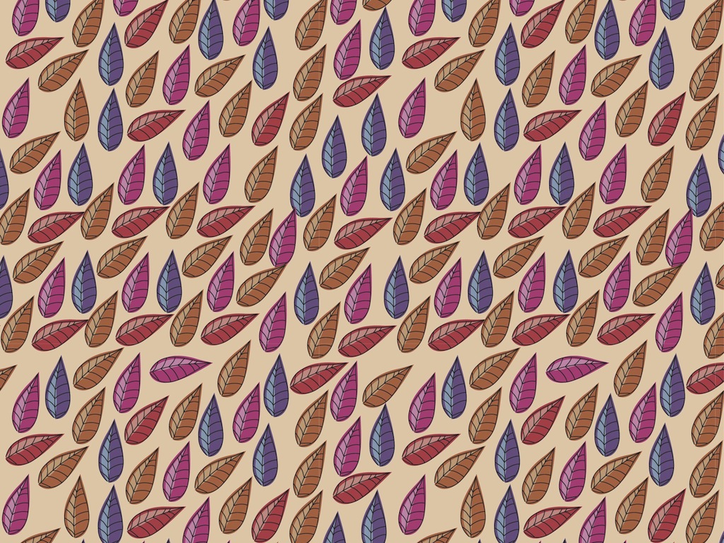
Best for: seasonal branding, textile concepts, packaging, digital backgrounds, and lifestyle products.
This resource can work well as a more illustrative seasonal direction, especially when the design needs recognizable autumn character rather than a neutral texture.
Use Illustrative Patterns as Hero Graphics
When the repeat contains enough personality, allow it to occupy a large visual area. Do not cover the most interesting motifs with unnecessary photography or text.
8. Autumn Floral Seamless Patterns
Format: JPG
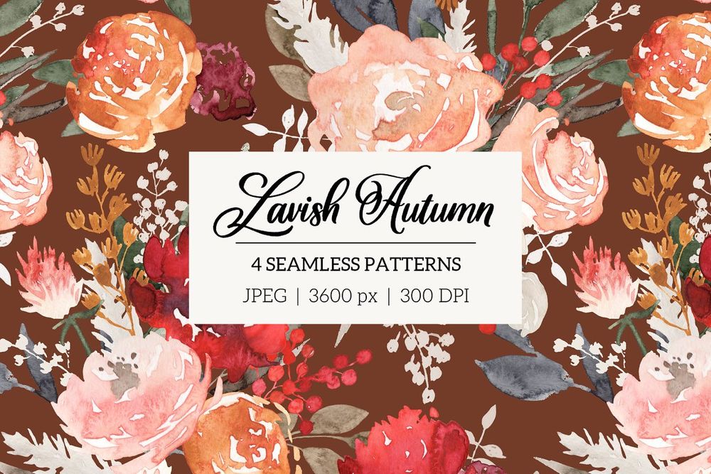
Best for: textiles, gift wrap, feminine packaging, stationery, notebooks, and lifestyle products.
Autumn floral patterns provide a useful alternative to literal pumpkins and acorns. They can communicate the season through palette and botanical forms while remaining appropriate for products that should feel elegant rather than themed.
Let the Palette Carry the Season
A floral motif can become distinctly autumnal through terracotta, rust, olive, mustard, brown, and muted plum without changing the illustration itself.
9. Thicket Thatch Patterns
Formats: AI, EPS, JPG, PNG
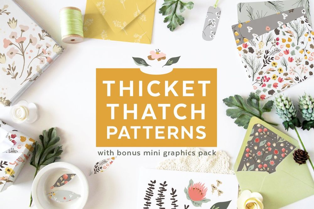
Best for: organic branding, fabric, rustic packaging, book covers, stationery, and natural products.
Patterns based on thicket, branches, and natural entanglement can feel more sophisticated than literal seasonal icons. They work particularly well for brands that want on thicket, branches, and natural entanglement can feel more sophisticated than literal seasonal icons. autumn mood without a holiday-specific appearance.
10. Earthy Ethno Seamless Patterns
Formats: AI, EPS, SVG, PNG
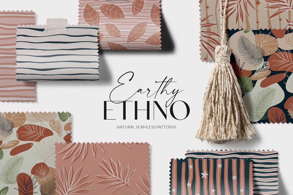
Best for: textiles, interior concepts, packaging, stationery, lifestyle products, and bohemian graphics.
This collection uses earthy visual language rather than obvious leaves or harvest objects. That makes it useful beyond a single season.
Seasonal Without Being Disposable
Design assets with earthy color and geometric-organic motifs can transition from fall campaigns into year-round product systems more easily than literal Halloween or Thanksgiving graphics.
11. Autumn Splendour Patterns
Formats: PSD, JPG, PNG
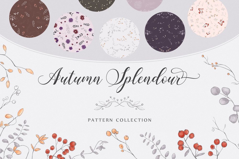
Best for: seasonal campaigns, packaging, greeting cards, print graphics, scrapbooking, and social media.
Raster-based collections are useful when the artwork contains texture or painterly detail that would be difficult to reproduce as clean vector shapes.
Check Resolution Before Large Printing
PSD and JPG artwork should be tested at the final physical size. A seamless repeat does not automatically mean the source resolution is unlimited.
12. Cozy Autumn Harvest Patterns
Formats: EPS, SVG, JPG, PNG
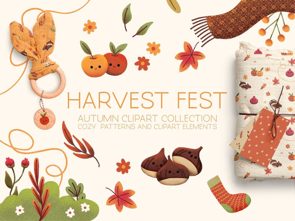
Best for: Thanksgiving graphics, food packaging, bakery branding, autumn events, gift products, and greeting cards.
Harvest patterns provide the most literal seasonal storytelling in the collection. They work particularly well when the product or event already has a connection to food, harvest, home, or gathering.
Use Literal Motifs Where They Add Meaning
A pumpkin pattern makes sense on bakery packaging or an autumn event invitation. It may feel forced on a technology service simply because the campaign happens in October.
13. Set of Autumn Patterns
Formats: EPS, SVG, JPG, PNG
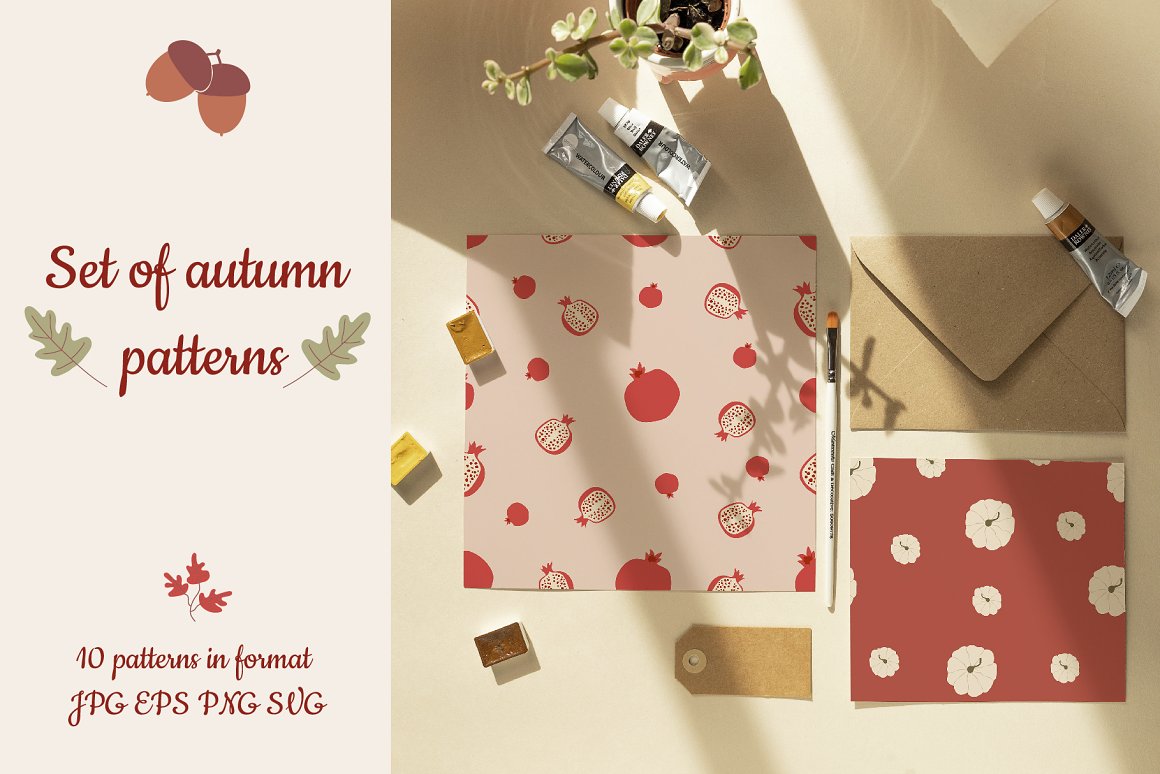
Best for: coordinated collections, brand campaigns, merchandise, packaging, and social graphics.
A multi-pattern set can support a complete visual system. One repeat may be used for packaging, another for tissue paper, another for digital banners, and a fourth for supporting graphics.
Build Hierarchy Across the Collection
Do not use every pattern at equal strength. Choose one hero pattern, one secondary repeat, and one quiet texture.
14. Autumn Patterns: Leaf Imprints
Formats: AI, EPS, JPG, PNG
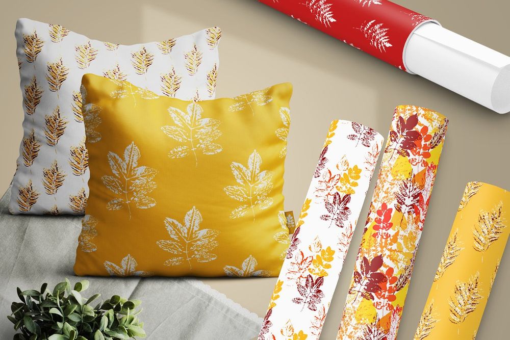
Best for: handmade branding, eco packaging, stationery, natural products, textiles, and art prints.
Leaf-imprint aesthetics have a tactile quality that works particularly well for projects that want to feel crafted or connected to natural materials.
Pair With Clean Typography
A textured pattern becomes more sophisticated when paired with a restrained sans serif or simple editorial serif rather than another highly decorative element.
15. 36 Autumn Floral Patterns
Formats: PSD, JPG
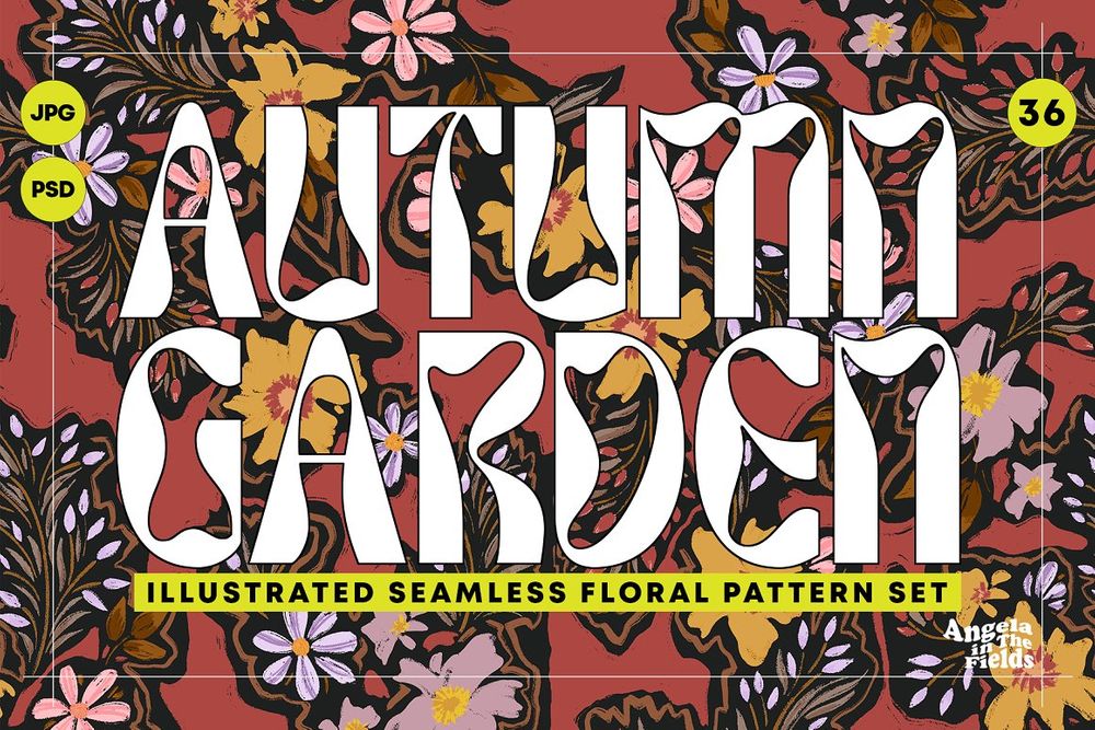
Best for: large coordinated product collections, stationery, textiles, fabric, wrapping paper, and digital content.
Thirty-six patterns provide plenty of variety, but that does not mean all 36 belong in the same project.
Create a Project-Specific Mini Collection
Select three to six patterns with compatible palette, motif scale, and density. This makes the final visual system feel curated rather than pulled from a large asset library.
16. Colorful Autumn Leaves Background Vector
Formats: EPS, JPG
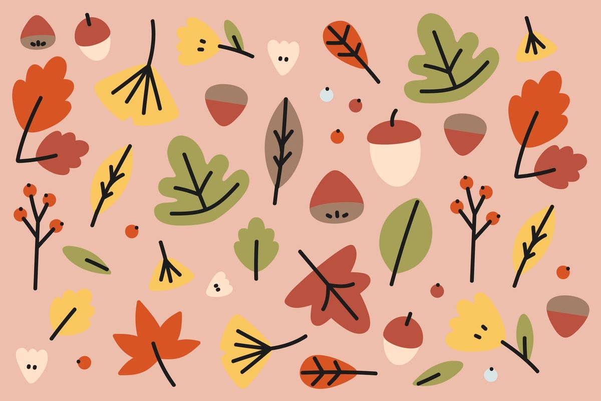
Best for: posters, seasonal banners, websites, invitations, cards, and simple promotional graphics.
A colorful leaf background is useful when the design needs immediate autumn recognition.
Control the Saturation
If the pattern sits behind text, reduce saturation or add a subtle color overlay. The background should communicate seasonality without fighting the message.
17. Hello Autumn Vector Pattern
Formats: AI, EPS
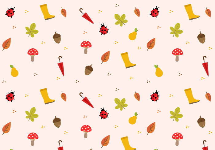
Best for: printable cards, craft graphics, autumn promotions, signage, and seasonal illustrations.
The vector format makes this resource easier to recolor and scale than a flattened raster image.
Create Brand-Specific Colorways
Instead of using the default palette, recolor the motifs using existing brand colors plus one or two seasonal accents. This helps the campaign feel like part of the brand rather than a generic holiday template.
18. Autumn Pattern Vector
Formats: AI, SVG
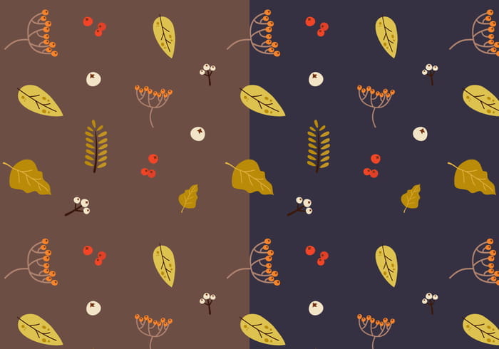
Best for: scalable seasonal graphics, print, packaging, web illustrations, and craft design.
AI and SVG are useful when the repeat needs to move between design software, web output, and different physical dimensions.
SVG for Digital Flexibility
SVG artwork can remain crisp at different screen sizes, although the final implementation should still be optimized when used on the web.
19. Fall Colors: Wreaths & Patterns
Formats: JPG, PNG
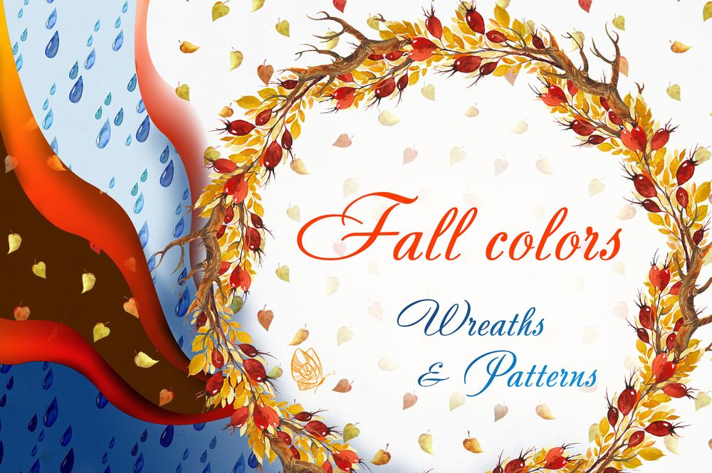
Best for: logos, invitation graphics, social campaigns, product labels, stationery, and seasonal branding.
The inclusion of wreaths gives this collection more flexibility than a repeat-only pack. A wreath can become a focal element while the related patterns support secondary applications.
Use the Wreath as the Hero
Place a short title, product name, or monogram inside the wreath, then use the matching seamless pattern on the reverse side, wrapping paper, or supporting graphics.
20. Fall Floral Autumn Background
Formats: EPS, JPG
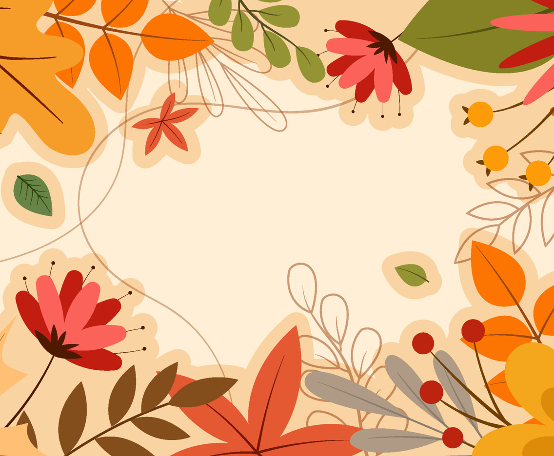
Best for: cards, posters, seasonal website graphics, packaging, social posts, and decorative print design.
This floral direction is useful when the project needs recognizable autumn colors but should remain softer than a harvest-based composition.
Crop Instead of Showing Everything
A background does not always need to be visible in full. Crop into the most interesting area and use only a section behind the main typography or product.
How to Choose the Right Pattern Scale
Pattern scale is one of the most important surface-design decisions because the same repeat can communicate completely different moods at different sizes.
Small Scale
Small repeats feel more like texture when viewed from a distance.
They work well for:
- Fabric.
- Wrapping paper.
- Notebook covers.
- Interior surfaces.
- Large product areas.
Medium Scale
Medium repeats usually offer the best balance between recognizable motifs and overall rhythm.
They work well for:
- Packaging.
- Tote bags.
- Boxes.
- Cards.
- Website sections.
Large Scale
Large motifs make the artwork more illustrative.
They work well for:
- Posters.
- Hero banners.
- Social stories.
- Statement packaging.
- Large decorative panels.
How to Build an Autumn Color Palette That Does Not Look Predictable
Start With One Seasonal Anchor
Choose rust, mustard, burgundy, olive, or another unmistakably warm seasonal color.
Add a Neutral
Warm cream, charcoal, taupe, stone, or chocolate helps the stronger seasonal colors breathe.
Add One Unexpected Accent
Consider:
- Dusty blue.
- Muted lavender.
- Soft pink.
- Deep teal.
- Desaturated turquoise.
An unexpected accent can prevent the palette from looking like a default “autumn” template.
Test the Palette in Context
Colors behave differently on screens, uncoated paper, fabric, ceramic, plastic, and packaging substrates. Do not approve the complete system from a monitor alone.
How to Combine Several Fall Patterns
A pattern collection becomes more useful when several repeats can coexist without fighting each other.
Use Three Levels
A practical system is:
- Hero pattern: the most distinctive and detailed repeat.
- Secondary pattern: simpler and less dense.
- Quiet texture: low-contrast background support.
Vary Motif Scale
Two patterns with identical motif size often compete. Pair a large botanical repeat with a smaller geometric or textural pattern.
Keep the Palette Connected
The patterns do not need identical colors, but they should share enough tones to feel like one collection.
Do Not Mix Unrelated Illustration Styles
A detailed watercolor pumpkin, flat geometric leaf, vintage engraving, and cartoon acorn may all be autumn motifs, but they do not automatically belong together.
Five Practical Fall Pattern Workflows
1. Seasonal Packaging Collection
- Select one medium-density hero pattern.
- Create a quieter secondary repeat.
- Reserve an open area for the product name.
- Use one seasonal accent color across the complete collection.
- Apply the system to boxes, labels, bags, and tissue paper.
- Print at actual size before approval.
2. Autumn Social Media Campaign
- Create one master pattern-based visual.
- Keep the center or one side clear for text.
- Use larger motifs for Stories and Reels covers.
- Use a smaller repeat for carousel backgrounds.
- Maintain the same palette across all formats.
- Check readability on a phone.
3. Textile Collection
- Choose three compatible repeats.
- Test each at several scales.
- Create alternate colorways.
- Inspect the tile edges carefully.
- Order or print a physical sample when possible.
- Evaluate the pattern from both close and distant viewing.
4. Seasonal Stationery Set
- Select one watercolor or botanical repeat.
- Create a matching invitation, envelope liner, and card.
- Use a related wreath or isolated motif for the cover.
- Keep text zones clear.
- Use typography that complements rather than imitates the illustration.
5. Autumn Brand Campaign Without Changing the Core Identity
- Keep the existing logo and brand typography.
- Select one compatible seasonal pattern.
- Recolor it using the brand palette plus one fall accent.
- Use the pattern only in campaign-specific materials.
- Return to the core visual system after the seasonal campaign ends.
Preparing Seamless Patterns for Print
Check the Repeat
Tile the pattern several times in both directions. Look for:
- Visible seams.
- Accidental empty lines.
- Repeated clusters.
- Obvious diagonals.
- Motifs that appear too close together at tile boundaries.
Work at the Correct Scale
A repeat tile may technically be seamless but still be unsuitable at the intended physical size.
Check Raster Resolution
When using JPG, PNG, or PSD patterns, confirm that the source resolution supports the final dimensions.
Convert Colors Carefully
Screen RGB colors can shift in CMYK or specialized textile printing workflows. Test the actual production method.
Use Bleed
When a pattern reaches the edge of packaging or printed stationery, extend the artwork into the required bleed area.
Preparing Patterns for Digital Design
Optimize File Size
Large raster patterns can make websites unnecessarily slow. Export a version appropriate to the actual screen dimensions.
Protect Text Readability
Use:
- A solid content panel.
- A gradient overlay.
- Reduced pattern opacity.
- A blurred pattern variation.
- Lower contrast behind text.
Test Different Screens
Patterns may appear very different on bright mobile displays, laptops, and large desktop monitors.
Common Mistakes With Fall Patterns
1. Using Every Autumn Motif at Once
Pumpkins, leaves, mushrooms, foxes, acorns, flowers, apples, coffee cups, and plaid do not all need to appear in one repeat.
2. Using Only Orange and Brown
A sophisticated autumn system can include olive, cream, plum, dusty blue, charcoal, muted pink, or deep teal.
3. Ignoring Pattern Scale
A repeat suitable for wallpaper may not work on a mug or small box.
4. Putting Text Over the Busiest Area
Seasonal decoration should not reduce communication.
5. Using Too Many Pattern Styles
Keep illustration language consistent across a collection.
6. Forgetting the Tile Edge
Always test the complete repeat before production.
7. Assuming Vector Means Print-Ready
Vector scalability does not solve color, bleed, licensing, or production setup.
8. Assuming Free Means Commercial Use
Always confirm the original license.
Pattern Licensing Checklist
Before using a downloaded pattern in a professional project, confirm:
- Whether commercial use is permitted.
- Whether client work is covered.
- Whether merchandise use is allowed.
- Whether print-on-demand use is allowed.
- Whether fabric production is permitted.
- Whether editable templates are allowed.
- Whether the pattern may be used as part of a logo.
- Whether attribution is required.
- Whether the original source files may be redistributed.
- Whether an extended license is required for high-volume products.
Save the license and source URL together with the project archive.
Frequently Asked Questions About Cozy Fall Patterns
What are cozy fall patterns?
Cozy fall patterns are repeat designs inspired by autumn colors, botanicals, harvest imagery, foliage, florals, woodland elements, and warm seasonal textures. They can be used in print and digital design depending on the file format and license.
What can autumn patterns be used for?
They can be used for packaging, textiles, wrapping paper, greeting cards, social media, websites, posters, stationery, mugs, apparel, invitations, wallpaper, and seasonal branding.
What is a seamless pattern?
A seamless pattern is designed so the edges of one tile connect continuously with neighboring copies, allowing the artwork to repeat across a larger surface without visible boundaries.
Which file format is best for patterns?
AI, EPS, and SVG are useful when scalable vector editing is required. PSD is useful for layered raster workflows, while JPG and PNG are convenient for ready-made digital and print applications when the resolution is sufficient.
Can I recolor an autumn pattern?
Usually yes when the file is editable and the license permits modification. Vector formats generally make recoloring easier than flattened JPG files.
Can fall patterns be used for fabric?
Yes, when the pattern license permits textile use and the artwork is prepared to the printer’s technical requirements. Test repeat scale and color before production.
How do I make an autumn pattern look less generic?
Adjust the palette, change motif scale, combine it with distinctive typography, crop the pattern differently, or use only selected areas rather than the complete default repeat.
Are all patterns in this collection free?
No. The collection includes both free resources and premium marketplace products. Check the original source for current pricing and licensing.
Can patterns be used in logos?
A pattern can support a brand system, but using stock pattern artwork as the central logo element may reduce distinctiveness and may be restricted by the license. Check the terms before use.
How many patterns should a seasonal brand collection include?
Three coordinated levels are enough for many projects: one hero pattern, one secondary repeat, and one subtle supporting texture.
Final Thoughts
The strongest cozy fall patterns are not simply the designs with the most leaves, pumpkins, or warm colors. A useful seasonal pattern needs to work as part of a larger system.
Watercolor repeats can create softness. Vintage motifs add nostalgia. Forest patterns build a stronger story. Floral designs create a more elegant seasonal direction. Leaf imprints introduce tactile character, while earthy geometric and ethnic-inspired patterns can extend well beyond autumn.
Before choosing a resource, think about where it will appear. Test the scale on the actual product. Build a controlled palette. Check the repeat. Protect the typography. Print a physical sample when possible. Confirm the license before commercial use.
Most importantly, customize the asset enough that it supports the project instead of dictating it.
A good fall pattern says “autumn.” A well-designed seasonal system still looks like the brand.
For more seamless patterns, textures, seasonal resources, mockups, and practical design inspiration, continue exploring DesignRise.