")


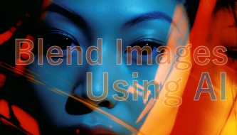
Image blending used to be one of those design tasks that looked simple from the outside but took real patience behind the scenes. You had to cut out subjects, refine masks, match lighting, fix shadows, soften edges, color grade every layer, and hope the final composite did not look fake.
Today, AI image blending makes that process faster. Designers can remove backgrounds, extend scenes, match lighting, generate new backgrounds, blend textures, harmonize colors, and create surreal composites in a fraction of the time.
But there is one thing AI still cannot do for you: decide whether the final image actually feels believable, intentional, and useful for the project.
That is why this guide is written for designers, not just tool collectors. We’ll look at 10 smart ways to blend images using AI, but also explain when each technique works, what to check before publishing, and how to avoid the common “AI composite” look.
Whether you are creating social media graphics, campaign visuals, product mockups, concept art, website hero images, editorial layouts, or brand assets, these AI blending techniques can help you create smoother, more professional compositions without losing creative control.
Before You Blend: What Makes an Image Composite Look Real?
Before opening Photoshop, Firefly, Midjourney, Canva, Runway, or any AI editing tool, it helps to understand why some composites look realistic and others look obviously fake.
A strong image blend usually depends on five things:
- Clean separation: the subject is cut out cleanly without jagged or blurry edges.
- Matching perspective: the subject and background feel like they were photographed from a similar angle.
- Consistent lighting: shadows, highlights, and light direction make sense.
- Color harmony: the overall temperature, contrast, and saturation feel unified.
- Edge realism: the transition between subject and background does not look pasted on.
AI can help with all of these, but it still needs guidance. A one-click result may be good enough for a quick social graphic, but professional design work usually needs extra checking and manual refinement.
Explore More DesignRise Resources:
- 10 AI Tools Every Designer Should Try in 2026
- Best AI Tools for Graphic Design
- How Designers Can Boost Their Interview Performance with AI
The Designer’s AI Image Blending Workflow
A good AI image blending workflow is not just “upload two images and merge them.” That can work sometimes, but it often creates random results. A better approach is to treat the composite like a small visual system.
Use this simple workflow before applying the 10 techniques below:
- Define the purpose: is this for an ad, website hero, mockup, poster, concept, or social post?
- Choose the visual anchor: decide which image is the main subject and which image supports the scene.
- Check perspective: make sure the angle and scale can work together.
- Remove or isolate: clean the subject before blending.
- Match light and color: align shadows, highlights, warmth, contrast, and atmosphere.
- Refine edges: use masks, feathering, blur, or AI edge tools.
- Grade the final image: apply a shared color treatment to unify everything.
- Zoom out: check whether the full composition works at real viewing size.
This process keeps AI from becoming random. You are not just blending images. You are designing one believable visual story.
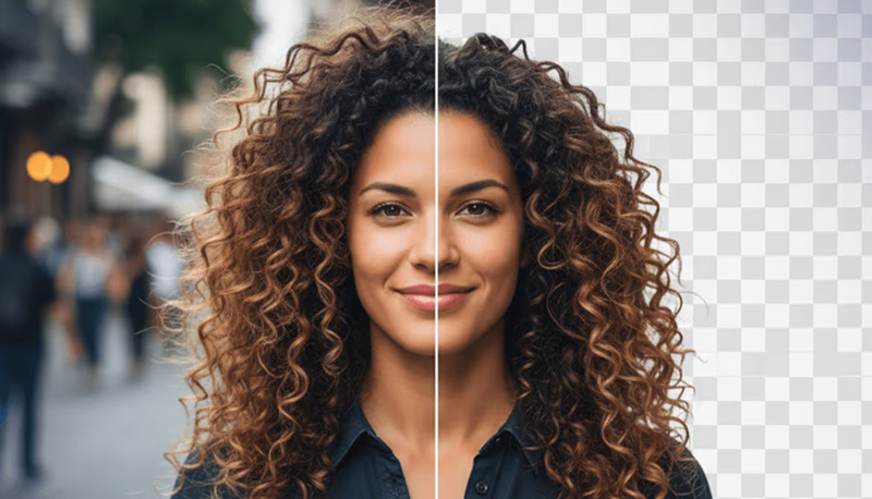
1. Start With AI Background Removal
Best for: product images, portraits, campaign graphics, social media posts, and website visuals
Clean background removal is the foundation of many composites. If the subject has messy edges, hair artifacts, transparent halos, or leftover background pixels, the final blend will look weak no matter how good the background is.
AI background removal tools can isolate a subject quickly, which gives designers a cleaner starting point for AI image blending. This is especially useful when working with products, people, packaging, objects, fashion shots, or simple marketing graphics.
Tools to Try
Designer Tip
After using AI background removal, zoom in around hair, fingers, glass, fabric, product edges, and shadows. AI often gets the main cutout right but leaves small edge problems that become visible after blending.
Quick Check
- Are the edges clean?
- Is there a white or dark halo around the subject?
- Do fine details like hair, fur, fabric, or glass still look natural?
- Does the subject still have its original shadow, and should that shadow be removed or rebuilt?
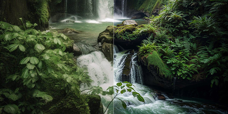
2. Generate a Background That Matches the Subject
Best for: advertising visuals, product scenes, fantasy edits, concept art, and campaign compositions
Sometimes the problem is not the subject. The problem is the background. You may have a strong product photo or portrait, but the background feels boring, inconsistent, or impossible to match manually.
AI can generate a background that fits the subject’s mood, lighting, camera angle, and story. This is one of the most useful forms of AI image blending because the background can be created specifically around the subject instead of forcing two unrelated images together.
Tools to Try
Prompt Example
Create a soft editorial background for a skincare product photo. Warm natural light, beige stone surface, subtle shadows, premium clean beauty mood, minimal composition, realistic photography style.
What to Watch For
AI-generated backgrounds can look beautiful but still fail if the perspective is wrong. If your product is photographed from above, the background should not look like it was photographed from eye level. Match camera angle before matching style.
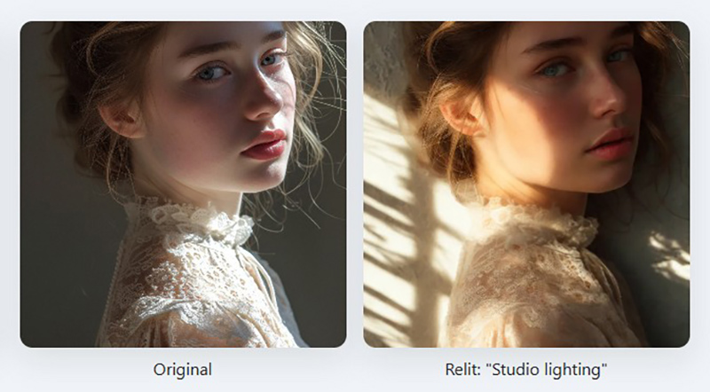
3. Match Lighting and Shadows With AI
Best for: realistic composites, product mockups, people in new environments, and commercial visuals
Lighting is usually the first thing that reveals a fake composite. If the background light comes from the left but the subject is lit from the right, viewers may not understand exactly what is wrong, but they will feel that something is off.
AI lighting tools can help relight a subject, adjust shadows, balance highlights, and make the subject feel more connected to the environment.
Tools to Try
- Luminar Neo Relight AI
- Glima AI Match Background Lighting
- Createimg Relight AI
- Krea AI Change Lighting
- Pixelcut AI Lighting Correction
Designer Tip
Do not only look at brightness. Look at light direction, shadow softness, contrast, color temperature, and whether the subject feels grounded in the scene.
Lighting Checklist
- Where is the main light coming from?
- Are the shadows falling in the correct direction?
- Is the subject warmer or cooler than the background?
- Does the subject need a contact shadow?
- Are highlights too sharp compared with the background?
4. Use AI Texture Matching for Products and Objects
Best for: product design, packaging mockups, fashion visuals, furniture scenes, and realistic object placement
Texture is easy to forget, but it makes a huge difference. A glossy product placed into a matte environment can feel wrong. A sharp object placed into a grainy background can look pasted. A smooth AI-generated object can look too perfect compared with a real photo.
AI texture matching helps make surfaces feel more consistent. It can add grain, improve material detail, match realism, or help blend objects into scenes more naturally.
Tools to Try
When This Works Best
This technique works especially well when blending products into realistic scenes. For example, if you place a bottle into a bathroom scene, the bottle should share the same softness, light reflection, sharpness, and surface atmosphere as the background.
5. Extend or Merge Scenes With Generative Fill
Best for: outpainting, fixing awkward crops, expanding backgrounds, and connecting two images
Generative Fill is one of the most practical AI tools for designers because it solves a common problem: the image is almost right, but the crop is too tight, the background ends too soon, or two parts of a composite do not connect naturally.
With generative fill, you can extend a scene, fill empty areas, remove distractions, or create missing background details that help the whole image feel complete.
Tools and Tutorials
- Adobe Photoshop Generative Fill
- Photoshop Essentials: Extend an Image with Generative Fill
- PhotoshopCAFE: Expanding a Picture with Generative Fill
Designer Tip
When extending a scene, do not accept the first result automatically. Generate a few options and choose the one with the most believable perspective, texture, and light direction.
6. Harmonize the Composite With AI Color Grading
Best for: final polish, editorial images, campaign visuals, social media graphics, and cinematic composites
Color grading is the step that makes separate elements feel like one image. Even when the masking, background, and lighting are good, the blend can still feel artificial if the colors do not belong together.
AI color grading tools can help match warmth, contrast, saturation, shadows, highlights, and overall atmosphere.
Tools to Try
Color Grading Checklist
- Do all image elements share a similar color temperature?
- Are the blacks and whites consistent?
- Is one element too saturated compared with the others?
- Does the final image need a subtle global color overlay?
- Does the grade support the mood of the project?
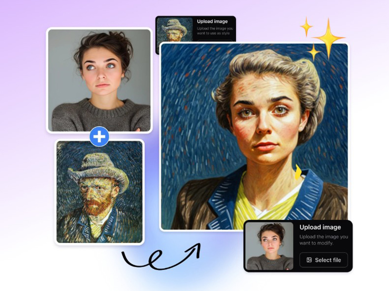
7. Use AI Style Transfer for Consistent Visual Language
Best for: mixing illustration and photography, campaign systems, concept art, posters, and stylized visuals
Sometimes the goal is not realism. You may want to blend a photo with an illustration, a 3D render with a painted background, or several images with different styles. In that case, style consistency becomes more important than photographic accuracy.
AI style transfer tools can help transform different image sources into one visual language. This is useful when creating posters, moodboards, editorial graphics, surreal compositions, and branded campaign visuals.
Tools to Try
- EditImg AI Style Transfer
- Createimg AI Style Transfer
- Pixelfox AI Style Transfer
- ArtificialStudio AI Style Transfer
Designer Tip
Use style transfer carefully for brand work. A strong style can make the composition memorable, but it can also overpower the message if the effect becomes more important than the design.
8. Refine Edges With AI Masks
Best for: portraits, hair, fabric, product cutouts, animals, transparent objects, and layered composites
Edges are where bad composites usually reveal themselves. A subject can have the right background, lighting, and color, but if the edges are too sharp, too blurry, or surrounded by a halo, the image will still look fake.
AI masks help refine transitions between layers. They can detect subject edges, soften difficult areas, and create more natural blends.
Tools to Try
Manual Refinement Still Matters
Even with AI masking, designers should check edges manually. Sometimes the right answer is not a perfect cutout. Real objects often need a little softness, color spill, contact shadow, or atmospheric blur to sit naturally in a scene.
Edge Checklist
- Are the edges too sharp for the background?
- Is there color contamination from the old background?
- Does hair or fabric look cut off?
- Does the subject need a small blur to match depth of field?
- Does the object need a contact shadow?
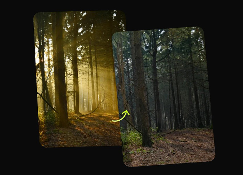
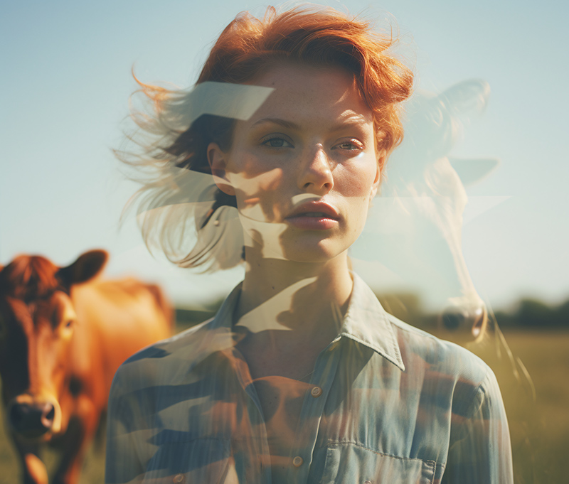
9. Blend Multiple Shots With AI Morphing or Fusion
Best for: surreal edits, transitions, campaign visuals, experimental posters, and creative storytelling
Not every blend needs to look like a realistic photograph. Sometimes designers want a more creative result: two faces merging, a product transforming into a landscape, a fashion image blending with architecture, or a poster where one scene melts into another.
AI morphing and fusion tools can help create these transitions quickly. They are especially useful for visual storytelling, music visuals, editorial design, and surreal campaign concepts.
Tools to Try
Creative Use Cases
- Before-and-after campaign visuals.
- Album covers and music promotion.
- Fashion editorial graphics.
- Surreal poster design.
- Animated transition concepts.
- Concept art and visual experiments.
10. Let AI Generate the Entire Composite
Best for: rapid concepts, moodboards, social visuals, early art direction, and creative exploration
Sometimes the fastest way to explore an idea is to let AI generate the entire composite from a prompt. This can be useful when you need visual direction quickly, especially at the concept stage.
Full AI composite generation can help designers test ideas before spending time on manual production. However, it is important to treat these images as drafts or references unless the final output is clean, licensed, and suitable for the project.
Tools to Try
Prompt Example
Create a cinematic product campaign visual showing a transparent perfume bottle floating above reflective water, soft sunset light, elegant shadows, premium editorial style, realistic texture, minimal background, high-end advertising mood.
Designer Tip
Use full AI generation when you need speed, mood, and exploration. Use manual compositing when you need exact product accuracy, brand control, or client-ready commercial assets.
AI Image Blending Tools: Quick Comparison
| Technique | Best For | Designer Control Needed |
|---|---|---|
| Background removal | Clean subject isolation | Edge cleanup |
| AI background generation | Creating matching scenes | Perspective and realism check |
| Lighting and shadow matching | Realistic composites | Light direction and contact shadows |
| Texture matching | Products and objects | Surface detail and sharpness |
| Generative fill | Extending or merging scenes | Composition and perspective |
| Color grading | Final visual harmony | Mood and brand consistency |
| Style transfer | Stylized or mixed-media visuals | Brand fit and readability |
| AI masking | Clean edges and cutouts | Manual edge review |
| AI morphing | Surreal transitions | Concept clarity |
| Full AI composite | Fast concepts | Quality, licensing, and accuracy |
Common Mistakes Designers Make When Blending Images With AI
AI makes blending faster, but it also makes it easier to miss important details. Here are the mistakes to avoid.
Ignoring Perspective
If the subject and background were created from different camera angles, the blend will feel wrong. Perspective should be checked before color or texture.
Forgetting Contact Shadows
An object needs to feel like it touches the surface. Without a contact shadow, it may look like it is floating.
Overusing Smooth AI Textures
AI can make surfaces look too clean. Real photos often have grain, texture, imperfections, and natural variation.
Not Matching Color Temperature
A warm subject in a cool background can look pasted. Use color grading to unify the final image.
Accepting the First AI Output
The first result may be impressive, but not necessarily the best. Generate options, compare them, and refine the strongest one.
Using AI Without a Clear Design Goal
A surreal blend may look interesting, but if it does not support the message, campaign, product, or brand, it may distract from the design.
Designer Checklist for Better AI Image Blending
Before publishing or sending a blended image to a client, check the final composite carefully.
- Does the image support the project goal?
- Is the subject clearly separated from the old background?
- Does the perspective make sense?
- Is the lighting direction consistent?
- Are shadows believable?
- Do the colors feel unified?
- Are edges clean but not unnaturally sharp?
- Does the texture match across image elements?
- Does the final image still look good when zoomed out?
- Does the image fit the brand style?
- Have you checked licensing and usage rights?
- Does the final result feel intentional, not random?
Useful AI Image Blending Resources
If you want to improve your AI image blending workflow, these official and practical resources are useful starting points:
FAQ: AI Image Blending
What is AI image blending?
AI image blending is the process of using artificial intelligence to merge, composite, harmonize, or transform multiple images into one more seamless visual. It can include background removal, lighting adjustment, generative fill, masking, color grading, and style matching.
Can AI blend two images automatically?
Yes, many AI tools can blend two images automatically. However, designers should still check perspective, lighting, color, edges, shadows, and overall composition before using the final result professionally.
What is the best AI tool for blending images?
The best tool depends on the task. Photoshop is strong for controlled editing and generative fill, Firefly is useful for creative generation, Runway works well for visual experimentation, and tools like PhotoRoom or Pixelcut are helpful for background removal and masking.
How do I make AI image composites look realistic?
Match perspective, lighting, shadows, texture, color temperature, and edge softness. Then apply a final color grade to unify all elements.
Can AI image blending be used for commercial design?
It can be used for commercial design, but you should always check the tool’s licensing terms, client requirements, and whether the generated or edited assets are suitable for commercial use.
Why do AI composites sometimes look fake?
AI composites often look fake because lighting, perspective, scale, shadows, texture, or color grading do not match. Overly smooth AI surfaces and unnatural edges can also make the result look artificial.
Is AI image blending useful for product design?
Yes. Designers can use AI image blending to place products into new scenes, create mockup backgrounds, test campaign visuals, improve lighting, and build faster product presentation concepts.
Should designers still learn manual compositing?
Yes. AI can speed up the process, but manual compositing skills help designers understand what to fix when AI results are not perfect.
Final Thoughts: AI Makes Blending Faster, but Design Still Matters
AI image blending is one of the most useful creative workflows for modern designers. It can remove hours of repetitive masking, background editing, lighting correction, and scene building.
But the best results still come from design judgment. AI can remove backgrounds, generate scenes, match lighting, and create full composites, but the designer decides what looks believable, what supports the message, and what fits the brand.
Use AI to move faster. Use your eye to make the result better.
The future of image blending is not about replacing creativity. It is about giving designers better tools to create polished, imaginative, and professional visuals with more control.
AI can blend the pixels. Designers still blend the idea, mood, story, and purpose.
Explore more AI creative guides, design tools, and visual workflow resources on DesignRise.