
")


")


Finger-Friendly UI Design: How to Create Better Mobile Interfaces
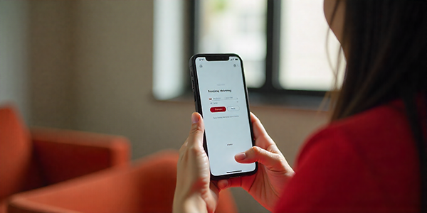
Finger-friendly UI design is one of the most important parts of mobile user experience. On phones and tablets, users do not interact with interfaces through a precise mouse cursor — they tap, swipe, scroll, and drag with their fingers. This means every button, link, menu, form field, and gesture needs to feel comfortable, clear, and easy to use.
For UI and UX designers, finger-friendly design is not just about making buttons bigger. It is about understanding thumb reach, touch target size, spacing, mobile accessibility, interaction feedback, and how people naturally hold their devices.
This DesignRise guide explains how to create touch-friendly mobile interfaces that reduce errors, improve usability, and make apps and websites feel smoother for real users.
Why Finger-Friendly UI Design Matters
In mobile-first design, fingers are the main input method. If a button is too small, a link is too close to another element, or an important action is placed in a hard-to-reach area, users may feel frustrated even if the visual design looks beautiful.
A finger-friendly interface helps users complete tasks with less effort. It improves navigation, reduces accidental taps, supports accessibility, and creates a more comfortable mobile experience.
On DesignRise, we see finger-friendly UI as part of practical user-centered design. A mobile interface should not only look clean — it should also feel easy and natural to use with one hand.
Designing for Thumb Reach and Comfort
Many people use smartphones with one hand, which makes thumb reach an important part of mobile UX design. The easiest areas to tap are usually closer to the lower part of the screen, while upper corners are harder to reach comfortably.
When designing mobile layouts, place primary actions where users can reach them quickly. Bottom navigation, sticky action buttons, and lower-screen controls often work better than placing important buttons at the top.
Thumb-friendly design tips:
- Place primary actions near the lower part of the screen when possible.
- Avoid putting important buttons only in the upper corners.
- Keep navigation simple and predictable.
- Consider how users hold the phone during common tasks.
- Use bottom navigation for frequently used sections.
Minimum Touch Target Size for Buttons and Links
Touch targets should be large enough for users to tap accurately without zooming, slowing down, or making repeated mistakes. Small buttons may look elegant on a desktop layout, but they can become frustrating on mobile screens.
As a practical rule, interactive elements should have enough visible size and spacing to support comfortable tapping. Buttons, icons, menu items, form controls, and text links should be easy to select even for users with larger fingers or reduced motor precision.
Touch target checklist:
- Make buttons large enough to tap comfortably.
- Leave clear spacing between interactive elements.
- Make small icons easier to tap by increasing the clickable area.
- Avoid placing multiple tiny links too close together.
- Test important actions on an actual mobile device, not only in a desktop preview.
Principles of Finger-Friendly Mobile UX
1. Comfortable Tap Size
Every interactive element should be easy to tap without requiring perfect precision. This includes buttons, icons, menu items, checkboxes, sliders, and form fields.
2. Clear Interaction Feedback
Users should immediately understand that their action has been recognized. Visual feedback, loading states, button changes, and microinteractions can make the interface feel more responsive.
3. Clean Layouts
Cluttered mobile screens increase the chance of mis-taps and confusion. A finger-friendly interface should focus on the most important actions and remove unnecessary visual noise.
4. Consistent Spacing
Consistent spacing helps users predict where they can tap and how the interface behaves. It also makes the design feel more polished and easier to scan.
5. Accessibility-Friendly Design
Finger-friendly UI also supports users with motor difficulties, visual impairments, or different device habits. Larger tap areas, readable labels, and clear spacing make mobile interfaces more inclusive.
Best Practices for Touch-Friendly Mobile Design
- Use clear visual hierarchy: Make primary actions stand out and reduce competition from secondary elements.
- Design for real thumbs: Test navigation and CTAs on an actual phone whenever possible.
- Keep gestures simple: Swipes and gestures can improve UX, but essential actions should not depend only on hidden gestures.
- Use enough spacing: Separate buttons, links, and icons to reduce accidental taps.
- Optimize forms: Use large input fields, clear labels, suitable keyboard types, and simple error messages.
- Make CTAs easy to reach: Primary actions should be visible, clear, and comfortable to tap.
Common Finger-Friendly UI Mistakes
Many mobile usability problems happen because a design looks good visually but does not feel comfortable in real use. These small issues can create friction and reduce engagement.
- Buttons that are too small to tap accurately
- Links placed too close together
- Important actions hidden in hard-to-reach areas
- Forms with tiny inputs or unclear labels
- Navigation that depends too much on hidden gestures
- No visual feedback after tapping a button
- Desktop layouts that are simply resized for mobile
How to Test a Finger-Friendly Interface
Testing is the easiest way to find mobile usability problems before users do. A design may look correct in Figma or a browser preview, but real-device testing often reveals issues with reach, spacing, scrolling, and tapping accuracy.
Quick mobile usability test:
- Open the design on an actual phone.
- Try completing the main task with one hand.
- Check whether the primary CTA is easy to reach.
- Tap every button, icon, and form field.
- Look for accidental taps or hard-to-select elements.
- Ask another person to complete the same task without guidance.
If users hesitate, miss buttons, or need to adjust their grip too often, the interface probably needs better touch spacing or layout adjustments.
Finger-Friendly Design and Mobile Accessibility
Finger-friendly UI is closely connected to accessibility. Larger tap areas, clear controls, readable text, and predictable layouts help more people use mobile products comfortably.
This is especially important for users with motor impairments, older users, people using phones while moving, and anyone interacting with an interface in real-world conditions.
Good mobile UX should reduce physical effort. The easier it is to tap, read, and navigate, the more inclusive and effective the interface becomes.
Conclusion
Finger-friendly UI design is essential for creating mobile interfaces that feel easy, comfortable, and natural to use. When buttons are large enough, spacing is clear, thumb reach is considered, and interactions provide feedback, users can complete tasks with less frustration.
Strong mobile UX is not only about visual style. It is about designing for real hands, real devices, and real user behavior. By applying touch-friendly principles, designers can improve usability, accessibility, engagement, and overall satisfaction.
DesignRise regularly shares UI/UX design guides, workflow tips, and creative resources for modern designers. Bookmark this guide and revisit it whenever you need practical ideas for improving mobile interface design.


